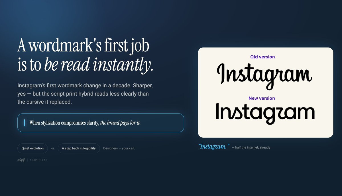
Instagram just refreshed its wordmark for the first time in a decade.
They called it “sharper and more modern.” Fair.
The old cursive was starting to feel dusty.
But the execution is a hybrid of script and print that somehow became less legible.
Half the internet is already reading it as “Instagzam.” That’s the risk with stylized letterforms: when craft beats clarity, the brand pays for it.
A wordmark’s first job is to be read instantly. The camera icon stayed the same (smart), and the broader system updates feel stronger than the wordmark itself. Brand equity this big can absorb a lot.
But “people will get used to it” is never the brief I want to write.
Designers, quiet evolution or a step back in legibility?
The best feedback loops are tight and specific. Vague feedback creates vague work.
What’s the most helpful piece of feedback you’ve ever received on creative work?
@Namecheap Private Email is currently “experiencing a temporary technical issue.”
Translation: my inbox is on a spiritual retreat and I’m over here having a full mental breakdown.
While Gmail just works, Outlook stays online, and even ProtonMail is out here being reliable… my @Namecheap inbox has decided to ghost me harder than my ex.
I'm one more failed refresh away from writing my resignation letter to email itself and moving permanently to carrier pigeons.
🚀 OpenAI DevDay 2025 MEGATHREAD - Major Announcements!
Today's keynote was packed with groundbreaking updates. Here's everything you need to know 🧵👇
Full keynote: https://t.co/bUUhBXhPIB
1/8
6/ Ask yourself next time you savor a juicy burger, ponder: Is That Heinz?
Because in the condiment kingdom, authenticity reigns supreme! Heinz, the unsung hero of saucy adventures.