Graphic & typeface designer. Founder of Sudtipos, a lovely type and lettering foundry from Argentina. @sudtipos —AGI @agigraphic member. + Food & wine.
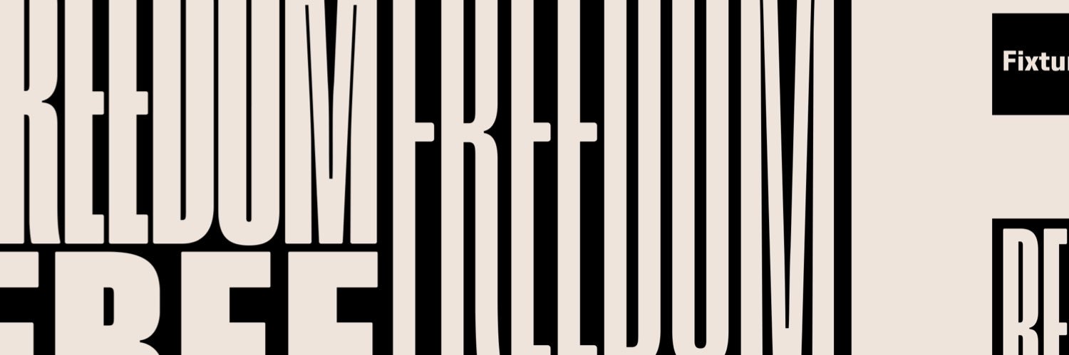
Introducing Queenie by Edgar Cápula — a playful variable display typeface inspired by 1960s psychedelic graphics.
Reverse contrast, fluid curves, and groovy rhythm in 9 weights + variable.
https://t.co/ugf4qPbH9n
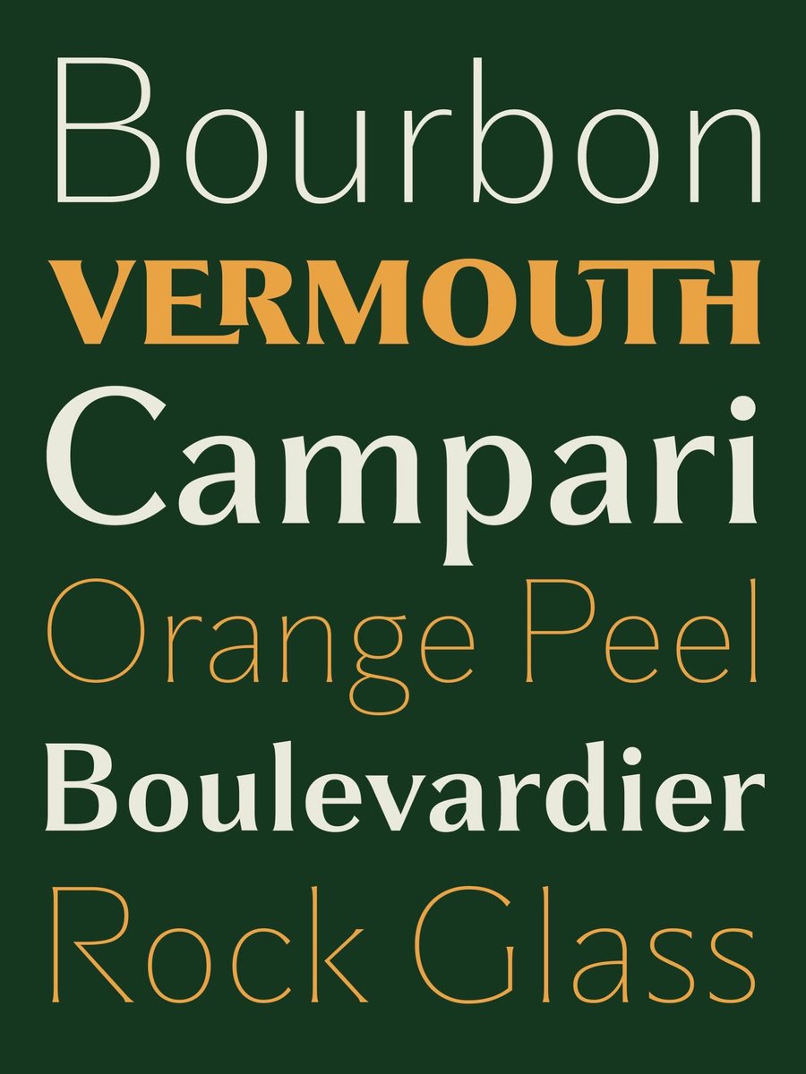
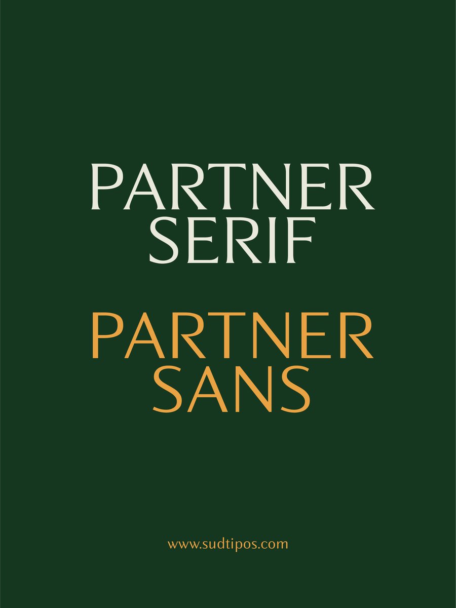
Partner — a new variable type system.
From sans to serif in one continuous axis.
Precision, warmth, and editorial tension in balance.
Inspired by gastronomy, fashion, and contemporary visual culture.
Check out this project on @Behance:
"Partner" https://t.co/rTUvn1L46l
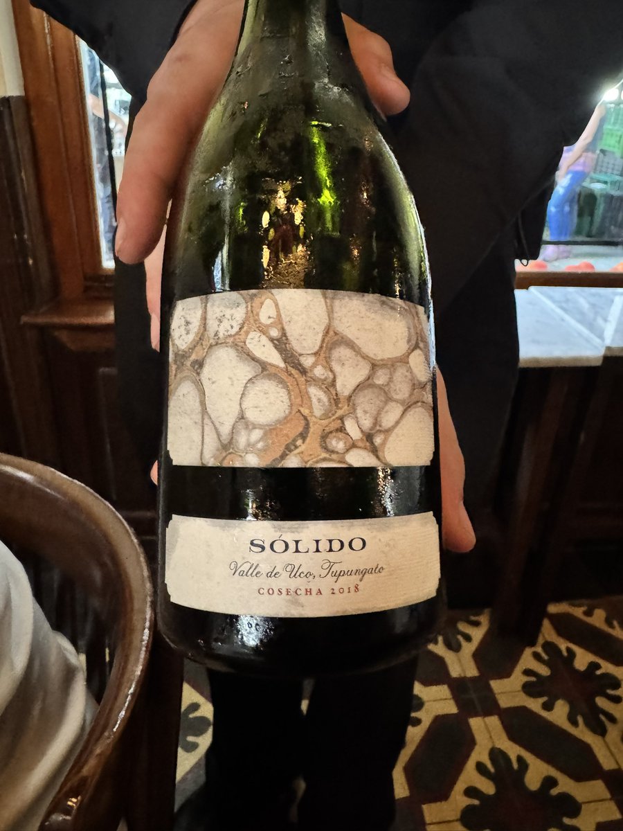
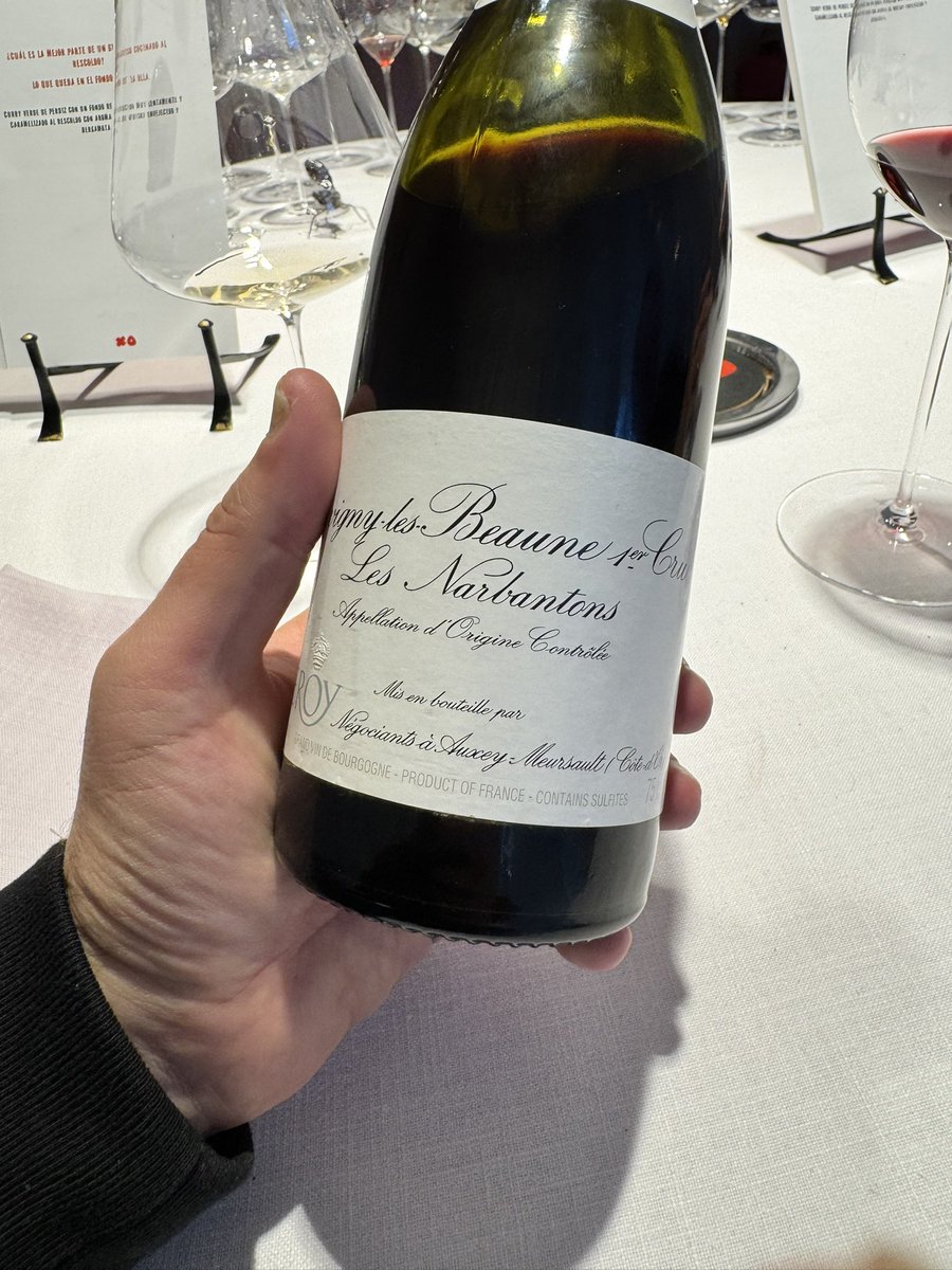
Y parte del impresionante maridaje.
Por su hospitalidad, su producción y su calidad, no quedan dudas de por qué Don Julio es el restaurante más importante de Argentina.
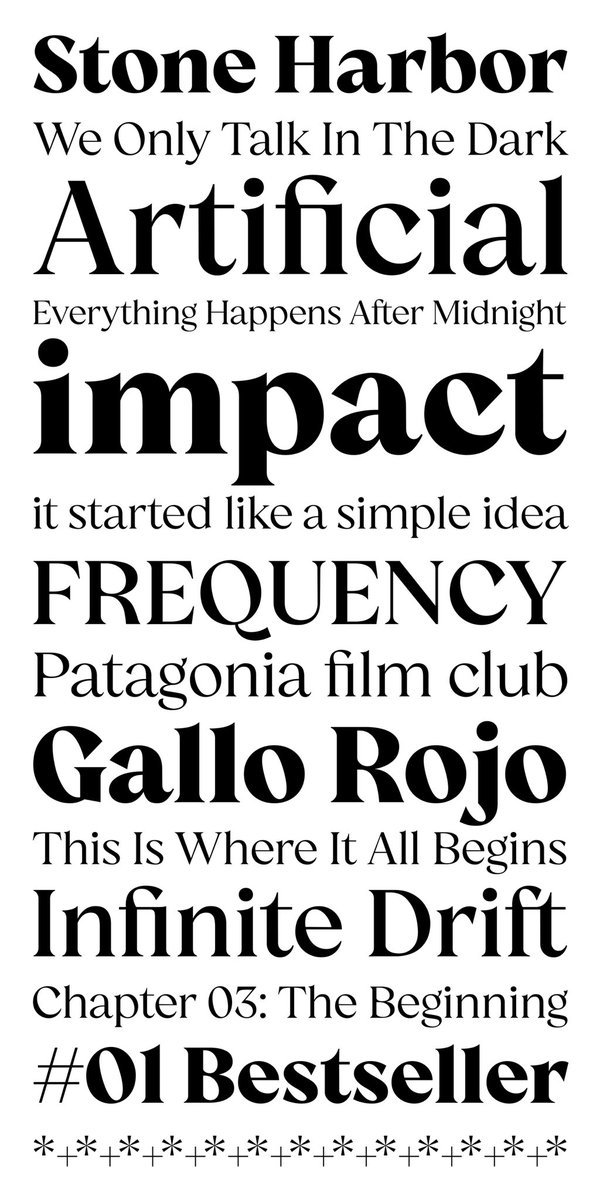
A contemporary neo-grotesque by Andrés Ramírez, built on European precision and shaped by Cauca.
9 weights + italics + variable font. 50% launch discount.
Check out this project on @Behance: "Quilichao Grotesk" https://t.co/fX6qpXeYbA
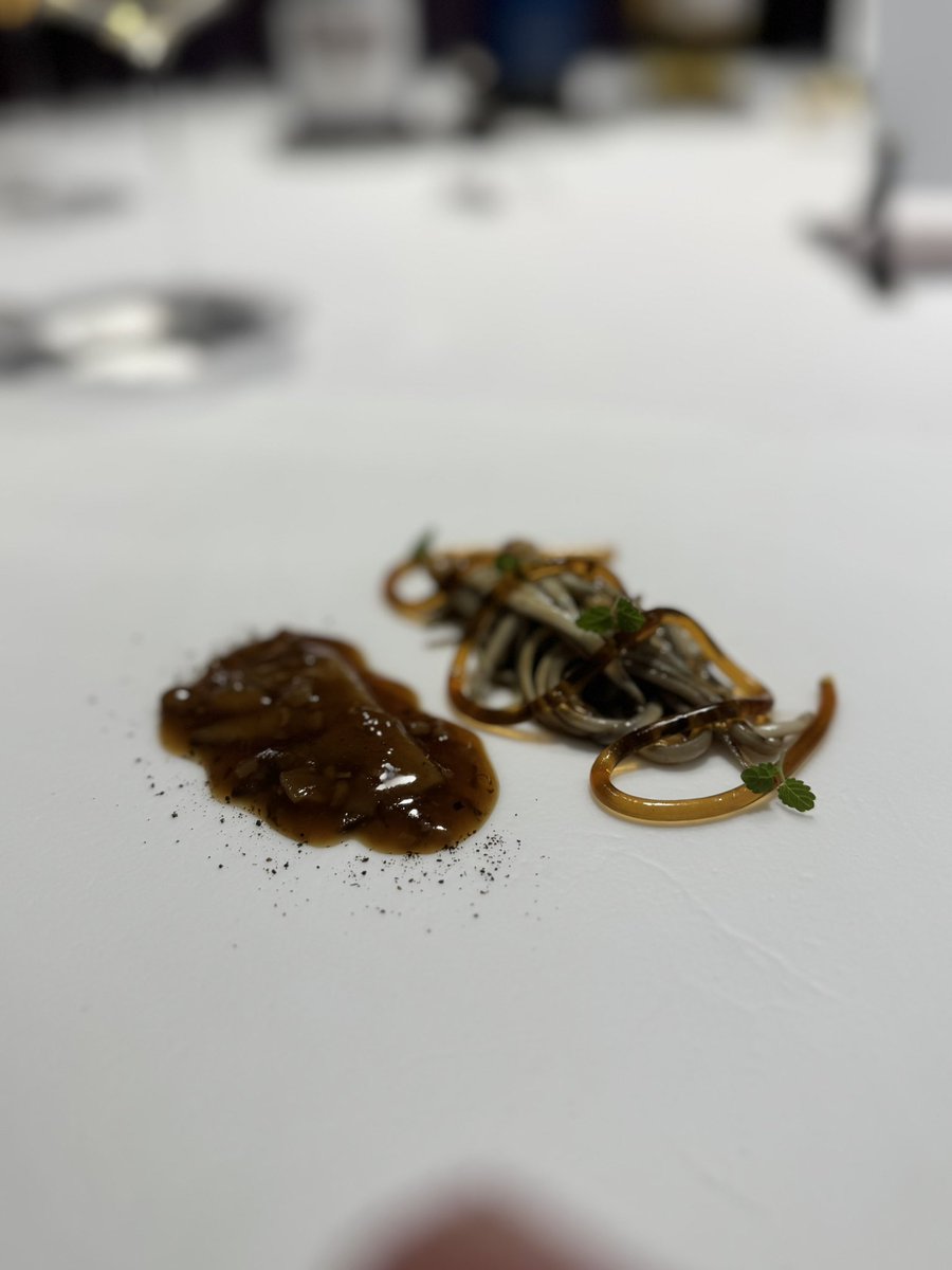
Conozco a Shimada Takeshi desde hace 20 años, cuando comandaba Bistro Tokyo. Llegó de Japón a BsAs en el 86 y nunca regresó. Cocina desde la memoria: la infancia, la familia, los maestros. Sin subestimar otros omakases locales, creo que es el único verdaderamente auténtico.