@amrook Your article about "No.22 Bicycles takes legal action against alleged imitator" I think has a small error: the link on the first line says "No.22 Bicycles", but links to https://t.co/ggs9R2NGGC.
FYI – Ken Goh has a terrible reputation in the Shanghai cycling community.
@matthewsyed Hopefully next time @matthewsyed appears on television he can stick to his area of expertise instead of parroting divisive rhetoric. This should do more to address the lack of trust in politics.
Shame on @matthewsyed for parroting tired old dystopian tropes about China on Newsnight, then a minute later talking about public loss of trust in politics. If only he had done his homework before speaking so authoritatively on a topic he clearly knows nothing about 🤦♂️
@matthewsyed From 15 years living in China I can attest that the social credit score is about addressing trust in society, not as he put it a "system of Orwellian scope". He can start by reading the Phd thesis of Adam Knight, or even just scan one of his articles...
https://t.co/Zlq7svKMXo
I really miss Macromedia FreeHand.
#AdobeIllustrator is way too cluttered and expensive.
#AffinityDesigner feels counter intuitive. None of the shortcuts or habits I have from 20+ years of using design applications transfer.
@sketch fancy adding print design capabilities 😬
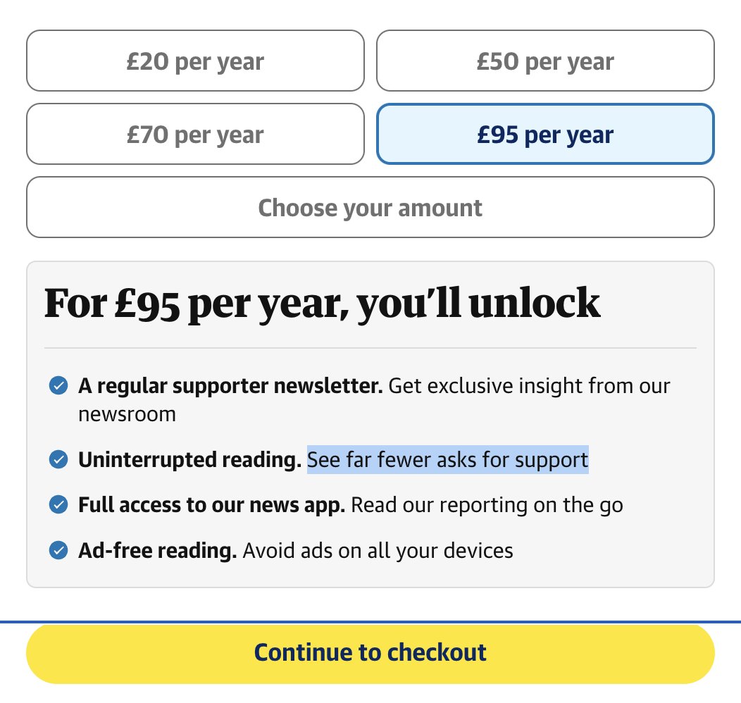
.@guardian is there a subscription tier that has ZERO begging messages? If so how much does that cost?
As a reader for 20+ years and former print subscriber it's the #1 reason I've not subscribed.
Despite at the top promising to reply in less than 5 minutes, you're presented with a dreaded lead capture form so they can bother you with emails from their CRM until eternity.
Amazing how horrible the UX of interacting with big tech companies has become and @intercom is complicit in enabling them. An automated chat bot obtrusively pops up in the corner, but you can no longer even chat to it. You're forced to reply by clicking on a canned response 😫
15 years ago, I helped design Google Maps.
I still use it everyday.
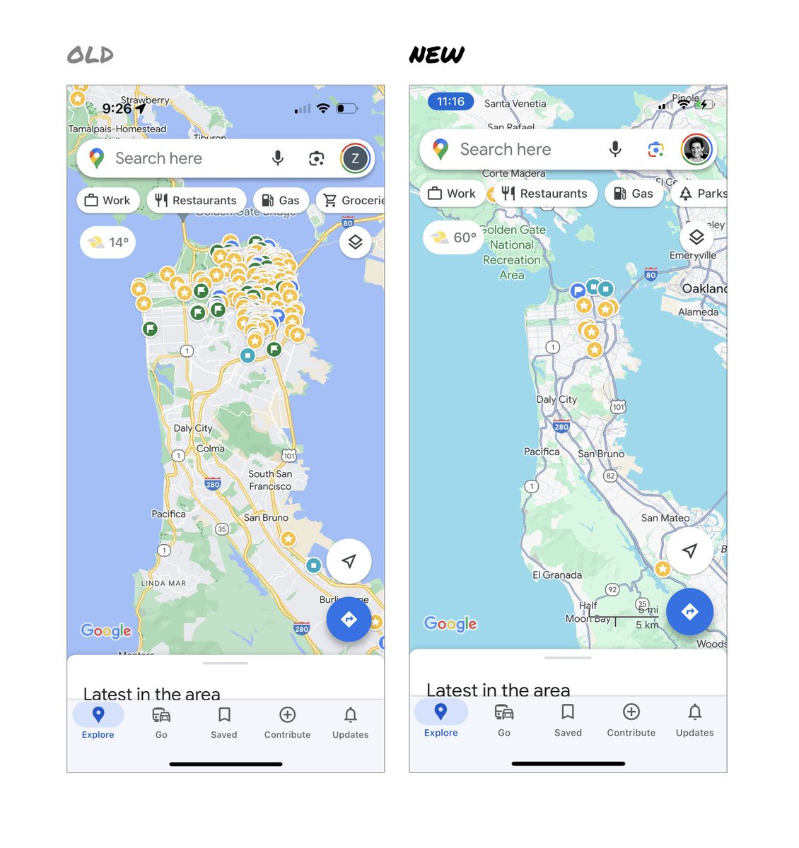
Last week, the team dramatically changed the map’s visual design.
I don’t love it.
It feels colder, less accurate and less human.
But more importantly, they missed a key opportunity to simplify and scale.
–––
Google Maps has started to widely roll out updated map colors:
- All roads are now gray
- Water changed from blue to teal
- Parks and open spaces are now mint green
It seems the goal was to improve usability and make the maps more readable.
Admittedly, I do think major roads, traffic, and trails stand out more now.
But the colors of water and parks/open spaces blend together.
And to me, the palette feels colder and more computer generated.
But color choices aside…
If the goal was better usability, the team missed a big opportunity:
Google Maps should have cleaned up the crud overlaying the map.
–––
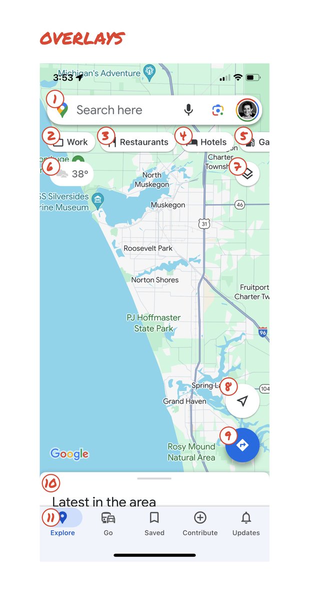
So much stuff has accumulated on top of the map.
Currently there are ~11 different elements obscuring it:
- Search box
- 8 pills overlayed in 4 rows
- A peeking card for “latest in the area”
- A bottom nav bar
(Personally, I would LOVE to see usage metrics for all these overlays.)
The map should be sacred real estate.
Only things that are highly useful to many people should obscure it.
There should be a very limited number of features that can cover the map view.
And there are multiple ways to add new features without overlaying them directly on the map.
–––
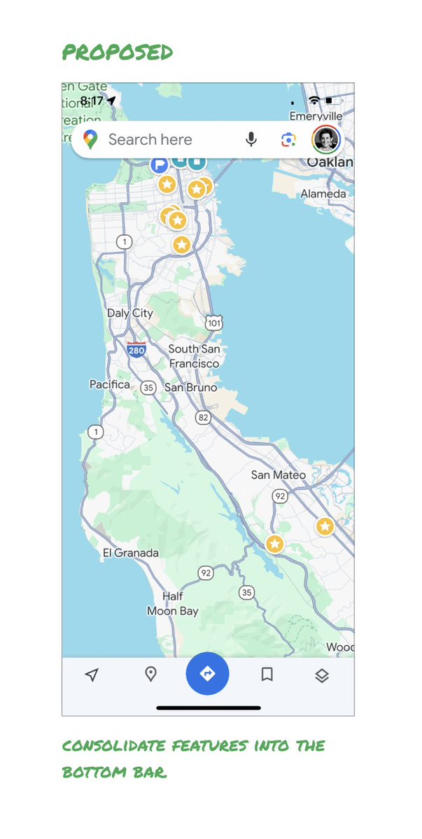
Here’s how it could look:
- Keep the search box
- Keep the bottom bar
- Remove everything else from the map
- Roll the most used features into the bottom bar
- Bury the less used features elsewhere in the app
I assume the search box and directions are top priority and should remain prominent.
My Location and map layers (satellite, traffic, etc.) could move to the bottom bar.
The explore overlays (restaurants, gas, etc.) could live in the bottom bar in “Explore” and open as cards.
The additional space in the bottom bar could be used for Saved, as a “More” option, or could be removed entirely.
There are many variations of how features could be arranged.
But the key points are:
- Dramatically simplify
- Strongly prioritize map visibility
- Bury legacy and low use features
–––
It’s normal for products to accumulate features over time.
But it’s also super important to stay vigilant and continually clean them up.
In many ways, it’s interesting to see history repeating itself.
In 2007, I was 1 of 2 designers on Google Maps.
At that time, Maps had already become a cluttered mess.
We were wedging new features into any space we could find in the UI.
The user experience was suffering and the product was growing increasingly complicated.
We had to rethink the app to be simple and scale for the future.
It seems like it’s time for Google Maps to do this again…
–––
For more on design + tips for early stage founders, follow me on X: @elizlaraki
@zoom_us our account was mysteriously downgraded to a "Basic" FREE plan despite having a valid credit card attached. Clicking "upgrade" just results in an error page. Can you help?
@pingdom https://t.co/IcfjrrUvTp says "Compress components with gzip" but CloudFlare compresses all our site assets with Brotli. Do you plan to update your speed test to also accept Brotli or is there a specific reason why you don't?
Released today: Social Media In China by KAWO [156 slides]. Up to date & accessible intro to the China online landscape
Link: https://t.co/9smgcmyjP8
@sammartino Yea, agree. I'm also loving the restoration videos. Check out @_MYMECHANICS channel on YouTube if you've not already:
https://t.co/3nj15z4xSB



![mbrennanchina's tweet photo. Released today: Social Media In China by KAWO [156 slides]. Up to date & accessible intro to the China online landscape
Link: https://t.co/9smgcmyjP8 https://t.co/18FpBBI3Hg](https://pbs.twimg.com/media/EaPLiXLVcAAgsBr.jpg)
![mbrennanchina's tweet photo. Released today: Social Media In China by KAWO [156 slides]. Up to date & accessible intro to the China online landscape
Link: https://t.co/9smgcmyjP8 https://t.co/18FpBBI3Hg](https://pbs.twimg.com/media/EaPLgiyU8AI7M3o.png)
![mbrennanchina's tweet photo. Released today: Social Media In China by KAWO [156 slides]. Up to date & accessible intro to the China online landscape
Link: https://t.co/9smgcmyjP8 https://t.co/18FpBBI3Hg](https://pbs.twimg.com/media/EaPLfmHU0AEx2dn.png)





![mbrennanchina's tweet photo. Released today: Social Media In China by KAWO [156 slides]. Up to date & accessible intro to the China online landscape
Link: https://t.co/9smgcmyjP8 https://t.co/18FpBBI3Hg](https://pbs.twimg.com/media/EaPLkNNWoAAcT7E.png)


