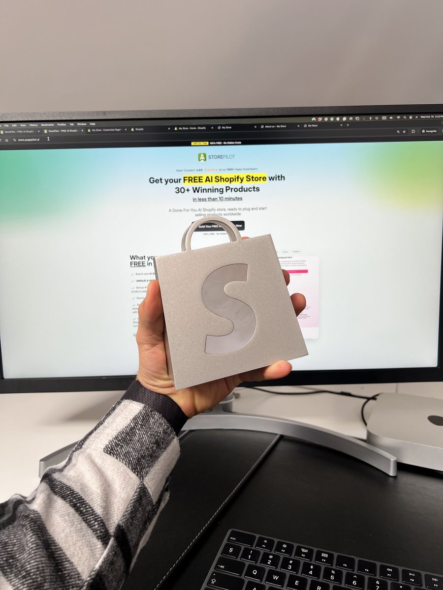
I put 5 years of ecom into 36 pages and I'm handing it out for free.
293,000+ users. $172M+ in revenue tracked. The patterns are always the same. The stores that print test 10+ products per week and kill losers in 48 hours. They sell to women 45-65 not Gen Z males. They write headlines at a 5th grade level. They run on the free Dawn theme. They sell in 3-5 countries not 1. They have abandoned cart emails, upsells, and subscriptions running on autopilot. The stores that die do none of this.
I documented the entire system. Product research. Demographics. Sourcing. Pricing. Pages. Ads. Backend. International.
Everything from $0 to $10K/month.36 pages.
Comment "PAGE" and I'll send it over(must be following)
the single highest-impact product page change nobody talks about because it sounds too stupid to be real:
move your reviews from section 5 to section 1
that's it. don't redesign anything. don't rewrite anything. just move "4.8/5 from 2,400+ reviews" into the hero section where it's visible without scrolling
why this works: 64% of mobile visitors never scroll past the first screen. your reviews are in section 5. 64% of your traffic has never seen your reviews. they're making a buy/leave decision based on a headline, a photo, and a price. with no social proof
one line of text. moved from the bottom to the top. visible without scrolling. 34% conversion lift
every CRO agency charges $3-5K/month to run A/B tests that produce 2-3% lifts over 6 weeks. this one change produces 34% in 10 minutes. they won't tell you because it would eliminate the need for the next 5 months of their retainer
my team told me not to give this away...
a 58 year old retired teacher who can't spell ROAS: $23K/month. a 19 year old security guard testing products during breaks: $34K/month. a couple who fired their $5K/month freelance team: $47K/month. none wrote a headline. none designed a layout. none hired anyone. they paste aliexpress links. AI builds the page in 60 seconds. they test 10 per weekend. kill monday. scale tuesday. the AI was trained on 771,000 pages of conversion data no human has ever seen
I documented the exact AI process they all followed. 36 pages. product research. AI pages. demographics. testing. scaling. backend. international
Comment "AI" and I'll send it over
(must be following)
after building 771,000+ product pages here are the 7 sections in the exact order that converts at 3%+ on mobile:
>section 1 - the hero (first screen, no scrolling):
lifestyle image + pain-driven headline + star rating + review count + price with anchor + benefit CTA + shipping date + guarantee. all visible without scrolling. 64% never see anything else. this screen IS the page for most visitors
>section 2 - the benefit stack:
3 benefits. each one sentence. each starts with a verb. each names a problem the buyer experienced yesterday. no features. no specs. no materials. the benefit is what changes in her life. the feature is what's in the box. she buys the benefit
>section 3 - the social proof wall:
5-star reviews with photos. customer-submitted images in bad lighting convert 3.2x higher than studio shots. the imperfection IS the trust. sort by most recent not most helpful
>section 4 - the "us vs them":
comparison table. your product vs "typical alternative." 4-5 rows. check marks vs X marks. pre-answer the comparison she was going to make in a separate tab. if you don't frame the comparison, she'll frame it herself. on your competitor's page
>section 5 - the objection handler (FAQ):
5-7 questions. each one is a buying objection disguised as a question. "is this safe for sensitive skin" = she's afraid it'll irritate her. answer the fear not the question. "tested on 2,400+ sensitive skin types with zero reactions" > "yes it's hypoallergenic"
>section 6 - the trust section:
guarantee details. return policy. shipping carrier. secure checkout badge. the last 5% of hesitation is "is this site legitimate." answer it visually. logos. badges. one-line policies
>section 7 - the sticky CTA:
floating buy button that follows her scroll on mobile. she can buy from any section without scrolling back to the top. the CTA is always visible. always one tap away. removing friction > adding persuasion
every section addresses a different stage of the buying decision. miss one and she exits at that stage. include all 7 in this order and 3%+ becomes the baseline not the ceiling
my team told me not to give this away...
a 58 year old retired teacher who can't spell ROAS: $23K/month. a 19 year old security guard testing products during breaks: $34K/month. a couple who fired their $5K/month freelance team: $47K/month. none wrote a headline. none designed a layout. none hired anyone. they paste aliexpress links. AI builds the page in 60 seconds. they test 10 per weekend. kill monday. scale tuesday. the AI was trained on 771,000 pages of conversion data no human has ever seen
I documented the exact AI process they all followed. 36 pages. product research. AI pages. demographics. testing. scaling. backend. international
Comment "AI" and I'll send it over
(must be following)
12 product page changes that take add 5-40% conversion:
1. change "add to cart" to a benefit ("start sleeping better") - 15-25% lift
2. add star rating + review count to the hero section - 34% lift
3. change "ships 5-7 days" to a specific date ("arrives june 12th") - 40% lift
4. add "compare at $X" next to your price - 25-35% lift
5. swap the supplier photo for a lifestyle image - 133% lift
6. rewrite headline at 5th grade reading level - 11.1% vs 5.3% conversion
7. add a one-line guarantee directly under the CTA button - 19% lift
8. pre-select the 2-pack as the default option - 60-80% keep whatever is pre-selected
9. build shipping cost into the price and display "FREE SHIPPING" - reduces 48% of cart abandonment
10. add "only X left" to the buy area - up to 30% lift
11. break price into daily cost ("$0.22/day") - removes price shock on products over $50
12. add one micro-review next to the CTA ("bought 3 more for my sisters") - social proof at the decision point
total time: 2 hours. total cost: $0. combined impact on a $50K/month store: $15-35K/month in revenue from the same traffic
save this list. implement one per day for 12 days. check your conversion after
12 product page changes that take add 5-40% conversion:
1. change "add to cart" to a benefit ("start sleeping better") - 15-25% lift
2. add star rating + review count to the hero section - 34% lift
3. change "ships 5-7 days" to a specific date ("arrives june 12th") - 40% lift
4. add "compare at $X" next to your price - 25-35% lift
5. swap the supplier photo for a lifestyle image - 133% lift
6. rewrite headline at 5th grade reading level - 11.1% vs 5.3% conversion
7. add a one-line guarantee directly under the CTA button - 19% lift
8. pre-select the 2-pack as the default option - 60-80% keep whatever is pre-selected
9. build shipping cost into the price and display "FREE SHIPPING" - reduces 48% of cart abandonment
10. add "only X left" to the buy area - up to 30% lift
11. break price into daily cost ("$0.22/day") - removes price shock on products over $50
12. add one micro-review next to the CTA ("bought 3 more for my sisters") - social proof at the decision point
total time: 2 hours. total cost: $0. combined impact on a $50K/month store: $15-35K/month in revenue from the same traffic
save this list. implement one per day for 12 days. check your conversion after
most stores: desktop conversion 3.2%. mobile conversion 1.4%. 76% of traffic is mobile. you have a mobile problem not a traffic problem
why mobile converts at half of desktop:
your page was designed on a 27-inch monitor. the designer viewed it on a macbook. the buyer views it on a 6.1-inch phone. the hero image that looks beautiful at 1920px is a blurry rectangle at 390px. the headline that fits in one line on desktop wraps to 4 lines on mobile and pushes the CTA below the fold
the reviews section that's visible on desktop is in section 5 on mobile - below the scroll threshold for 64% of visitors
the buy button that's always visible on desktop disappears on mobile the moment she scrolls past the first section. no sticky cart. no floating CTA. the button is gone until she scrolls back up. she doesn't scroll back up
the fix:
- add a sticky cart that follows her scroll on mobile. the CTA is always visible
- move star rating + review count to the hero section (visible on first screen)
- ensure headline is 1-2 lines on mobile, not 4
- test your page on a phone before launching, not after
- compress images so the page loads under 2 seconds on mobile data
- increase button size to 48px minimum tap target
one operator added a sticky cart and moved reviews to the hero. mobile conversion: 1.4% to 2.8%. doubled. from two changes that took 20 minutes. the mobile gap is the single largest conversion opportunity most stores have and almost nobody checks it
giving away way too much here...
your store has 5 checkout toggles you've never enabled ($15-35K/month). a klaviyo tab you've never opened that predicts which customers buy this week. a meta checkbox silently spending 5% on placements you excluded. free google shopping listings you didn't know exist. and you're still paying $800 per page when AI builds them in 60 seconds at higher conversion. every fix is free. every fix takes minutes. combined impact on a $50K store: $40-70K/month in revenue you're currently leaving behind
I put every hidden setting and every AI shortcut into 36 pages. plus product research. demographics. testing. scaling. backend. international
Comment "PAGE" and I'll send it over
(must be following)
at Shopify’s #DotDev event this week.
three key things stands out:
1. shopify is going all in on “agentic commerce” - your products discoverable and purchasable inside AI chatbots like ChatGPT and Perplexity. no website visit needed. there’s already a tab in your admin for it. the merchants who enable it first will own a channel their competitors don’t know exists yet.
2. every product handed out at the event - the water, the snacks, the merch - is from a brand that runs on shopify. that's a cool thing to keep everything inside the ecosystem.
3. the Catalog API is the quiet engine behind a lot of this. it lets you push clean, real-time product data straight into AI platforms so your catalog stays accurate and discoverable everywhere, no extra apps or manual syncing required. super powerful for staying ahead in agentic commerce.
met directly with shopify’s team to discuss what they’re building next and how PagePilot stays ahead of it. spent time with other app founders, partners, and operators who are shaping where ecom goes from here.
if you’re here this week - DM me. let’s meet up.
the "buy area" on your product page is the 300 pixels around the add-to-cart button. this is where 80% of purchase decisions are made or lost. most stores put nothing here
what should be within 300 pixels of your CTA:
- the price anchored against something ("compare at $89.99" or "$180/month in spa visits vs $79 once")
- the guarantee phrased as empathy not legal ("if your dog doesn't love it we refund you anyway")
- the shipping as a date not a range ("arrives june 12th")
- a trust badge she recognizes (secure checkout, money-back, shipping carrier logo)
- a micro-review (one sentence from one customer, "I bought 3 more for my sisters")
everything within 300 pixels answers the question "is it safe to click this button." the button itself is the last thing she reads. everything around it determines whether she clicks it
if your buy area contains: product title, price, "add to cart" and nothing else - you have a 300-pixel dead zone where trust should be. the conversion gap between a decorated buy area and an empty one is 15-35%
this should probably be a paid product...
$467K/month. every page built by AI in 60 seconds. zero designers. zero copywriters. the AI writes at 5th grade because 3.4% conversion. the designer wrote at college level because simple felt beneath her. the AI converts at 3.4%. the designer converted at 1.4%. same products. same traffic. different pages. different outcome
I put the entire AI system into a 36-page guide - product research, demographics, AI pages, testing, scaling, backend, international. everything from $0 to $10K/month
Comment "STORE" and I'll send it over
(must be following)
giving away way too much here...
your store has 5 checkout toggles you've never enabled ($15-35K/month). a klaviyo tab you've never opened that predicts which customers buy this week. a meta checkbox silently spending 5% on placements you excluded. free google shopping listings you didn't know exist. and you're still paying $800 per page when AI builds them in 60 seconds at higher conversion. every fix is free. every fix takes minutes. combined impact on a $50K store: $40-70K/month in revenue you're currently leaving behind
I put every hidden setting and every AI shortcut into 36 pages. plus product research. demographics. testing. scaling. backend. international
Comment "PAGE" and I'll send it over
(must be following)
at Shopify’s #DotDev event this week.
three key things stands out:
1. shopify is going all in on “agentic commerce” - your products discoverable and purchasable inside AI chatbots like ChatGPT and Perplexity. no website visit needed. there’s already a tab in your admin for it. the merchants who enable it first will own a channel their competitors don’t know exists yet.
2. every product handed out at the event - the water, the snacks, the merch - is from a brand that runs on shopify. that's a cool thing to keep everything inside the ecosystem.
3. the Catalog API is the quiet engine behind a lot of this. it lets you push clean, real-time product data straight into AI platforms so your catalog stays accurate and discoverable everywhere, no extra apps or manual syncing required. super powerful for staying ahead in agentic commerce.
met directly with shopify’s team to discuss what they’re building next and how PagePilot stays ahead of it. spent time with other app founders, partners, and operators who are shaping where ecom goes from here.
if you’re here this week - DM me. let’s meet up.