The latest project I’ve been working on is the design of Liquid Glass, alongside an army of designers and engineers. We're designing it to bend and shape light while feeling like an elastic, flexible material that can dynamically shape shift, to make apps feel fluid and organic.
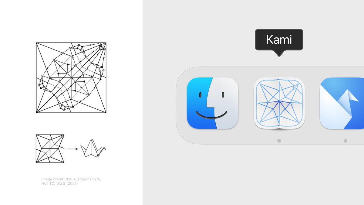
When designing the app icon I learned about ‘crease patterns’ – structural representations of intricate origami folds.
The app icon shows the crease pattern for an Origami Crane – a nod to Origami Studio’s original app icon.
I’ve made a little AI copilot for Origami Studio.
Think of it as a tiny code editor that sits on top of Origami's canvas and lets you generate patches using GPT-4 – all within the same surface.
It’s a native macOS app and you can get it here: https://t.co/eWKvAudn9m
In my day-to-day prototyping I use it mostly to create little utility patches and ‘jigs’ for all sorts of things (transforms, validate strings, randomize this and that etc.)
Just describing the desired inputs and outputs of a patch helps a lot – it makes you break down the logic of a prototype and is almost as useful as generating the patch itself.
PS. little accidental find:
You get a directional Motion Blur for free if you blur the layer *before* applying the distortion shader. The shader compresses the blur horizontally but stretches/emphasizes the blur vertically
The blur strength responds to the drag/scale velocity. I'm using @jmtrivedi's fantastic Wave package which makes it easy to work with the velocity + animate the shader values.
The code is up here:
https://t.co/H2v6PQ0a1n
Prototyped a subtle Zoom Blur and Motion Blur SwiftUI shader this weekend.
It's a little detail that changes the feel of the dragged element entirely (and is fun to play around with)
It’s an amalgam of SpriteKit particle layers, gradients and blend modes. Together they create a nice materiality.
I liked the idea of using a turbulence burst to change between the material's colors
@ollybromham For the time, I just had a hunch how it should move and feel. I pulled some of the variables into sliders and built a little 'design tool' which allowed me to fidget around with the values and feel it out (this makes SwiftUI such a neat prototyping tool!) :-)
@ollybromham The stick itself is a spline that gets more flexion the longer it gets (like a flimsy piece of wood). It's a v subtle detail that gives the interface more materiality and makes it feel less like a slider – even if you're not consciously aware of it
@tarngerine@parkerhendo@diagram yea we had to abandon it for reasons, but I still believe in the idea behind it. One pattern I love is that the code is stored on the Artboard itself, so to iterate on a prototype you'd just option-drag/duplicate the frame – it's like visual versioning, felt p great & natural