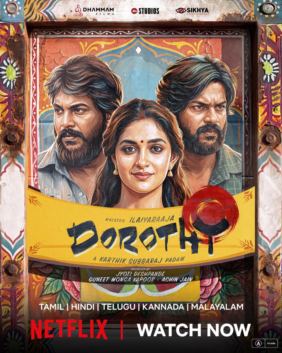
Dorothy is the kind of film that makes me grateful for cinema. @karthiksubbaraj, take a bow. Sananth and Rishikanth are so, so good!!!! these performances deserve far more love. Films like this come along rarely, and we somehow fail to celebrate them enough. I’m sure this will become a cult classic. I just wish we didn’t have to wait years to recognise something this special.
design wise i have never been more uninspired by anything apple has released in the last 20 years.
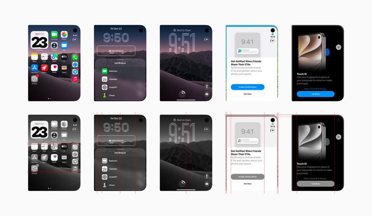
it’s not just the 'apps aren’t adapted yet' problem (and the irony is that in most cases the apps that haven’t been adapted look better than the ones that have) or the usual first iteration issues. it’s a series of fundamentally weird design choices that make it impossible to even come up with nice layouts. there are screens where nothing aligns with anything, buttons floating around randomly. forget about symmetry. like, forever. it’s not even a concept anymore.
not a single screen on the main display has made me think, 'oh, that looks neat' (or balanced, or at least makes sense from an IA perspective). everything is just...random.
but yeah, a nice opening animation (that you barely ever actually see), a cool combo status bar (that most of the time just sits there all alone, taking up 1/5 of the screen’s width), and a nice click when opening or closing it (no comments here, the click is actually nice).
We’ve been making lots of changes to GO Club over the past couple of months. Small improvements and experiments take more time than you’d think, but I’m hopeful all that effort will pay off 🤞
2.0.1 (214)
I was experimenting with new pricing for our app using App Store Connect CLI, and it’s crazy how easy it was to make changes right from the terminal. Huge thanks to @rudrank for building this!
iPhone Duo is here! Excited to have worked on the design of our open/close transition. It’s designed to make the two displays feel like one seamless experience by perceptually bending the focal plane, not the content, so that it feels like opening a window onto a singular view.
Thanks Jose! Really appreciate the feedback. A few things you mentioned were already on our list for next season, and you’ve given us a few more to work on too! 😁🦾
Agree or disagree?
This is exactly why I was never a fan of the new form factor and the Duo app experience. For a $2,000 device, I expected a significantly better, more polished app experience from day one.
@SteveLCFC_@BoxBox_Club Hey Steve, we’ve pushed the Slicks release to a later date since we’re caught up with the Duo update across all our products right now. We'll keep you posted!
Since most apps already support the iPad, I feel sticking with that layout would have been a much better approach than introducing something entirely new. Realistically, it’s going to take years for even some of the biggest companies and most popular apps to fully optimise for Duo. Why compromise the user experience when a more mature layout already exists?
I mean, it’s a cool video and all, but the new icon is just black and white?
There’s nothing in this icon or the app UI that showcases “made by sound”.
All they’ve done is remove the red accents.