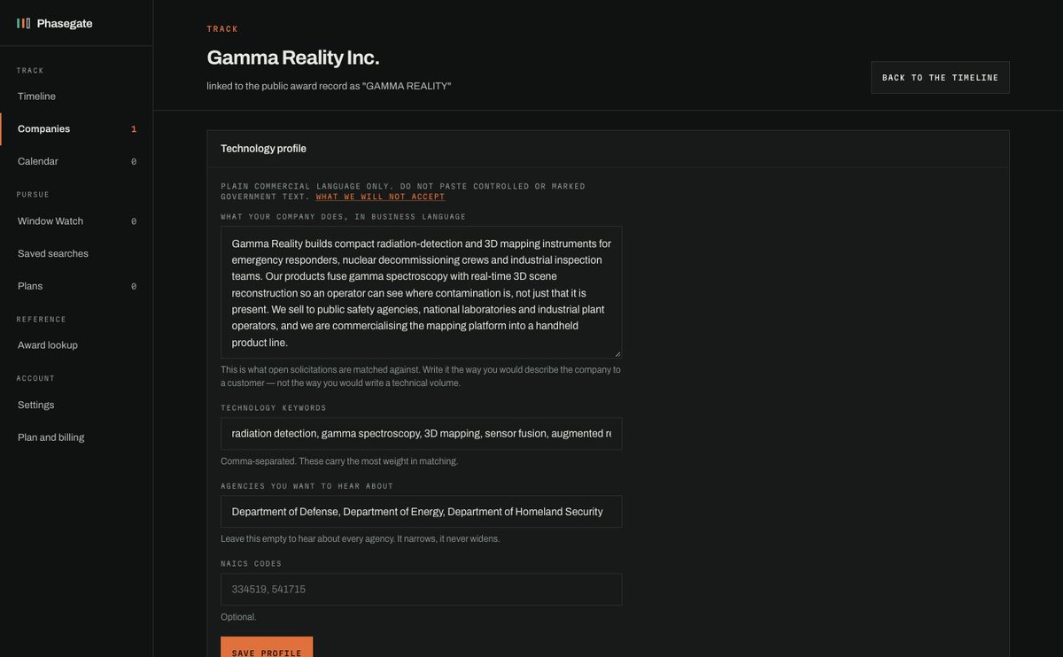
Phasegate asks a company to describe what it does in business language, not proposal language, then matches open solicitations against that. The helper text says so right under the box. Half of form design is telling people what the box is for.
Every date in SponsorClerk has the rule behind it printed right next to it, quoted in full. If a product is going to tell a legal team "keep this until September 30", it had better show its work. Trust is a layout decision.
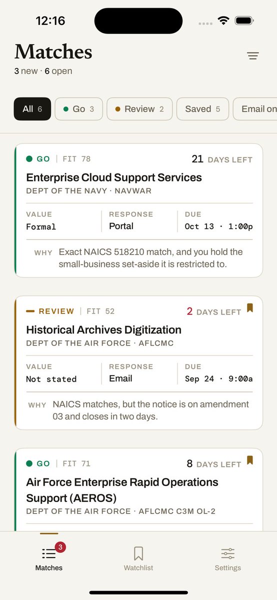
Bidwire's match list gives every contract notice a colored edge: green for Go, amber for Review. Days left sits top right, one line of why at the bottom. You should be able to triage a morning of notices with your thumb.
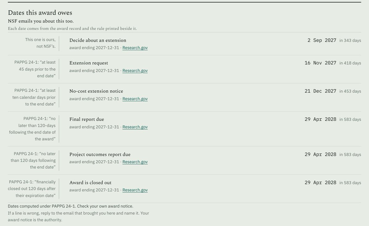
GrantClerk turns a research award into the dates it owes: extension request, final report, closeout. Each row has the rule it came from quoted in the margin. One row says "this one is ours" because it's a suggestion, not a requirement. https://t.co/FimUbkWiRc
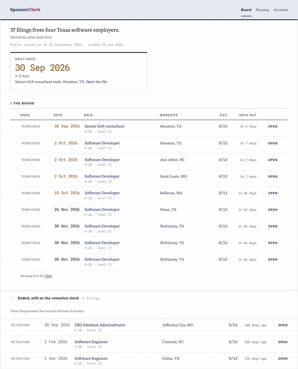
SponsorClerk turns an employer's own work-visa filings into a register, sorted by what ends first. I skipped the dashboard. One plate at the top answers "what's closest" before you read a word, then one row per filing. Registers are underrated. https://t.co/Td2mazRdyg
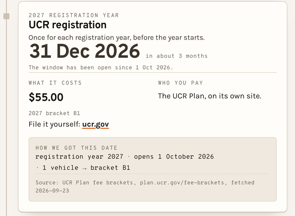
Haulmarker lists every federal date a trucking operator owes. Each card carries the date, what it costs, who you pay, and the arithmetic that produced it, with its source. If you're going to tell someone about a deadline, show how you got it. https://t.co/7qxOT1vEUb
Bidwire answers one question about a federal contract notice: can you bid it, and is it worth the day? One card. Go or No-Go up top, the fit score beside it, then exactly three reasons with the points each one added. A score you can't take apart is just a vibe.
Phasegate puts every federal research award a company holds on one rail, drawn to scale, with today marked. The gap between one stage and the next should be something you see, not something you work out in a spreadsheet. The timeline is the product. https://t.co/WbFuBDIwTo
Fifteen apps in, here's the onboarding rule I'd tattoo on a wall: the screen nobody skips is the one that asks for nothing. Ask later. Ask after they've felt something.
QRF. One swipe and your team comes to get you. The old page said that and then kept talking. The new one says it, shows the swipe, and stops. Restraint is a feature.
Yoga studio site. The entire job was the schedule on a phone. If you can't book tonight's class in two taps from the parking lot, nothing else on the page matters. So that's the page.
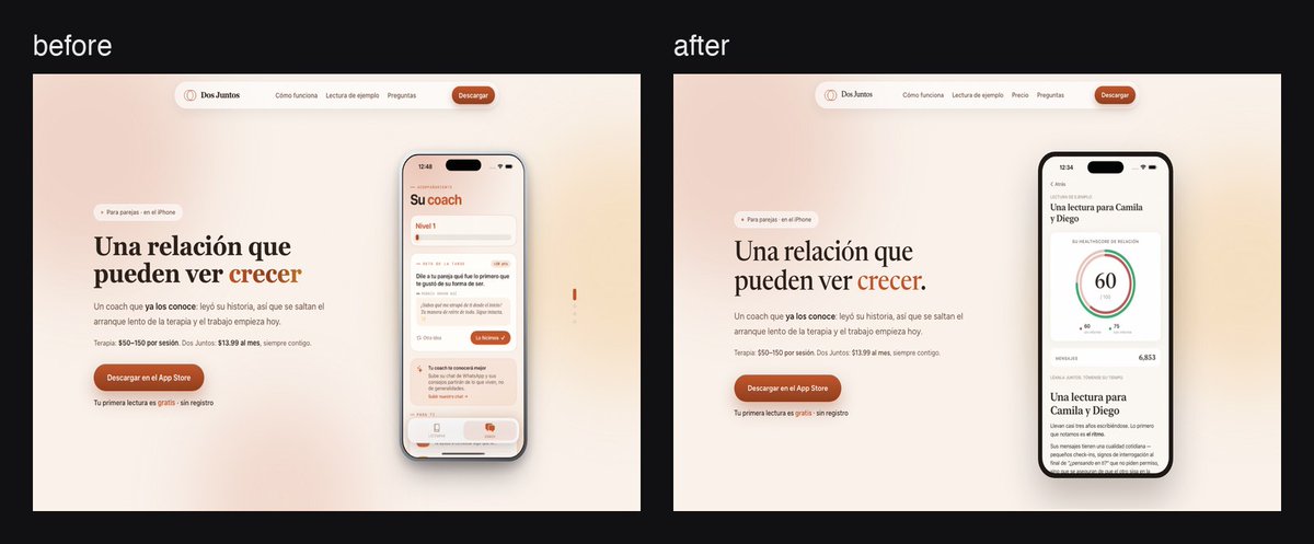
Dos Juntos reads a couple's chat and hands them a plan. The screen I'm proudest of is the boring one: the score. One number, one line on why, one next step. Nobody wants a dashboard about their relationship.
Pinglight. Before, a paragraph in monospace pretending to be a headline. After, three words in green and the actual radar screen next to them. If the app is the interesting part, put the app on the page.
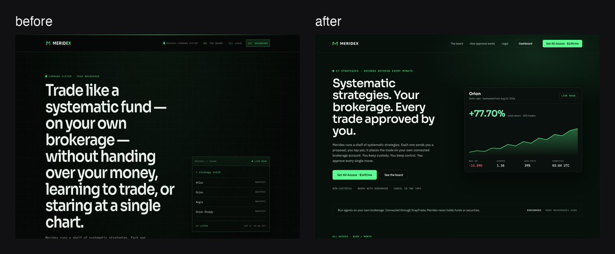
Meridex, before and after. The old hero was one long sentence in giant type next to a list of names. New one: a claim, a live number, a button. When the whole pitch is "your money never leaves your account," lead with the money.
Redid the HOA President page. Before: a 32-word headline doing the whole page's job. After: the headline says one thing, the phone shows the game, the scores get to be scores. Same words. Fewer of them shouting.