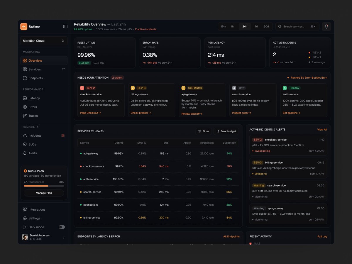
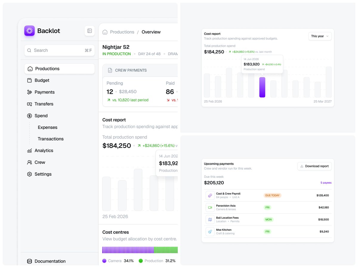
Finished a full dashboard design with animation in a couple of days.
Clean and modern with some personality is exactly what real products should feel like.
Brand work for DearLife, a precision health concierge.
Health brands usually swing one of two ways: sterile and clinical, or woo-woo wellness. DearLife needed to feel like neither. Precise but warm. Scientific but personal. So we built this bento design and reveal to explore how the brand behaves in motion, because a static identity only tells half the story.
Honest process note: we tried to produce the motion with AI first.
Claude-generated Remotion code, then Figma's motion tools. Both gave us output. Neither gave us the result. Generic easing, templated transitions, no intent behind any of it.
So we did it properly in @jittervideo . By hand, with taste, until every movement felt like DearLife and nothing else.
That's the gap AI hasn't closed. It can produce motion. It can't produce judgement. Knowing when a delay feels considered versus sluggish, when a blur reads as depth versus mush. That's craft, and it's the difference between work people remember and work they scroll past.
More of this coming.