@benjitaylor Expand doesn’t always = full screen as many are saying. Though I get the confusion. It’s more like a reverse accordion, though an up-chevron would arguably be more ambiguous. I’m curious, why did you land on the expand icon?
Lots of people misunderstanding this. The new passport does not have the same crest as the old one; that's the point.
E.g. Zoom in on the alignment of the stars and compare. They should have just copied the original, but instead they AI'd it or something and introduced new issues like that one.
Couldn’t agree more. Comes off very insecure. To just imply something old is inherently better rather than considering the criticism and belittling those working on SaaS products is beyond arrogant and out of touch. Especially when the SaaS being referenced is a modern design leader like Linear. Like what are we talking about?
Design critique is not shitting on others… that’s literally half the job… The ability to take constructive criticism without getting offended is par for the course.
There are clear objective flaws in the crest that don’t take an expert to see, it couldn’t be a colder take. E.g. stars completely out of alignment with the surrounding lines. You can zoom in and see it for yourself. The original crest doesn’t contain that mistake, meaning the newly introduced issue was caused by AI usage or some other form of laziness or neglect.
Mistakes happen, but reacting defensively and belittling others when someone calls attention to them doesn’t get anyone anywhere. Couldn’t be a more insecure look for Joe IMO.
@lordofda@pdotcv "crap" and it's work for Google DeepMind from 10 years ago, cherry picked from peak flat design era out of 100 other insane projects 😂🤣
display evidence of >2 neurons challenge: impossible
Sometimes. But more often, newer is better. That's not to say there's anything inherently good about "new" itself, it's just that you and I work and make progress as time passes; human hands get more skilled and better products are the consequence.
It's only the exceptions to this rule that we remember (survivorship bias); the timeless examples like this crest. There were probably thousands of other crests designed in the 1780's that no one remembers. Can you list a bunch without googling? I certainly can't. Compare that to the 1900's that produced hundreds of universally recognizable crests, logos, etc.
And don't forget that the people who made that crest in 1782 were making it anew for the first time. If they agreed with you, we wouldn't be talking about it today.
@caelin_sutch Why design if stuff done 200+ years ago is inherently better?
Usually receiving feedback without getting immediately offended is required for entry level design roles. And Linear = any other "SaaS app"? Be fr😂
Couldn't be a more egotistical and out of touch look for Joe.
@jgebbia@pdotcv So we’re implying old = better and throwing @Linear (the source of design inspiration of every software tool of the past 5+ years) in with every other “b2b saas”? 😂
Was the 1782 version of finding places to stay superior to Airbnb?
Valid. One word italic reminds me of the early @browsercompany style, which I don't mind entirely, but definitely adds left to right imbalance here. Caps eyebrows gotta stop for sure.
I prefer the filled feathers, but certainly doesn't resolve balance completely - where the arrows bunch together bugs me. I'd hope the lines around the stars aren't final though...
Well I don’t think OP is arguing that everything pre-AI was slop, and I certainly wouldn’t. To use your analogy, I think the point is more that there’s always been a lot of shitty YouTube channels trying to be like CocoMelon in the cheapest way possible, creating 1,000 worse channels no one’s ever heard of, and that AI only amplified this laziness and lack of care that already existed. So there’s 10,000 now instead of 1,000 but the slop has always been there.
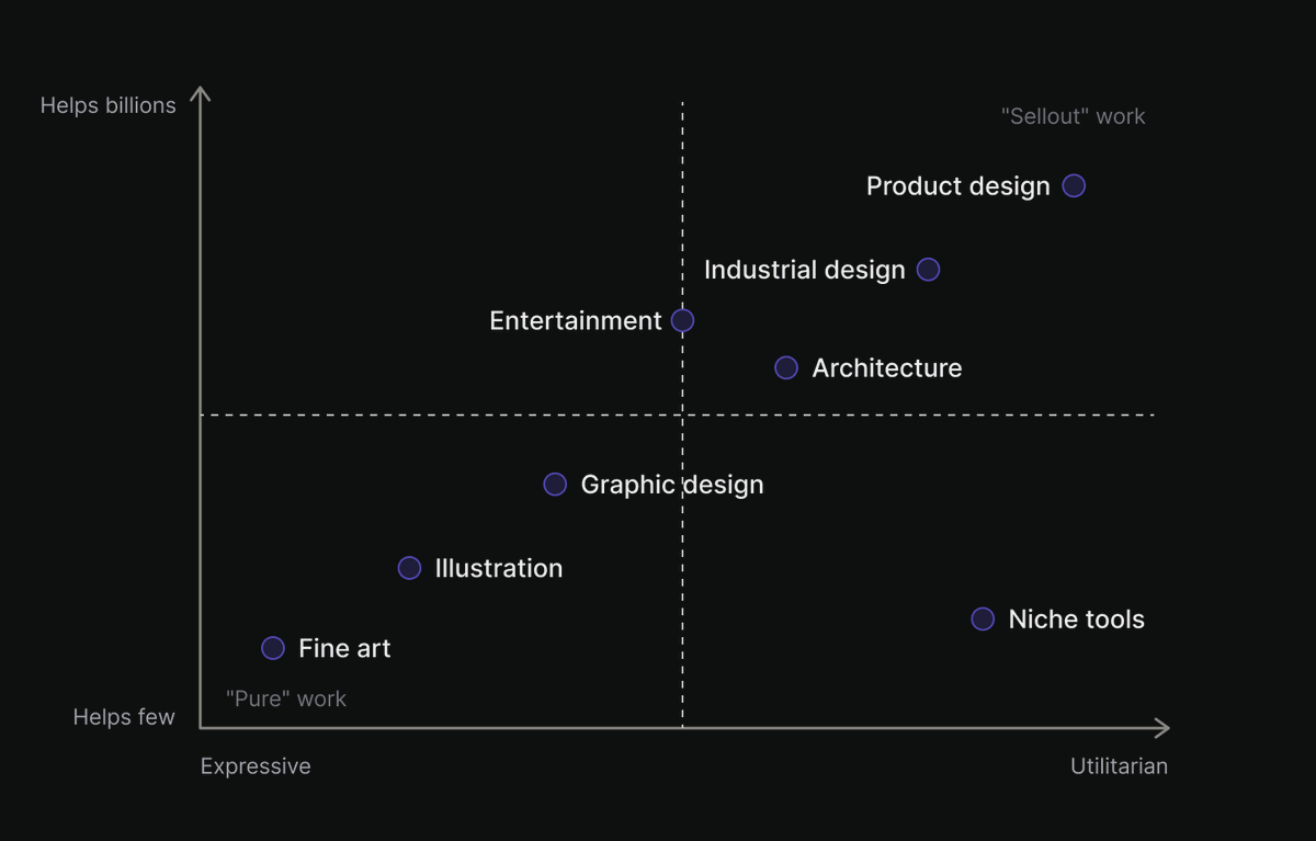
I think what's underneath that elitist “graphic designers are better than product designers” argument is the same old bias that money is evil and therefore taints creative work.
Graphic designers are undoubtedly the masters of applied design fundamentals. But if empathy for the human on the other end of your work matters most in design, and I believe it does, then work that most tangibly and verifiably helps the most people would logically sit at the furthest end of good. It would follow that commercial success is just the consequence of making something genuinely useful to millions of people, rather than evidence of corrupted design.
Work made primarily to visually impress or showcase one’s ability (especially when it comes at the cost of utility to others), on the other hand, would necessarily sit on the opposite end of the spectrum.
IMO the great modern irony is that the work that may feel the purest is often the most self-indulgent, while some of the most honest work is dismissed as evil or compromised simply because it happens deep inside capitalism.
Don't sign users out.
It's pure interruption with zero upside for the user 99% of the time.
We're not in the days of family computers anymore. If people were so concerned about account security, we'd observe them regularly logging themselves out.