For nearly 30 years, I’ve watched companies run events the same way:
Big booths. Busy crowds. Constant activity.
And afterward, nobody could clearly explain what the event actually produced.
That frustration became an obsession for me.
After more than 2,300 live events across multiple industries, I finally put the entire philosophy into a book:
The Event Revenue Engine.
The book is about human behavior, emotional connection, live environments, and turning events into real revenue systems.
It’s now moving through the publishing process and will be available later this year.
Not every booth needs a major attraction or an elaborate display to be effective.
But every booth needs to give attendees a reason to stop.
And that's where I think CStore Decisions has an opportunity to improve.
There are some good things happening here.
The magazine covers immediately establish that this is an industry publication. The large CStore Decisions sign reinforces the brand, and the displays promote several initiatives, including CStore Connections, Chain of the Year, and Power Hour.
There's certainly plenty of information available.
But as I look at this booth from the perspective of someone walking down the aisle, I have one question.
What do you want me to do?
Am I supposed to pick up a magazine? Subscribe to the publication?
Register for an event? Learn about advertising opportunities? Connect with someone about an industry partnership?
Any of those could be worthwhile objectives.
The problem is that the booth doesn't establish a clear priority.
The different displays are competing for attention, and the main table is covered with publications and promotional materials.
There's nothing necessarily wrong with any individual element. It's the overall presentation that could be stronger.
I would start by identifying the single most important action the company wants attendees to take.
Then I would make that the primary message of the booth.
The other initiatives can still be represented, but they should support that objective rather than compete with it.
I would also consider moving some of the printed materials away from the front of the table to create a more inviting space for conversations.
And here's something worth remembering.
Just because someone can walk up and take something from your booth doesn't mean you've created meaningful engagement.
A publication like CStore Decisions has a lot to offer the right audience.
Industry knowledge, connections, exposure, and opportunities.
The booth should make those benefits immediately apparent.
Because being present at an event is only the beginning.
Giving attendees a compelling reason to stop, engage, and take the next step is what matters.
Sometimes the most effective thing you can do at a trade show is put your products directly in front of potential customers.
And Dove Men+Care does that exceptionally well.
Take a look at this booth.
The branding is impossible to miss. The large Dove Men+Care sign across the top immediately identifies the company, and the logo is repeated throughout the exhibit.
The clean white and gray design, combined with blue lighting, creates a modern appearance that fits the brand.
But what I really like is the product presentation.
Dove Men+Care isn't making attendees search for what it sells.
The products are prominently displayed in illuminated shelves, arranged across the front counter, and available for attendees to examine.
There's even a large container of individual products positioned right at the front of the exhibit.
That's smart.
If you're promoting consumer products, getting those products into people's hands is one of the best ways to create engagement.
And look at the booth staff.
One team member is holding a product out toward the aisle, making it easy for someone walking past to notice what's being offered.
That simple interaction can be more effective than an elaborate display that nobody engages with.
There's also a QR code encouraging attendees to sign up for a "Hero Moment."
I like that the company is attempting to extend the interaction beyond simply handing someone a product.
A giveaway gets someone's attention. A meaningful interaction gives you an opportunity to build a relationship with that person.
One thing I would like to understand better is the large blue illuminated area in the center of the booth.
It's visually striking and certainly attracts attention.
But from the photograph, its purpose isn't immediately clear.
If it's part of an interactive experience, I would want to make sure attendees understand what they're being invited to do.
That's a relatively small criticism of an otherwise very effective exhibit.
What stands out to me is how many things Dove Men+Care gets right.
The company is immediately recognizable.
The products are visible.
The booth team is positioned to engage attendees.
And the exhibit offers opportunities for people to interact with the brand rather than simply walk past it.
That's what a good trade show booth should accomplish.
You don't need to make attendees work to understand what you're offering.
Show them your products. Give them a reason to stop. And create an opportunity for your team to start a conversation.
Dove Men+Care does all three.
Sometimes the best way to sell a product is to let people experience it for themselves.
And that's exactly what I like about this TourBox booth.
The first thing that catches my attention is the purple branding. It's everywhere, from the backdrop and counters to the demonstration tables and stools.
The booth has a consistent look, and the large TourBox signage makes it easy to identify the company.
But the real strength of this booth isn't the branding.
It's what attendees can do once they walk inside.
Look at the demonstration area.
Multiple workstations are set up with drawing screens, software, and TourBox controllers. There are even stools positioned in front of each station.
Everything about the setup encourages attendees to sit down and try the product.
And that's important because TourBox makes a product that benefits from being experienced.
You can explain what a creative controller does. You can show someone a video of it working. You can hand them a brochure with all the features.
But none of those things compares to putting the controller in someone's hands and letting them discover how it works.
I also like that the demonstration area is positioned toward the front of the booth. Attendees walking past can immediately see the equipment and understand that this is a hands-on experience.
One thing I would consider is making the product's purpose a little clearer to someone who has never heard of TourBox. The branding is strong, but the connection between the controller and the creative software may not be immediately obvious to every passerby.
Still, this is a very effective approach.
The booth doesn't just give people something to look at. It gives them something to do.
And when you're selling a product that can change the way someone works, that experience can be far more convincing than any sales pitch.
Don't just tell attendees what your product can do. Give them the opportunity to find out for themselves.
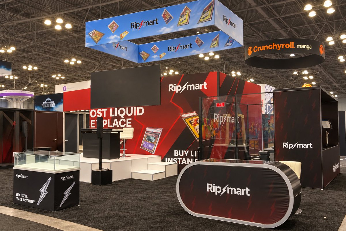
Take a look at RipMart's booth. It is fantastic!
The first thing that catches your attention is the large overhead sign. The company name is clearly visible, and the trading cards incorporated into the graphics immediately tell you this is a business involved in collectibles.
Then you see the messaging.
"Buy | Sell | Trade Instantly."
Four words that tell potential customers exactly what they can do.
The branding is excellent. The black and red color scheme is bold, the graphics are consistent, and the entire exhibit has a professional appearance.
But what really makes this booth work isn't the signage or the graphics.
It's what happens inside the booth.
RipMart has a dedicated area on the right side of the exhibit for live shows.
There's also a center stage area that can be used for additional live broadcasts.
And I absolutely love this approach.
Think about what that accomplishes.
First, it allows people walking past the booth to see exactly what RipMart does.
They don't have to watch a promotional video or listen to someone explain the platform.
They can watch the business in action, live and in real time.
Second, those live shows give attendees a reason to stop.
People naturally gather around something interesting happening on a trade show floor.
And when people stop to watch, something else happens.
The booth team now has an opportunity to approach those attendees, start conversations, explain the platform, and potentially turn that interest into new customers.
That's how an exhibit should work.
Attract attention. Demonstrate what you offer. Create opportunities for conversations.
RipMart accomplishes all three.
I also like how the space is organized.
There are display cases for collectibles, a prominent front counter, dedicated broadcasting areas, and plenty of room for people to move around.
Nothing feels wasted.
Every major element of the exhibit appears to support what the company is trying to accomplish.
And that's something I wish more companies understood.
A trade show booth shouldn't simply be a place where your employees stand around waiting for someone to ask a question.
It should actively help you attract and engage potential customers.
RipMart doesn't just tell attendees what its business does. It lets them experience it.
And that's what makes this exhibit so effective.
From the moment someone sees the overhead signage to the opportunity to watch a live show, the booth is doing exactly what it should.
Drawing attention, communicating the business, and giving people a reason to stop.
This is an excellent example of trade show marketing done right.
RipMart doesn't just pass The Walk By Test.
It passes with flying colors.
You don't have to spend a fortune on a trade show booth to do a good job communicating what your company sells.
Pearson Ranch is a great example of that.
This is a fairly traditional trade show setup with pipe and drape, tables, product displays, and a large branded backdrop.
But what I really like is how clearly they've presented their products.
Right across the top of the backdrop, you see exactly what they sell.
Elk. Venison. Duck. Wild Boar. Bison.
And directly underneath, they tell you what those products are.
Jerky, snack sticks, and summer sausage.
There's no guessing about what this company does.
The animal illustrations add some personality to the booth, while the packaged products and freestanding retail displays show attendees exactly what they can expect to find on store shelves.
I especially like those retail displays.
For a company selling packaged food products, showing how the merchandise can be presented in a store is an important part of the conversation.
They've also brought actual products to the event, with what appears to be a sampling area at the front of the booth.
That's another opportunity to move beyond simply telling people about the products.
Now, is this the most elaborate booth we've reviewed? Not even close.
The pipe and drape is basic, and the different tables and displays give the booth a somewhat busy appearance.
But I don't think that takes away from what they've accomplished.
The branding is visible. The products are easy to identify. The retail displays help attendees understand how the merchandise could fit into their own businesses.
And that's the lesson here.
A booth doesn't have to be expensive or elaborate to be effective. It needs to clearly communicate what you're selling and give attendees a reason to take the next step.
Pearson Ranch does a lot of that very well.
The recent theft of a FedEx truck carrying more than $1 million in graded trading cards raises a question I think the entire collectibles industry should be asking.
Why aren't independent tracking devices standard practice when shipping high-value collectibles?
I recently had my @m1ntaverse G1 Case shipped back to me.
When M1NT packaged it, they included a DispoTag tracking device inside the package.
I also received a text message with tracking information.
Throughout the shipment, I could see where my package was.
Think about that.
A company shipping my collectible case took the extra step of including a tracking device so I could monitor its location.
And they're not the only company doing this.
As many of you know, I work at Ship My Cards.
We offer customers the option to add an Apple AirTag to their shipments, and we include AirTags in all international packages so we can track their location throughout the shipping process.
It's a relatively simple additional layer of security that provides valuable visibility into where a shipment is.
Now consider what happened with the FedEx truck carrying more than $1 million in graded cards.
PSA doesn't offer customers the option to add an independent tracking device to their shipments. They don't include tracking devices in the packages they return to customers, either.
I find that astonishing.
We're talking about a company that handles some of the most valuable trading cards in the world.
Cards worth thousands, tens of thousands, and sometimes hundreds of thousands of dollars.
Yet customers don't have the option to add a tracking device to their return shipments.
Why?
The technology already exists.
Other companies in the collectibles industry are already using it.
And the cost is relatively small compared to the value of the items being shipped.
To be clear, I'm not suggesting that an AirTag or another tracking device would necessarily have prevented this theft.
But independent tracking could provide another layer of visibility and potentially valuable location information if a shipment is stolen or goes missing.
When you're shipping collectibles worth thousands or even millions of dollars, relying solely on the carrier's tracking system shouldn't be the only option.
PSA should offer customers the ability to add independent tracking devices to their return shipments.
And frankly, I think the entire collectibles industry should be looking at making this standard practice for high-value shipments.
If M1NT and Ship My Cards can provide this kind of service, why can't PSA?
It's time for the industry to take package tracking and shipment security more seriously.
What do you think? Should independent tracking devices be standard for high-value collectible shipments?
So you think companies shouldn’t use tracking labels or AirTags? DispoTags are cheap and easy to add to any package that allows both that company and recipient to track it. Do you just want to leave it luck & hope it gets to you? This has been something many of us have asked about for years.
@SportsCardNews I don’t cry about it at all. I have no problems paying high prices for grading. I do think grading companies need to start offering tracking options that I am happy to pay for.
Sometimes a company doesn't need to explain who they are or what they sell.
Their branding does it for them.
HARIBO is a great example of that.
The first thing you notice about this booth is the enormous HARIBO logo against the bright blue backdrop.
You can recognize the company from across the show floor.
But what I really like is how they used the rest of the space.
The two oversized cartoon snakes immediately bring some personality to the exhibit. The green and yellow characters, along with the playful "I'm Sssweet" and "I'm Sssour" signs, make the display fun without distracting from the brand.
And right in front of them is a large container filled with candy.
It's a relatively simple presentation, but everything works together.
The colors, characters, products, and branding all reinforce the same message.
There's no complicated explanation of what the company does. No walls filled with text. No need to figure out what they're promoting.
You know it's HARIBO, and you know it's candy.
Now, one thing I would be interested in seeing is what happens after someone stops.
The booth certainly gives people a reason to look, but the photo doesn't tell us much about how HARIBO is engaging attendees or what actions they want people to take.
That's an important part of the overall experience.
Still, there's a lesson here that applies to companies of every size.
You don't always need an elaborate booth to get attention. You need clear branding, a recognizable product, and something that makes people want to take a closer look.
HARIBO does that very well.
Let’s talk about one of the biggest challenges with card grading in the hobby.
Consistency.
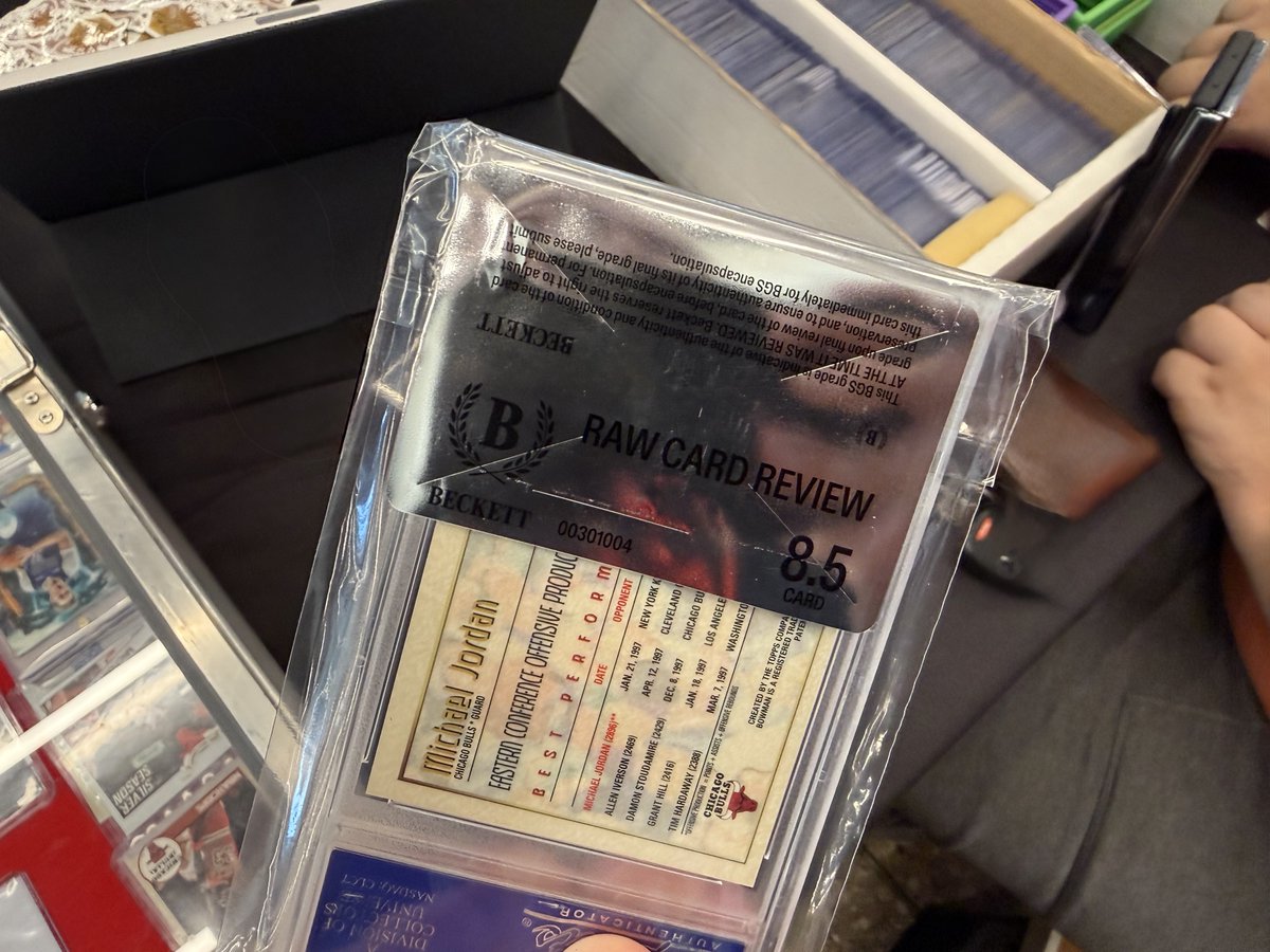
Someone stopped by our booth at a recent show with a Bowman’s Best Michael Jordan Refractor.
It’s currently in a PSA 10 holder.
The collector was considering crossing the card over to Beckett, so they had Beckett perform a Raw Card Review at the show.
Beckett’s opinion?
8.5.
Think about that.
One major grading company looked at this card and determined it was Gem Mint 10.
Another major grading company looked at the same card and determined it was an 8.5.
That’s a point and a half difference on the exact same card.
And in this hobby, that difference matters.
Grades can have a significant impact on value. Collectors buy based on them. Dealers price based on them. Investors make decisions based on them.
Yet ultimately, grading still involves a person or grading system making a judgment about a card.
With millions of cards being graded, consistency becomes incredibly important.
Collectors aren’t just paying grading companies to put cards into plastic holders.
They’re paying for the opinion represented by the number on the label.
When one respected grading company says 10 and another says 8.5, it raises an important question for the entire hobby:
How much confidence should we put in the number?
Because when that number can change the value of a card substantially, consistency isn’t a small issue.
It’s fundamental to the entire grading business.
This is a great example of building a booth around what your business actually does.
At New York Comic Con, TikTok Shop created an exhibit that does a lot more than display its logo.
First, the branding is excellent.
The enormous TikTok shopping bag hanging above the booth makes it easy to spot from across the show floor. The black walls and bright neon lighting give the entire exhibit a look that fits the brand.
But what really caught my attention was how they used the space.
On one side, there's a dedicated creator area with equipment for producing content.
In the center, there's a livestream setup.
And on the other side, several brightly colored pods create additional spaces for activities.
Each area has a purpose.
And that's what makes this booth interesting.
TikTok Shop is a platform built around creators showcasing products and connecting with customers through content and live selling.
Rather than simply telling attendees about those capabilities, they've built an environment around them.
There's also plenty of open space, making the different areas easy to see and approach.
I would be interested in seeing how the booth operates when the show is busy, particularly how attendees move between the different spaces and participate in the activities.
But from a design standpoint, I really like the direction they took.
The best event experiences don't just tell attendees what a company does. They give people an opportunity to see it in action and, when possible, experience it themselves.
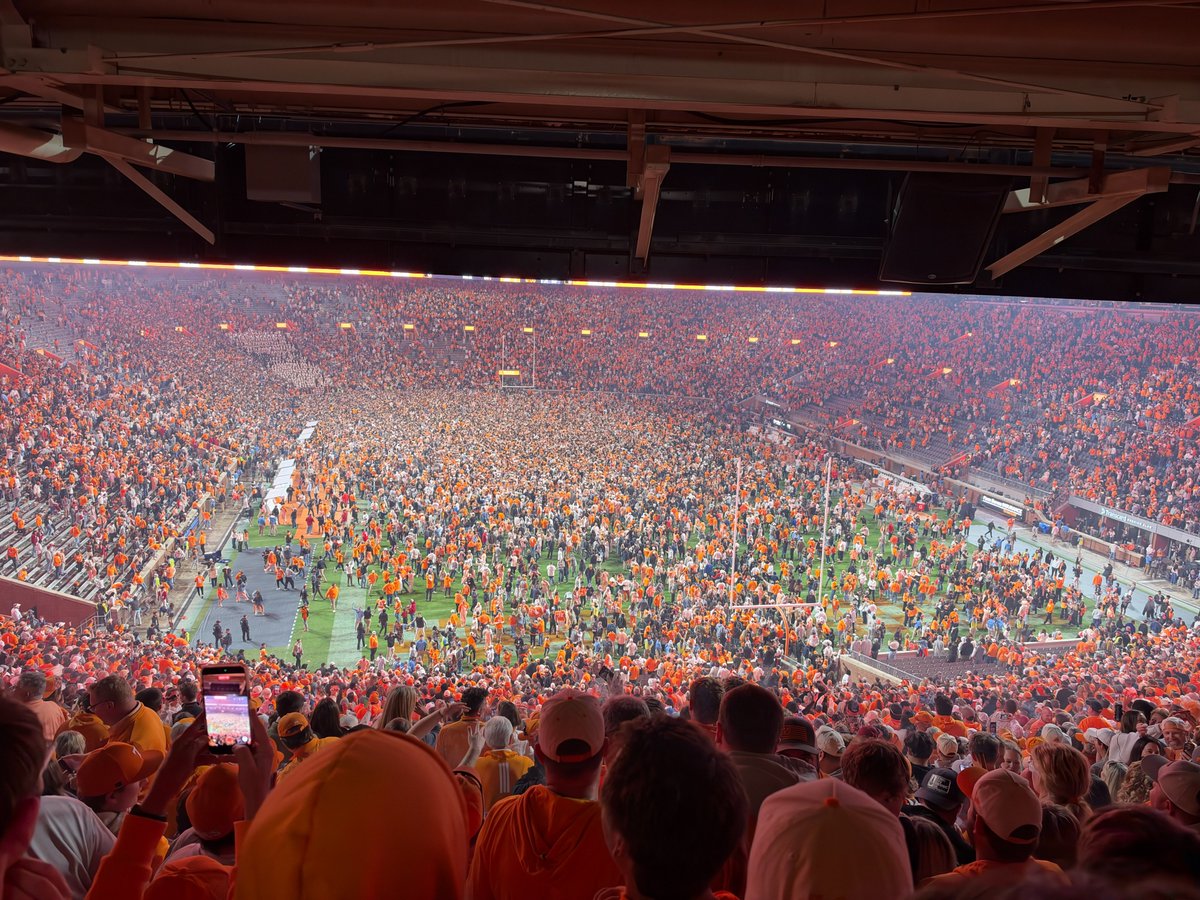
Game number 250 at Neyland Stadium could not have turned out any better!
Of all the games I have attended over the past 43 years, having my 250th fall on the Third Saturday in October and getting to celebrate a win over our biggest rival made it even more special.
And in the 20 Tennessee–Alabama games I have attended at Neyland, my record is now 9–11.
Sure, I wish that record against Alabama was a little better. But a 45% winning percentage against our biggest rival is something I will gladly take!
I've witnessed some incredible moments inside Neyland Stadium since my first game in 1983.
Big wins, heartbreaking losses, unforgettable plays, and memories that will last a lifetime.
But beating Alabama on the night of my 250th game is one I will never forget.
It doesn't get much better than that!
GO VOLS!