🚫SCAM ALERT🚫
AppFillip does NOT offer any “work online & get paid” jobs.
Scammers are misusing our name on fake sites like:
🔗 https://t.co/Wy9NUFyyiC
📞 +1 (628) 246‑4864
❌ Don’t reply
❌ Don’t pay
✅ Report & block
We’ve filed a legal complaint. Stay safe.
— Team AppFillip
@mykolaharmash Looks interesting. Bringing everything in one place helps.
Nice concept. This could help creators.
Clean idea. All features in one platform help.
Looks promising. Curious to see performance.
Good approach. Simplicity makes a difference.
@shoppin81943241 Nice launch. Wishing the app great success ahead.
Looks interesting. Hope it gains good traction.
Good to see new apps coming out. All the best.
Nice concept. Curious to see how users respond.
Great start. Hope it grows well in the market.
@Amani_Art Smart way to compare screenshots. Really changes how you evaluate them.
Interesting view. Makes it easier to see what actually works.
Habit Rabbit stands out. The visuals feel much clearer.
Great use case. Comparing like this improves screen design.
@omo_akeye Looks interesting. Could catch on quickly.
Hearing about this a lot. Curious to see user response.
Nice to see something new. Execution will matter.
This has potential. Retention will be the real test.
Seeing some buzz already. Interesting to track growth
@saadbelfqih This is happening quite a lot lately, especially around the holiday period. Review times slow down. While waiting, it is a good time to improve onboarding, refine user experience, and work on ASO so the app performs better once it goes live.
@uixabuhossain Clean and practical CRM design that makes projects, payments, and tasks easy to manage, with a simple layout that feels professional and user-friendly
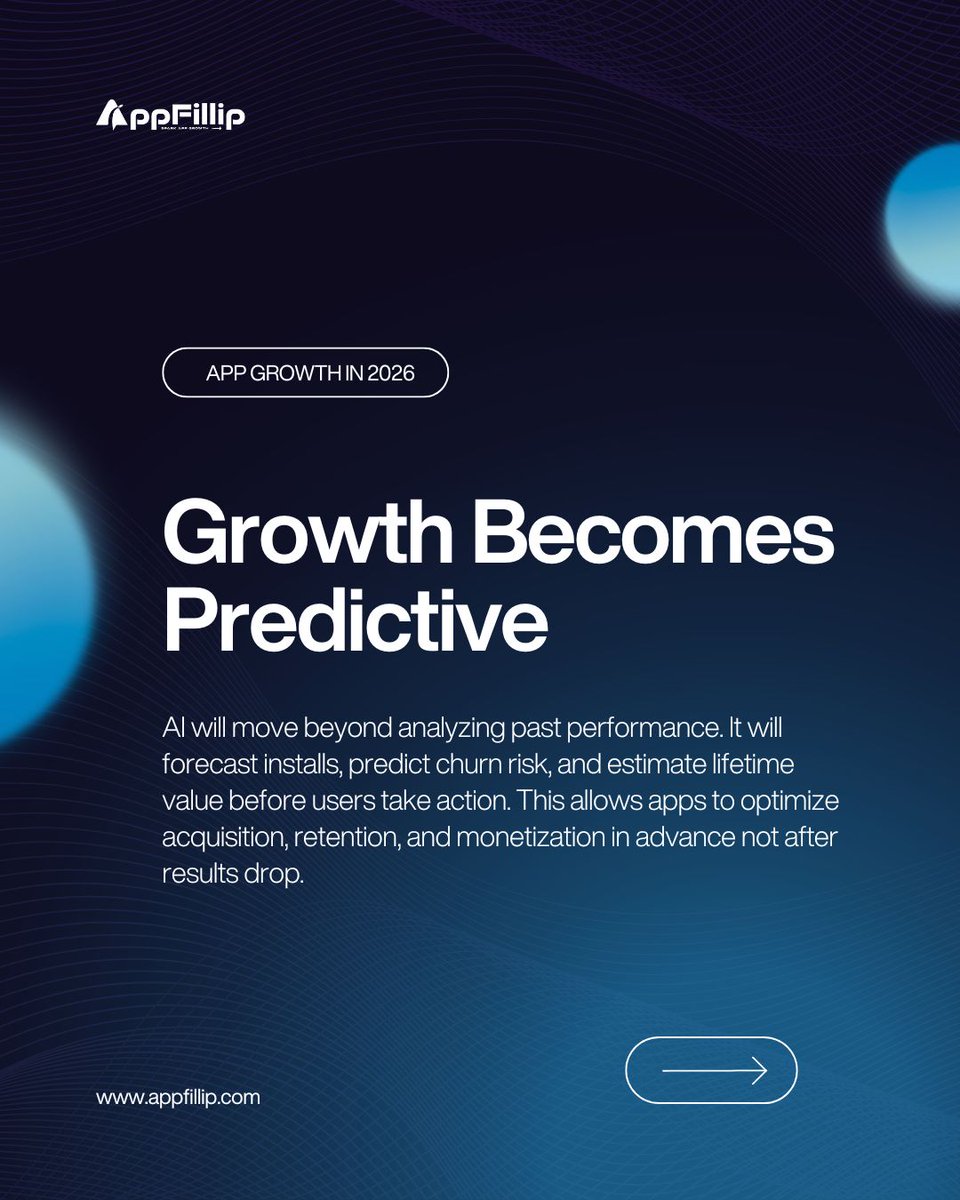
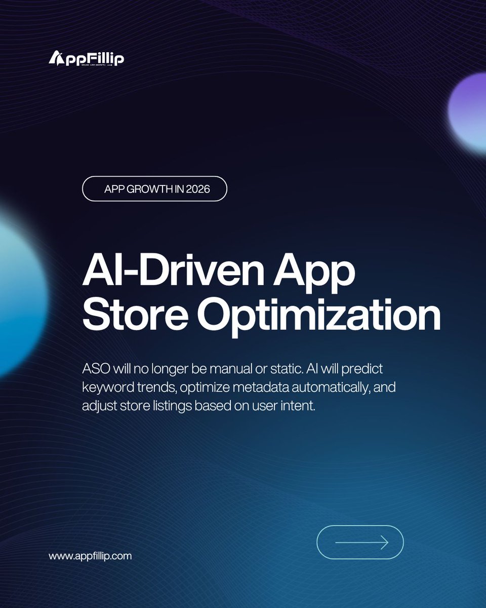
AI is changing how apps grow.
In 2026, growth won’t be reactive.
It will be predictive, personalized, and smarter.
✨ AI-driven ASO
🎯 Smarter user acquisition
🎨 Scalable creativity
🔁 Proactive retention
#appgrowth#aiinapps#futureofapps#mobilegrowth#aso#useracquisition
@uixabuhossain This feels very practical and well thought out for small businesses. The layout makes projects,payments, and tasks easy to understand at a glance, without feeling cluttered.The use of cards and clear sections gives it a calm, organized vibe, which is exactly what a CRM should do.
@uixabuhossain Looks really engaging and fun. The visuals instantly communicate “easy cooking,” and the AI flow feels simple instead of intimidating. Nice mix of playful illustrations and clean UI makes it feel both smart and beginner-friendly
@marcelkargul Really clean and polished work. The layout feels familiar but fresh, and the flow from home to player to playlists is very smooth. Nice balance between visuals and controls without feeling crowded. Feels like something users would instantly be comfortable using
@marcelkargul Really clean and polished work. The layout feels familiar but fresh, and the flow from home to player to playlists is very smooth. Nice balance between visuals and controls without feeling crowded. Feels like something users would instantly be comfortable using.
@uixabuhossain Clean, modern, and very easy to follow. The food visuals stand out nicely, navigation feels intuitive, and the flow from discovery to checkout looks smooth. I like how pricing and add-ons are clear without feeling cluttered. Overall, user-friendly, and ready for real-world use.
@adriankuleszo@designme Dark mode with charts is honestly one of the hardest things to pull off on mobile, and this does it really well. The data feels clear, balanced, and easy to scan without straining the eyes. Good contrast, clean hierarchy, and just enough color to guide attention.
@adriankuleszo@designme Dark mode data done right is genuinely hard, and this is a solid example of getting the balance right. The charts feel readable without overwhelming the screen, hierarchy is clear, and the colors guide attention instead of fighting for it.
@jaydwivedi Clean and well thought out screens. The flow feels simple and intuitive, and the payout + stats screens clearly communicate value to creators. The soft colors and spacing make it easy to scan without feeling noisy, which really helps with trust and engagement.
@pJacquelDesign Really nice, calm execution. The screenshots clearly show what Yukee does without feeling crowded,and the minimalist style fits a todo app perfectly. Features like habits,calendar view, and customization are easy to understand at a glance, which is great for App Store conversions
@HelalHossain09 Clean, clear, and very App Store–friendly. The screenshots instantly explain what the app does, highlight real benefits like calorie tracking and meal suggestions, and build trust with visuals and social proof. This kind of clarity usually helps a lot with conversion.
@salungprastyo Clean, calm, and easy to read, this UI focuses on clarity first. The numbers are easy to scan, insights feel simple instead of overwhelming, and the overall layout builds trust.