I help growing brands communicate clearly through brand identity, social media & e-commerce design. Sharing practical design breakdowns + real projects. ↓
Hi, I’m Ashok, a graphic designer helping growing brands communicate clearly through brand identity, social media and e-commerce design.
Here I share practical design breakdowns, real project lessons and the thinking behind visuals that work.
Follow my design journey ↓
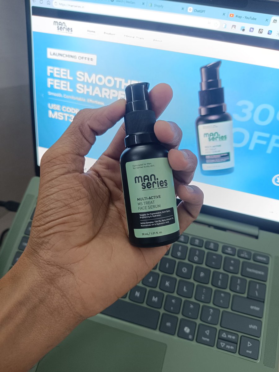
This gesture made me feel exactly that.
Thank you, Team Man Series, for the thoughtful surprise and for believing in my work. I’m truly excited about everything we’re building together—and this is only the beginning! 🚀
#Gratitude#DesignerJourney#ManSeries#CreativeCollab
Yesterday, I received a thoughtful package from the founders of Man Series, and it genuinely made my day. 💚
As a designer, you always hope for more than just projects you hope for trust, creative freedom, appreciation, and the feeling of being part of the journey.
A good idea can still look weak when a poster has no clear hierarchy, too many typefaces, or weak contrast.
I broke down 5 common poster mistakes and how to fix them.
Part 1/2 👇
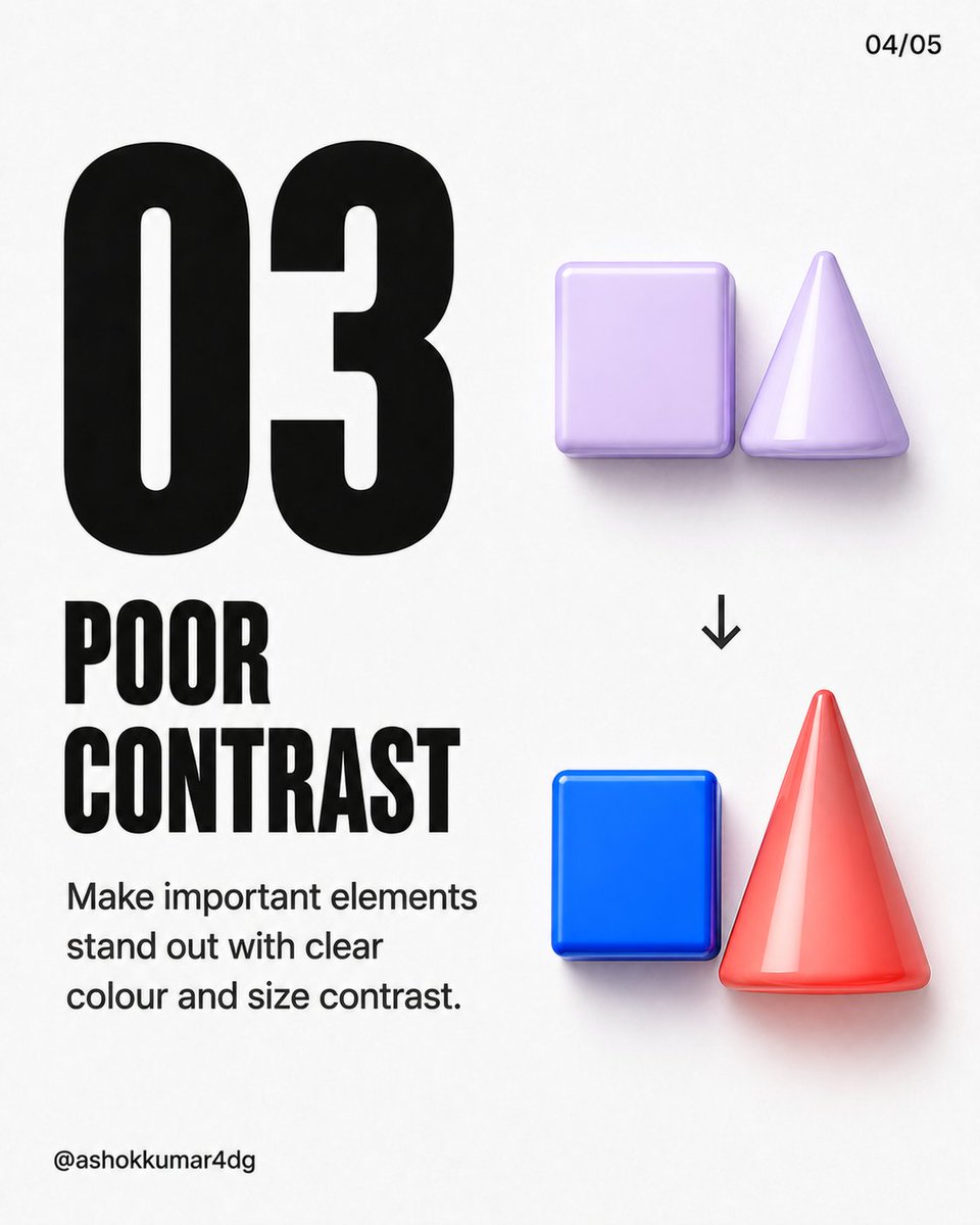
Good typography should guide the viewer not make them work harder.
3 mistakes that can ruin a design:
1. Too many fonts
2. Inconsistent spacing
3. Poor contrast
Which one do you notice most often? 👇
Save this for your next project.
#GraphicDesign#Typography
Less visual noise.
More brand value.
A great logo isn’t made to decorate.
It’s made to build a brand.
If you’re looking for a unique logo designed exclusively for your business, let’s create it together.
what's your thought?
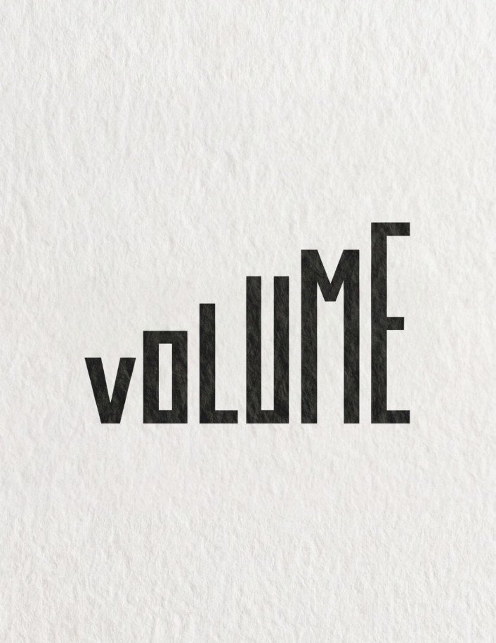
Typography is evolving beyond the uniformity of traditional computer fonts, embracing a more exaggerated and playful aesthetic. This year, we can expect to see:
- Oversized sans-serifs that make a bold statement.
- Bubbly and puffy letterforms that add a sense of fun.
Reference Style:
I quite like book covers from publishers like Penguin India or HarperCollins India - they blend modern design with Indian aesthetics very well.
Target Audience:
1. Indian readers aged 25-50
2. Those who enjoy literary fiction and slice-of-life stories
3. Readers interested in Mumbai culture and 90s nostalgia
My recent Skin-care branding project.
VARNA blends Ayurvedic inspiration with modern dermatological science, combining time tested Indian ingredients with clinically proven actives to deliver gentle yet effective skincare.
let's connect;
📧 [email protected]#branding
The logo symbol draws inspiration from nature and Indian roots, merging organic forms with a modern structure.
It represents growth, healing, and the balance between tradition and contemporary science.