i feel like if insomniac’s verse wasn’t restricted to being set in a “realistic” environment and broke off into a more stylistic comic book aesthetic
it would look infinitely better, wolverine unfortunately looks so visually uninspiring.
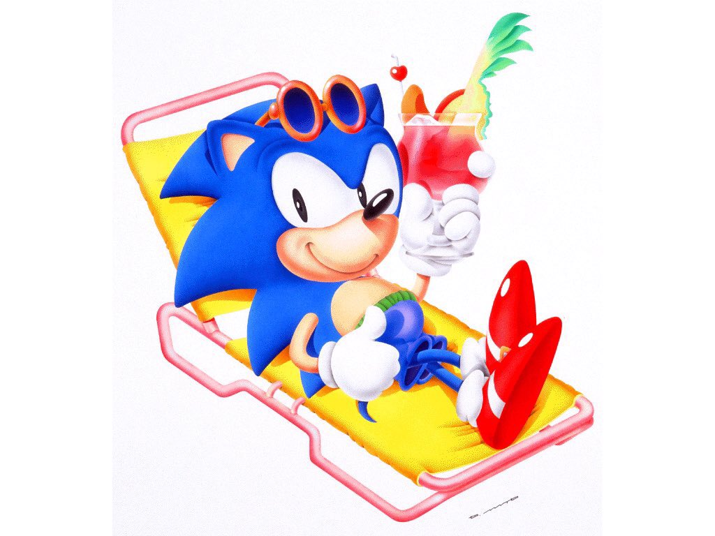
Every disagreement with the left image stems from misunderstanding Sonic’s character and his relationship with his character *design*. Sonic is reserved and aloof. That’s why you reserve the significant cartoony expressions for appropriate *moments*. Not constants.