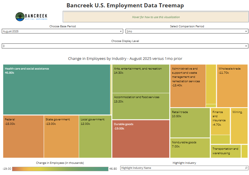
#Nonfarm#payroll data is out. +64k new jobs - ALL of them from #healthcare and social assistance (+64k). Once again, no net new jobs coming from anywhere else.
Our updated visualization includes the October 2025 changes as well to help you catch up.
https://t.co/6h9OlMsEpZ
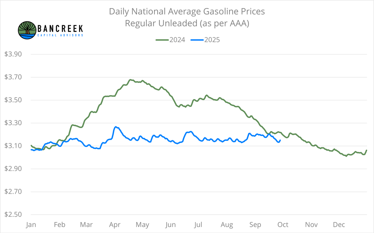
With September #gasoline prices almost in the books, we can now get a sense for what its impact will be on September #CPI, which will be reported on 10/15.
We have been warning all year that (as shown below) we were going to start cycling tougher comps with gasoline prices.
Well, here we are. Sept YoY deflation looks set to drop under -2%... from -6% YoY in August.
When we apply gasoline's weight to this change, expect this alone to put 20 basis points of upward pressure on headline CPI. Consensus isn't out yet... but when it comes out, this means we should expect it to be around 3.1%, up from 2.9% last month.
As shown below, this dynamic only gets worse through the end of the year. Not good for those hoping for positive #inflation optics anytime soon.
It's test time! I've spelled out what's going on with #inflation in these posts for a year now... but today, you can figure that out using our #PCE data visualization.
Here's the link. Post what you think are today's takeaways in the comments. Have fun!
https://t.co/az8FQh9JQD
Thanks to @CNBC for having me on Market Navigator again! I'm trying to tell this story however (and wherever) I can. But don't blindly believe me. Study the data yourself and see what conclusion you come away with.
https://t.co/LN5JdSQf8l
Check out this finding from the @BLS_gov Employer Cost for Employee Compensation (ECEC) database!
This chart shows the avg dollars per hour paid by employers for #HealthInsurance over time for both management and service employees.
Look at the divergence in the lines since 2020. Management employees have gotten a 21% bump, while service employees have seen a -10% cut!
Add this to the pile of data showing clear inequities in our #healthcare system.
On the surface August #CPI was reported in-line with consensus, but when you dig down, the details do not inspire confidence.
First off, the good news... Motor vehicle insurance deflated MoM. That's great! But this was offset and then some by the bad news:
🚗 Motor vehicle repair spiked to +15.0% YoY. Used cars and trucks rose to +6.0% YoY. New vehicles only +0.7%, but is now in a strong upward trend.
🧑⚕️ Hospital services remained at +5.8% YoY, suggesting that last month's spike was not an outlier.
☕ Coffee was up +20.9% YoY! Despite carrying a very small weight this item still added four basis points to headline inflation.
🥩 Beef prices continue to rise. Uncooked beef steaks were +16.6% YoY. Uncooked ground beef was +12.8% YoY. Uncooked beef roasts were +13.6% YoY.
🏚️ And worst of all... the two primary #shelter items (OER and Rents) both jumped MoM (see chart). This is very scary as together these two comprise over a third of the CPI measure. We simply can't afford for them to start accelerating again to have any hope of remaining around 3% (it's just math).
As always, our interactive #data #visualization has been updated and is available to explore for free here:
https://t.co/irVDtFxiWu
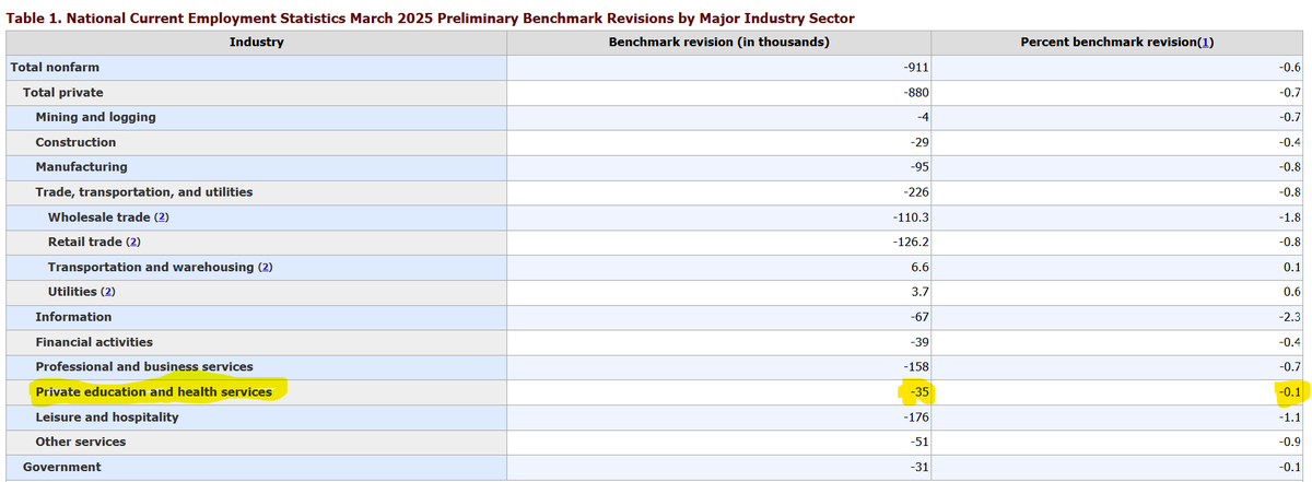
While there isn't much detail available with the @BLS_gov preliminary #payrolls revision, here's what we do know:
1⃣ It was worse than expected (-911k vs. -682k), and
2⃣ Our labor market was even MORE reliant on healthcare jobs than we thought before the revision, as the downward revision to Private education and health services was much more tame than the other heavy hitter industries.
So, our #healthcare concentration risk rises again. If you haven't checked out our deep dive on this topic, here you go:
https://t.co/YbzHJBYTl9
So grateful I was able to join @sam_vadas and the @SchwabNetwork this morning to talk about this morning's #NonFarmPayroll data release, and my broader thoughts on the structural challenges our U.S. #Economy is facing.
https://t.co/JNqaUTWaNf
Happy "#Labor data day!" Wish we had a happier story for you, but this one is ugly (again). As shown below, all we have left is #healthcare ❤️🩹. Removing that, the U.S. shed private jobs. 😢
As always, the data is all there for you to explore (for free) here:
https://t.co/3w4vu97ApL
And, before you get too excited about the next rate cut, why not read the deep dive we published yesterday in which we study whether the U.S.'s economic challenges are CYCLICAL or STRUCTURAL. Seems like this is an important distinction given that Jerome Powell just told us the Fed is largely powerless to combat structural changes in the economy. Read our report, again for free, right here:
https://t.co/YbzHJBYTl9
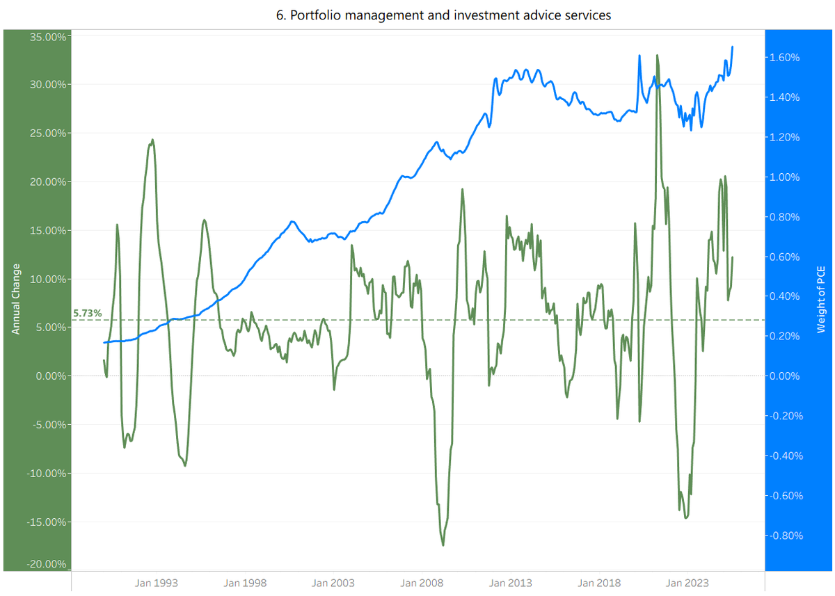
More on today's #PCE data. Here's a chart showing the item the provided the largest upward pressure to today's #inflation print.
Portfolio management and investment advice services (i.e., the stock market).
Check out this item's weight ⚖️(the blue line) within PCE over time.
❗️In 1990 it was 0.17%.
❗️In 2000 it was 0.78%.
❗️In 2010 it was 1.15%.
❗️In 2020 it was 1.30%.
‼️Today it is 1.65%.
The more the market rises, the more this item pushes up the #Fed's key inflation measure.
Makes it sorta hard to have our cake and eat it too?
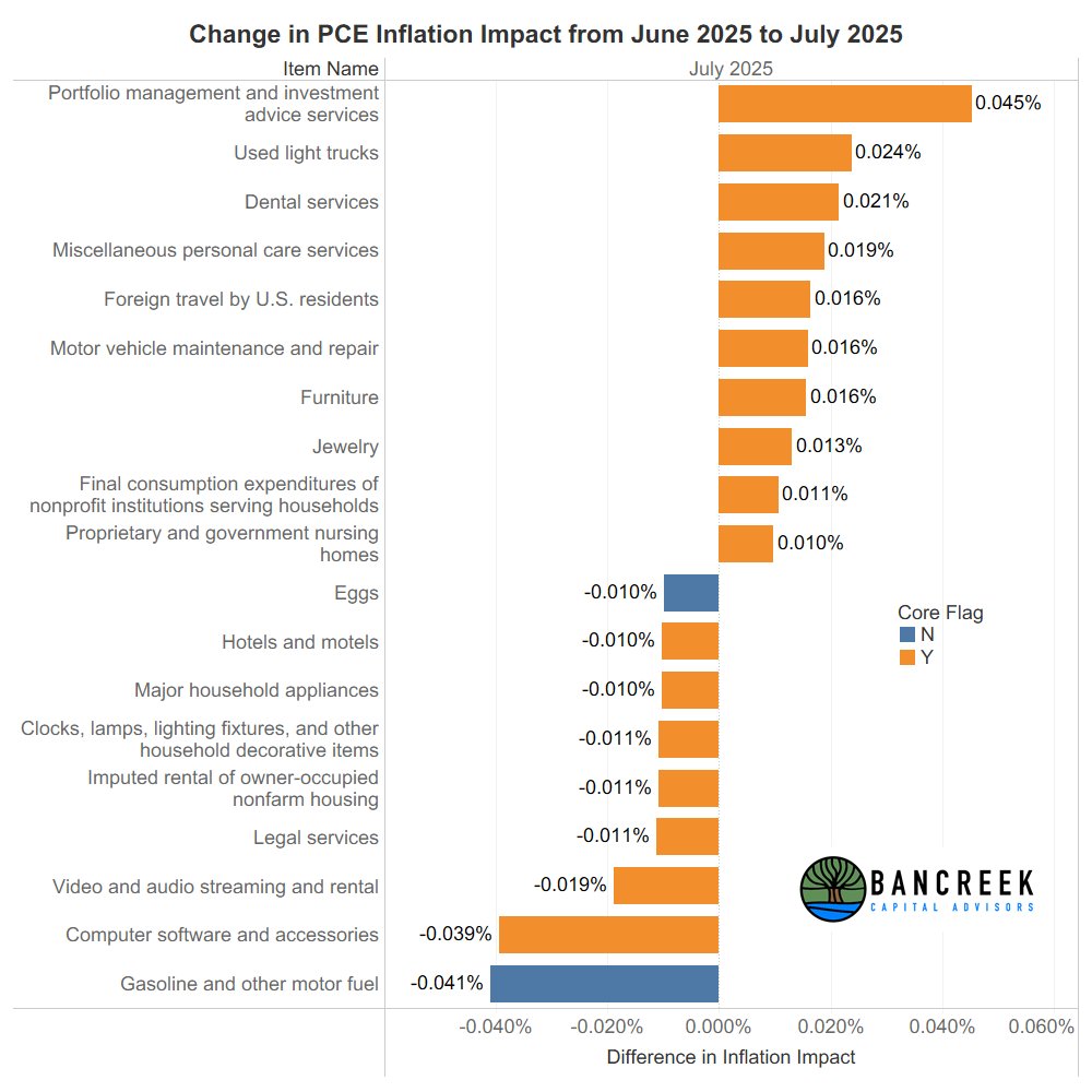
July 2025 #PCE is now out! On the surface everything was spot on with consensus, which shouldn't be surprise given that the #Fed told us their estimate of this key #inflation measure at #JacksonHole. But as always the devil is in the details... and @Bancreek is here to unmask that devil for you
Shown below is the #InflationImpact of the top moving items from June to July, colored by core and non-core. Top of the list was "Portfolio management and investment advice service," which just moves with the stock market. Generally, if the market is rising, this is too... so this shouldn't be a surprise!
Feel free to explore the rest of the top moving items using our interactive PCE #Datavisualization:
https://t.co/QtWzxlNC1z
Step aside tariffs—health services inflation just stole the show. 🏥✈️🚗
July CPI crept up to 2.70% YoY and Core CPI hit 3.06%.
Our deep dive into the data shows:
➡️ Hospital & Dental services jumped sharply—no data quirks, just real price increases.
➡️ Used cars & trucks reversed last year’s deflation tailwind.
➡️ Airline fares flipped from “good guy” to inflation driver.
Shelter is still calm, but without relief in high-weight items, CPI’s path of least resistance is up—and the Fed’s next move may hinge more on jobs than prices.
📊 Full analysis & charts: https://t.co/FTyv6NcQXF
#CPI #Inflation #BancreekAnalysis #Markets #Macro
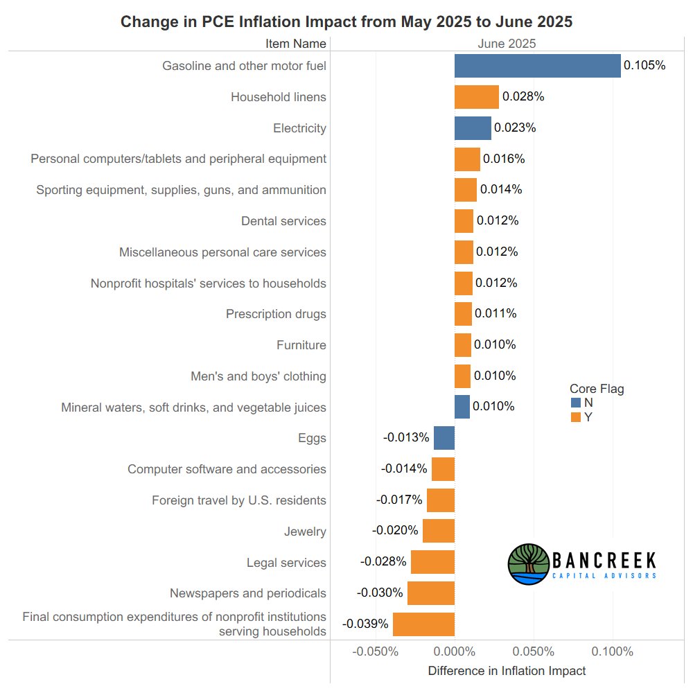
#PCE#inflation just came out at 2.6% YoY headline and 2.8% YoY core. Both numbers were above consensus expectations (2.5% and 2.7%, respectively).
Note that the real "surprise" here was not June's number, but the upward revision to May's PCE number, which brought May's core PCE up to 2.8%. After this revision, June had the same core inflation as May.
FWIW, the chart below shows the main items that changed when we compare the weighted inflation from May's revised PCE to June's PCE. Our detailed PCE data visualization tool is also updated and available here. 👇
https://t.co/QtWzxlNC1z
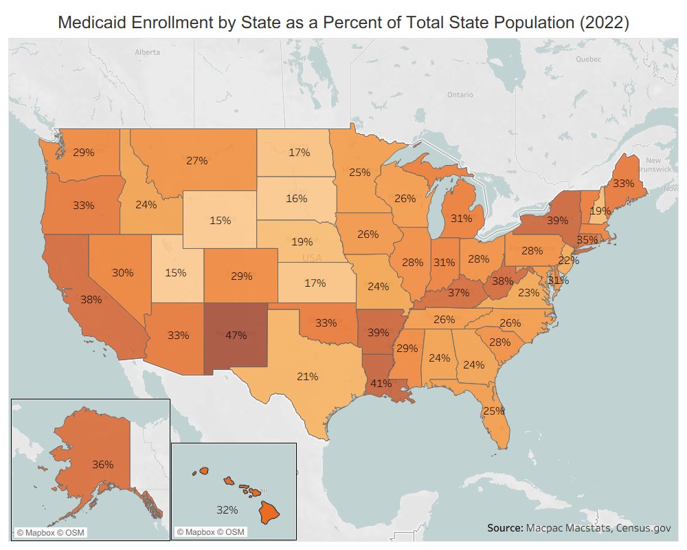
#Macro Chart of the Day (Day 15) sticks with my exploration of the #Medicaid program.
In 2022, 28% of the U.S. population was enrolled in Medicaid. But how does that break down by state? Today's chart of the day shows you that.
Day 12 #macro Chart of the Day is a doozy!
Today's chart should terrify #universities across the country. This shows the #unemployment rate going back to 1985 for 16-24 year olds by education level.
Look how the different lines have compressed over time! In 1985 unemployment amongst 16-24 year olds with no high school diploma was over 30% compared to just 6% for those with a college degree. As of June 2025, college educated 16-24 year olds had 7% unemployment (highest in a decade if we ignore COVID), equal (for the first time) to those with an associate degree. Meanwhile, unemployment for 16-24 year olds with no high school diploma hovers around historical lows at ~14%, although it is on the rise over the past year.
Scary chart for the value of U.S. #college #education in today's economy.
Day 6. Chart of the Day.
On a recent interview with @SchwabNetwork I mentioned two items I thought could push year-over-year #inflation up in tomorrow's #CPI data release, at least compared to last month's print.
One was Airline fares. This chart shows why I said that. It's not that I have any knowledge on what the next index value could be for this item. My comment was based on what happened a year ago.
Look at how Airline fare CPI dropped considerably into the summer of 2024 (green line). Well, now in 2025 (orange line) if the Airline fare index just stays the same for the next few months, what was deflation will flip to inflation, putting upward pressure on YoY CPI. This dynamic is what is called "cycling a tougher comp."
It's wild how closely one can guesstimate #CPI each month just by understanding which items are cycling either tougher or easier comps. Anyway, gasoline and airfares are the two the really jumped out to me in June.
Day 5. Chart of the Day.
Hey everyone, great news! There is no problem with prescription drug #inflation! Well, at least according to the #CPI data that is. Average prescription drug inflation dating back to 2005 has been just 2.6% YoY, exactly in line with overall inflation.
Never mind most American's lived experience with the frustratingly opaque (and way higher than other countries) pricing of drugs in the U.S... or even @medicarepayment's own (as always, fantastic) analysis which shows that between 2007-2017 all drug inflation in the #medicare Part D program was, on average, over two points higher (5.5% vs. 3.3%) than what the @BLS_gov reports.
This is not to say the BLS is wrong. They just have a different methodology, which arrives at a different answer than most would expect. The main point of today's chart is to illustrate how difficult it is to measure something as complex as prescription drugs with any accuracy. How many other items in CPI are like this?