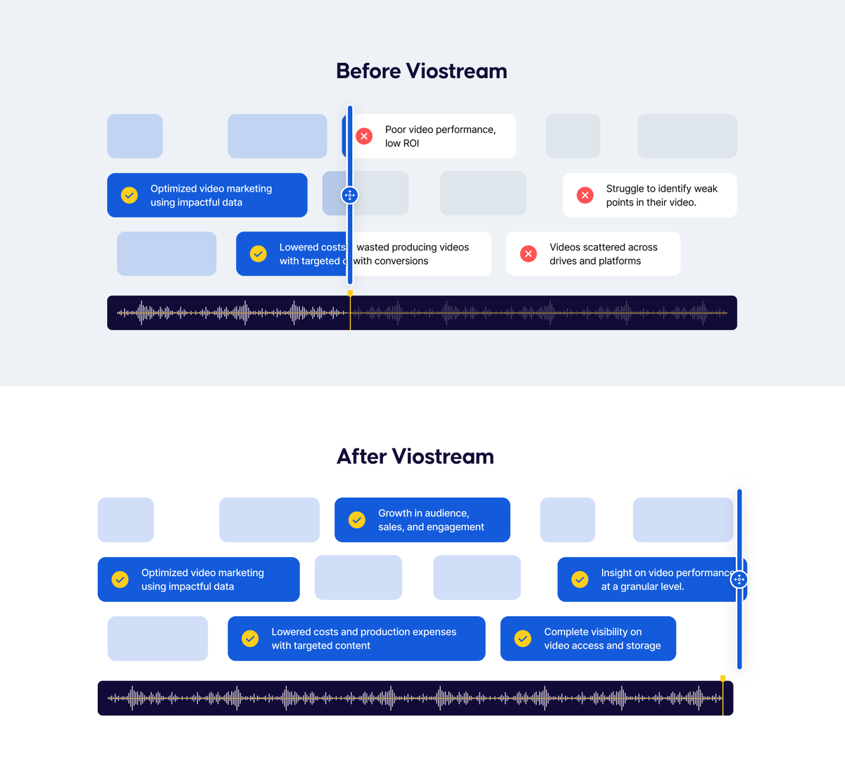
Before/After sections are one of my favorite things to put on a website.
They're basically a cheat code.
Visitors immediately understand the problem, the transformation, and the value without having to piece it together across six different sections.
You get to tell the entire story in a few seconds.
And if you've done your positioning right, it's usually one of the highest-impact sections on the page.
Pricing pages can get overwhelming fast.
When every plan is competing equally for attention, visitors are forced to do all the work.
One of the simplest ways we've found to reduce that friction is to highlight the plan that's right for most buyers. Whether it's your most popular plan or the one that fits the majority of visitors, it gives people an obvious place to start.
Instead of comparing everything at once, they can anchor on a recommendation and work from there.
It's a small design decision, but it can make pricing pages much easier to navigate.
Here are a few pricing pages we've designed recently, and most of them use this approach.
When selling to enterprises you need to be confident.
Buyers want options. They want depth. They want proof your platform can handle complexity.
If you hide all that, you look too small for them.
Here are a couple of sections we created for B2BWave to give their visitors this confidence in them.
Abstract visuals we designed for Scrut.
A website filled with product screenshots can start to feel repetitive fast.
People need moments to breathe.
That's where abstract visuals come in.
They reinforce the brand, add personality, and help turn a collection of product sections into a cohesive experience.
Colors, fonts, and icons from the Risotto website revamp.
When you're a new company entering a crowded IT support market, looking like everyone else isn't an option.
We built a visual identity for them that stands out in their space. Something warmer, more like them, than their biggest competitor.
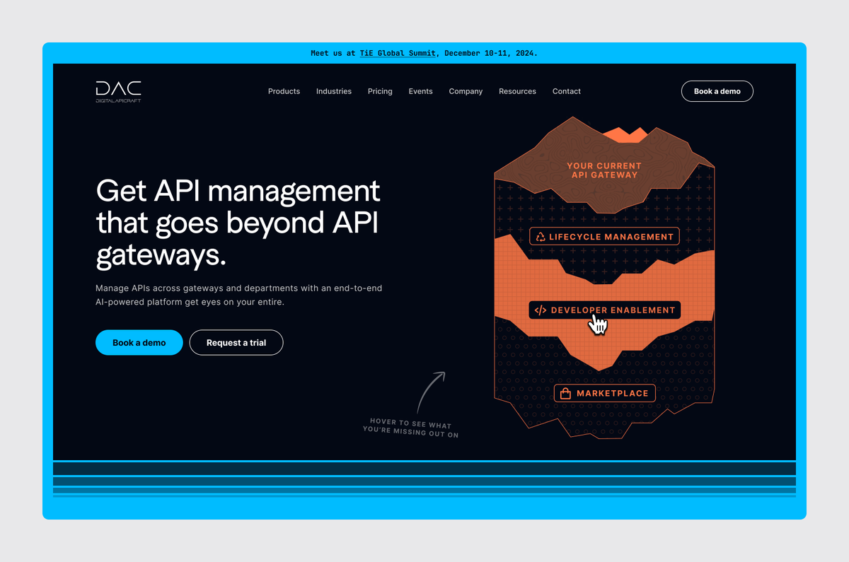
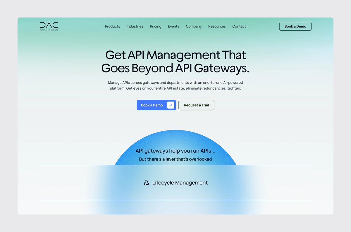
A homepage alone can't get you the leads your company deserves.
That's why feature and solution pages are slowing becoming almost as important (if not more) for SaaS companies as their homepage.
Here are a couple feature and solution pages we created for DAC.
A great product visual does as much heavy lifting as your headline.
Enterprise buyers switching from competitors ask themselves:
"Will my team actually use this?"
Good product visuals answer that question before a demo happens.
Here are some we created for DAC to show the product is powerful, familiar, and easy to use.
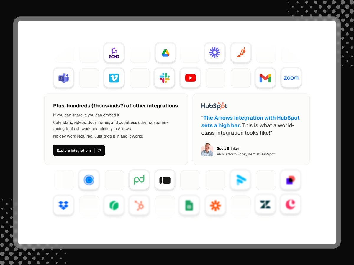
Integrations sections are simple. You need a bunch of logos so clients can tick off a box in their list of must haves.
But with a trust indicator next to your integrations section: Someone talking about how easy your integrations were to use...that's a differentiator.
Here's how we turned Arrow's integrations section into something that helps the conversion, instead of just checking a box.
AI product/feature pages are some of the most important pages on your SaaS website recently.
All SaaS has moved/is moving towards AI being a core part of their product.
Showing off your AI feature/product is crucial now that prospects actively look for such features.
Here's a AI solution page we created for a recent client.
Pricing page we designed for B2BWave.
SaaS companies often go overboard with a lot of selling instead of showing the PRICE on the pricing page.
That's what should be the thing in focus without needing to scroll at all.
You can't sell enterprise software with just a homepage.
I'd argue product and solution pages play a way bigger deal in the sale that we give them credit for.
Here are two pages we created for Scrut that helped them win trust with enterprises.
An Integration section we created for a recent client.
Enterprises work on a Jenga stack of tools.
One of their biggest concern when looking for a new solution is that the new thing will force them to risk collapsing that stack.
That is why a clean, clear, shinning bright integration section is one of the best hesitation handlers on your homepage.