Ich behaupte: würden Strafverfahren von Politikern deutlich schneller laufen, wäre unsere politische Landschaft eine andere.
1 Monat vor der Wahl ist etwa noch kein einziges Strafverfahren gegen Sebastian Kurz ausverhandelt.
1/12
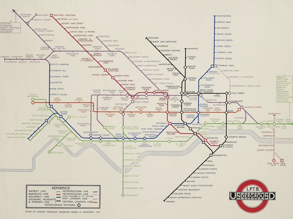
Mind the gap! The designer of the London Underground map, Harry Beck, was born #onthisday in 1902 🚇
Back in 1933, Beck designed this map in the form of a colour-coded diagram of criss-crossing lines to breakdown the network and was once deemed too radical for its simplicity
Ein Querschnitt durch das Eis der Gletscherzunge der #Pasterze, Österreichs größtem #Gletscher, von 1969 bis 2023. Im Jahr 1850 reichte das Eis bis ca. 2420m Seehöhe, also fast bis an den oberen Rand der Grafik. Details zur Gletschermessung auf https://t.co/44FrXxeN2B
Oder anders ausgedrückt:
Alle rechten Parteien zusammen sind gemeinsam für 91,72% des gesamten Strafmaßes verantwortlich, die Linken, vertreten nur durch die SPÖ, für 8,28%
Nie zu Haftstrafen verurteilt wurden Grüne und Neos.
@davidjablonski_ gefällt mir alles schon sehr gut :-)
Marktstandeln mit Bio- und regionalen Produkten
Freiluftdisco ohne Konsumzwang
Zweigstelle der Schuldenberatung
Spielplatz
… und bitte ein öffentliches, gepflegtes WC – dafür fehlt der Leiner am meisten.
@PaulUnmuth @LandauDaniel@elefant3107 Ich bin Grafikerin und sehe das ganz anders. Es gibt einige Möglichkeiten, gendersensible Schreibweisen typographisch ansprechend zu gestalten. Meine Favoriten sind * und Mittelpunkt · (🍎⬆️9) — Buchtipp: https://t.co/q6FIwLmoQj
Okay, was ist da heute passiert auf der Weltklimakonferenz #COP28? Wie ist der Beschluss zum Fonds für Verluste & Schäden einzuschätzen? Wie geht’s den fossilen Energien? Und welche Rolle spielt Österreich dabei? 1 Thread aus Dubai.
15 years ago, I helped design Google Maps.
I still use it everyday.
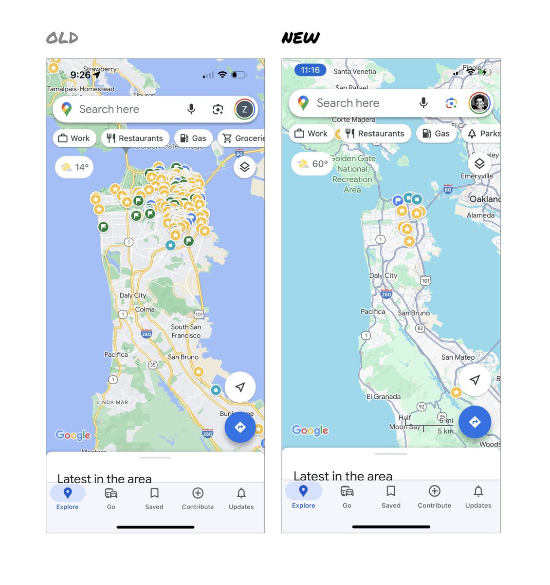
Last week, the team dramatically changed the map’s visual design.
I don’t love it.
It feels colder, less accurate and less human.
But more importantly, they missed a key opportunity to simplify and scale.
–––
Google Maps has started to widely roll out updated map colors:
- All roads are now gray
- Water changed from blue to teal
- Parks and open spaces are now mint green
It seems the goal was to improve usability and make the maps more readable.
Admittedly, I do think major roads, traffic, and trails stand out more now.
But the colors of water and parks/open spaces blend together.
And to me, the palette feels colder and more computer generated.
But color choices aside…
If the goal was better usability, the team missed a big opportunity:
Google Maps should have cleaned up the crud overlaying the map.
–––
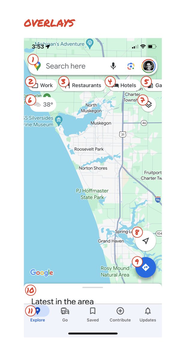
So much stuff has accumulated on top of the map.
Currently there are ~11 different elements obscuring it:
- Search box
- 8 pills overlayed in 4 rows
- A peeking card for “latest in the area”
- A bottom nav bar
(Personally, I would LOVE to see usage metrics for all these overlays.)
The map should be sacred real estate.
Only things that are highly useful to many people should obscure it.
There should be a very limited number of features that can cover the map view.
And there are multiple ways to add new features without overlaying them directly on the map.
–––
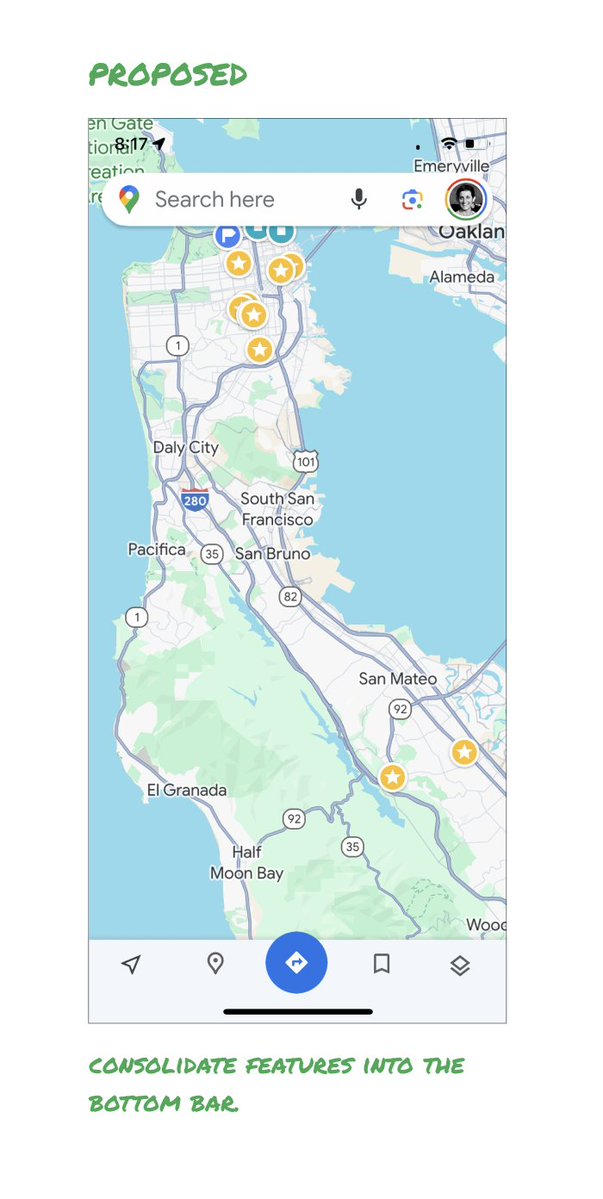
Here’s how it could look:
- Keep the search box
- Keep the bottom bar
- Remove everything else from the map
- Roll the most used features into the bottom bar
- Bury the less used features elsewhere in the app
I assume the search box and directions are top priority and should remain prominent.
My Location and map layers (satellite, traffic, etc.) could move to the bottom bar.
The explore overlays (restaurants, gas, etc.) could live in the bottom bar in “Explore” and open as cards.
The additional space in the bottom bar could be used for Saved, as a “More” option, or could be removed entirely.
There are many variations of how features could be arranged.
But the key points are:
- Dramatically simplify
- Strongly prioritize map visibility
- Bury legacy and low use features
–––
It’s normal for products to accumulate features over time.
But it’s also super important to stay vigilant and continually clean them up.
In many ways, it’s interesting to see history repeating itself.
In 2007, I was 1 of 2 designers on Google Maps.
At that time, Maps had already become a cluttered mess.
We were wedging new features into any space we could find in the UI.
The user experience was suffering and the product was growing increasingly complicated.
We had to rethink the app to be simple and scale for the future.
It seems like it’s time for Google Maps to do this again…
–––
For more on design + tips for early stage founders, follow me on X: @elizlaraki
12 Fotos, 1860 rundum vom Stephansdom fotografiert - das älteste #Panoramafoto von Wien. Originalbilder: #WienMuseum, ich habe diese nahtlos zu einem Panorama zusammengestellt und mit vielen Infopunkten ergänzt. Faszinierende Zeitreise!
https://t.co/myFHM4bbpM
All the suffering we’ve seen so far is nothing compared to the amount of suffering we might see. Interview with @s_wo_ for @zeitonline.
https://t.co/vG9kgGFNsK
#Nehammer, #Merz +#Lindner geben viele Beispiele, wie „Rohe Bürgerlichkeit“ (Heitmeyer) immer mehr Politik gestaltet. Über gesellschaftlich schlecht gestellte Gruppen wird ohne Empathie geredet. Dahinter steht kognitive Unfähigkeit, zunehmende gesellschaftliche Ungleichheit (1/7)
Das Erdklima bewegt sich gerade in einer Freakzone extrem unwahrscheinlicher Ereignisse.
Das bekommen zu wenige mit, deswegen kommen hier all die krassen Klima-Charts, die ihr sehen solltet 🧵
Today we say goodbye to this great blue bird
This logo was designed in 2012 by a team of three. @toddwaterbury, @angyche and myself,
The logo was designed to be simple, balanced, and legible at very small sizes, almost like a lowercase "e", a 🧵
Philipp Leeb will mit seinen Schulworkshops Gewalt und Extremismus vorbeugen. Dafür redet er über Männlichkeitsideale und problematische Vorbilder wie #RAFCamora und Rammstein. Im Interview mit @philipdulle erzählt er, wie die Generation Z darauf reagiert. https://t.co/YzGwDt8ddS