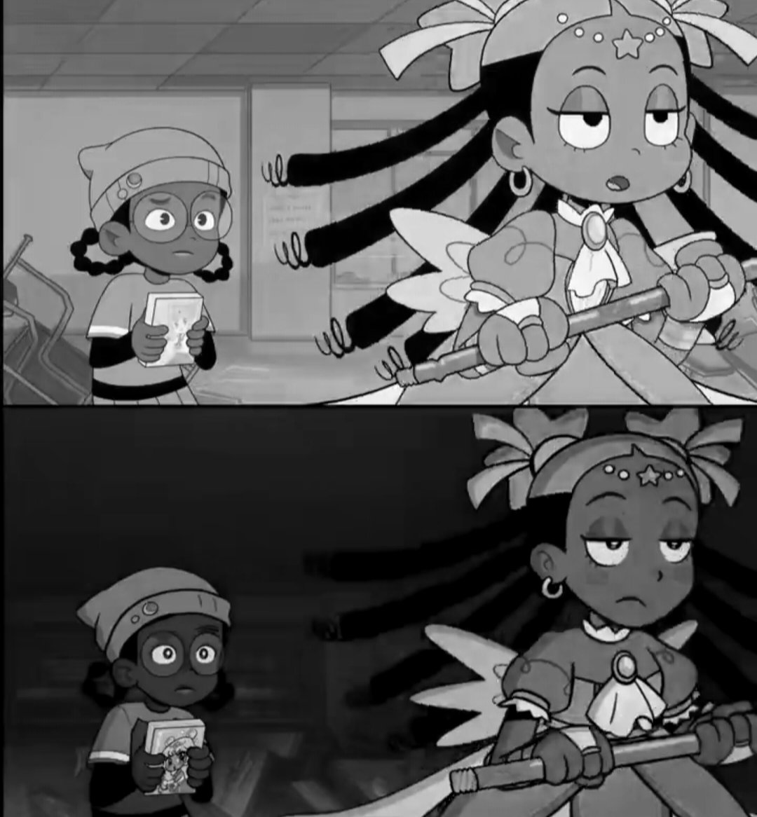
@Water_Deer_Art I can understand her wanting to saturate them more after the criticisms that Zira looked ashy in the pilot episode, but I think Kiana overcorrected a little bit. Adding saturation to a color also darkens it, and it's decreased the legibility of the scenes as a result
@mufinwheats I do actually think the character designs themselves (especially hoshi) are an improvement, though! The art style has more of a unique identity in the new version, the colors just need to find a better balance of light and saturation imo
@mufinwheats I do think the values are a little too saturated/dark and it makes the finer details harder to see in scenes like this (like their hair against the backgrounds)
@Fisticutz@AugustRaven Having all the P3 characters at the top and not the thieves who all go on a "besties" road trip across the country after graduation is diabolical