Today we recognize all the amazing women in our lab!
Their contributions to our research and local communities help women and girls reach their full potential in how they work, play, and live 👩🎓👩🏫👩💼👩🍳👩🔧🧕🤱🏃♀️👩🦽
#IWD2021#InternationalWomensDay
I made this plot for a class showing covid cases in Ontario by age over time.
I'm not sure if this type of plot has a name but thinking of calling it either the "Glass Water Feature" plot or the "Window Condensation" plot
@GraphicMatt@CityHallWatcher Makes sense, changing with the times!
🏔️ could also be accurate for budget committee into the future (closest there is to an iceberg!)
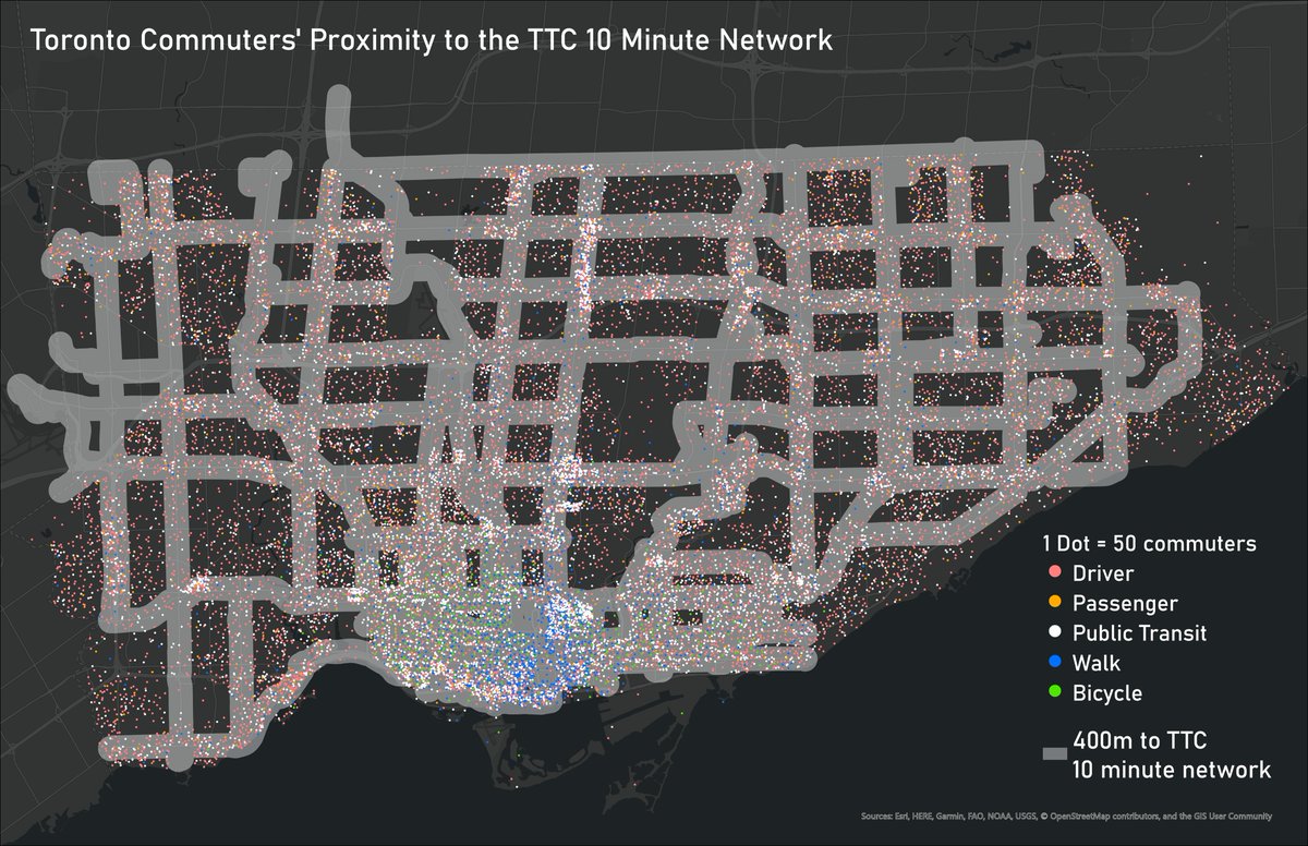
How well does the TTC's frequent 10 minute network serve commuters in Toronto? This map helps to visualize where commuters are well served, and where there may be gaps
#ArcGIS#CanMaps#Transit#Toronto
@jaythegray@cityjada But for that one you can make the trip without crossing a zone boundary, if you go around the east side of the skytrain. I made that trip often when I lived in Burnaby, and if I remember correctly it counted as one zone.
@jaythegray@cityjada Interesting, that's actually not what I was expecting, but it does make more sense.
I guess the same applies for travelling between Evergreen stations and Surrey stations
@cityjada Here's one that I've been wondering about: Metrotown to Lonsdale Quay via Expo line and SeaBus.
Origin and destination are both zone 2, you never have to leave the fare paid area, but you have to travel through zone 1.
Is this a one-zone or two-zone fare?
Week 10: Toronto’s Peaks and Valleys
We used a digital elevation model to highlight some of Toronto’s topographic features and prominent lookouts #TorontoAtlas@OntarioOpen
@HealthyCityMaps @wklumpen Right...that makes sense. I guess you also need to join Routes and Shapes to create the line files
Looks good! Definitely useful for quantifying transit access in different areas