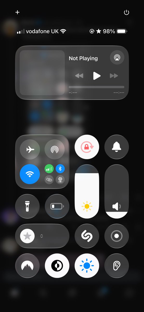
@theapplehub To those of you saying what's the difference:
The icons are better glass themed now and more visible.
The background is more darker making the icons visible over the app icon colors.
The alignments and spacing are fixed.
@jacksonhinkle To the people saying they stand with India:
It's obvious you people lack the general knowledge and the intelligence quotient to comprehend who's the terrorist here.
The country that's bombing residential and religious areas or the country that's defending itself.
Pathetic.
@duolingo Interesting marketing strategy.
Leveraging the connection users have with the mascot to increase user interaction by "completing their lessons"
Something similar to the fictional death of Mr Peanut by Planters, where the 'death' of the mascot led to increased brand visibilty.