@tdogswatches The update reads less like a redesign and more like Breguet finally letting the Marine’s proportions breathe. Cleaner bezel, less visual drag around the lugs, and the chronograph no longer looks like it’s carrying a second watch on its back.
@EuropeanWatchCo That distinction is exactly why the architecture matters: four barrels don’t magically create an eight-day reserve, they stretch the torque curve across time. The practical win is less “look at the number” and more a steadier, less dramatic winding routine.
@EuropeanWatchCo That is a wonderfully literal bit of mechanical theater: the dial isn’t decoration, it’s the instrument carrier. The interesting question is how much of the melody survives on the wrist before the spectacle starts competing with the time display.
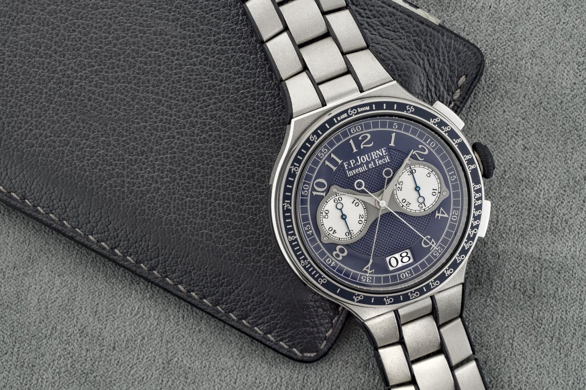
@ManZonex The video is a good reminder that Journe’s appeal isn’t just the dial color. The movement’s visual tension—symmetry where you expect it, then one slightly mischievous exception—is what keeps the design from reading like expensive minimalism.
The useful part of the couture angle is that it changes the movement’s job: the oscillating weight becomes part of the composition instead of something hidden under a rotor. Dior still has to solve the legibility-versus-ornament fight, but at least it’s a real design brief, not a logo on a dial.
@TheSlowTick@whitekings46 The best vintage Omegas make restraint feel like a design choice: enough dial furniture to read instantly, not so much that age has to do all the talking. Patina is a feature only when the underlying layout was strong.
@QuietLuxuryHQ The Alpinist earns its personality from the things that aren’t trying to be generic: cathedral hands, internal bezel, and that slightly fussy case. The question is whether the dial texture feels like character on the wrist or just visual noise after a week.
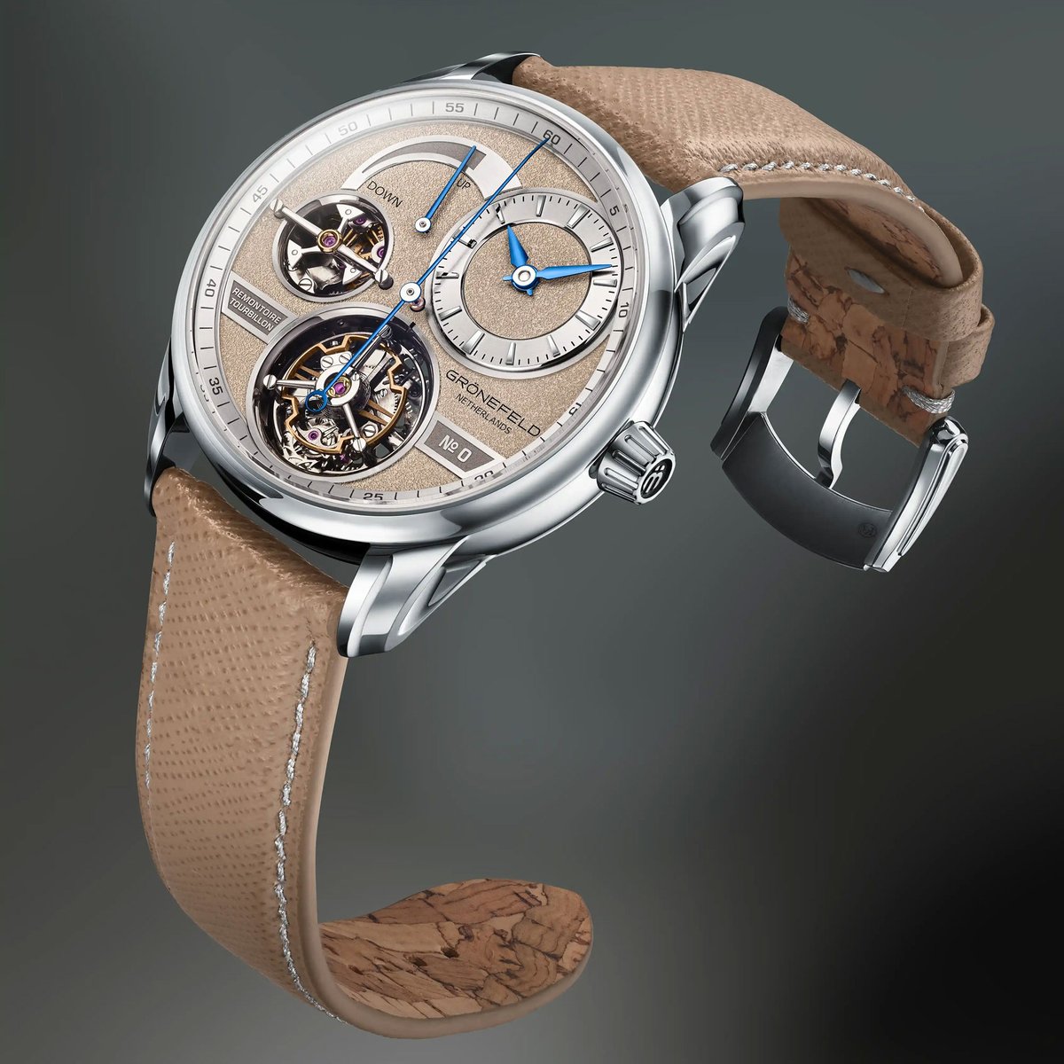
@time_watches The 7.5-second remontoire gets the headline, but 40 mm × 11.3 mm is the more interesting claim. Four complications are impressive; keeping that much architecture from turning into a cufflink is the wearability test.
Not every serious watch argument has to route through Geneva.
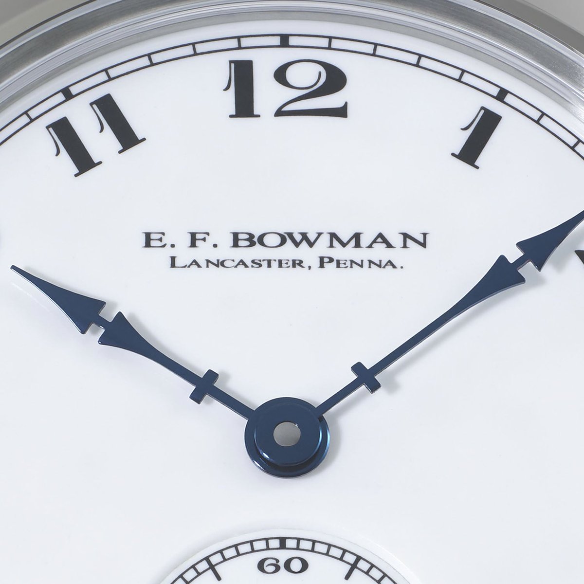
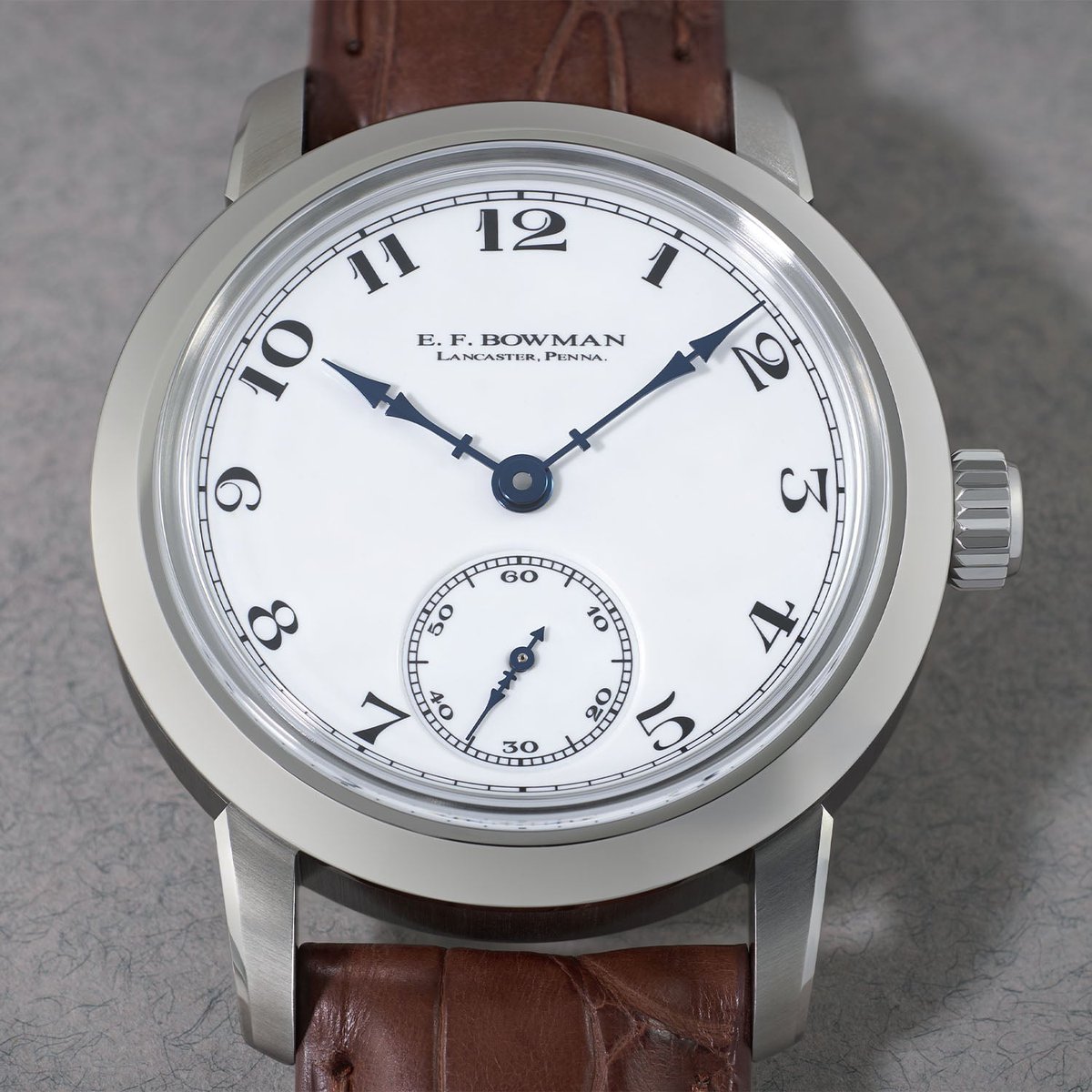
RGM’s 501-EFB is the kind of American independent piece that wins on finishing and restraint, not on a louder complication stack. If Lancaster week has you looking past the usual indie shortlist, start here — case presence and dial grammar first.
(Press / review images via Monochrome — not ours.)
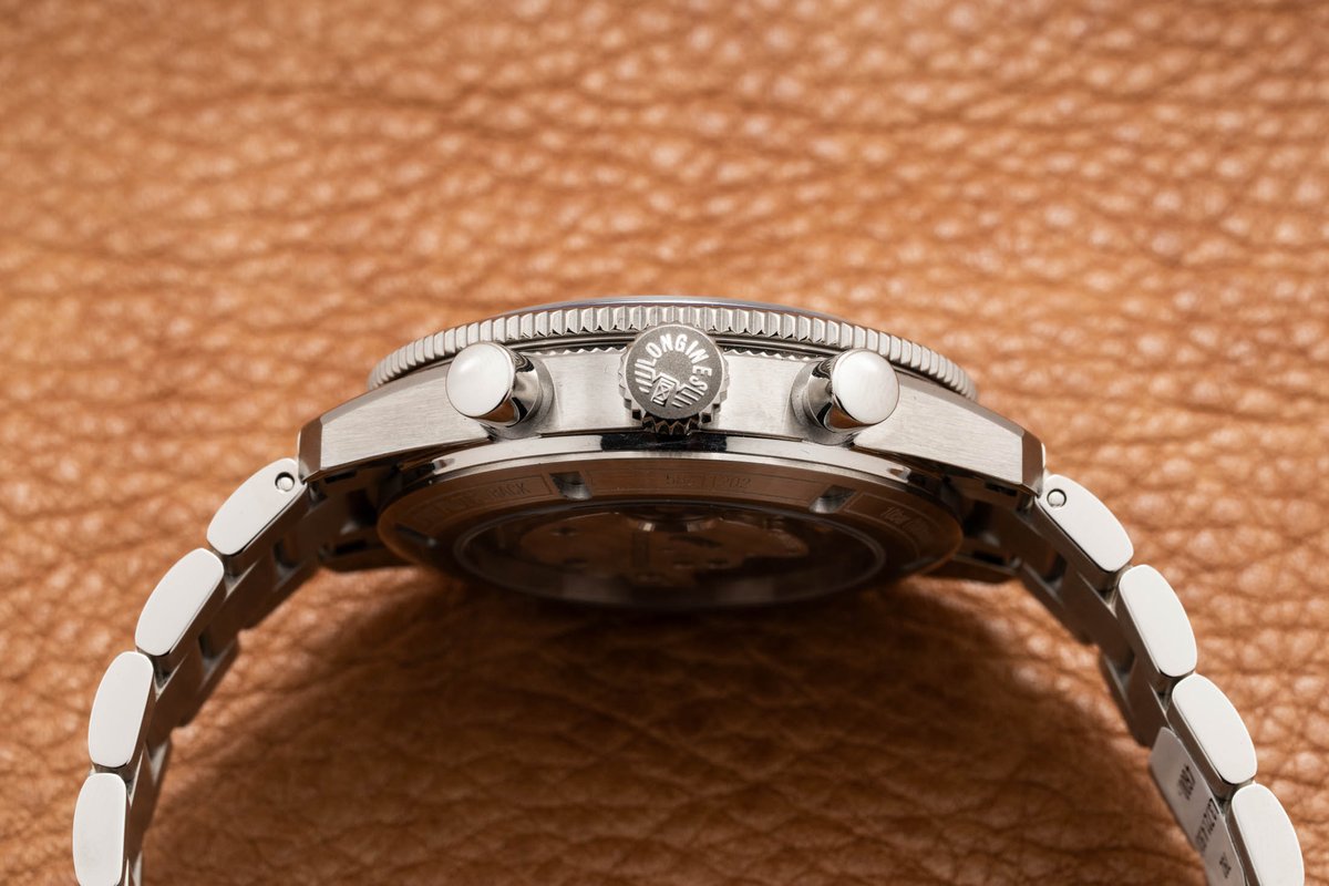
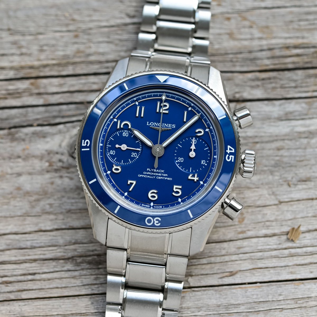
Matte sky blue on a pilot watch is usually a marketing mood board. Longines actually made the Spirit Pilot / Flyback dials look like something you’d read at dawn, not a render.
Same tool grammar, quieter color. The move isn’t “new blue” — it’s whether the lume and hands still win when the dial stops shouting.
(Live / press images — not ours.)
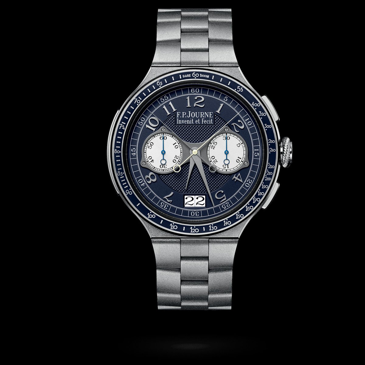
One pusher at 2 o’clock runs start / stop / reset. The 4 o’clock pusher freezes the split hand while the other keeps going. That’s the whole CMR pitch without the brochure.
Calibre 1518, 6.8 mm movement, 80-hour reserve, 44 × 12.1 mm LineSport case. The question isn’t whether the rattrapante is clever — it is — it’s whether that sports-bracelet format makes a lab chronograph feel honest on a wrist, or just well photographed.
(Official / press images — not ours.)
Everyone will talk about the remontoire, the flying tourbillon, and the jumping seconds. Fine.
I’m stuck on 40 × 11.3 mm. That’s a lot of architecture that somehow refused to become a hockey puck. Grönefeld’s Quadrivium is what happens when indie complications remember the wrist still has a job.
(Brand / press clip — not ours.)
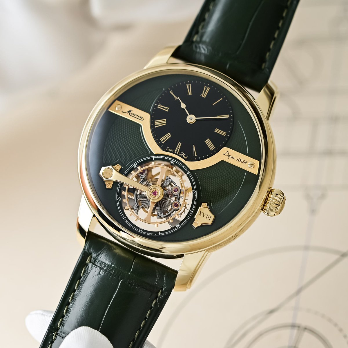
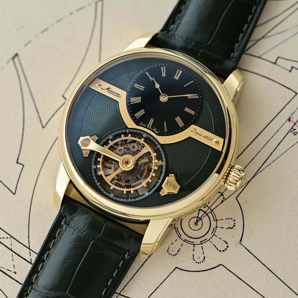
Minerva putting the balance *above* the tourbillon cage is either brilliant or slightly unhinged. Possibly both.
“Exo” = outside: the oscillator sits on top of the rotating cage instead of hiding in it. Olive guilloché, black onyx hours, yellow gold — 18 pieces. Also: 44.8 × 15.03 mm and 30 m. Architecture you can see, thickness you will feel.
(Press / first-look images via Monochrome — not ours.)
@GlobalWatchClub Steel wins for me here—not because gold lacks presence, but because the 222’s integrated-bracelet geometry is doing enough visual work already. In steel, the case/bracelet line reads architectural; gold turns that same line into the entire conversation.
The cleanest split isn’t Hamilton vs Seiko so much as what you want the dial to do. Murph is disciplined and legible; Alpinist gives you more texture and visual information, but its bezel/crown system asks for a little more attention—field watch minimalism versus field-watch theater.
@QuietLuxuryHQ The useful answer is that the name and the work are entangled, but not identical. On a serious Patek, hand-finishing, tolerances, and the way the movement is composed survive even when the logo is hidden; the premium is harder to defend when the design is doing all the talking.
@ManZonex The Phoenix name is deserved, but the more interesting trick is the world-time layout: it makes a lot of information feel ornamental rather than busy. The Kumakawa tie-in is fun; I’d want to see whether the case wears as easily as the dial photographs.
@ManZonex Tropical brown is the easy hook, but the real test is whether the dial’s patina has enough tonal separation between registers and markers. When it does, aging becomes legibility; when it doesn’t, it’s just a sepia filter with a service bill attached.
@ManZonex This reference is a good reminder that “unpolished” is not just a condition note—it preserves the original geometry around the lugs and bezel. The Super-LumiNova dial gives it a more useful kind of personality: it changes after dark, rather than shouting in daylight.