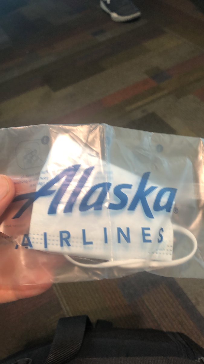
I still prefer to wear a mask in crowded places like airplanes, but found myself without one today in #smf and you can’t buy them here anymore! Thanks @AlaskaAir staff person who gave me one from their personal supply. 🙏😷✈️ #Grateful
Great visualization in case anyone needed clarification when looking at those mostly red maps and not understanding why their beloved candidate is loosing...#Election2020
Hopefully this tragic accident is a wake up call for other governments everywhere who might be storing “stuff” less than securely and with great caution. https://t.co/zSbG7gvnIh
Sad how these terms get incorporated in every day English language with the users understanding the original connotations. Now you know https://t.co/uf71jx87ii
This animation illustrates the geographic patterns of COVID-19's spread over time in the continental United States. Particularly striking how quickly things shift, and how many cities are fast growth now compared to the initial wave of growth. Made with #QGIS#Blender3d#RStats
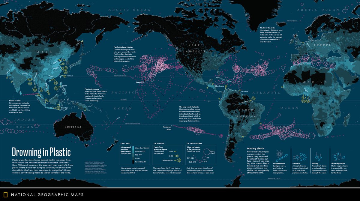
#Maps can help turn huge amounts of data into a gorgeous, simple image. But picking the right symbols isn't always as easy as you might think.
Unless, of course, you've already read this guide to choosing effective symbology 👉 https://t.co/lDThq88qFJ #cartography