Founder of MashMetrics - your friend in data! Making Google Analytics more Accurate, Actionable and most importantly Accessible to soloprenuers and bloggers.
@tottawahull@FIFAWorldCup Absolutely. I was surprised to see the amazing infrastructure built over the years when I came back in 2020. Amazing venues, spirit, you watch!!
@pc4media I could not agree more. Good Analytics takes proper tech skills, domain expertise as well as communication skills. I have been doing this for 20yrs and still had to build a team to meet the needs of our clients.
We are that dream team at @mashmetrics :)
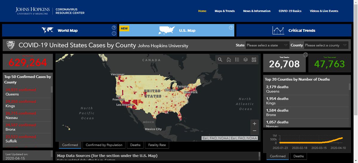
By far, among the official health institutions, the John Hopkins dashboard is the most complete fo Covid-19.
Check it out our selection for Best Covid-19 D
WHO has two different graphics for Covid-19. One with data on cases/deaths and others on public emergencies.
it has a tab called “explorer”. In this area, you can cross-check data to expand your analysis. Our selection for Best Covid-19 D
This one is also a great dashboard fro COVID-19. Simple and easy to use for laypeople and those that bought "data analysis is for dummies" just log in and you can see the data by region, city, or state.
Our selection for Best Covid-19 D
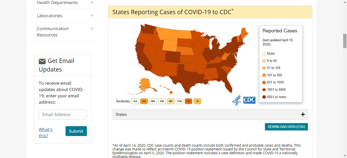
It is not the best in terms of usability but CDC, like the other organizations above, is too important for it not to be on this list. It is important that these organizations make data available and work with.
Our selection for Best Covid-19 D
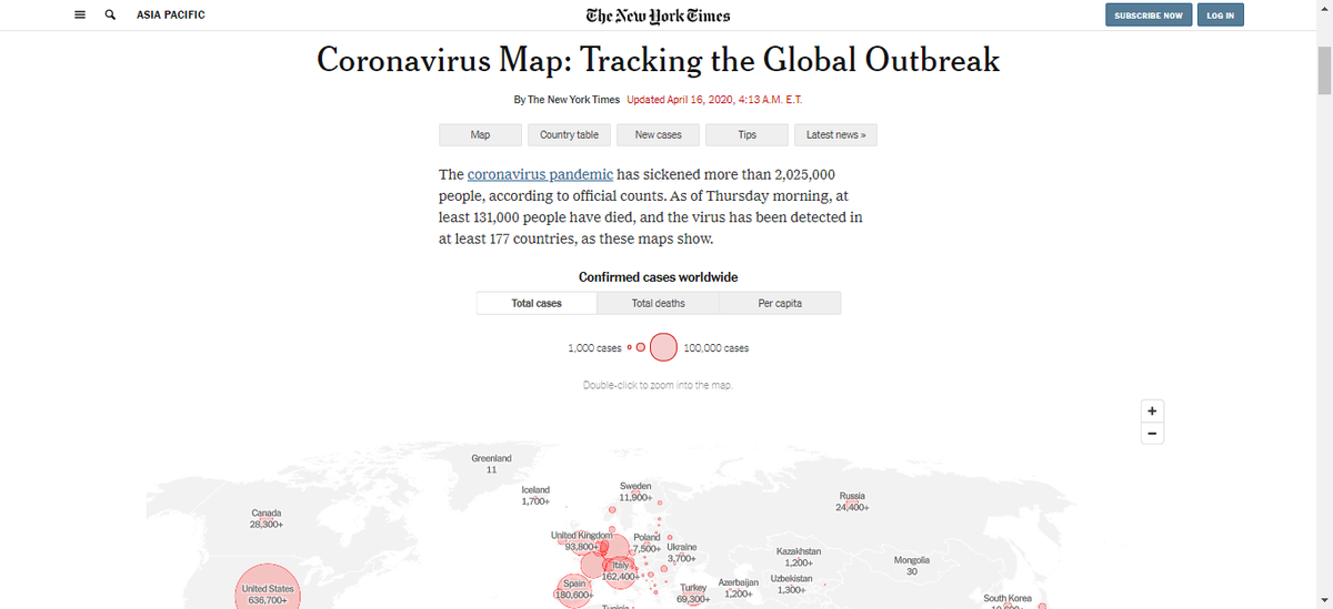
As always, an excellent example of how the media can make good use of a dashboard. Informative and interactive, it holds the reader’s attention. You can interact with data without even realizing it. Out our selection for Best Covid-19 D
Microsoft did a good job of merging data with making content available.
They made an interesting chart with a core scale for the “Top 10 regions by active cases”. Check it out our selection for Best Covid-19 Dashboard:
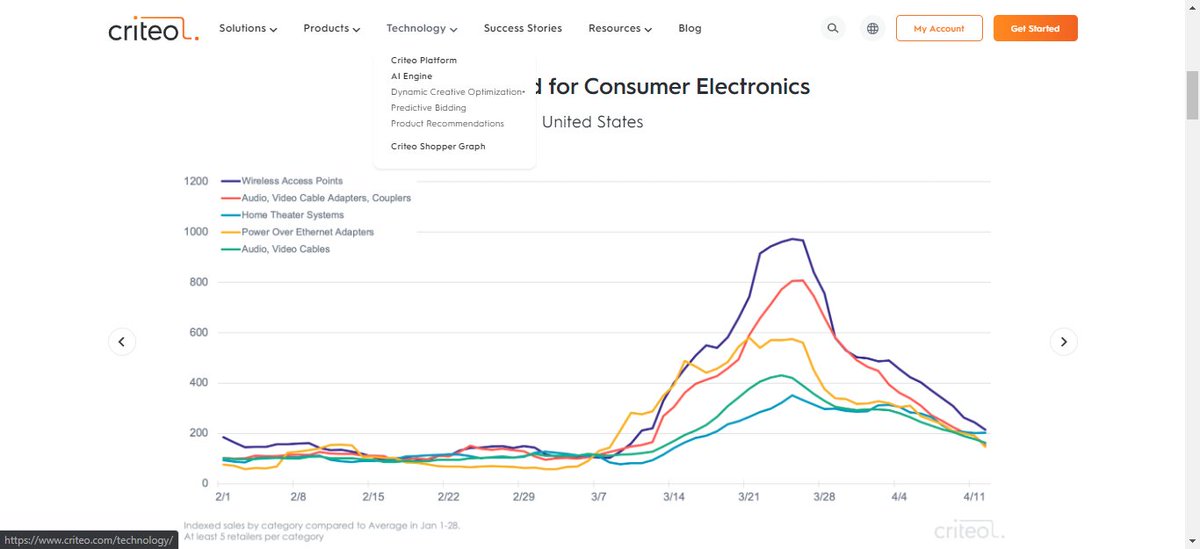
Understanding the Changing Economy: Unlike other dashboards, Criteo brings interesting data about the world economy. Among all the graphs here, this is the most interesting and different. Check it out our selection for Best Covid-19 Dashboard:
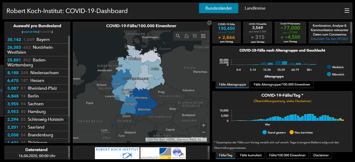
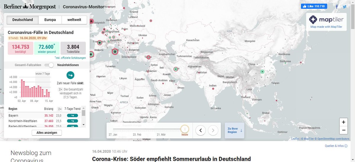
The Berliner Morgenpost is a daily newspaper in Berlin (again, looking local!). Like the New York Times, it is interesting to analyze the production of dashboards through communications companies to disseminate information.
Check it out our selection for Best Covid-19 D
Query String Parameters are starting to break your Google Analytics reporting.
- Your landing pages are all split up
- Your page behavior report is shattered
- @facebook is sending a unique id for their clicks
- your @hubspot emails contain a unique id https://t.co/KbgHPATz3z
With seamless integrations into #Google Analytics, #GoogleAds or even Google #BigQuery (and much more), #googledataStudio offers the data transformation, #dataviz and customization requirements to making analytics a bit easier.
https://t.co/pz8wqwq6SJ
While it was quite the hype a few years ago when #GDPR came into effect, guess what, it is still in effect! Now we have #CCPA in California.
Here is a 5 step process to doing your part in making privacy
Compared to others dashboards this is the simplest but that is exactly what makes it special. Sometimes all we need is this: simple, straightforward data. Oh, this was created by a high schooler in Washington State, USA.
Check it out our selection for Best Covid-19 D
Attribution: The difficult answer to where your marketing dollars are best spent.
How can you fix some of your marketing attribution challenges?
You should check this content about it⤵️