The design takes inspiration from New York's iconic checkered cabs. The New York Excelsior (Upward) branding returns from the first round of the series but with a new color scheme. It's complimented by the "trunk badge" based on the iconic checker cab badge.
Haven't done a new concept kit in a while, so let's drop one... This one was originally designed for @olive_york Kits Across America Pt. 2 last year but I got caught up in a few other projects and ultimately it never got released.
Kits Across America is back! And we're doing it big this time...
$250 for every winning design + share of sales.
Your design boosted on our socials and newsletters.
Tag your designer friends below 👇and let's see if we can fill out the entire map!
https://t.co/pIw95ywPsK
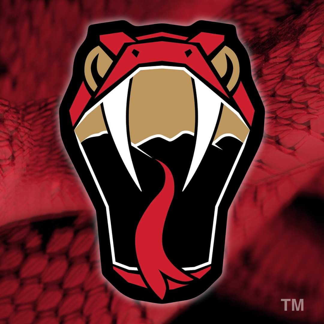
The logo takes cues from our local venomous snakes, and incorporates imagery inspired by the Hudson River and Catskill and Shawangunk mountains inside the mouth.
The Venom take to the ice this October. Stay tuned for more from this ongoing partnership
Logo reveal day for the Hudson Valley Venom, the newest club in @TheFPHL!
This project meant a lot to me and I'm humbled by the confidence the Vipers/Venom organization has shown in me to work on their branding #hudsonvalley#hockey
...as the home of the Red Hook Society for the Apprehension and Detention of Horse Thieves, the oldest equestrian organization in the USA. The jerseys borrow patterns inspired by barn art and jockey silks (the shirts work by horse racers).
Let's keep the HV Series going... This time we've got Red Hook
Red Hook's design starts with the village's iconic "hook" emblem as inspiration for the logo. The jerseys find inspiration from the area's equestrian heritage...
A new concept, (most likely) a new series
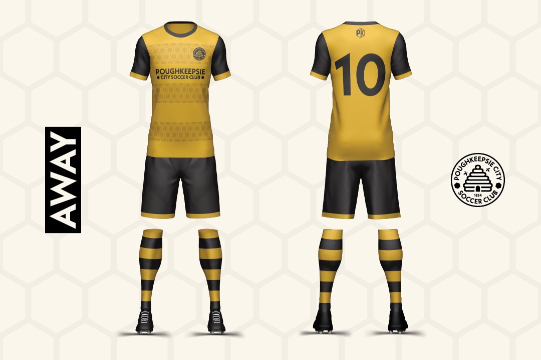
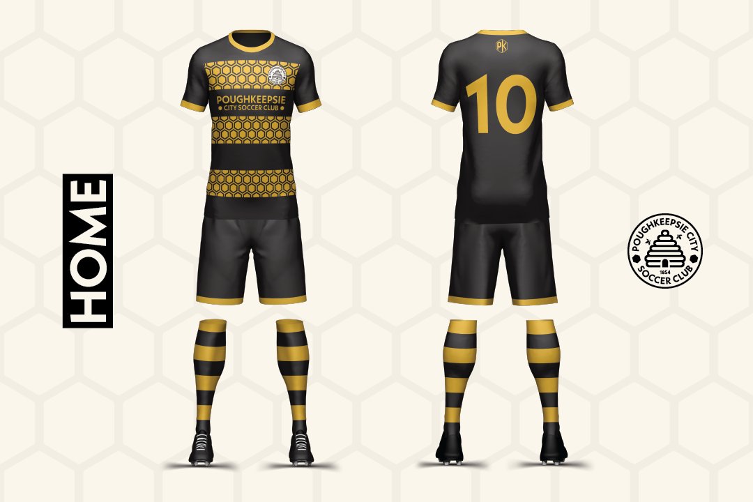
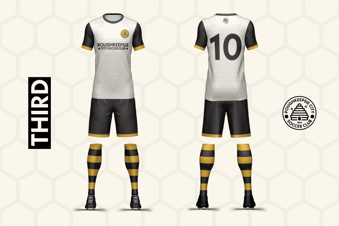
First of the Hudson Valley concepts: Poughkeepsie City
The concept takes influence from the city's crest and flag which feature a beehive. The primary color scheme follows the recent changes to the city's branding, adopting black & gold
Btw if you're interested in finding out more about the team check out https://t.co/I59JT3ZgFC
Not affiliated with the team but very excited for the return of minor league hockey to the Civic Center
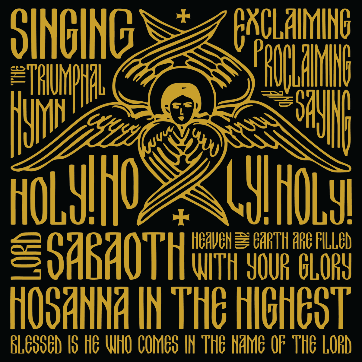
With the celebration of the Centennial of Kimisis Greek Orthodox Church (@kimisisny), I wanted to share the logo I designed for the occasion earlier this year. The design is inspiring by the mosaic of the Virgin Mary "Platytera" behind the altar in the church.
Haven't posted a new concept in a while but here's a new one!
A Great Wave for Japan (especially with their recent "wave" of scoring)! The design features a new take on the iconic woodblock print "The Great Wave off Kanagawa"
The primary jersey concept for @SoccerFedMI takes inspiration from the flag of the Marshall Islands. The sash design mimics the orange and white of the flag, radiating out from there into a blue sunburst pattern. This design sets an iconic look for the nation for years to come.