I just found a free gradient builder!
It has tons of styles like mesh, grainy, aurora, waves, animated gradients, pixel & more.
You can export as SVG, PNG, or MP4, or paste it directly into Figma as editable layers.
Check it out → https://t.co/jVCWXcIZm8
The best UI components ready to use, save this 👇
- https://t.co/NUFnvVJNYc free animated component library
- https://t.co/KziDkjhTOJ Animated thinking orb component
- https://t.co/ZQi6w2xsv8 essential transitions for web apps
- https://t.co/rzW0Q8PcwZ crafted UI for AI-native interfaces.
- https://t.co/VtGoFU5bS0 huge community library
- https://t.co/xHQ2IRmVAf The React component library
- https://t.co/A0C17jwDbs patterns from 95 design systems
- https://t.co/DdA3oBeScp Annotate your UI. Guide your coding agent
What Did I Miss?
I’ve added 4 new skills to the /better collection.
/better-accessibility
Finds accessibility issues and helps fix them.
/better-layout
Improves layout, spacing, hierarchy and responsiveness.
/better-writing
Makes product copy clearer, more concise and consistent.
/better-interface
Brings all the new and existing skills together to review and improve whatever you’re working on as a whole.
There are now 7 skills in total and the collection keeps growing to cover more and more areas.
npx skills add jakubkrehel/skills
https://t.co/lcR4NU8I1p
@disco_lu@mindcloudhq It's just three stacked rectangles. Top layer is essentially the gradient with no blur, acting as a stroke for the white container.
Then two other layers stacked with different blur treatments.
👌🏼
/custom-skills-are-now-in-make-so-you-can-create-and-call-repeated-workflows
Note: you can create and manage your own skills now. Sharing skills with your team and org is coming soon.
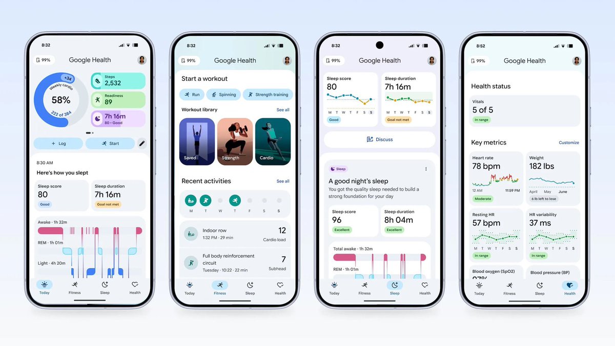
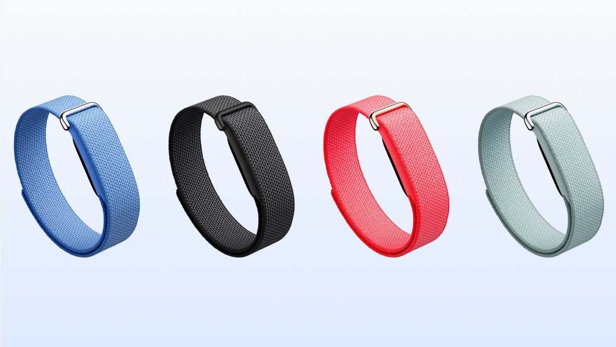
If you bought a Whoop, I feel sorry for you.
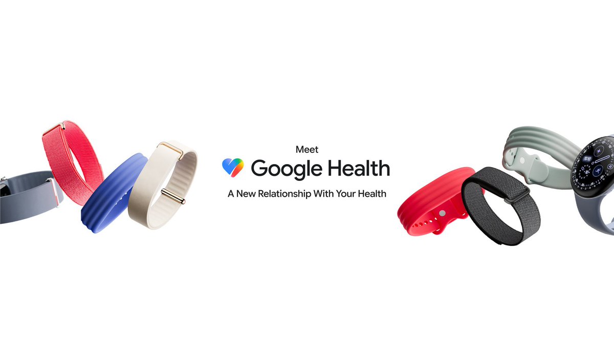
Google’s Fitbit Air just made it look silly
- $100 one time payment vs Whoop’s $199–$359/year forever
- Free tier actually works HR, sleep, SpO2, HRV, recovery, no paywall
- Optional $10/mo for Gemini Health Coach (vs Whoop where the sub is mandatory)
- Gemini analyzes meal photos, not just biometrics. Whoop can’t touch that
- Conversational health AI ask questions like why was I tired Tuesday?and get a real answer
- Open data platform Apple Watch, Garmin, third-party data all flow into Google Health
- 7-day battery, 5-min quick charge = full day
-Whoop just got a $10B valuation… and Google undercut them by 50% on day one
The Config 2026 agenda is live and virtual registration is open and free for everyone globally. Register to tune in to this year’s sessions. https://t.co/dHBubhSO6D
The average person types 36 words a minute on a phone.
But, they can say it four times faster.
Essential Voice turns your speech into clear, ready-to-use writing.
SaaS dashboard cheatsheet (bookmark this) :
- Typography: Inter. 14px body, -0.2px letter spacing
- Sidebar width: 240px. Always.
- Table row height: 48px minimum for scanability
- Primary action: top right, never buried
- Empty states: illustration + CTA, not just No data
- Status colors: green = done, amber = pending, red = action needed
Bookmark this. You need it.
We are completely humbled by the amazing response to our launch last week! 🫶 Now, we want to help you get the absolute best results from Stitch.
In this new video, David East walks you through how to consistently get premium results.
We also launched a new prompt enhancer (located under ‘+’ menu) to help you quickly collaborate on your vision before you submit your first prompt.
Stitch doesn't replace the design process—it is a tool for fast exploration and refinement, which is most effective when you step into the role of Creative Director.
Here are David's top strategies for taking your designs from generic to amazing:
🧠 Start with Intent: Define exactly who the design is for and how you want them to feel before you start building.
🎨 Enhance your prompt: You can use the new prompt enhancer (under the ‘+’ button’) to teach you design language and swap abstract words like "sporty" for tangible aesthetic descriptions like "high-end stationery" or "architectural limestone".
📐 Master Color Hierarchy: Treat colors as visual weight—Neutral for the canvas, Primary for ink, and Tertiary for your loudest accents.
Watch the full breakdown and see the transformation here👇images in 🧵
If you open a Chinese app for the first time, you’ll probably think it’s badly designed.
Too many icons and features. Everything crammed onto one screen.
If you grew up on Western apps, your instinct is immediate: this is cluttered.
But it works.
In the U.S., we’ve been trained to associate good UX with minimalism. In China, density often signals value.
Open WeChat or Alipay, and it feels overwhelming at first. Information-heavy, feature-packed.
But to local users, that density means capability. It says: everything you might need is already here in front of you.
If you enter a new market assuming your design taste equals good UX, you’ll misread the signal.
Good design is contextual.
Meet the new Stitch, your vibe design partner.
Here are 5 major upgrades to help you create, iterate and collaborate:
🎨 AI-Native Canvas
🧠 Smarter Design Agent
🎙️ Voice
⚡️ Instant Prototypes
📐 Design Systems and DESIGN.md
Rolling out now. Details and product walkthrough video in 🧵