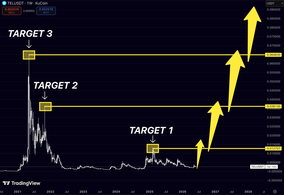
$TEL has spent almost four years trading in the shadows.
While most traders moved on to newer narratives
the chart kept quietly building one of the largest accumulation structures in its history.
Now the roadmap is becoming very clear.
The first major objective sits at 0.012555.
This level marked one of the most important local peaks during the previous recovery cycle and represents the first real test for the current trend.
Reclaiming it would signal that buyers are no longer trading a relief bounce.
They would be building a genuine long-term breakout structure.
The second target stands at 0.036269.
This zone acted as a major distribution area during the 2021 cycle, where aggressive selling repeatedly overwhelmed demand.
Breaking through it would completely change market psychology.
At that point, $TEL would no longer be viewed as a forgotten altcoin.
It would become one of the strongest recovery charts in the market.
The final target sits at 0.064894.
This is the level where previous euphoric buying reached its peak before the long bear market began.
Historically, these old cycle highs attract liquidity like a magnet once momentum returns.
The progression is straightforward:
0.012555 - First Target
The level that confirms a new bullish structure.
0.036269 - Second Target
A major historical resistance and the point where sentiment could shift dramatically.
0.064894 - Third Target
The ultimate recovery objective and the level that would put $TEL back on every watchlist.
What makes this setup interesting is how long the market has ignored it.
The longer an asset spends building a base, the more explosive the move can become once demand returns.
Most traders only notice the trend after the first big breakout.
The chart suggests $TEL may still be in the stage where patience is rewarded.
First reclaim Target 1.
Then attack Target 2.
And if momentum keeps building, the path toward Target 3 becomes surprisingly realistic.
Sometimes the biggest moves come from the coins nobody is talking about.
$XLM is one of those charts that looks boring… right before it ruins everyone’s bear thesis
Back in 2018, $XLM topped around the first target zone.
In 2021, it ran straight into the second target zone.
Now look where we are.
The market spent years building pressure like a shaken soda can nobody wanted to open.
And here’s the part people keep missing:
Every cycle, Stellar doesn’t just revisit old levels.
It overshoots them.
A lot.
Target 1 was the 2018 peak.
Target 2 was the 2021 peak.
Target 3 sits around the $1.8-$2 area.
If history keeps rhyming, XLM isn’t trying to get back to old highs.
It’s trying to create new ones.
The funny thing?
At $0.20, nobody cares.
At $1, crypto Twitter will suddenly discover that Stellar exists.
At $2, you’ll start seeing:
“Should I buy XLM here?”
from the same people who ignored it at twenty cents.
Crypto is basically a never-ending remake with different actors.
$XLM looks like it’s following the same staircase it’s followed for years.
And if that trendline keeps doing its job…
The next stop could make a lot of people wish they paid attention sooner
Nobody talks about $TEL
Which is exactly why it’s interesting
The chart has spent years doing absolutely nothing
And crypto traders hate one thing more than losing money:
Being bored
Meanwhile, the roadmap on the chart is sitting right there:
🎯 $0.0127
🎯 $0.0361
🎯 $0.0648
From current levels, those targets aren’t small moves
They’re the kind of moves that turn “I’ll buy later” into “why didn’t I buy earlier?”
Most people are waiting for confirmation
The market usually rewards the people who arrive before the crowd, not after it
$TEL is still trading like nobody cares
Those are often the dangerous ones
$INJ is sitting in the same zone where every major expansion phase has started
And if history repeats, the next move could be much larger than most traders expect
Most people focus on where Injective traded in the past
What matters now is where price repeatedly found resistance during previous bull market advances
The chart highlights three major targets:
Target 1 - $25.05
Target 2 - $35.09
Target 3 - $53.04
These levels are not arbitrary
Each one comes directly from historical market reactions where bullish momentum stalled and sellers stepped in aggressively
What’s interesting is that $INJ is currently trading near the same accumulation zone that preceded previous explosive rallies
Similar structures appeared before the 2021 breakout
Similar structures appeared before the 2023–2024 expansion
Now price is once again building from a deeply discounted area while the higher resistance levels remain untouched
The first major objective sits near $25.05
Above that, the next significant resistance zone comes in around $35.09
That’s an area where the market experienced a powerful rejection during the last cycle
But the level that stands out most is $53.04
This is one of the most important resistance zones on the entire chart
It’s the area where a major distribution phase began after Injective’s historic rally
Markets often revisit the levels that previously defined trend reversals
And when a multi-year base begins expanding, those old resistance zones tend to become magnets for price
The roadmap is clear:
$25 → $35 → $53
If momentum continues building and buyers maintain control of the current structure
$INJ could be setting up for another major expansion cycle
The biggest rallies often begin when nobody is paying attention
$INJ is sitting in the exact same pump zone that launched the last two cycles
Pump Zone 1 ➜ $25
Pump Zone 2 ➜ $55
Now Pump Zone 3 has formed at the same long-term support trendline
The pattern is almost identical:
Accumulation at the base
Explosive breakout
Vertical expansion to the next target
If history keeps rhyming, the next major move isn’t measured in percentages
It’s measured in multiples
Target 1: ~$25
Target 2: ~$55
Target 3: ~$80+
Most traders see a dead chart
I see $INJ back in the same launch zone that produced every major rally on this chart
$SIREN doesn’t have years of history
That’s exactly why this chart is interesting
Most traders look at new tokens and see a lack of data
This chart looks at $SIREN and sees a series of lower highs getting compressed into a single point
Target 3 → $3.15
Target 2 → $2.23
Target 1 → $1.37
Those levels aren’t random
They’re the exact zones where previous rallies lost momentum
Now price is sitting inside what the chart calls the Pump Zone
The area where the descending structure finally runs out of room
Think of it like a spring
Every rejection pushed the ceiling lower
Every month reduced volatility
Every month tightened the range
Eventually compression stops creating pressure
It releases it
If that release happens, the first objective isn’t a new all-time high
It’s simply reclaiming the levels that once acted as ceilings
And for a small-cap chart like $SIREN, reclaiming old ceilings can be where the real move begins
If there’s one chart that keeps getting more interesting, it’s solana:rndrizKT3MK1iimdxRdWabcF7Zg7AR5T4nud4EkHBof
Look at the pattern
Every major cycle peak has respected the same rising trajectory
Target 1 → ~$8
Target 2 → ~$14
Target 3 → ~$21
That’s not random
Each expansion pushed into a higher zone than the previous one
Not equal highs
Higher highs
That’s what strong long-term trends look like
Right now the market is sitting near the same area where previous major moves began
The chart isn’t screaming for attention yet
It’s quietly setting up another test of that ascending structure
And if history repeats, the next destination isn’t where solana:rndrizKT3MK1iimdxRdWabcF7Zg7AR5T4nud4EkHBof was
It’s where solana:rndrizKT3MK1iimdxRdWabcF7Zg7AR5T4nud4EkHBof has never traded before
Most people see a chart that’s down from its highs
I see a chart that has spent years building a staircase higher
The only question is whether Target 3 becomes resistance…
or the launchpad for the next leg up
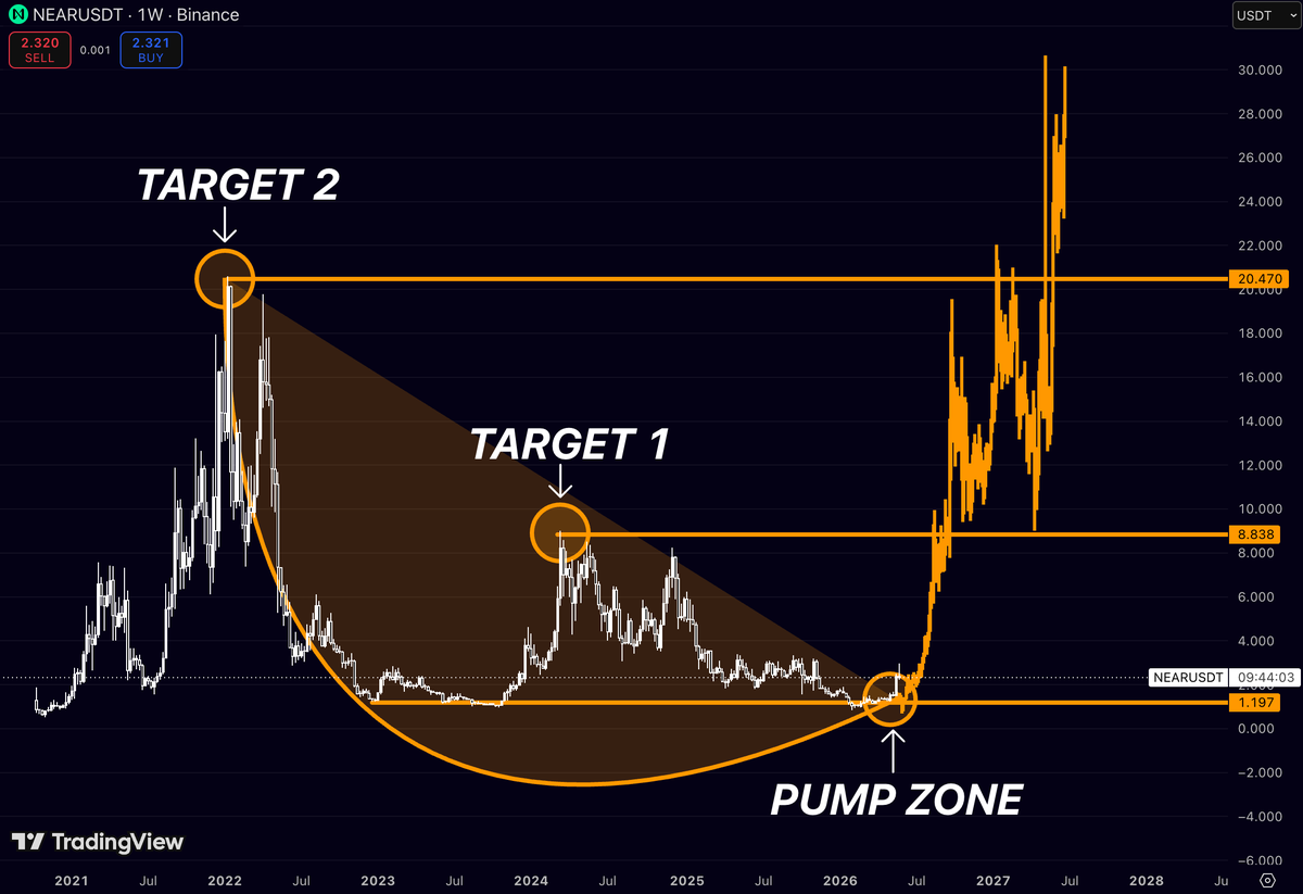
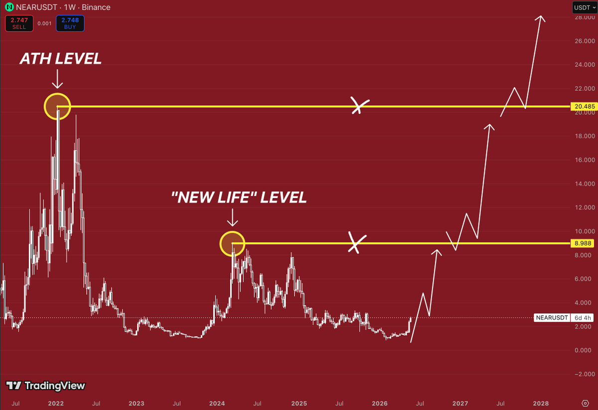
$NEAR spent almost 4 years building one MASSIVE base
The entire structure points back to the same zone:
Pump Zone: $1.19
Target 1: $8.84
Target 2: $20.47
What catches my eye is how every major cycle peak lines up with these levels
The 2022 top created Target 2
The 2024 rally stalled almost exactly where Target 1 sits today
And now $NEAR is back at the same launch area where previous impulsive moves started
If history decides to rhyme one more time, this chart isn’t talking about a move to $5 or $10
It’s talking about a return to levels most people stopped believing were possible
$LUNC
This is the kind of chart that makes people uncomfortable
Not because it’s weak
Because it’s already proving them wrong
For years, $LUNC lived under a massive ceiling while everyone called it dead
Then price exploded out of the breakout zone and started doing something even more important: turning old resistance into support
The first major level around 0.00028 gave way
Now price is attacking the final historical barrier near 0.00065
The same zone that rejected every rally attempt before
And here’s what catches my attention:
The move into resistance isn’t happening after a vertical spike
It’s happening after months of grinding higher, building structure, and absorbing supply along the way
That’s usually how sustainable trends develop
Most traders are still anchored to what happened to $LUNC years ago
The chart only cares about what’s happening now
And right now, it’s sitting one breakout away from revisiting levels that many thought it would never see again
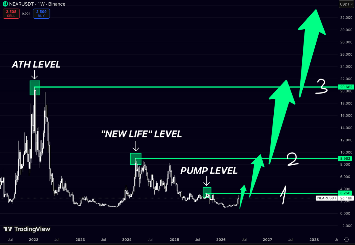
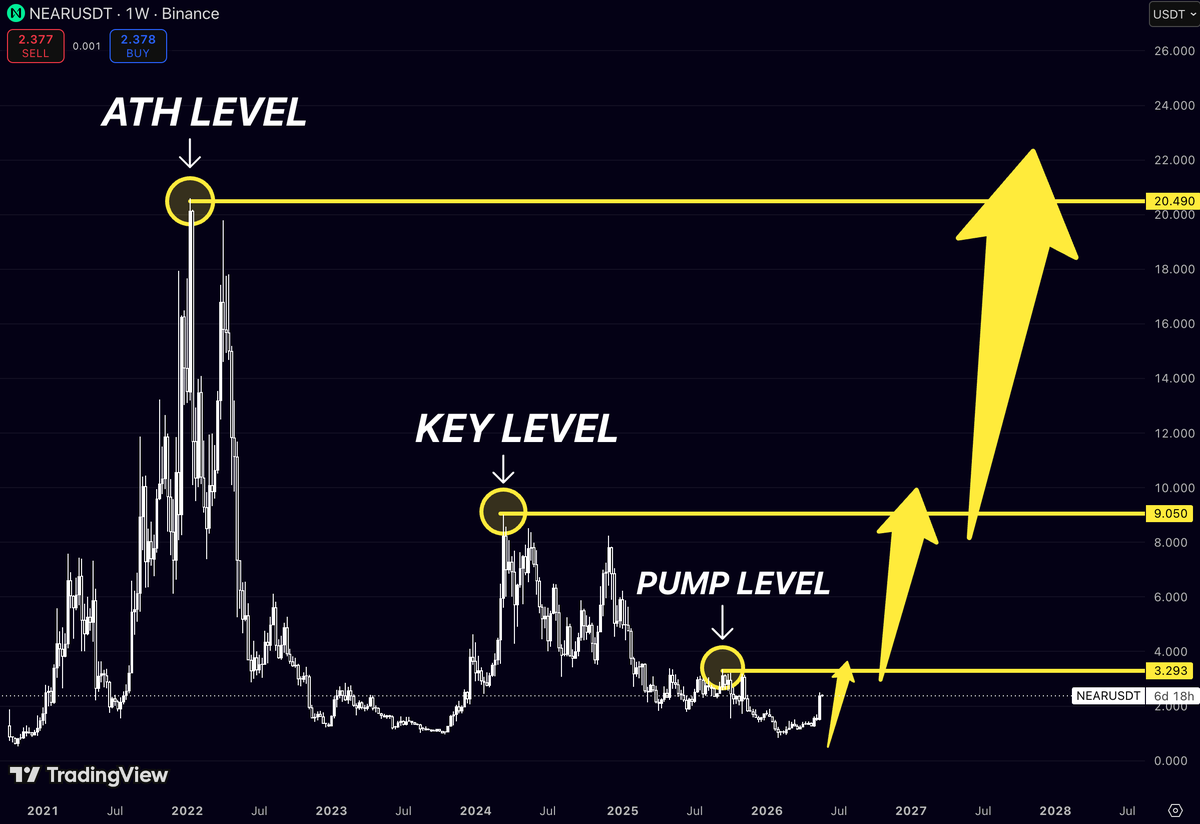
$INJ looked exhausted after the 2024–2025 distribution phase
Momentum faded
Buyers disappeared
Most traders stopped treating it like a market leader
But the current structure is rebuilding from the exact area where previous expansions began
What makes this setup interesting:
Pump Level marks the first major liquidity zone
Above that sits the “New Life” level where trend perception starts to change
The ATH level remains the ultimate magnet if the cycle fully develops
Price is still trading far below the zones that defined the previous bull market
The strongest leaders often spend months looking forgotten before the next expansion phase begins
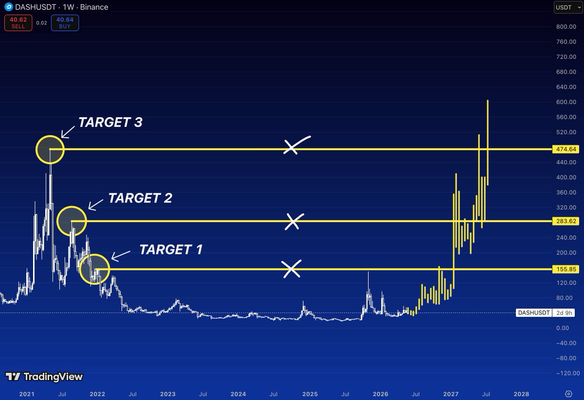
$DASH is quietly building one of the strongest long-term recovery structures among legacy cryptocurrencies
After years of sideways accumulation and fading market attention, the chart is now revisiting the same historical levels that defined the previous bull cycle
What’s important here is that each target comes directly from major reaction zones where price previously found support, resistance, or explosive momentum
The first major target sits at $155.85
This was a crucial level during the 2021 cycle and acted as a major battleground between buyers and sellers
Reclaiming it would confirm that $DASH has transitioned from accumulation into a true expansion phase
For many market participants, this is where the asset would return to relevance
The second target is located near $283.62
This area represents one of the strongest historical resistance zones on the chart
During the previous cycle, it served as a key pivot before the move toward the highs
If $DASH can break above and hold this level, it would signal a complete change in long-term market structure and likely attract significantly more attention from investors
The final target stands at $474.64
This level marks the upper resistance zone from the last major bull run and represents the ultimate objective of the recovery structure
A move into this area would mean $DASH has recovered a substantial portion of its multi-year bear market losses and re-established itself as a major player among older crypto assets
The roadmap is simple:
$155.85 - First breakout target
The level that confirms bullish momentum is returning
$283.62 - Major resistance zone
A break above here would validate the larger recovery thesis
$474.64 - Long-term cycle target
The area where $DASH would approach its former market strength
What makes this setup particularly interesting is that $DASH has spent several years building a base while most traders focused on newer narratives
Historically, some of the strongest percentage moves occur when forgotten assets finally break out of long accumulation ranges
The longer the compression, the more explosive the expansion can become
If momentum continues to build, the path toward $155 → $283 → $474 becomes one of the clearest long-term structures currently visible on the chart
$NEAR is sitting at a level that has historically marked the beginning of its strongest expansions
The first target is around $3.25
The current pump level and the closest major resistance
This area acted as a turning point during previous cycles, making it the first checkpoint for bullish momentum
A clean break above it would signal that buyers are taking control again after a long accumulation phase
The second target sits near $8.96
This is where $NEAR previously transitioned from consolidation into a powerful trend
Reclaiming this zone would completely change market sentiment and likely attract a wave of new participants who have been waiting for confirmation of strength
The third and most important target is around $20.66
Close to the previous cycle’s ATH zone
This level represents the final major resistance before price enters true price discovery territory again
Historically, once assets revisit these areas, volatility and momentum tend to increase dramatically
What’s interesting is the structure itself
After spending years correcting from the 2022 highs, $NEAR has built a broad base while most market participants lost interest
These long accumulation periods often create the foundation for the largest moves because supply gradually transfers from weak hands to long-term holders
If the bullish scenario plays out, the roadmap is straightforward:
$3.25 - first breakout confirmation
$8.96 - trend reversal fully confirmed
$20.66 - return to major cycle highs
For many traders, the real story isn’t the targets themselves
It’s that $NEAR is approaching the same zones where previous multi-hundred-percent moves began
The market has spent years compressing
Now it’s approaching the point where expansion becomes possible again
$ZEC spent years trapped below the same major resistance zones while most of the market ignored it
Now the chart is doing something completely different
Price reclaimed every historical support level one by one
And each reaction from support created a stronger expansion than the previous move
The structure no longer looks like a dead coin
It looks like a long-term accumulation finally transitioning into a momentum phase
What stands out here:
Multi-year base already formed
Strong reaction from the $212 support zone
Previous resistance levels around $303 and $370 flipped into acceptance areas
Weekly candles are expanding vertically with almost no pullbacks
The interesting part is that $ZEC still hasn’t revisited the true euphoric zone from prior cycles
Most traders focus on coins already trending on social media
Meanwhile older large-cap names quietly build the cleanest macro reversals
$CHZ spent almost 3 years in a slow bleed while attention rotated into newer coins and faster narratives
Most traders stopped watching it completely
But the weekly structure is starting to change
Price is now approaching the first major historical resistance after a long accumulation phase
And every reclaim since the bottom has happened with stronger momentum than the previous move
What makes this chart interesting:
Target 1 hasn’t been reached yet
The move toward it already triggered expansion volume
Above that, liquidity opens toward the higher cycle levels
The entire structure still looks early compared to previous runs
The biggest moves usually begin when a chart still looks “forgotten” to most of the market
$TEL spent years fading into irrelevance while MOST of the market moved on
Now price is reclaiming historical breakout levels one by one
And the structure looks almost identical to the early stages of previous parabolic expansions
What stands out on the weekly chart:
Target 1 already reclaimed
Target 2 sits near the next major liquidity zone
Target 3 aligns with the original cycle resistance
The important part isn’t the targets themselves
It’s the fact that momentum returned after a multi-year accumulation phase while sentiment is still extremely low
$NEAR spent almost 3 years under resistance
Charts that survive that long usually don’t stay quiet forever
After the 2021 hype cycle, price spent years bleeding and destroying sentiment
Now the chart is approaching the levels that historically change everything:
$9 → trend reversal confirmation
$20+ → full return to ATH territory
The interesting part is how long $NEAR has been building a base under resistance
That usually matters more than short-term volatility
Because when a market spends years compressing under major supply, the breakout can become explosive once liquidity returns
Most people won’t care until price is already trading much higher
But structurally, this is the type of chart that can completely change character after reclaiming the first major level
$RENDER still has one of the strongest AI narratives in crypto
And the chart is starting to reflect it again
After a brutal reset from the highs, price is now sitting near long-term accumulation levels while reclaiming previous support zones
The roadmap on this structure is pretty clear:
~$5.5 → first major reclaim
~$11.8 → expansion zone
~$13.8+ → macro breakout territory
What makes $RENDER different is that the narrative never really disappeared
AI demand kept growing even while the chart cooled off
That’s usually what strong cycle leaders look like before the next expansion phase begins
Technically this setup resembles:
long-term accumulation
seller exhaustion
support stabilization
early trend reversal structure
Once momentum returns to AI-related assets, $RENDER is one of the first charts traders will start watching again
$NEAR holders checking hotel balconies while waiting for TARGET 2 😭
But structurally this chart is actually becoming very interesting
After a full multi-year reset, $NEAR is starting to print the kind of accumulation base that strong altcoins form before trend reversals
The important levels are obvious:
~$8 → first major reclaim
~$20 → macro resistance / TARGET 2
above that = full expansion territory
What makes $NEAR dangerous is the combination of:
AI narrative exposure
strong ecosystem activity
one of the cleaner long-term chart structures in crypto
Most people only notice these charts after they already move 300–500%
Right now it still looks “dead” to the majority
That’s usually where the biggest reversals begin
$ASTER has the type of structure traders hunt for before explosive repricing phases
The entire chart is compressing inside a massive falling wedge while volatility keeps shrinking near the lows
That’s important because:
falling wedges after long downtrends often resolve violently upward once resistance breaks
The current zone around the wedge apex is the decision point
You can see how price stopped making meaningful lower lows while pressure from sellers weakened over time
That usually signals exhaustion, not strength
The breakout trigger here is psychological as much as technical
Once price escapes the wedge with volume, the market narrative changes instantly:
from “dead launch chart” → “new momentum breakout”
And because $ASTER is still relatively early in price discovery, upside moves can become irrational very quickly if liquidity rotates in
The ATH area near $3 becomes the magnet once momentum confirms
But the real signal is whether the current compression resolves upward with sustained closes outside the structure
That’s where trend acceleration normally begins
$ONDO is starting to print something very different from the earlier structure
Before, every rally created a lower high and immediately rolled over
Now price is compressing near the lows while holding a higher base
That’s usually how breakout structures begin
The interesting part is the geometry on this chart:
descending resistance getting weaker
flat accumulation forming underneath
then a sharp expansion attempt out of the range
That breakout near the $0.45–0.50 area matters a lot because it’s the first time buyers showed real aggression after months of slow bleed
And once charts like this escape long compression zones, they often move much faster than expected because there’s very little resistance overhead
The market still sees $ONDO as “cheap because it dumped”
But structurally, this looks closer to a transition from distribution → accumulation → expansion
If RWA narratives stay strong, $ONDO could easily become one of the charts people wish they paid attention to earlier