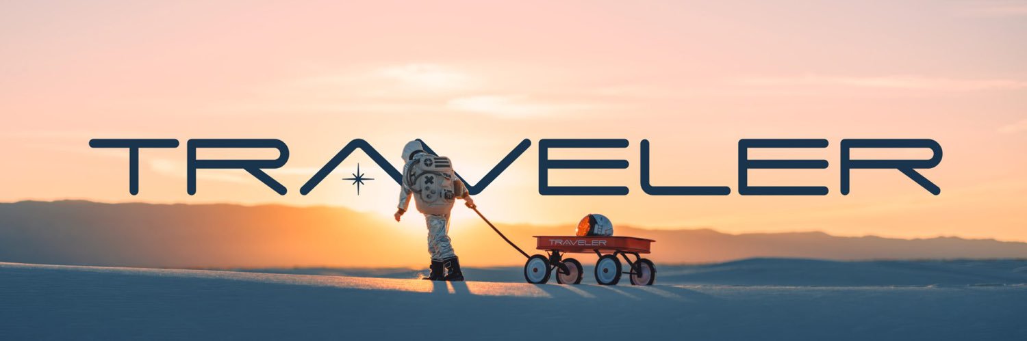
I'm purely going by the letter shapes of the L's and K's. They are very different. 🤷♂️ don't know what else to say.
That logo font is almost certain Franklin Gothic SB Condensed. Though it could also be Kapra Neue Pro.
I think to font our dear @FKA787 used is a knockoff version emulating one of those.
No need to question my education here. Though I've taken more than a few type classes.