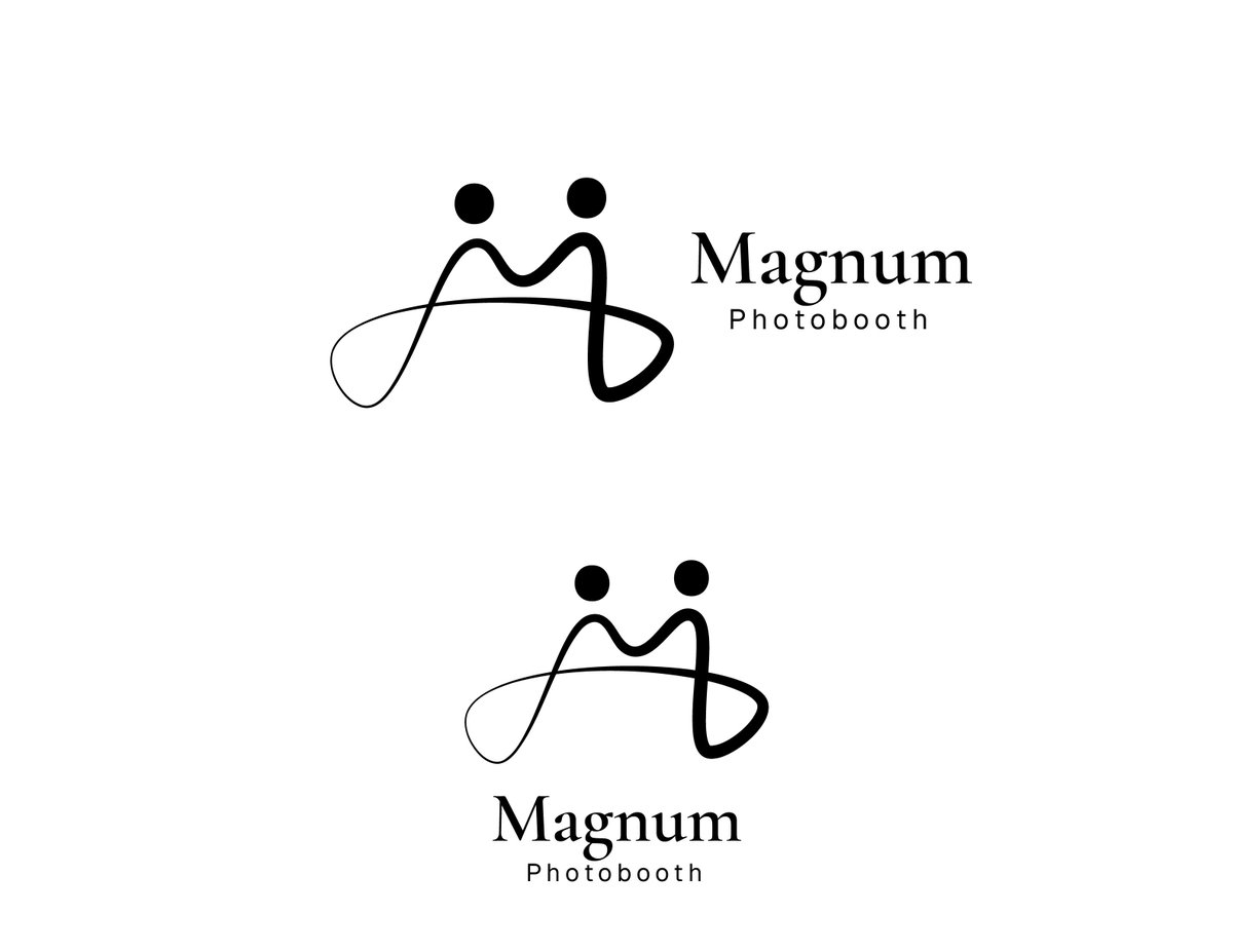
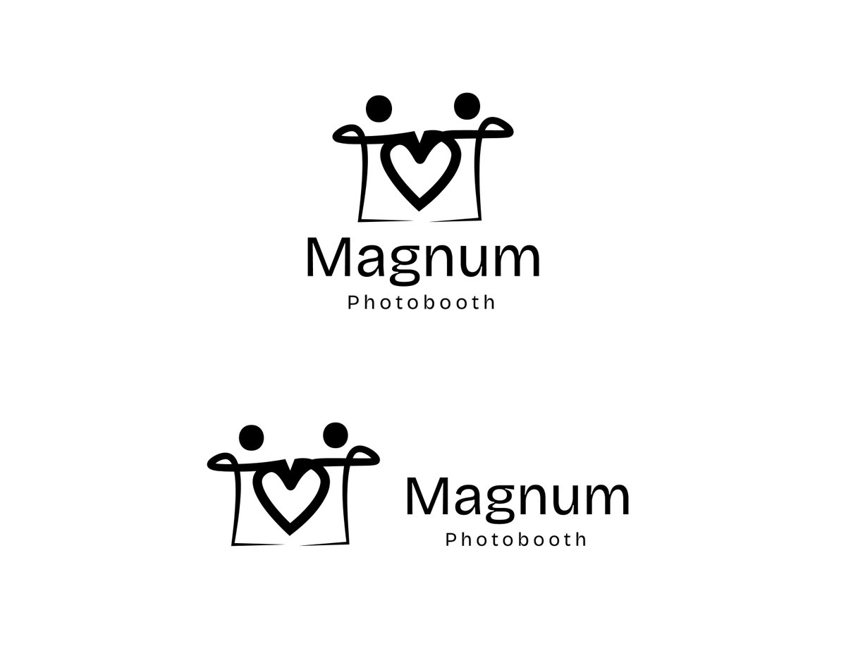
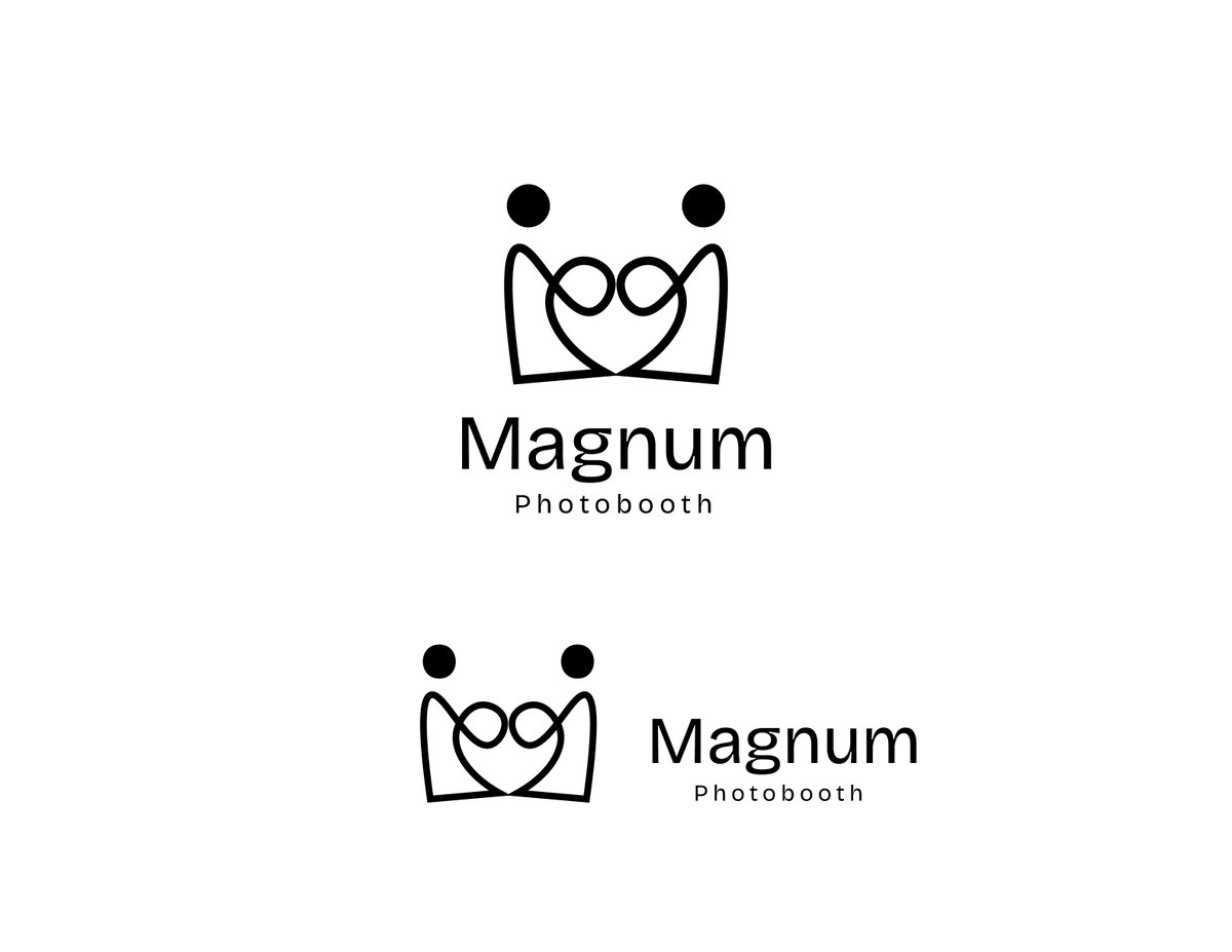
Currently cooking something for Magnum Photobooth 👀📸
I’ve been exploring a logo direction for a photobooth brand called Magnum Photobooth, and instead of starting with the obvious camera icon, I wanted to build the identity around what a photobooth actually represents.
People. Connection. Love. Memories.
The main idea is to create the letter M using two people standing together.
As I developed the sketches, I noticed an opportunity to introduce a heart shape between them, which represents the emotional side of photography and the moments people want to remember.
I’ve also been experimenting with elements inspired by a camera lens and Polaroid photographs to connect the symbol back to photography without making the logo feel too predictable.
So the concept is basically:
M for Magnum
Two people for connection
Heart for memories and emotion
Photography elements for the service
Right now, I’m exploring different ways to bring everything together without overcomplicating the mark.
The next stage is all about simplification.
Cleaner curves.
Better proportions.
More consistent strokes.
Stronger typography.
Better negative space.
And most importantly, making sure the symbol still works when it’s tiny.
After that, I’ll start testing colours and mockups across photo strips, event backdrops, social media, booth branding and other applications.
It’s still very much a work in progress, but I think there’s something interesting here.
Which of these explorations would you develop further? 1, 2, 3 or 4? 👀
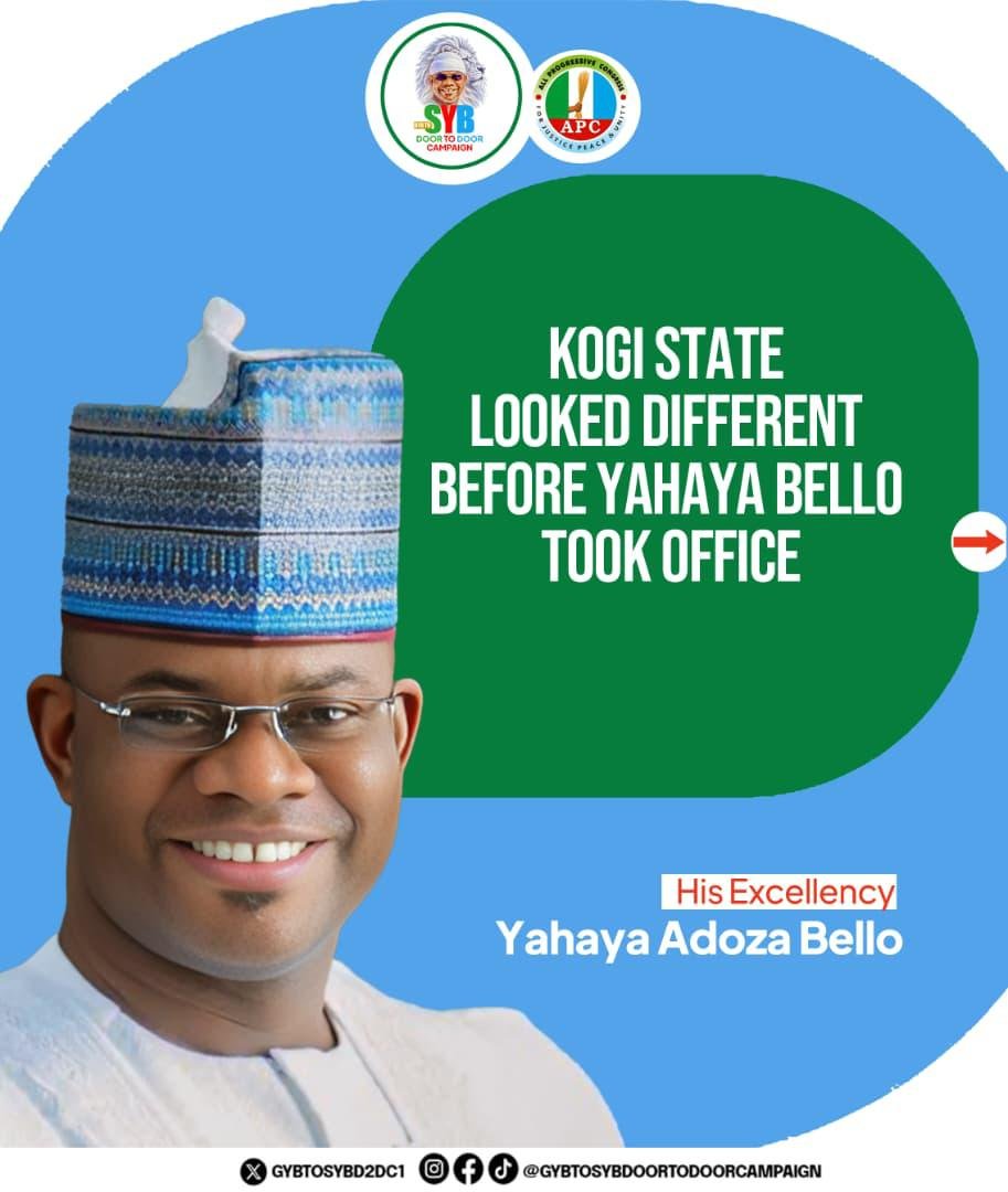
For those who know Kogi Central well, development here was never just roads and buildings. It was vision, courage and transformation.
Bello came, saw, and made his mark and in 2027, Kogi Central will feel his impact.
Vote Yahaya Adoza Bello for Senate.
#YahayaBello4Senate
E get some kind drinks wey you no ft see for my mouth again and hollandia yoghurt is among them. Fake Hollandia too plenty outside. Stay save out there