Individual logos for Lenstec's SoftecHD, Astrea and ClearView product ranges, each designed to communicate that product's own specific features. 👁️ #MedicalDeviceBranding#ProductBranding
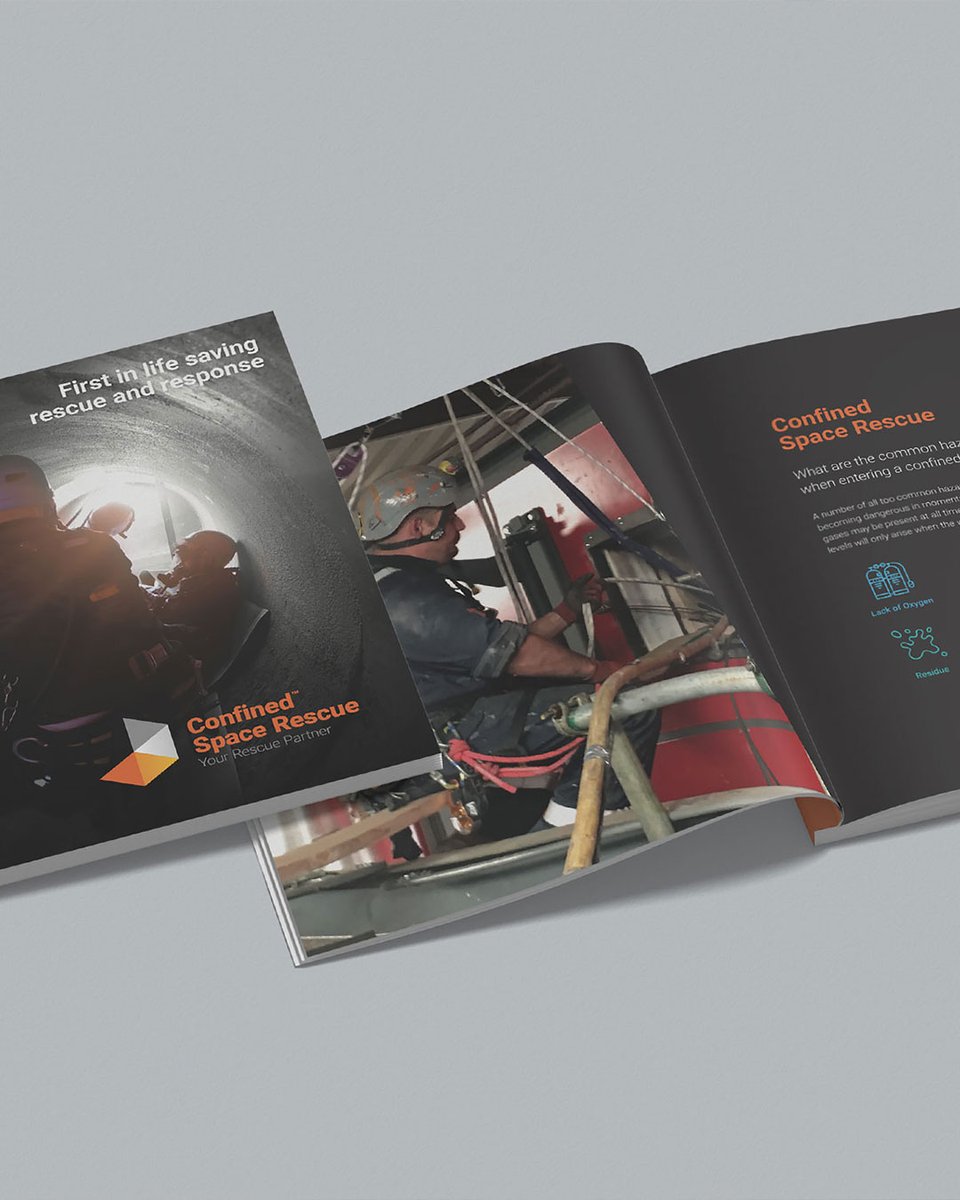
Icons for every service sector turn Confined Space Rescue's brochure into a genuine one-stop-shop for anyone assessing their capability. 👷 #SafetyBrochureDesign#B2BBrochure
We pulled a design motif straight from RCE Electrical's existing logo and carried it through the whole site. #ElectricalContractorWebsite#B2BWebDesign https://t.co/CMhApXyYwX
Playful cartoon graphics for iShop's automated launderette in Huddersfield, signage designed to catch the eye of passers-by. 🧺 #LaunderetteSignage#CartoonIllustration
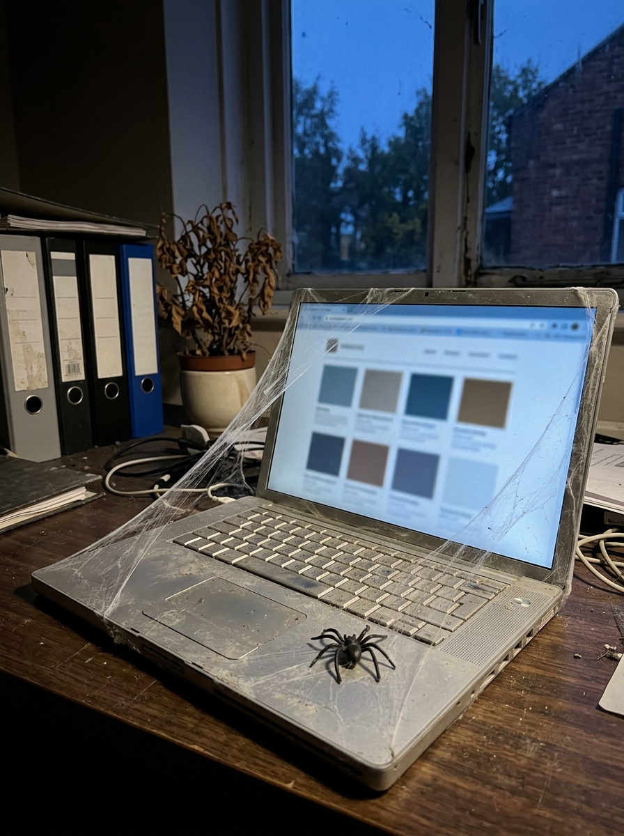
🎃 Design horror stories we fix most: script fonts nobody can read, menus four levels deep, three versions of the same logo. 😱 All fixable. See our case studies: https://t.co/zmFXuEqKEp #DesignHorrorStories#WebDesignTips#Halloween
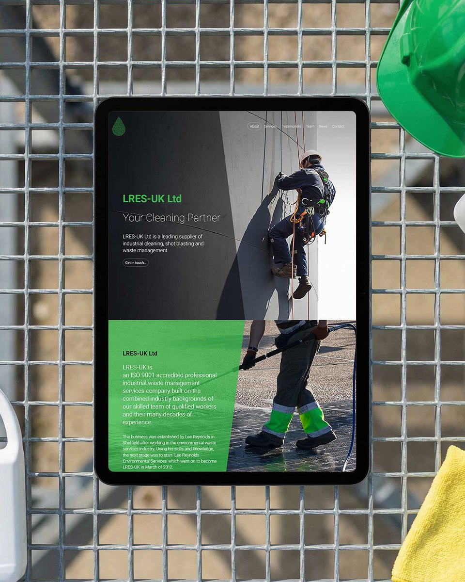
Our second website for LRES-UK keeps the bold green brand their clients recognise, with icon-led navigation and full client content control. 💚 #IndustrialCleaningWebsite#B2BWebDesign https://t.co/ErzVsZeOBG
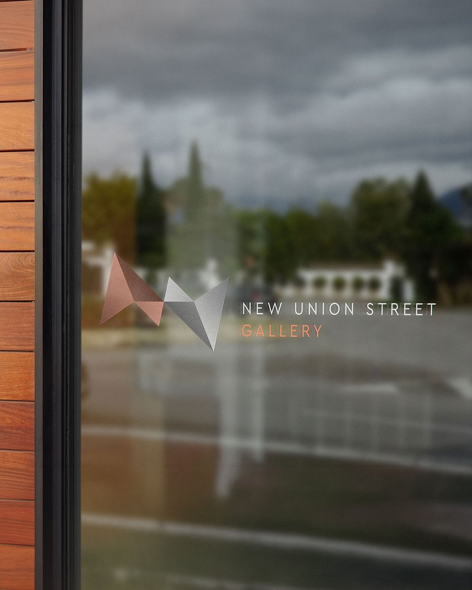
Abstract N and U letterforms in silver and copper tones give New Union Street gallery a logo that echoes the building's own architecture. 🖼️ #GalleryBranding#ArtSpaceLogo
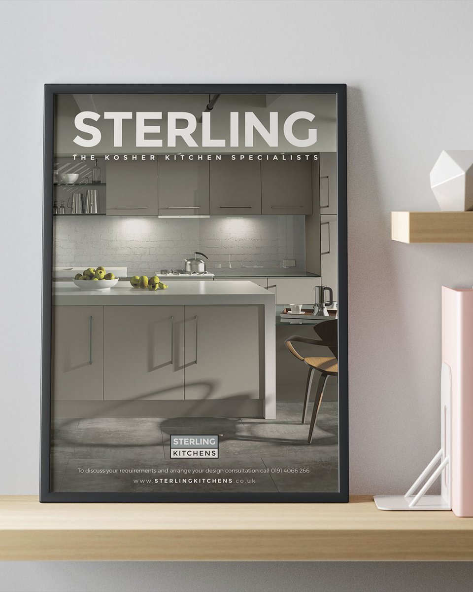
An avant-garde advert for Sterling Kitchens, built around aspirational 3D visualisations of their bespoke kosher kitchen designs. 🧑🎨 #KosherKitchenDesign#3DRenderingDesign
A portfolio-led design for architectural visualisation specialists Tangible Visual, built by their own team from our design and documentation. 🧑💻 #ArchitecturalVisualisation#CreativePortfolioDesign https://t.co/YYNnCK9CLn
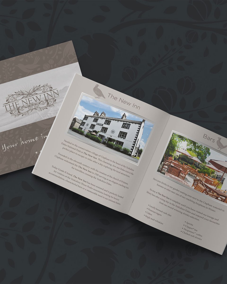
A concept brochure for The New Inn, positioning it as both restaurant and accommodation, with William Morris-inspired patterns and real-world photography. 🐇 #RestaurantBranding#HospitalityDesign
Before your next post, ask who it's for. Who makes the decision? Where are they online? What makes them stop scrolling? 🤔 Our social media work starts with audience. Content comes second. https://t.co/5pgZLN5KGz #GetToKnowYourCustomersDay#SocialMediaStrategy#B2BMarketing
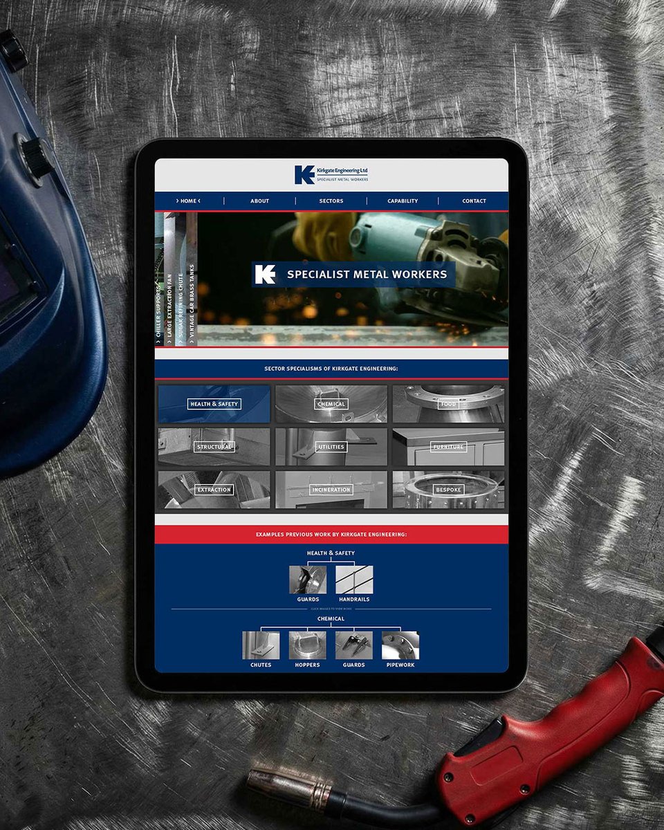
Black and white photography and targeted SEO: our second website for Kirkgate Engineering supports lead generation in a competitive sector. ☎️ #EngineeringWebDesign#ManufacturingMarketing https://t.co/Sun4WPDaUP
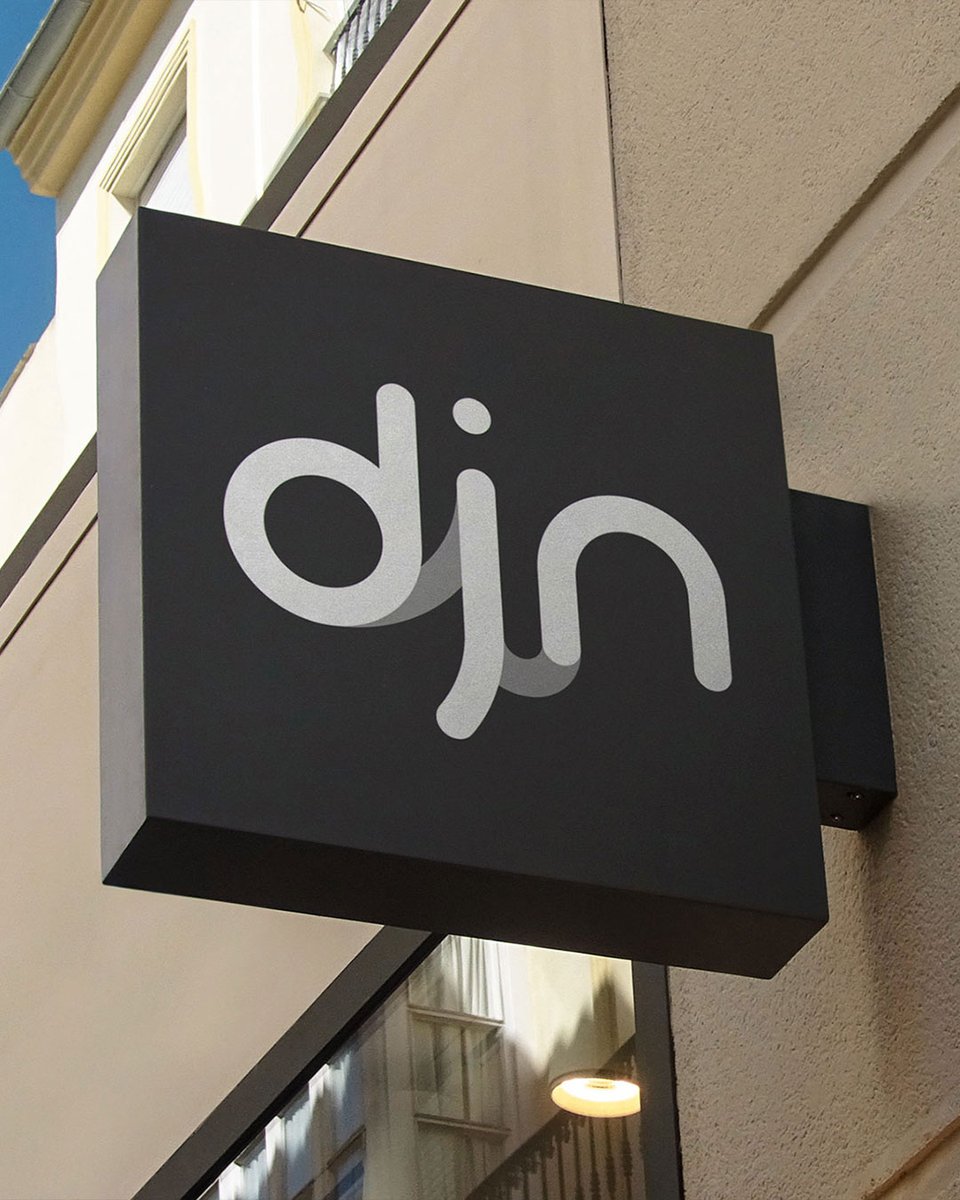
Fluid lines between the letters give DJN Accountants' logo a modern, dynamic feel without sacrificing legibility. 👓 #AccountancyBranding#ModernLogoDesign
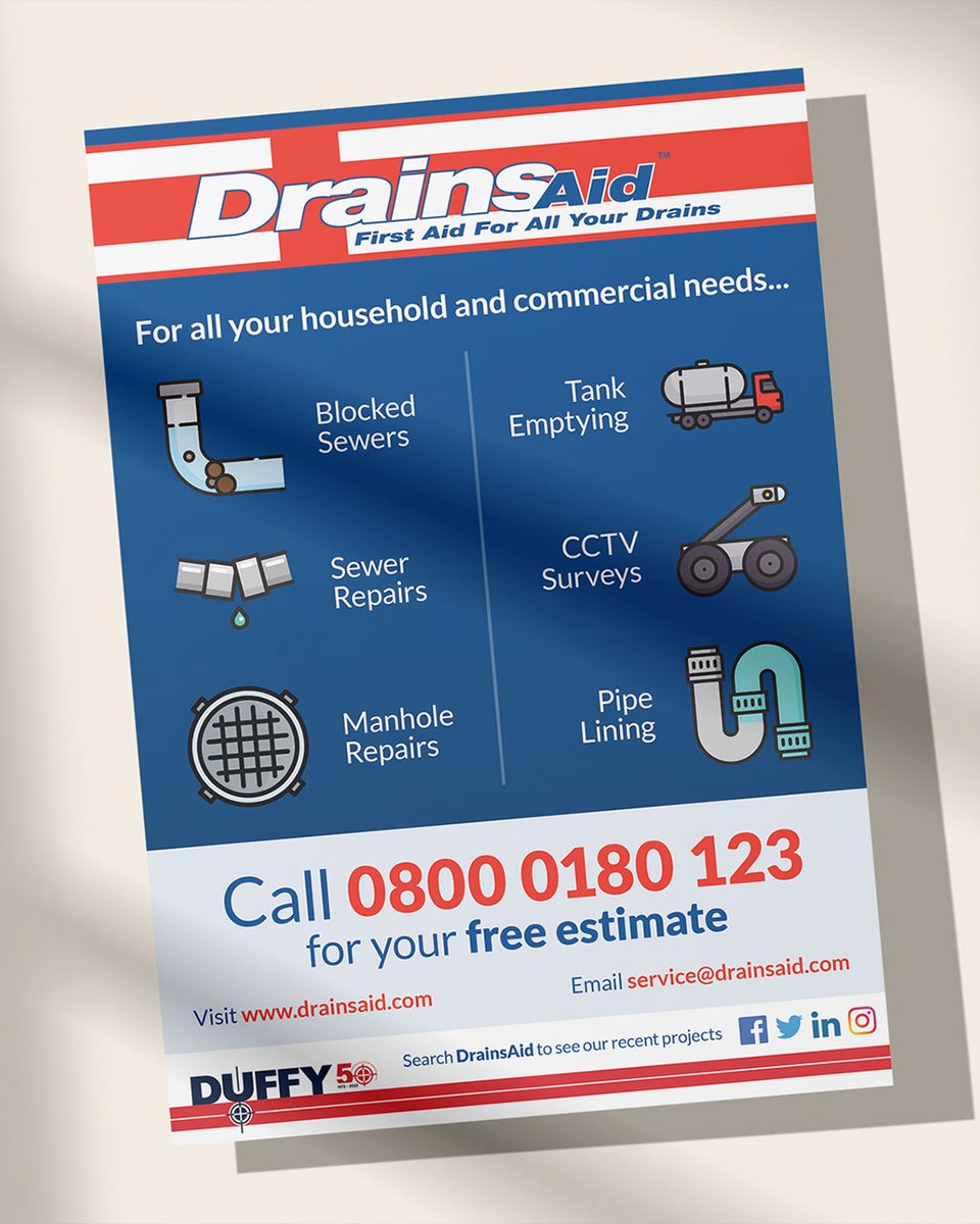
We elevated DrainsAid's existing design and added service icons so their flyer instantly communicates the full range of services on offer. 🚽 #FlyerDesign#LocalAdvertising
Dyslexia Awareness Week: three web design choices that make any site easier to read. 👍 Clear sans serif fonts. 1.5 line spacing, left-aligned. Plain language under clear headings. https://t.co/DQbBmP6Yxh #DyslexiaAwarenessWeek#AccessibleWebDesign#UXDesign
Our second website for Butterfield Plant Sales, 50+ years in plant machinery, has been directly credited with converting visitors into buyers. 🚜 #PlantMachinerySales#B2BWebDesign https://t.co/FoIIrlu8Go