The foldable smartphone paradox:
Square inside, perfect outside. The big screen letterboxes every video.
Wide inside, stubby outside. The cover screen's so short you're scrolling nonstop.
Every design just moves the compromise.
Two screens, and somehow never two good ones.
@TokenGremlin And how exactly would I know that I have it? Does anything change in the UI? I still see the same effort slider and absolutely no mention of the model used just like when it was 5.6 in chat
@leerob@bot More usage, more connectors, and please sort out the confusing Cursor/Grok subscription/usage tier situation. Also, the Android app still needs some polish, especially in how scrolling feels and how long it takes to load chats
@SnazzyLabs They're not good ideas though, they're gimmicky BS "ideas" (why not remove the thing that made smartphones ubiquitous to begin with - the touchscreen - entirely?) that only sound good if you're a VC in dire need of offloading some tons of cash or if you're 5.
@feedly @andrewgilmartin I have this too. It's not just Chrome, the same happens in Edge and Vivaldi too. Scrolling up seems to be the worst, but "j" for next is also very iffy for the past few days.
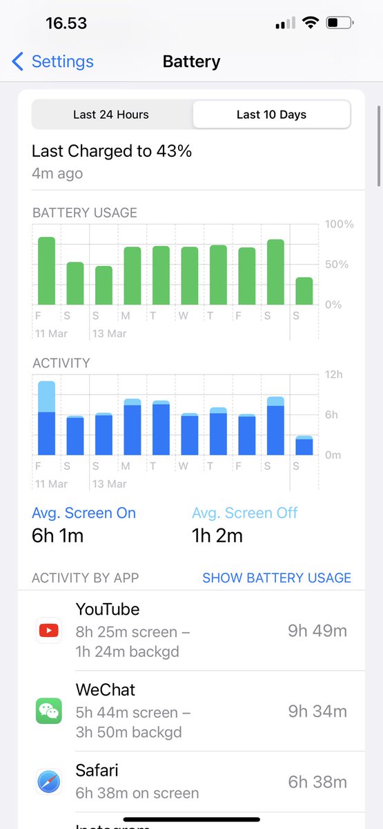
Okay quick question:
I see tweets about 13 Pro Max having phenomenal battery, and I get it the battery is great, but I’m only seeing 6h SOT on average
Any tips on how to read it properly?
@TechAltar in case you haven't finished the Friday checkout yet, this seems big, custom "non-ARM" designs and all (including the tight release timeline): https://t.co/hGxVLrnUgn