Every AI startup site I studied had the same problem.
Same layouts, same promises, a push for the sale before saying who it’s for.
My site is live.
I build clear credible sites that stand out.
Taking 3 founding clients. Book a call below or DM me.
https://t.co/X5puhCI0Yc
Concept hero for @usewonder , one of the most fun brands out there.
Click “Design” colors change, subheadline scale change.
Click “Ships” and it all locks in, like it just merged to the PR.
The mascot reacts to changes.
The hero IS the canvas.
Really love how Calendly handled their redesign.
They injected real brand into the site even though they sell to enterprise, where most companies default to safe components.
Took me:
- 2 years to get my first design client
- 3 more years to land my first $5k project
- 3 more years before I started posting
- 2 years of posting before I started @designme
- then 1 year to take it to $1M/yr
Pretty much 8 years of nothing before anything worked.
Surprised I kept it going for so long.
@adriankuleszo@designme that silent phase before anything is working out is so painful, it really tests your resistance and patience, and shows how much obsession works eventually
The footer has one more detail I haven’t shown.
The hero pattern is back, moving very subtly behind everything. Like I’m still at work in the background while you read.
Noise settling into signal, even at the bottom of the page.
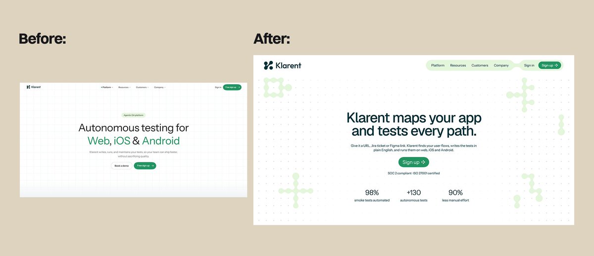
The hero build from Klarent's concept redesign.
Before, the background followed your mouse and said nothing, fully invisible by default.
Now The common QA patterns draw themselves, explaining the product.
Your hero background is probably wasting your best real estate.
I redesigned an QA AI site:
→ Vague copy became a precise headline
→ Background now draws the 6 QA patterns
→ SOC 2 + stats placed where doubt shows up
→ One CTA instead of two
and added some brand touches👀
Been doing cold outreach as a new web designer for a week now.
What I've learned:
1. Specific messages get replies, generic ones get ignored
2. Most people never answer, and that's normal
3. Showing the work first beats explaining myself
No clients yet. More updates soon.
@seb__design yes everyone's debating whether AI is good or not, when in the end of the day results are what matter.
people are still shipping WordPress templates btw!
My process section follows the same manual style as the work section.
Each step animates one by one fast enough to see it.
The illustration draws itself.
Same sequence for all three steps, so the process explains itself in the order you read it.
@maguro_tanaka Glad it helped! A good test for any step-by-step layout is whether the reading order feels obvious without instructions. What’s the book about?
Your hero background is probably wasting your best real estate.
I redesigned an QA AI site:
→ Vague copy became a precise headline
→ Background now draws the 6 QA patterns
→ SOC 2 + stats placed where doubt shows up
→ One CTA instead of two
and added some brand touches👀