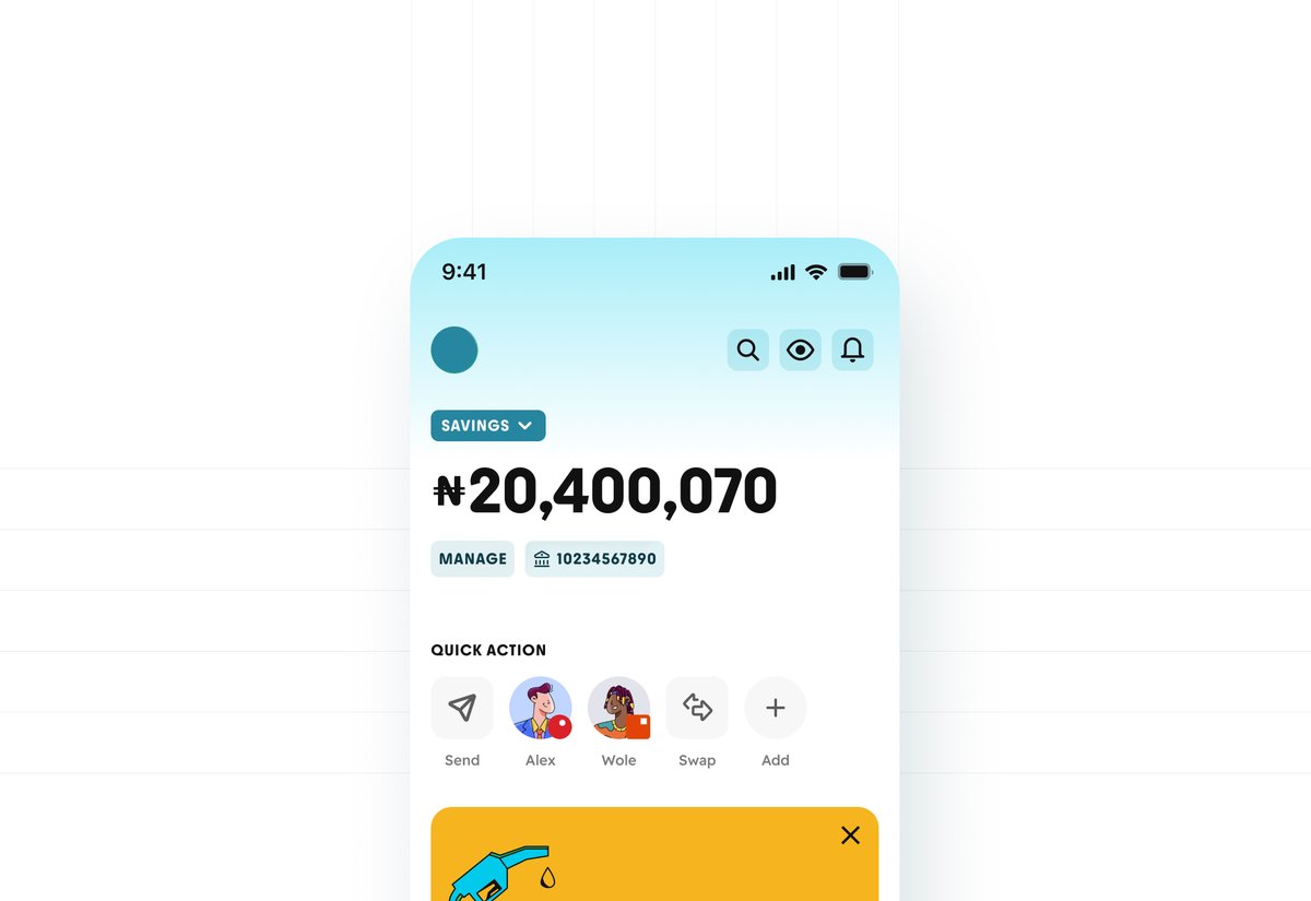
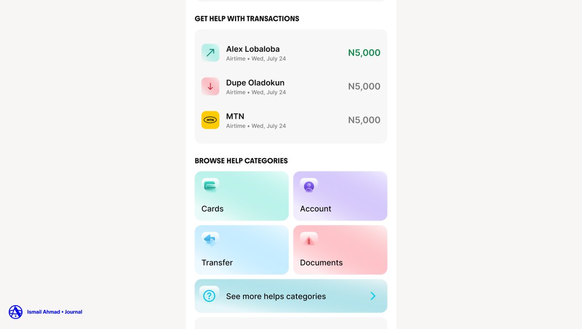
Some of the scenarios we were using the icons for. We tried to fit it in, but it was going to be a lot of work when time comes to scale. Especially with the APCA.
❤️🔥 Just Recorded a 16 min Tutorial on How to use Gemini 3.1 + Seedance 2.0 Build Cinematic $10k Websites (step-by-step)
You can now build stunning marketing sites fully with AI
Couldn’t decide on color for the site, so color auto generated based on visitors preference. Light tone for days, dark tones for evening.
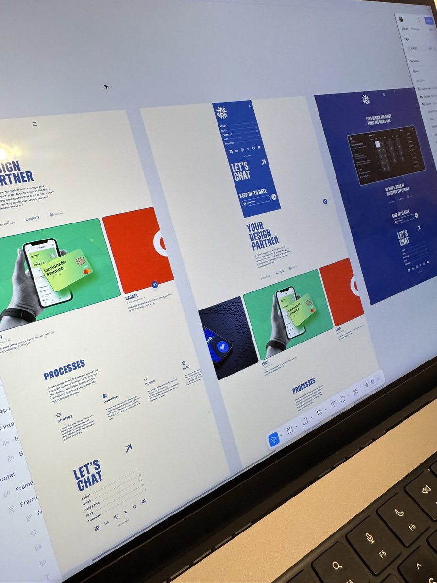
The only thing Claude need to help me with is generate infinite canvas for work(.)page. Yeah, Figma is not going anywhere soon.
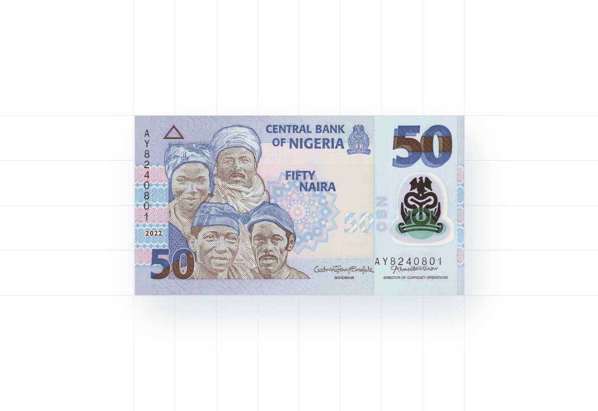
If you look at the new notes you barely see ₦ sign on them, compare to the others, even rupees. What I am trying to say in a nutshell is that, when you're working on a new project that involved Naira symbol, show it some love too.
At least, that's what we hope to do!
The ₦ problem is a symptom of a larger issue, when you're building financial products for African markets, you're often working with typographic and design infrastructure that wasn't built for your currency. Thanks to the like of Ojuju, you can tell it was design for inclusion.
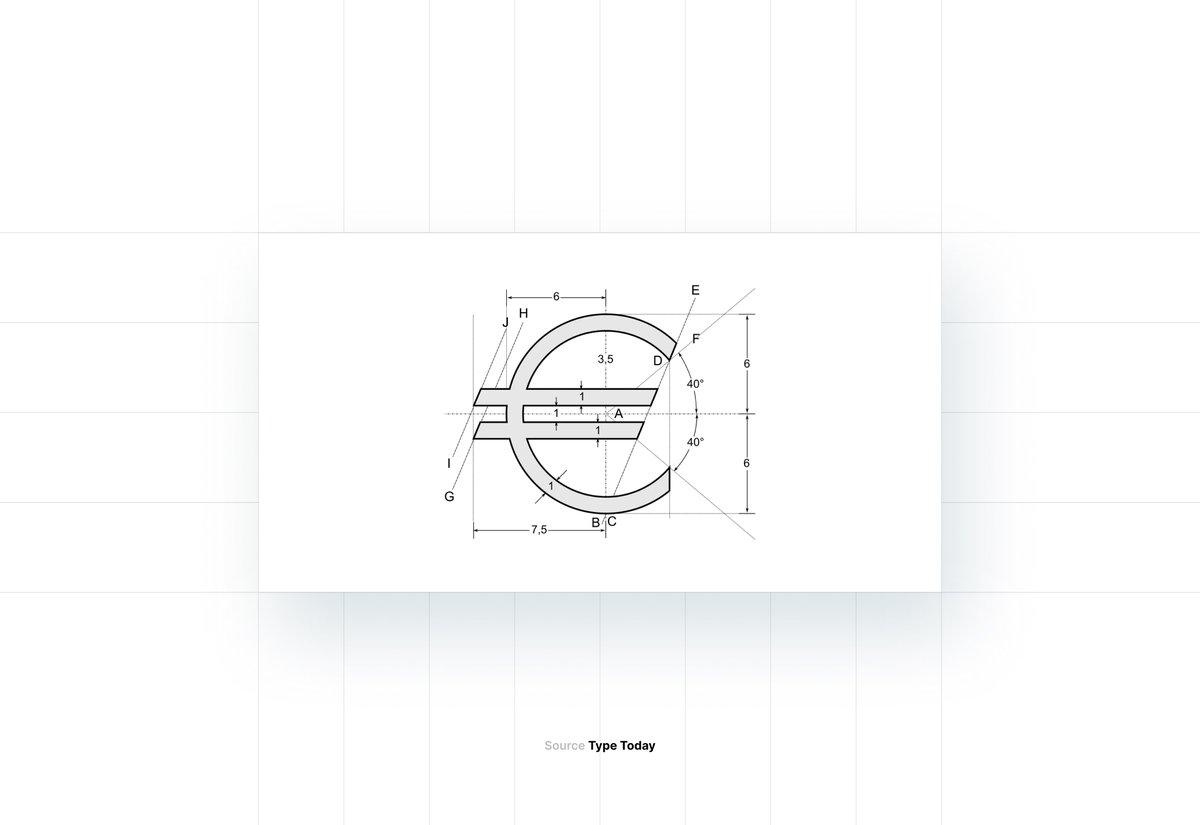
We were having an internal joke on why "₦" was an after thought on the UI were working on. And why it is an hassle to pair, compared to other currencies. Then we went into the rabbit hole on why others currencies symbol sit well with text.
The obvious conclusion was that;