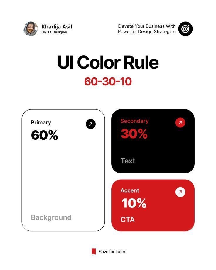
60-30-10 still works.60% dominant (background)
30% secondary
10% accent (CTAs & highlights)
Simple ratio. Strong hierarchy. Easy on the eyes.
One of the most reliable color rules in UI.
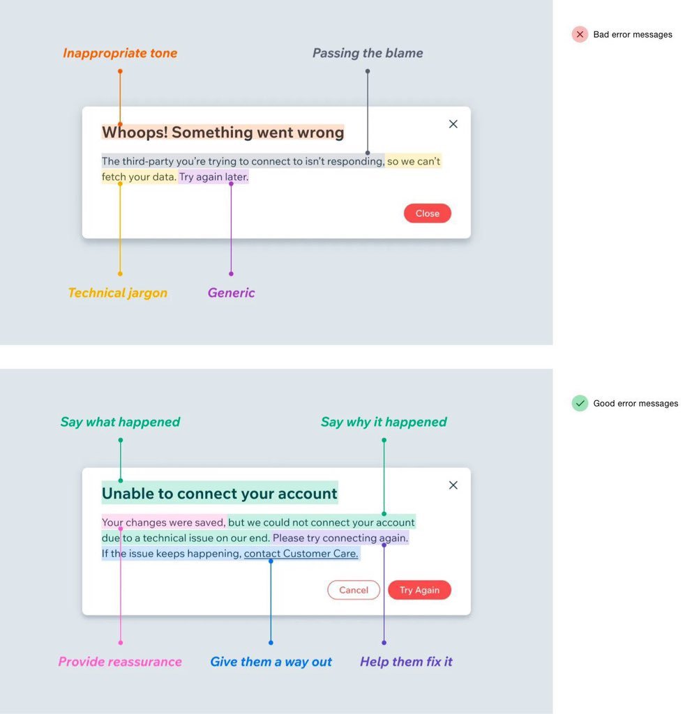
Bad error messages blame and confuse.
Good ones explain, reassure, and help.
Say what happened → why → how to fix it.
Add a clear way out.
Error states are product moments.
Design them with care.
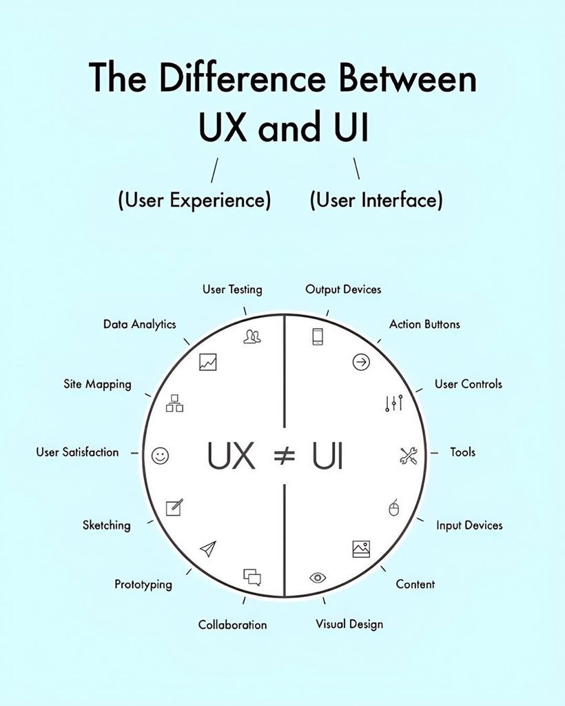
UX ≠ UI.
Still the most misunderstood pair in design.Left side = the experience (research, testing, flows, satisfaction)
Right side = the interface (visuals, buttons, controls, content)One solves the problem.
The other makes it usable and beautiful.Both needed.
Classic optical alignment lesson.
Bad = equal mathematical spacing
Average = partial correction
Good = visual balance (shapes optically centered)
Eyes don’t measure in points. Design for perception, not just numbers.
Hero leads with outcome + objection.
Pain points → Why us → How it works → Benefits creates a clean persuasion flow.
Pricing and CTAs stay visible and decision-ready.
One of the better landing page anatomies I’ve seen for AI products. Clean hierarchy, no fluff.
Most people get C right.
A = Reply
B = Upload
C = ShareIcon meaning is learned, not universal. Consistency > clever metaphors.
Which one feels most intuitive to you?