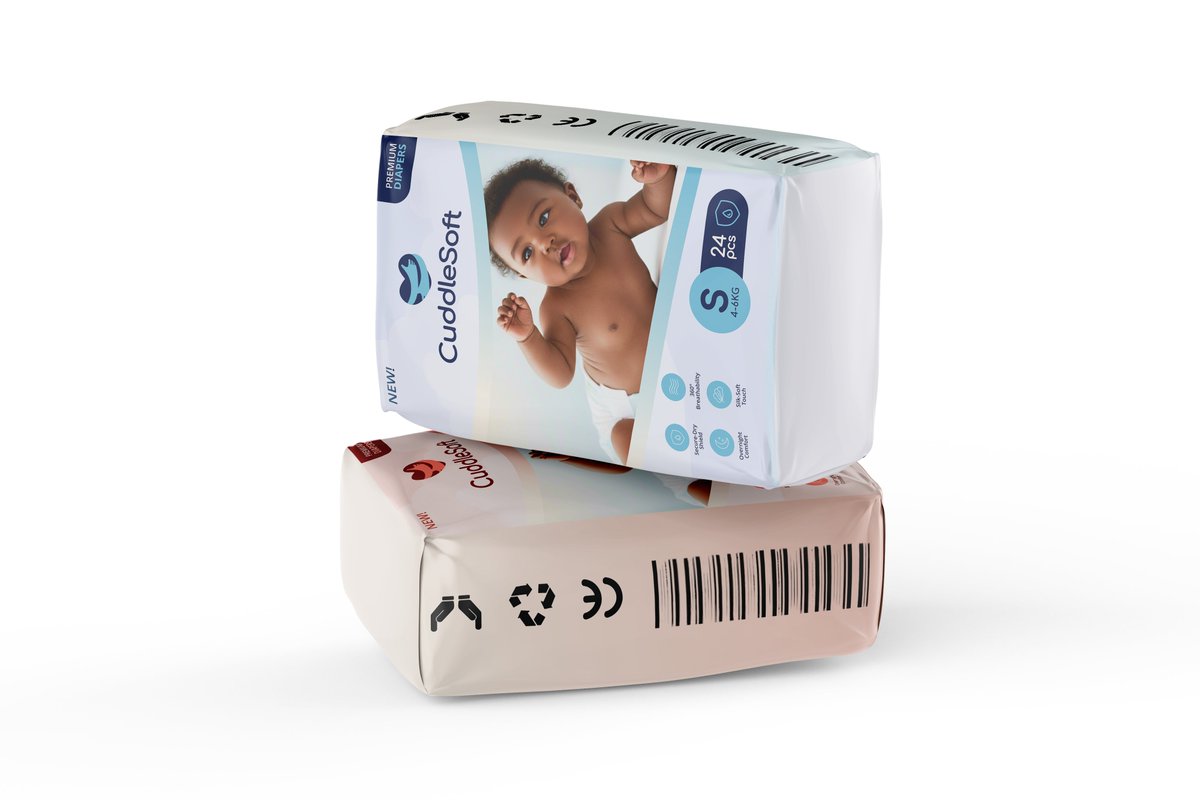
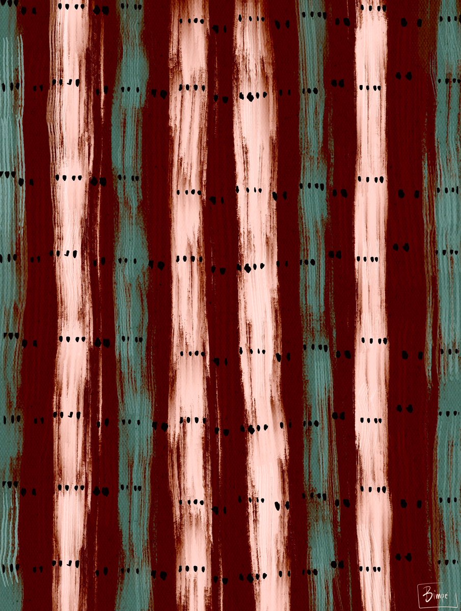
Olddie but Goldie 😊
That's 'me' on the cover of the vogue magazine... You can grace the cover of any magazine of your choice... Just hit me up and I can get it done for you😊😜
#artist#VogueChallenge#VOGUE#illustration
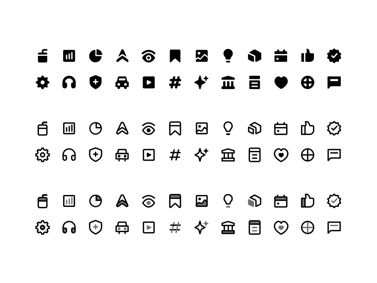
It’s finally happening! I’ve officially launched my icon design course in collaboration with @genezaschool 🎉 🎉
This is everything I wish I had when I was starting out. I walk you through my entire icon design process, and you’ll have access to a dedicated channel to ask questions and get real-time feedback as you learn.
Early bird pre-orders are now open, and the course goes live on September 7th
You can support this launch by pre-ordering, gifting the course to others, or simply interacting with this post.
Preorder link: https://t.co/pyqtkNHRwu
I think every designer should understand the basics of iconography. Even if you can't make one yourself, you should be able to look at a set and tell whether it's good and why.
So here are a few things I look out for.
Variety - does it actually have the icons you need or does it run out halfway.
Consistency - do they all look like one family.
Ease of integration - how easily it drops into what you're already working with, think npm packages and figma plugins.
Maintenance - when was it last updated.
What set do you keep going back to?
Did you know two icons can share the same overall visual properties, yet still feel different? One reason is level of detail.
Designers often check consistency in stroke and size but forget to check whether each icon in a set has a similar amount of visual detail which affects how icons looks from a distance.
After designing an icon set, I run several checks to make sure the icons work well together, not just individually. One of my favourite checks is the squint test, which I do in Figma using layer blur.
With a layer blur applied, it becomes much easier to spot icons that are too heavy or too light. It is a simple trick, but it makes inconsistencies much easier to see.
How do you make an icon set memorable? One way is to give it a personality.
An icon is a very small canvas, so a small decision travels a long way. The problem is that most people only ever play with one or two properties. You would be surprised how much opens up once you start tweaking the others. Corner radius, angles, variable stroke widths, opacity, and that is barely the start. Stack a few of those and the personality takes care of itself.
What memorable icon sets have you seen recently?
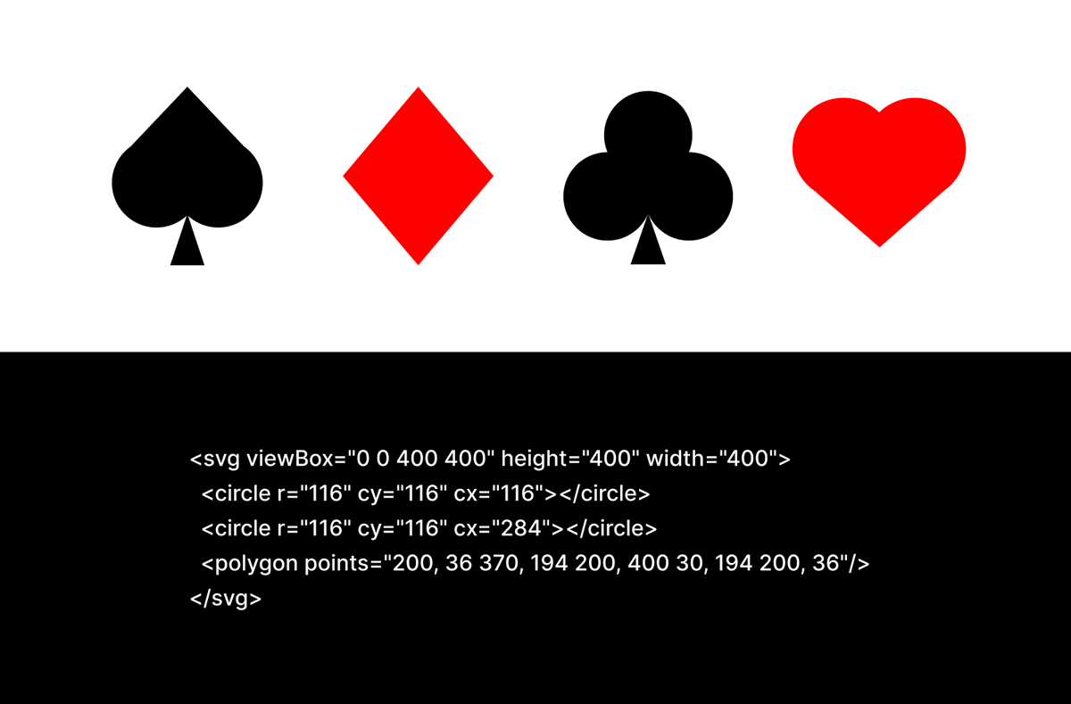
One of my earliest icon projects was designing the four classic suit symbols. The client needed an icon designer with a deep understanding of how SVGs, because the deck was to be built with actual code. Talk about a niche in a niche.
I got it through Mudia. I had called him because I wasn't sure about leaning into iconography, and in that same conversation he mentioned @mark_oyk was looking for my exact skill set. I hadn't finished doubting myself before the answer showed up.
What I was really afraid of was that narrowing down would close doors. It did the opposite.
Can we have an app where we can find everything needed to set up an event all in one place? My head is everywhere and nowhere trying to find a venue. God, please take the wheel.😪
I used the @chowdeck app for the first time yesterday, and I loved how seamless it felt. Funny enough, I screenshot the delivery pin to share it directly with the recipient and Chowdeck noticed. 🙂
Scrolled past a burger illustration on IG by @mashamartt and instantly thought of Kadis Pizza in Ugbowo, Benin. 🔥
Couldn’t eat it, so I recreated it. Ponytail, bold earring, 🦋, 🍕and all.
I didn’t just eat the pizza. I ate the design. Twice as nice.