If you’re curious about our library and how to use it, we just published a bunch of posts on our new blog https://t.co/09BbPCdb3p #DataVisualization#dataviz#chrt
In the Rwandan 🇷🇼 General Elections, President Paul Kagame was re-elected for a 4th term with over 99% of votes 🗳️
Check out the results for both the presidency and the Chamber of Deputies at https://t.co/BYg7jNqq6v
#RwandaElections#PaulKagame#Elections#dataviz
Just published: 2024 - ELECTIONS YEAR
Our latest project explores the 2024 elections around the world , dive into the global pulse of democracy. Check out insights from India, Mexico, and more at https://t.co/WHxBjpGas4
#dataviz#datavis#elections2024
Most cocoa is produced in West Africa. In #WestAfrica around six million hectares are planted with #cocoa which provide about 80 percent of the total world production. #chart#dataviz 1/4
Côte d'Ivoire is the world's largest producer of cocoa, in 2018 it produced 1.96m tonnes of cocoa beans - almost 40 percent of the worldwide production. Cocoa is strategic in Côte d'Ivoire: it accounts for 10% to 15% of GDP, nearly 40% of export earnings. #Ivorycoast#chart 3/4
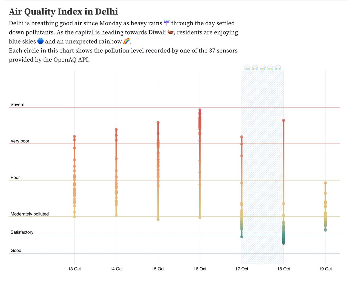
While I’m in Delhi, we thought it could be our first stop for the series!
This chart shows the Air Quality Index (AQI) recorded by 37 sensors spread around the city. Each circle shows the AQI reported by one sensor.
Made with @chrt.io and data from @OpenAQ#charts#dataviz
Delhi could breathe good air for a couple of days as heavy rains ☔ through Monday settled down pollutants. As the capital is heading towards Diwali 🪔, residents enjoyed blue skies and an unexpected rainbow 🌈. This is a series of charts about Air Quality around the world.
The best way to build a product is to use it, right? That's what we are doing with @chrt_io - we have recently built few #Charts with #Formula1 data to flex the muscles of our library with bar charts and range plots
We are working on our diary 🔖 to document the process with bits and pieces of code and ideas from @visualizenews @simonelippolis @littleark
Keep around from more stuff!
Let's make a bar chrt! Bar chart A look at how quickly
🚄 we could code 👩💻 together a simple bar chart with
@chrt_io
Forked from this #ObservablePlot notebook https://t.co/6DjyMkjzKA
Mary Eleanor Hunt Spear (March 4, 1897 – January 22, 1986) was an American data visualization specialist, graphic analyst and author, who pioneered the development of the bar chart and box plot. She worked at the U.S. Bureau of Labor Statistics, Graphic Consultant and Illustrator
“Periods of time may also be compared by using two time scales. Particular care must be taken to identify the time scale with its corresponding curve. This chart compares wholesale prices in two world wars.... #dataviz
This is part 2 in the series from “Charting Statistics” by Mary Eleanor Spear. We are fascinated by the way two different time scales have been used. It is not common to find multiple scales in charting frameworks. https://t.co/9sXCGQ8KsW provides a way to define multiple scales.