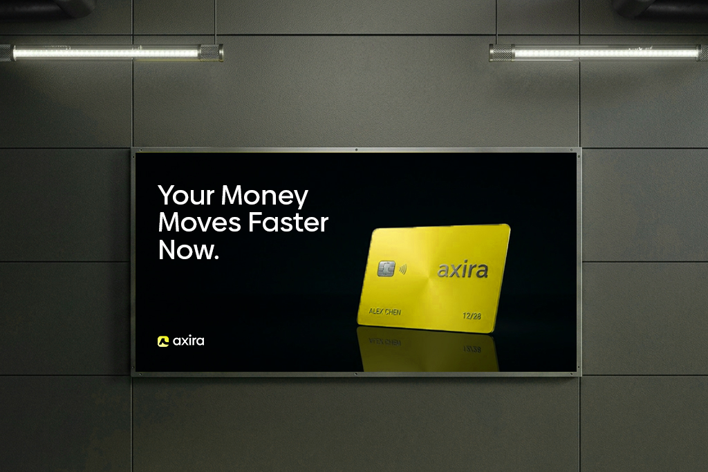
Fintech brands don’t have to be blue.
Blue became the “safe” choice, so everyone copied it. Now most apps look the same.
But users don’t trust color rules. They trust what feels clear and memorable.
Standing out often builds more trust than blending in.
@nsavecom This is exactly what the global earning space needs, real stories and tactical playbooks over income screenshots.
As a brand designer helping companies & brands build a trustable global presence, this resonates deeply
@polyrex_app@Polymarket Great new logo..Make all community channels and announcements visuals use the same geometric style and colors...
Keep it consistent and clean
Add small dino character for updates, will look pro and onbrand
85% of founders think rebrand = logo fatigue.
That's rarely true.
A rebrand is needed when the business has moved forward but users still understand it the old way.
If you're in this stage, Let's have a discussion
Send me a DM or an email at [email protected]
The World Cup generates billions of views.
The brands that stand out don’t rely on visuals alone they win with clarity, consistency and trust.
Design and strategy matter more than aesthetics
That’s how I approach every brand I design.
Welcome to a New Month
A reminder that design isn't decoration
Good design helps
• Build trust
• Make brands easier to understand
That's the focus for every project I take on this month
Currently onboarding clients to improve their branding and visuals. Send me a DM now
good designs are centered around;
- amazing contrast of colors.
- proper alignment of text and elements.
- text and color hierarchy.
- simple typefaces (serif, sans or both).
- images/illustrations.
- a background (plain or not).
- doing whatever comes to mind.
@NinjaPayWallet Smart move. Self-custody QR payments in LatAm, SE Asia & Africa is exactly what’s needed for real
adoption.
Branding and premium designs will be key to building trust. @NinjaPayWallet