#HappyNewMonth 🇳🇬
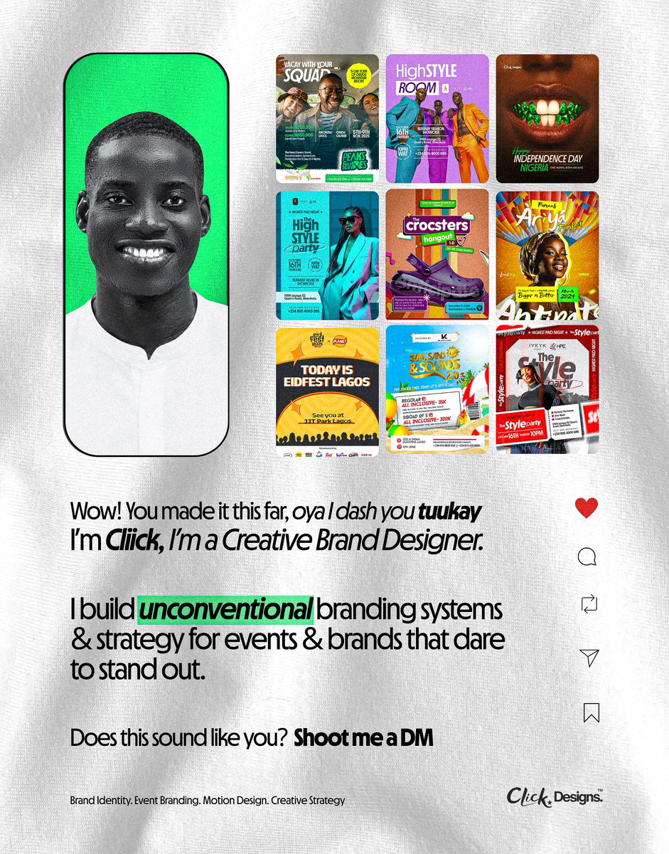
It's been a while since I showed up properly on here. I'm back with a belief that drives my work: the norm can always be redefined.
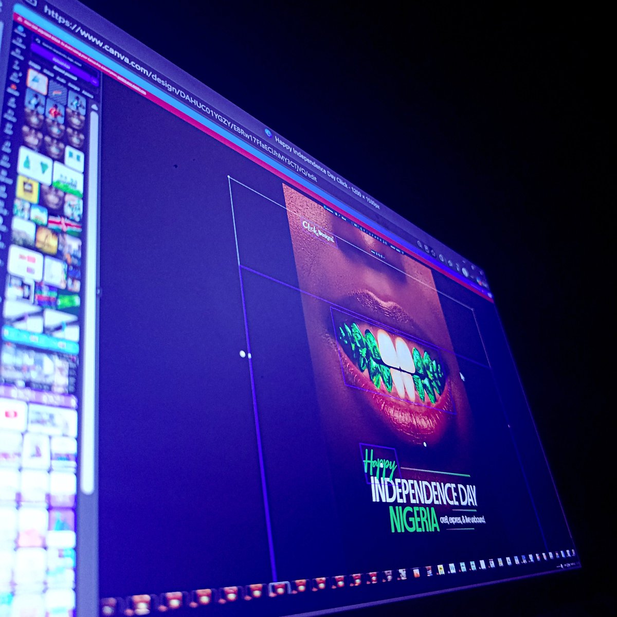
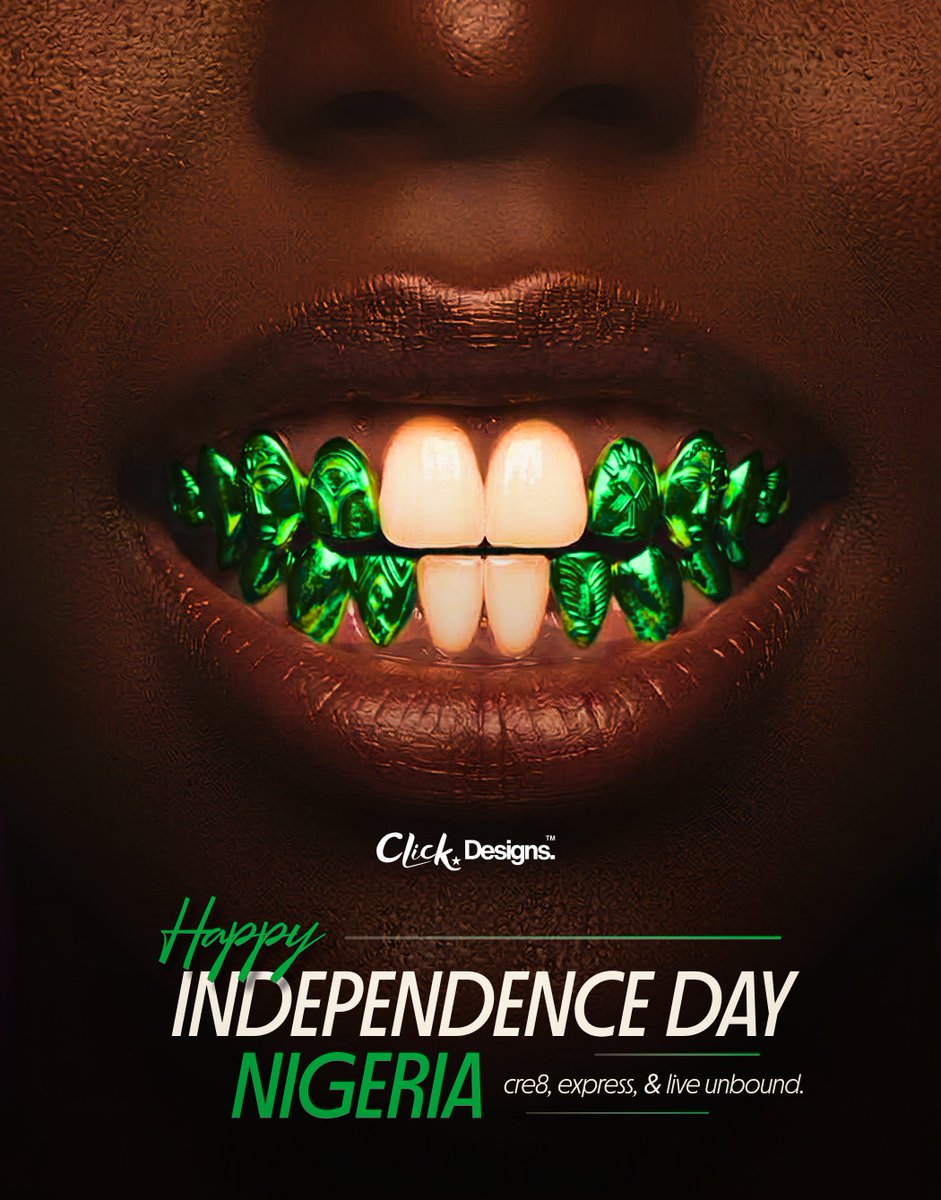
#independencedaynigeria yesterday & the Nigerian flag was everywhere. So I decided to place it somewhere unexpected: in a smile.
#ThrowbackThursday The Style Party🔥
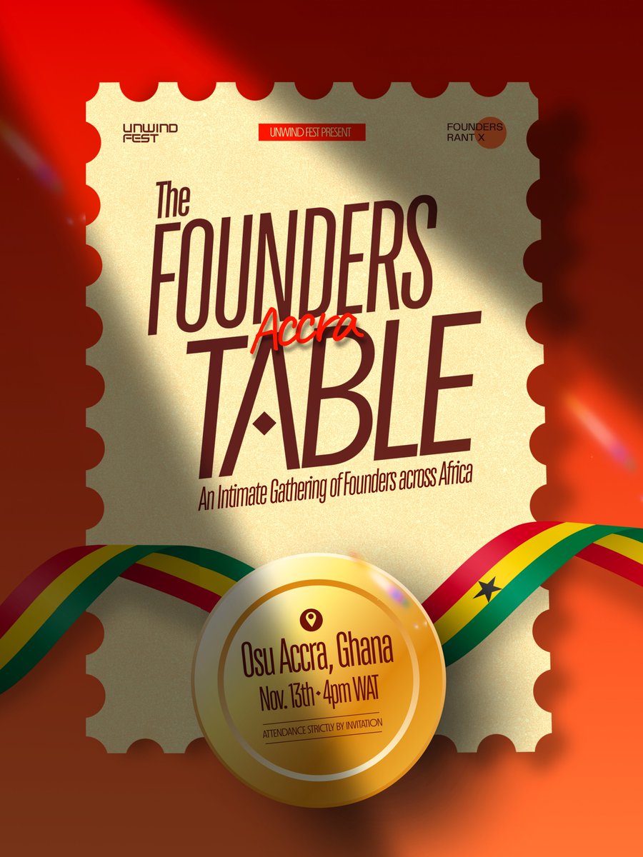
Event Visual Identity.
My clients often give me 100% creative freedom, and I never take that lightly. I know my onions and have the results to back it. Lemme take my flowers joor😅
Over the years, I have immersed myself in the study and active engagement of what makes an event a success, and it goes far beyond a good flyer.
A great event starts with a clear identity, so people know exactly what they are pulling up for. It needs anticipation, so the buildup has people talking before the day itself. It needs a promise strong enough to make someone decide, "I can't miss this."
It needs visibility, and the identity has to be solid and visually appealing. Everything the audience sees must also feel consistent and cohesive, because that is what makes an event feel credible, and people need to trust that it will deliver on what it promised.
These are only a few of the things that shape a successful event. Many more factors come into play, from planning and logistics to the ticketing and marketing, and no single ingredient guarantees the outcome. But I have noticed that a lot of what makes an event land still comes back to these, and a solid identity is where it begins.
I have trained myself to see events this way. Whether it is a party, a festival, a corporate gathering or a conference, every event has its own psychology, and I approach accordingly, keeping in mind what the event is meant to achieve and the audience it intends to reach.
That is why my clients trust me with full creative freedom. They bring the idea, we shape the strategy, I create, I deliver, and the result most times goes beyond what they expected.
Case in point, I created this Visual Identity System over 2 years ago for Highest Paid Night: The Style Party, and it was a banger🔥
Your event brand deserves an unconventional identity people trust before they pull up. I build that for brands that dare to be different. Shoot me a DM or Email at [email protected]
How do you build a political campaign identity that breaks from convention and still serves a specific strategy?
That was the question on my mind when Ishow Lee reached out to me earlier this year. He was running for President of AMTES, the Association of Mechatronics Engineering Students, at the Federal University of Agriculture, Abeokuta (FUNAAB).
During our onboarding call, he made one statement that became the backbone of the entire campaign Identity:
"Let's run AMTES like a control system."
My job was to turn that sentence into a visual identity. Here's how I approached the brief.
A control system manages how something behaves in order to produce a desired outcome. Take cruise control in a car as an example; you set the speed to 80 km/h. It measures your actual speed, compares it to the target, and adjusts the throttle until the two match. Input, control, feedback. Without that feedback, the car would hold one pedal position and hope for the best....
...his point was that AMTES should operate the same way: every action monitored, measured and refined...not on operation vibes & inshallah😅
The people he intended to lead study how to design and build intelligent machines, so they already think in control systems every day.
So I built the entire campaign identity on that foundation.
This was never about making a "pretty" flyer. The goal was to communicate the idea functionally first and let the aesthetics follow.
Here's how each element supported the idea:
• The binary code; A subtle texture sits behind every piece. Binary is the language machines run on, the raw input behind every machine output. Understated but unmistakable, it tells a mechatronics audience this campaign comes from their own discipline before they read a single word.
• The color system; Blue is widely associated with trust, stability and intelligence, which are the qualities you want in someone asking to lead. I built the palette around that: a vivid blue for energy and clarity, a dark blue for authority, a pastel blue for approachability, and a light grey as the neutral base. Four colors, applied consistently across every piece.
• The typeface; A tall, condensed face that is compact, structured and commanding. Its narrow letterforms let long names run large without crowding, and its vertical rhythm feels ordered and precise.
•Black-and-white portraits kept the focus on him and let the blue carry the identity. The name and vote blocks worked like applied labels, adding structure and a sense of order.
Every decision had to be controlled and deliberate....
....I'd have loved to be explosive and explorative with this one, but I had to keep in mind that this is mechatronics, the field behind robotics and intelligent machines. Machines follow structure, process and system. A system like that leaves nothing to chance, neither do the people who design and build them.
I completed the identity and shipped it. He loved it. When the campaign launched, more compliments came in. The identity worked! It felt sophisticated, unconventional and tailored, because it was built directly & deliberately from his strategy.
He went on to win the presidency🥂
Now think about your own project...you have the vision, you know exactly what you want, you have the strategy. The only missing piece is the visualization.
That's the piece I bring onboard.
If that sounds like where you are right now, I'm just a DM away, or email me at [email protected].
À bientôt✨