As a scientist-to-be, I know how useful good design is when trying to portray concepts to a non-specialized audience. A couple months ago I participated in the 3 Minute Thesis competition and had to come up with a catchy slide to accompany my presentation. Here is the result!
It's been busy on the science-front the past couple of months, but here are a couple graphics made for the next issue of @eusci, accompanying an article on food waste!
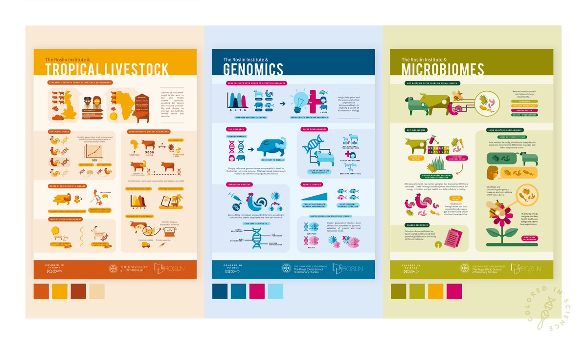
It's great to see these beautiful infographics Elena @coloredinsci has been producing for us, explaining the research of our Institute. There are a few more to go and they're looking better and better all together. I especially like the spring colours of the last one! #scicomm
And the Roslin ISP infographics continue! Second one, tackling genomics research at the Institute, was published several weeks ago. Check out the article here: https://t.co/P2mwkSHQA1
Been working on a series of infographics for the @roslininstitute these days, covering the research done at the Institute. These should be published soon(ish), but here is a little sneak peak at the Tropical Livestock ISP!


![eliza_coli's tweet photo. Choo choo! The #sciart train is passing through thanks to @KristinHenry - check these guys out!
[RT, tweet with your art/tag some artists you think everyone should know about!]
@saraillamas @RibosomeStudio @OperonArt @coloredinsci @elainetwsalt @KateGravett @nanoclustering https://t.co/rpxqWJ1Rdc](https://pbs.twimg.com/media/EcZCna2XkAEoGCa.jpg)