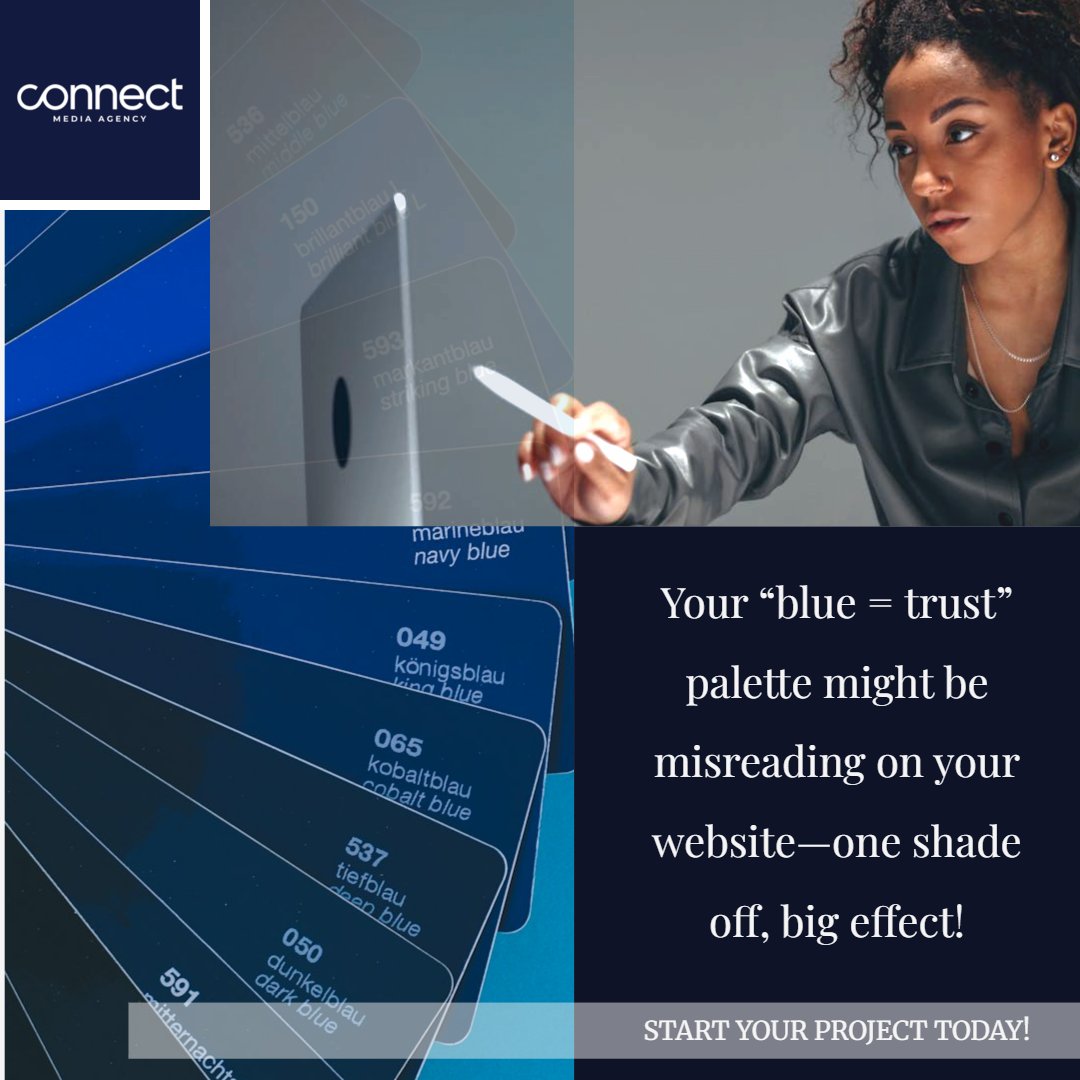
A customer lands on your homepage… but your “blue = trust” color choice sends the opposite message.
😮💨We see this all the time: a palette looks great in a logo file, then appears different on a website with varied lighting, contrast, accessibility, and competing colors.
If you’re relying on “it looks trustworthy,” we’ll help you verify it.
Start Your Project Today and refine your palette to shades your customers actually resonate with—so your traffic stays longer and your sales climb higher. https://t.co/Anzz2nSLpk
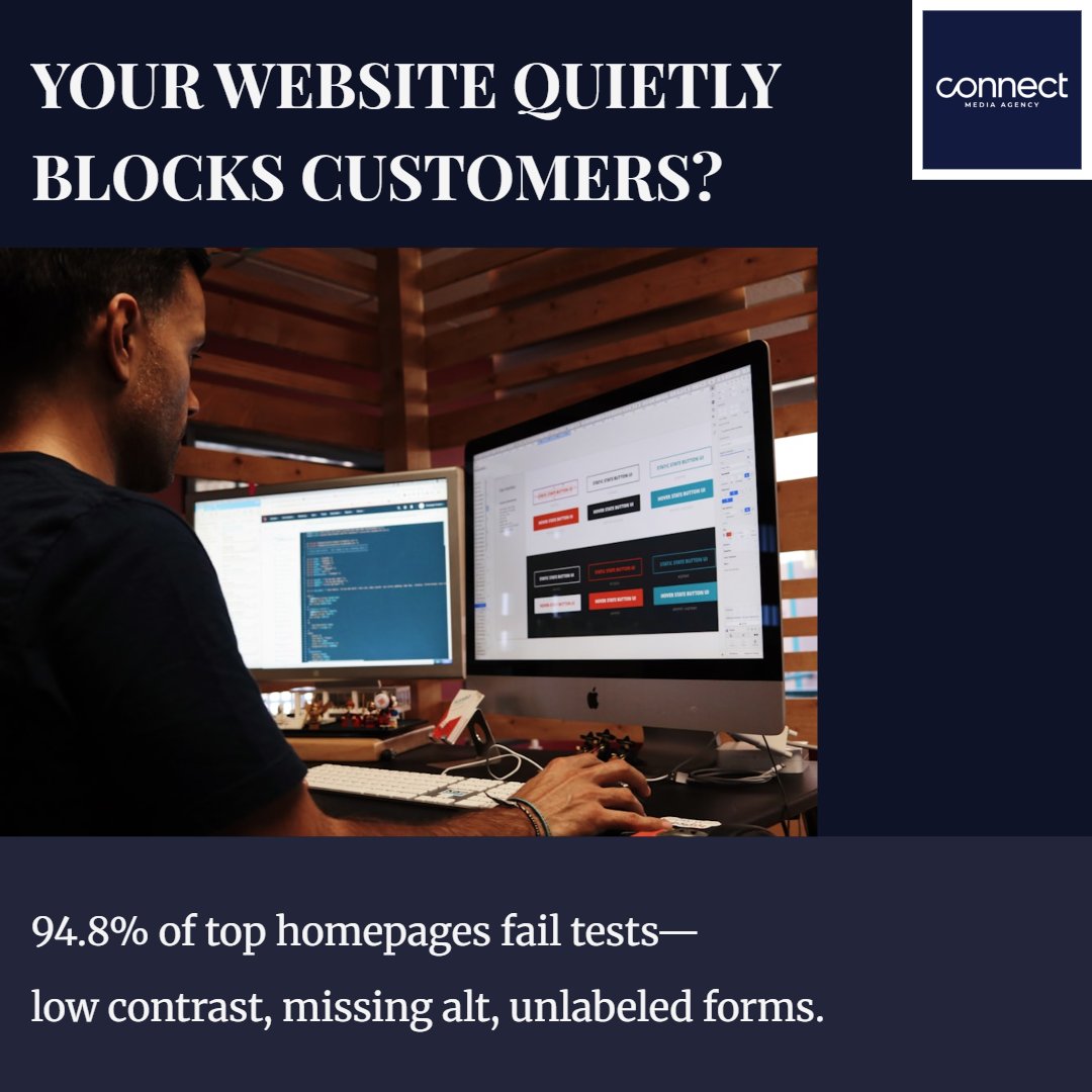
🚨Your website can be “easy” for you—and a brick wall for someone else.
We see it all the time: low color contrast they can’t read, images with missing alt text, and form fields that don’t tell screen readers what to do.