24 lessons from David Ogilvy:
1. Search all the parks in all your cities; you'll find no statues of committees.
2. The best ideas come as jokes. Make your thinking as funny as possible.
3. You are advertising to a moving parade, not a standing army.
4. Do not address your readers as though they were gathered together in a stadium. When people read your copy, they are alone.
5. Remember you are a human being writing to another human being. Neither of you is an institution
6. Tell your prospective client your weakness before they notice them. This will make you more credible when you boast about your strong points.
7. Avoiding excess in all things is a recipe for dullness and mediocrity.
8. A good advertisement is one which sells the product without drawing attention to itself.
9. There is no need for advertisements to look like advertisements. If you make them look like editorial pages, you will attract about 50% more readers
10. Big ideas come from the unconscious. This is true in art, in science, and in advertising. But your unconscious has to be well-informed, or your idea will be irrelevant
11. People who think well, write well
12. The most important word in the vocabulary of advertising is 'test'.
13. On average, five times as many people read the headline as read the body copy.
14. When you have written your headline, you have spent eighty cents out of your dollar.
15. Tell the truth, but make the truth fascinating
16. Advertising is only evil when it advertises evil things.
17. Advertising people who ignore research are as dangerous as generals who ignore decodes of enemy signals.
18. Raise your sights. Blaze new trails. Compete with the immortals.
19. I am a lousy copywriter, but I am a good editor. So I go to work editing my own draft.
20. If you're trying to persuade people to buy something, use the language in which they think.
21. Insist that due dates are kept even if it means working all night. Hard work never killed a man. People die of boredom
22. If you are lucky enough to write a good advertisement, repeat it until it stops selling.
23. At the start of your career in advertising, what you learn is more important than what you earn.
24. When Fortune published an article about me and titled it: 'Is David Ogilvy a Genius?', "I asked my lawyer to sue the editor for the question mark.”
A fantastic case example from @ChCh_Oxford for any higher education institution trying to balance "historical allure" with "modern academic aspirations” within their visual identity. https://t.co/hbRUdRGuZ9 #highered#higheredmarketing#branding
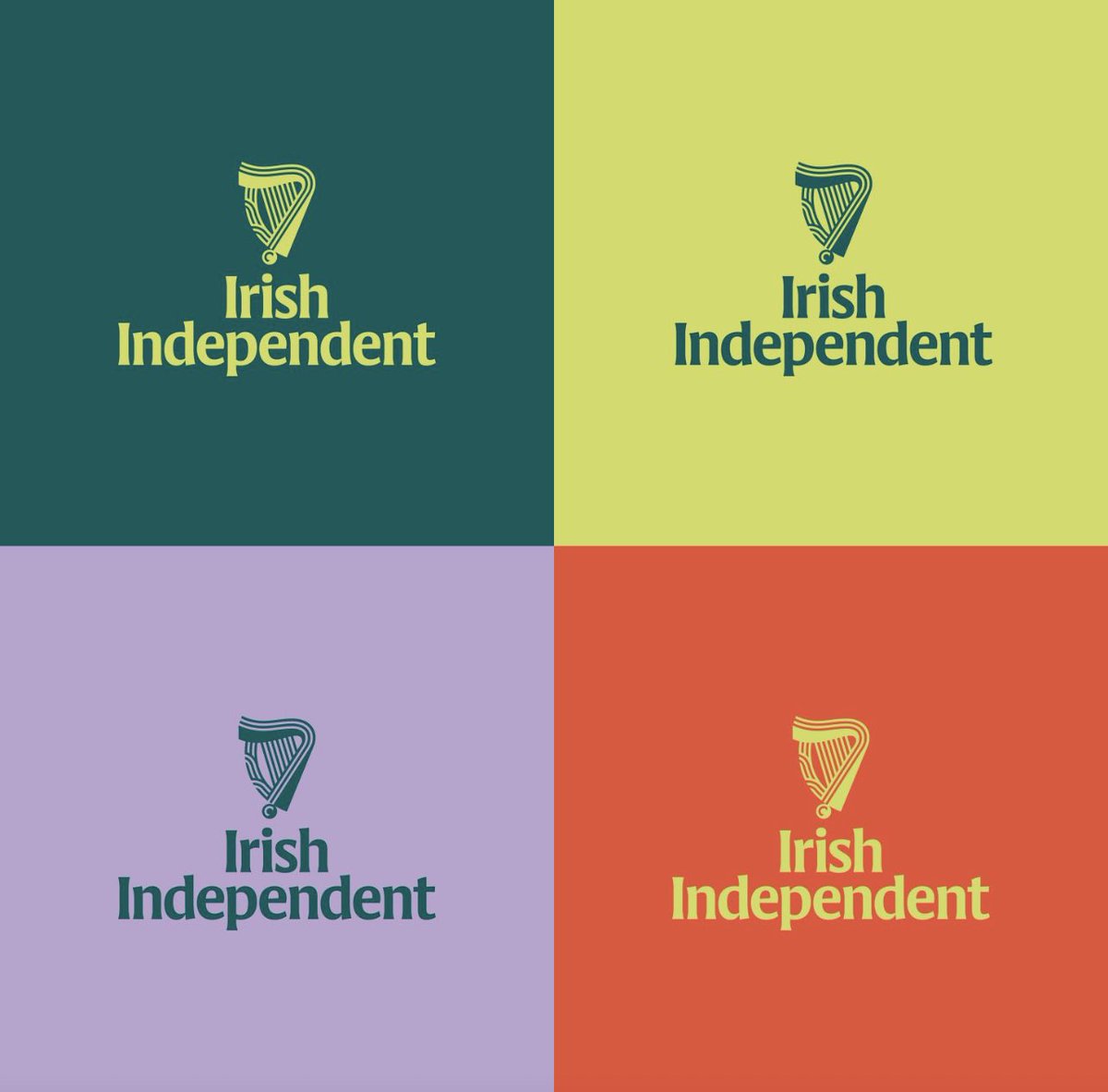
And then, there is work so precisely on-point that it feels inevitable. Bravo to Mark Porter and his crew for a dazzling reimagining and new identity for the Irish Independent masterbrand. It is evolving from a disparate group of newspapers, websites and apps into a one mutil-platform news platform
And here’s its new flag.
It speaks to a legendary history in a way that is absolutely future-facing.
So, bravo to the gifted Dublin-based teams who did this work, including Clare Bell, and Max Phillips, illustrator Andy Goodman and Smörgåsbord Studio for animation.
And congratulations to The Independent for asking the right people to do the right work.
💚🧡
Love this clip that surfaced in the @RTEArchives of Pete St John on Dublin. He is best known for composing "The Fields of Athenry". He died last year on March 12th. Hopefully, we'll hear the Fields of Athenry ring out tomorrow at Ireland Vs Scotland on his first anniversary.
Awesome new brand from the @SonomaSeawolves who have completely captured the uniqueness of the Seawolves name in their identity. The wave and fluid nature of the wolf head is perfect.
Tidy work from @DragonRougeUK on the refreshed @AVFCOfficial identity. While I chuckle at the rationale for the change in orientation (we always say the same thing), I think to color updates are spot on. Feels historic with an eye on modern application.
https://t.co/FX2mQrL6M0
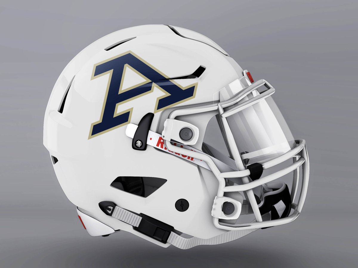
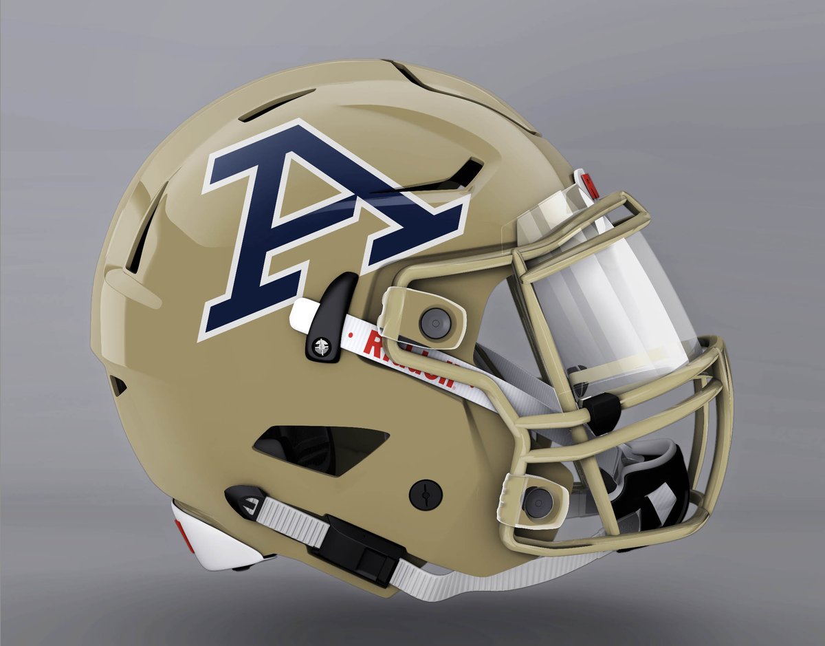
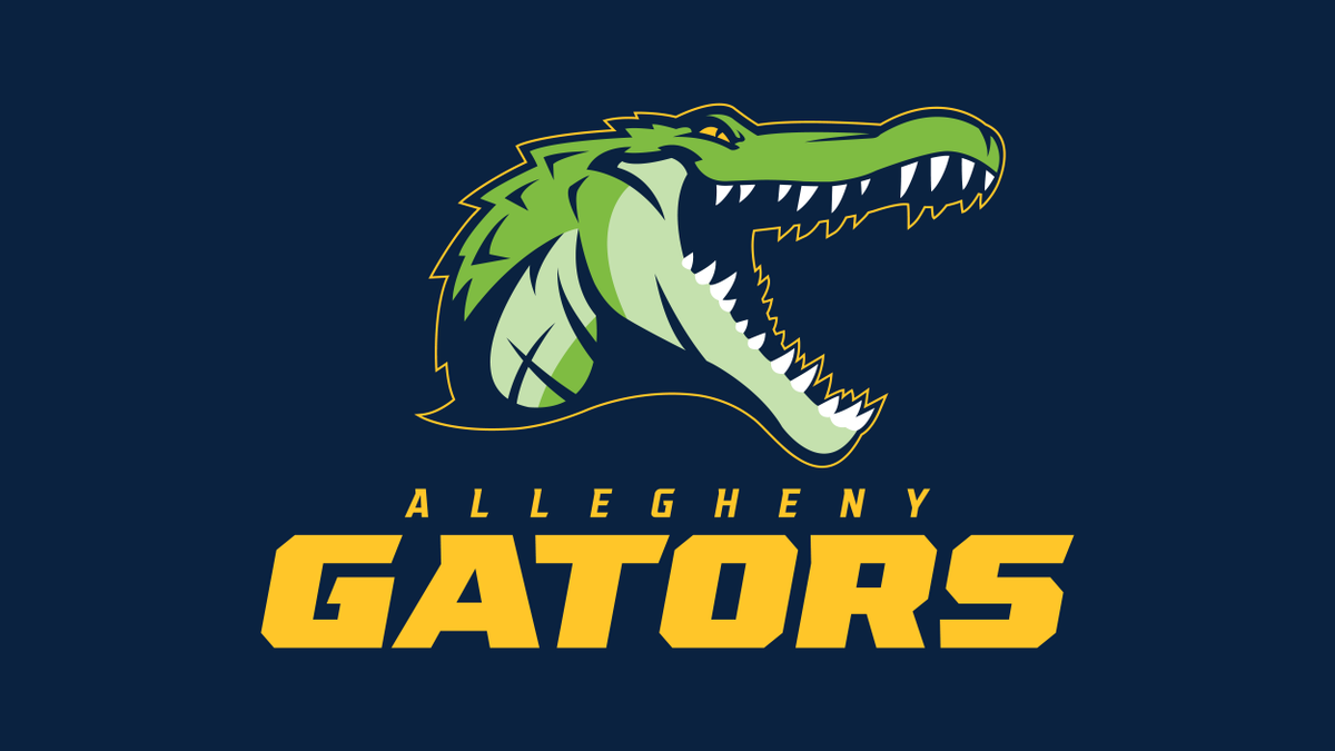
Really nice new identity work from @ACGatorSports. I particularly like the typography while the new A logo is absolutely top notch. That A just has baseball cap written all over it!
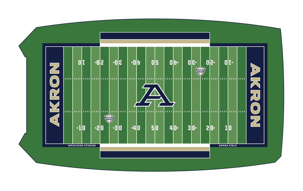
A clean and fresh update from the @AkronZips that reflects the brand’s position as a top tier Division I program. Great job by all involved in this one. 10/10