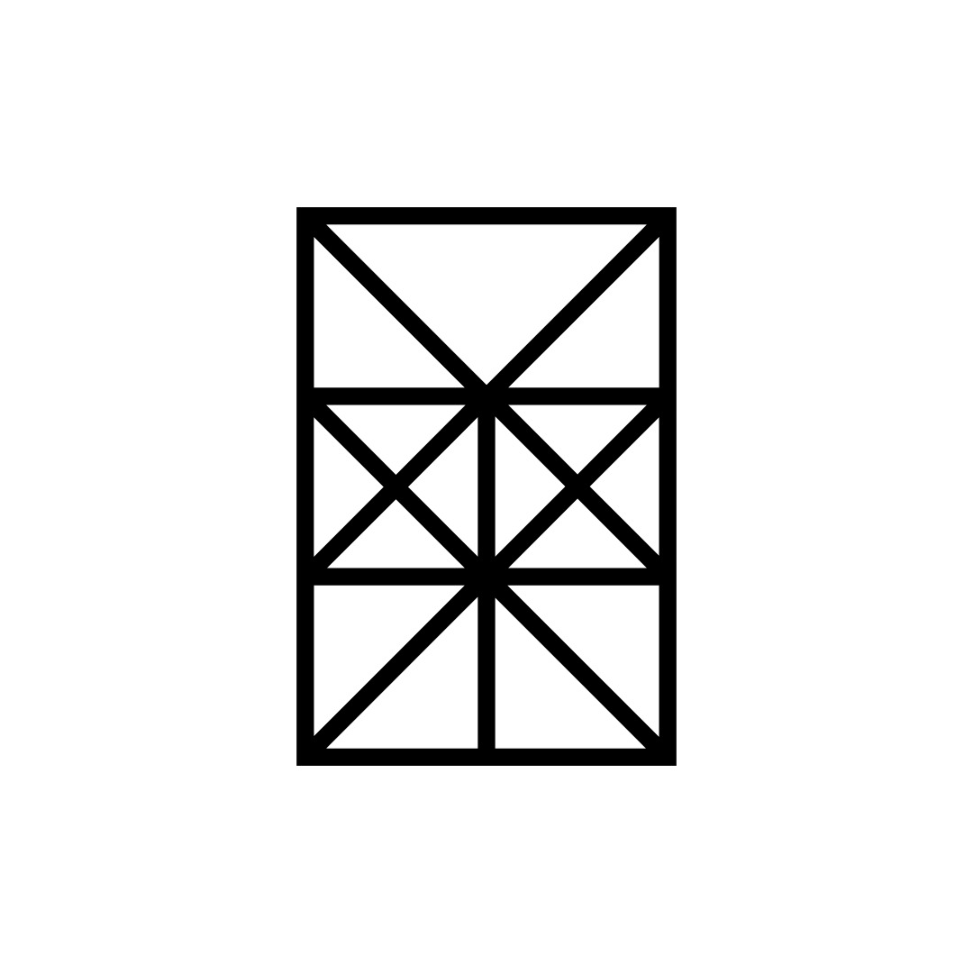
The work of Yasaburo Kuwayama, Japan, 1962–1982.
Discover thousands more historical logos at https://t.co/APXxAk0tw8
Yasaburo Kuwayama’s logos for the Kowa Kogei Group (1977), Kuwayama Fittings (1962), Tenguya (1979) and Kashiwa Shobo (1982).
#logos#branding#yasaburokuwayama #japanesedesign #logodesign #graphicdesign
Nike paid a student $35 for this logo. The founder didn’t love it.
Carolyn Davidson’s original drawing went into production before she could revise it. A decade later, Nike gave her a few hundred shares.
Full story → https://t.co/RM6wUzClrx
Sony asked the world’s designers to redesign its logo. 29,883 people entered. Sony kept the old one.
The judges found no clear winner, split the prize money three ways and kept Yasuo Kuroki’s 1973 logo.
Full story → https://t.co/jiPTmXKoX8
Sony asked the world’s designers to redesign its logo. 29,883 people entered. Sony kept the old one.
The judges found no clear winner, split the prize money three ways and kept Yasuo Kuroki’s 1973 logo.
Full story → https://t.co/jiPTmXKoX8
Milton Glaser, Shigeo Fukuda and Grapus all lost to this logo. Then the expo was cancelled.
Ikko Tanaka’s looping blue line won Tokyo’s Urban Frontier competition. In 1995 the city’s new governor cancelled the expo before it opened.
Full story → https://t.co/QjtMJRyJmN
The work of Franco Grignani, Italy, 1962–1973.
Discover thousands more historical logos at https://t.co/APXxAk0tw8
Franco Grignani’s logos for Delchi (1964), Solo Seta Sempre Seta (1962), AerHotel (1969) and Chemi (1973).
#logos#branding#francogrignani#italiandesign #logodesign #graphicdesign
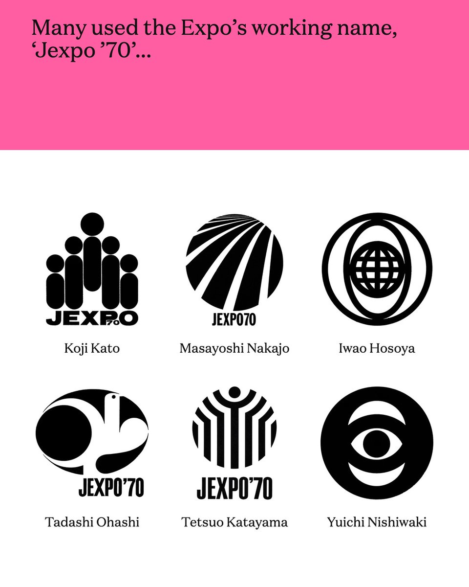
This logo won the Expo ’70 competition. Then the chairman said no.
Isao Nishijima’s globes and sun beat 47 other entries, but Taizo Ishizaka called it ‘too conceptual’. Takeshi Otaka’s cherry blossom was chosen instead.
Full story → https://t.co/0ykRy7vjKe
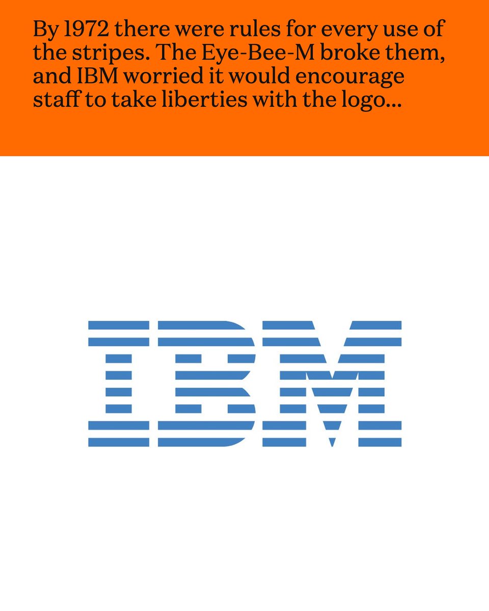
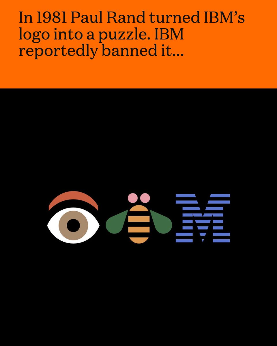
Paul Rand turned IBM’s logo into a puzzle. IBM reportedly banned it.
His 1981 Eye-Bee-M broke the rules for the striped logo, and became one of the best-known pieces of corporate design ever made.
Full story → https://t.co/k6ZGxNMUaQ
This logo lasted 65 years. Did you spot the tree?
In 1958 Lester Beall turned International Paper’s initials into a spruce tree. It ran on trucks, signs and water towers until 2023.
Full story → https://t.co/N4Tz5vgLyX
The work of Shigeo Fukuda, Japan, 1963–1989.
Discover thousands more historical logos at https://t.co/APXxAk0tw8
Shigeo Fukuda’s logos for Sanyo (1963), Hokkaido Takushoku Bank (1969), the symbol for “Graphic Design” (1971) and Ehime Prefecture (1989).
#logos#branding #shigeofukuda #japanesedesign #logodesign #graphicdesign
This logo won the Expo ’70 competition. Then the chairman said no.
Isao Nishijima’s globes and sun beat 47 other entries, but Taizo Ishizaka called it ‘too conceptual’. Takeshi Otaka’s cherry blossom was chosen instead.
Full story → https://t.co/0ykRy7vjKe
The work of Stuart Ash, Canada, 1972–1986.
Discover thousands more historical logos at https://t.co/hRs3Bezklk
Stuart Ash’s logos for Transport Oakville (1972, with Fritz Gottschalk), Reilly Lock (1973), Norcount Property Development (1974) and Canadian Pacific Forest Products (1986, Gottschalk+Ash).
#logos #branding #stuartash #canadiandesign #logodesign #graphicdesign
Paul Rand turned IBM’s logo into a puzzle. IBM reportedly banned it.
His 1981 Eye-Bee-M broke the rules for the striped logo, and became one of the best-known pieces of corporate design ever made.
Full story → https://t.co/k6ZGxNMUaQ
In 1962 the Società Metropolitana Milanese commissioned Bob Noorda (Unimark International) to design the symbol and wayfinding for Linea Uno, Milan’s first underground line, alongside architects Franco Albini and Franca Helg.
Noorda’s symbol was a mirrored double M, one below the other: the initials of Milan Metro, and a picture of two Milans, one above ground and one below. Its forms came from Albini and Helg’s handrails, its red from the Milanese coat of arms.
Noorda added a custom typeface and wayfinding that won a Golden Compass. But the president disliked the symbol, swayed the board to vote against it, and a plain M in a red square was used instead – still in place today.
Read the full story behind the logo → https://t.co/wxN4KZguSW
A student spotted a mistake in the Munich ’72 Olympic logo. So they asked him to fix it.
Peter Knopf saw the spiral wasn’t exact, and redrew it using Archimedes’ maths.
Full story → https://t.co/MpxV6CWr0j
The work of Takenobu Igarashi, Japan, 1982–1995.
Discover thousands more historical logos at https://t.co/hRs3Bezklk
Takenobu Igarashi’s logos for Suntory Hall (1986, with Igarashi Studio), Calpis (1982), Noritz (1984) and Tama Art University (1995).
#logos#branding #takenobuigarashi #japanesedesign #logodesign #graphicdesign
The judge who secretly entered his own logo. And won.
Franco Grignani didn’t like any of the 86 Woolmark entries, so he had his own design entered under someone else’s name. The jury chose it unanimously.
Full story → https://t.co/On0QseDfFm
A student spotted a mistake in the Munich ’72 Olympic logo. So they asked him to fix it.
Peter Knopf saw the spiral wasn’t exact, and redrew it using Archimedes’ maths.
Full story → https://t.co/MpxV6CWr0j