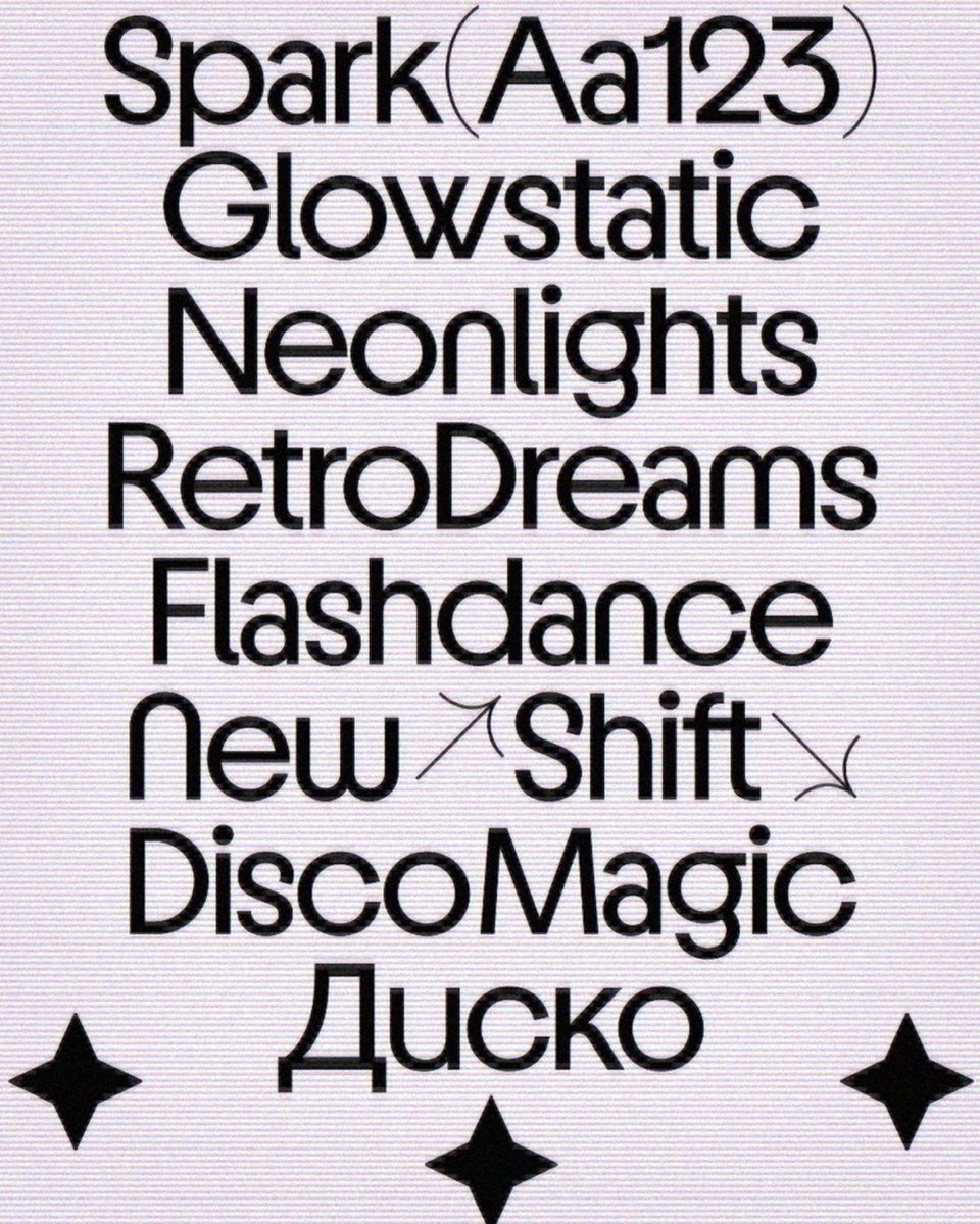
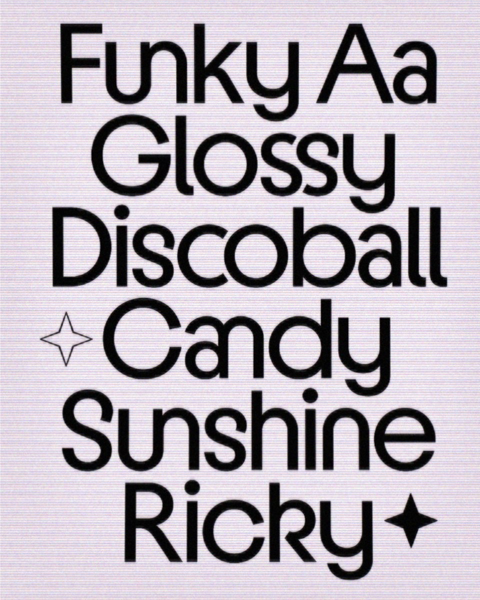
963 ligatures. Yes, really.
Sugarspark by @intervaltype is a retro-inspired display typeface with seven weights, Cyrillic support, alternates, arrows, circular dots, and enough ligatures to keep you experimenting for a very, very, long time.
Explore >
🔗 https://t.co/rmcHWTukLQ
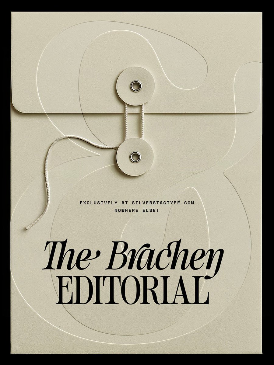
SLTF Brachen from @silverstagtype is a calligraphic serif in two cuts: Regular and True Italic
Equipped with beautiful sweeping forms common to a calligraphic serif, SLTF Brachen is another versatile tool for creating emotive branding outputs
Explore >
https://t.co/GTkhSC0MjY
Shaping What Matters identity by @pm2_agency x @luca.locci
"Developed around the concept “Shaping What Matters”, the visual system translates the bending and physical deformation of steel tubes through the dynamic graphic movement of typography."
#type01#animatedtype
SLTF Netsera – a calligraphic editorial serif typeface from @silverstagtype
Meticulously crafted with over 900 characters, SLTF Netsera includes 170+ alternates and ligatures, offering a wide range of expressive possibilities.
Explore >
https://t.co/Gyt9T83IQw
Meet Sugarswift, the text counterpart to Sugarspark by @intervaltype
The same open, bright personality has been reworked for smaller sizes, with generous spacing, balanced proportions and optical adjustments that let the type settle into longer passages
https://t.co/xOjzAxXUYh
LP and identity for Copenhagen-based @_hansphilip by @barkas ⭐️
"His album ‘Honey’ blends electronic sounds with classical instruments, weaving together recurring motifs of folklore, seasons, light and space.
Images by @lassedearman
#type01#visualidentity
Alphabettes Soup: Feminist Approaches to Type from @alphabettes_org
Celebrating a decade of community-building, the book features 55 articles by type practitioners worldwide
Design: @tbettinardi x @gui_mohr
Edited: @fontnerd
Published by @bikini.books
Print: Gráfica Maiadouro
SLTF Arcilla #typeface by @silverstagtype
What started as just a single font weight, SLTF Arcilla has expanded into a fully equipped variable contemporary serif built for the full range of editorial, branding, and packaging work.
Free to trial >
🔗 https://t.co/mdWThuvRy5
A little retro and a lot of spark 💥🪩🕺
Sugarspark by @intervaltype takes the optimism of Bauhaus, the geometry of Kabel and the eccentricity of Avant Garde, then adds a little sprinkle of sweetness on top.
Explore >
https://t.co/rmcHWTtMWi
Work by @andreacelante 🌄
"some graphics inspired by my latest journey in the Dolomites around the routes of Altavia delle Dolomiti n1. 3 guys, 3 stops, 3 days, infinite peace and breathtaking views."
#type01#graphicdesign#graphicdesigner#typography
The Silver Editorial #typeface from @silverstagtype ✒️
TSE is a high-impact serif typeface inspired by the expressive typography of 1980s fashion magazines.
Now fully redrawn and expanded into a powerful 18-font system (9 weights + italics).
Explore >
https://t.co/Sa8Ob04bmq
As a playful yet highly functional element for Zed by @typotheque, it also includes a set of icons designed as part of the same system.
Instead of treating icons as an add-on, they were built with the same logic as the type: real-world usability
Explore>
https://t.co/GQSIrcb8uA
540 ligatures deep—introducing First Contact #typeface by Silver Stag TF 🔗
First Contact is an ultra-condensed typeface family built for bold, space-efficient design.
Trial for free >
🔗 https://t.co/I0mQK9KxQA
#type01#typedesign#graphicdesigner#typography