One chart, two records.
Occupied senior housing units are at their highest recorded level while supply growth is at its lowest recorded level.
And it's still early. We are 12 years away from the peak of Americans turning 80.
This is a supercycle.
I think I'm in the process of learning the power of hyper-local banking relationships. I got a term sheet last week from one and, relative to national banks:
5-10% higher LTC
50 bps lower SOFR spread
And.... zero prepayment penalties!
Plus the banker felt like Grandpa.
We closed our 3rd deal this week 🙏
Good basis in a great market. Bought it from a friend off-market at a time when competition for value-add deals is really heating up.
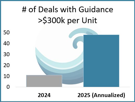
A senior housing broker succinctly summarized for me the difference between 2024 and 2025:
In 2024, the market had a per-unit cap of $300k. Transactions prices above that cap were scarce.
In 2025, that cap is gone.
Our internal data agrees. On an annualized basis, we see over 4x more deals with guidance above the cap this year.
(Granted this is guidance, not trade price. Still - instructive.)
Another framing of the tremendous supply/demand growth imbalance in senior housing right now:
Unit construction required to meet demand by 2030: 564,000
Units constructed by 2030 at current development pace: 191,000
We will need 3x more units than are on track to be built
Todoist is by far the best productivity/organization app I’ve used. Amazing UX.
Been using it for years and it’s integral to my entire life at this point. Highly recommend.
Signed an LOI this week for a deal we’ve been evaluating on and off for a year. Price came way down from our first off-market look.
Pays to hang around the hoop.
Deal Pricing vs. Reality
@coryDwake and his partner Elan dug into 51 closed senior housing deals since January 2024 where they had both broker guidance and the actual sale price. That’s out of 330 reviewed deals (closing price is notoriously hard to pin down).
What did they find?
•23 traded below guidance
•9 traded at guidance
•19 traded above guidance
•Only 12 landed within a tight ±10% band
Most common outcome? Deals going 5–10% below what brokers were guiding.
What predicts that spread?
They looked at the “Transaction Delta” vs. revPOR, facility size, NOI margin, and vintage.
The results:
•No clear relationship with revPOR or size
•Some correlation with vintage (newer = better)
•Erratic link with NOI margin—except at the low end, where poor margins led to steeper discounts
Two big takeaways:
1.Pricing is more normally distributed around guidance than you’d expect.
2.Newer builds are more likely to beat guidance.
Caveat: This doesn’t capture deals that didn’t close because the price was just too high—but it’s still a super useful lens on the market.
Nice work Cory and Elan.
Last year we solved a problem that was limiting us as a small team: we were wasting too many hours in Excel underwriting deals that never went anywhere.
When a deal piques our interest, we want to test the numbers and tweak assumptions. For too long, we did that by jumping straight to full discounted cashflow underwritings. We’d spend 3-5 hours building a model that was unnecessarily complex.
For raising capital, you need a DCF model. For vetting deals, talking to operators, and submitting LOIs, you don’t. We needed a faster, 80/20 analysis that told us what we needed to know without bogging us down.
Thus, the SWC Roll-Up Analysis was born.
Shown below, this simple dashboard gives us the key info needed for deciding whether to pursue or pass, and the analysis takes an hour at most. We just pull in historical financials, tweak the adjustable inputs, and make minor deal-specific changes.
What results is a 360-view of the deal, including:
• Trended historical financials, including revenue and expenses per occupied unit.
• A pro forma sketch based on 3 simple inputs: occupancy, rate growth, and operating margin. It’s not perfect, but it grounds our expectations.
• Asset info including unit mix, vintage, pricing guidance, and potential bid amount (including cap rates and price-per-unit).
• Sources and Uses.
• Debt assumptions (in this example we’re underwriting a bridge-to-HUD, so we include both the bridge and HUD loan).
• NOI-to-cashflow conversion estimates.
• Historical and projected cash-on-cash return based on our assumed capital stack.
• If we have square footage, we include a discount-to-replacement-cost estimate using NICMap construction cost data.
With this model our throughput significantly increased without reducing the quality of our analysis.
We’re happy to share the template with anyone. If interested, reply/DM me and I'll send you a link.