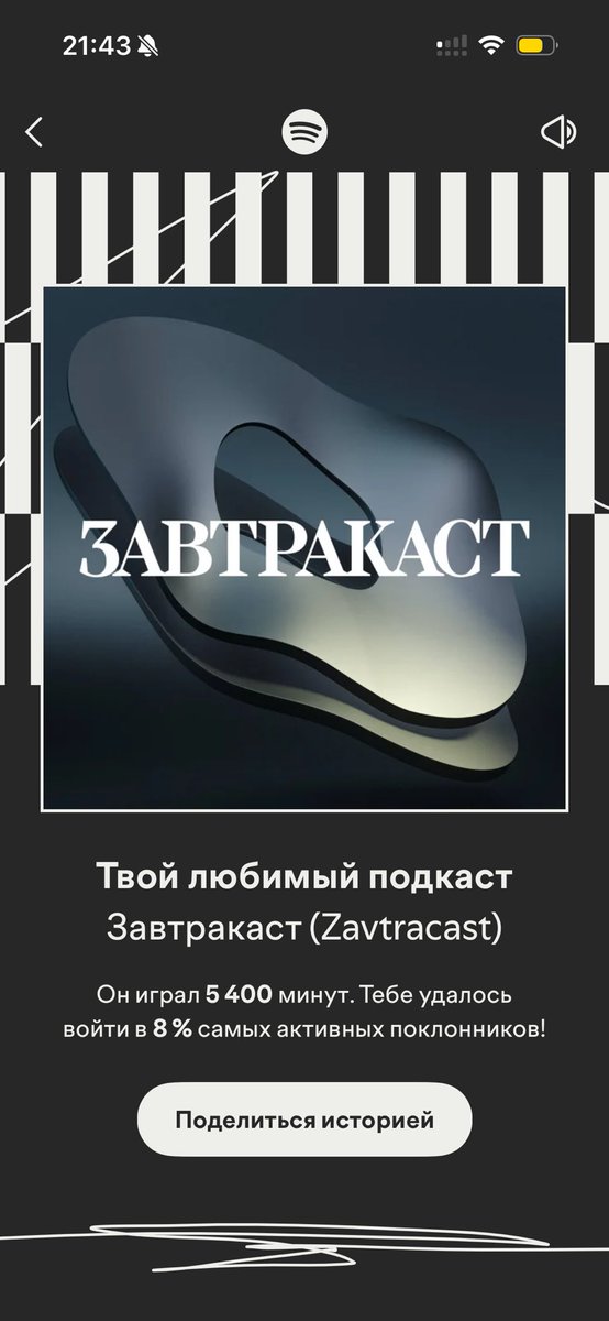
@DaytonaMess future advice: it is better not to look at the cyrillic alphabet in the base fonts. it is very weak there
for example, you can look at high-quality Cyrillic fonts from studios: type today and contrast foundry
@DaytonaMess good work. as it is a decorative font and readability is not so important here. it seems to me that a few symbols could be improved )
in the letters Дд - the bottom bar is definitely needed, in the letters Чч - the corner point should be moved to the base