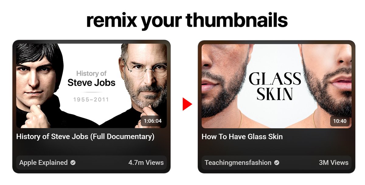
The thumbnail text rule that nobody teaches:
Less is more. Always.
3 words beat 8 words.
1 word beats 3 words.
A face with zero text beats everything if the emotion is strong enough.
Every word you add is a second of attention you're asking for.
Make your thumbnail work at EVERY size
Design at full size → zoom out to 25% → check if subject is still clear
lastly test it on https://t.co/nmgbAh1SVH
Most people watch on mobile and TV nowadays
make sure it has enough sharpness for TV, and is simple enough for mobile
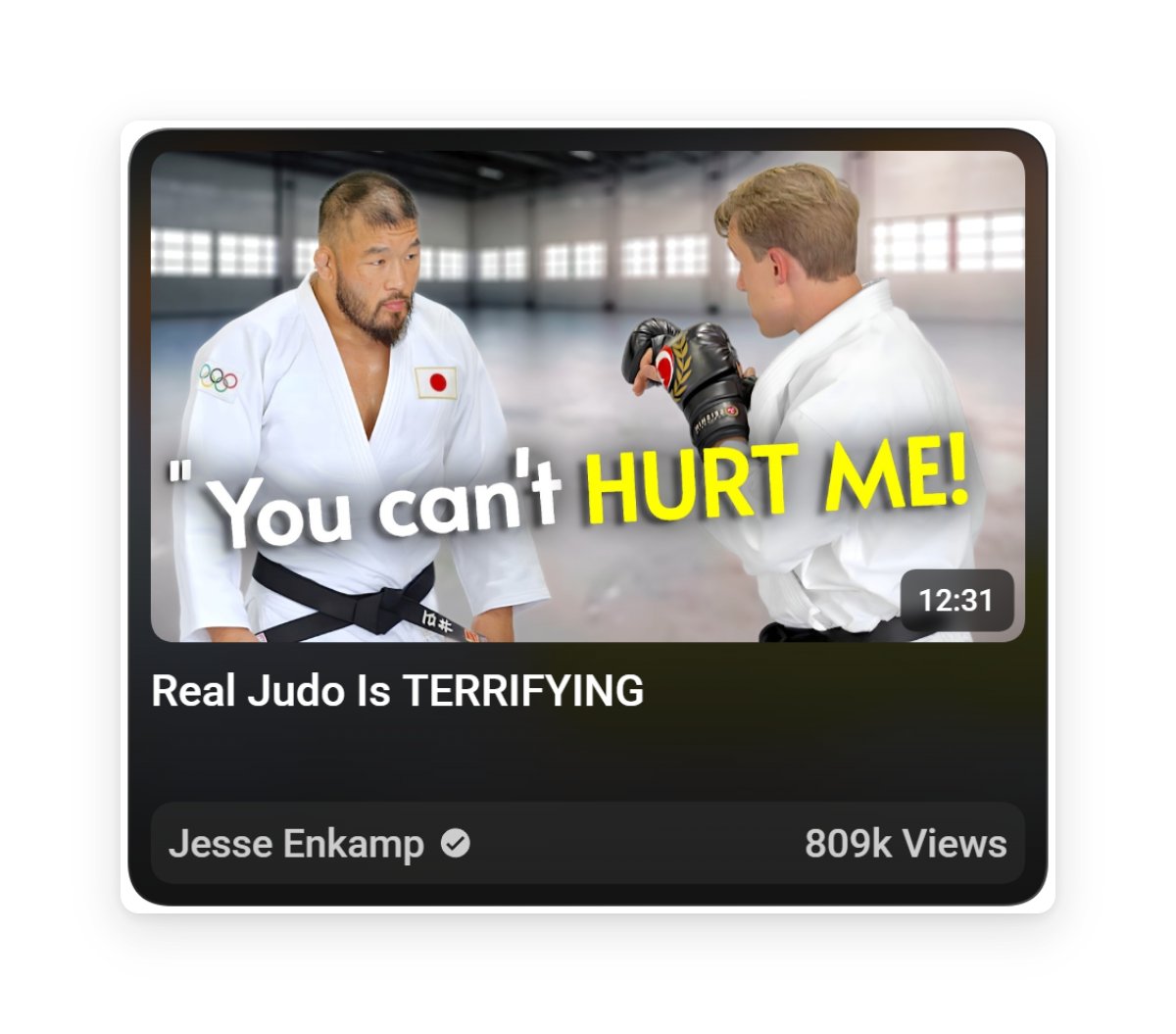
Your FACE is your most underused thumbnail asset
Stop picking frames where you look neutral.
Go through your footage and find the most extreme expression.
Shock. Confusion. Disbelief. Laughter.
They feel what you feel before they even click.
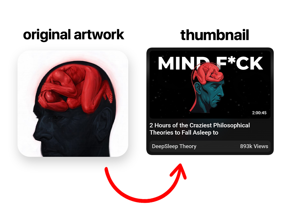
Here's how top creators use EMOTION in thumbnails to force clicks
Disgust. Shock. Confusion. Desire. Fear of missing out.
Pick ONE emotion your thumbnail should make the viewer feel.
Then design backwards from that feeling.
Every color, expression, text should point to that one emotion.
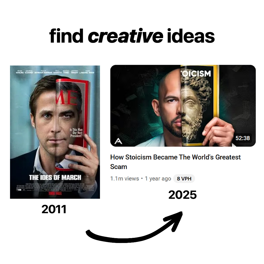
Here's why this thumbnail style is killing it right now
-pattern interruption, these thumbnails stick out,
they aren't begging for your attention,
also the high contrast of black and white.
HIRING a YouTube Thumbnail Designer to join our team
Compensation: $3,000/month
Type: Full Time
Location: Remote
If you're interested, apply via the link below this post
We're managing 50+ YouTube channels for brands & businesses - if you're obsessed with thumbnail design and strategy this is for you