🚀 Welcome to CredaChain! 🚀
We’re building a secure, fast, and transparent blockchain platform for payments, invoicing, and utility services.
💡 We’re just getting started! Follow us for exciting updates and progress as we shape the future of finance together 🤝.
It feels like SuperteamNG has been around for 10 years already.
So much has happened within just 3 years, growth, experiences, challenges, wins, and unforgettable memories.
It’s truly an honor to be part of this amazing family.
it’s still day one.
The job is not finished yet.
SuperteamNG turns 3 in a few days.
It’s been an incredible journey building what is arguably Solana’s most active global community; from a small local collective to an ecosystem spread across the country, producing founders, developers, creators, and global talent.
To celebrate the milestone, we’ll be hosting local community meetups across different states in Nigeria.
Three years down.
Job’s not finished.
@yabsssai@gstarVM Relatable. The "partners" ghost page — we've all been there.
How'd you end up handling it? Kill it entirely or build it out properly?
We're in that exact decision right now.
@yabsssai Not yet , haven't try it out
we're still building in the background.
Demo would just be static sample data for now. Nothing connected to real chain data.
Landing page, section 5: CTA + Footer.
The final section of the landing page.
CTA card:
"Ready to Experience Secure Payments?"
"Launch the demo with a connected Solana wallet and walk straight into the dashboard."
🧵
B) Keep it but make it scroll to the features grid (anchor link).
C) Build a read-only demo dashboard (no wallet needed, static data).
What would you expect from a pre-launch product footer?
Roast it 👇
#BuildInPublic#UIUX#CredaChain
C) Functional footer: Build 1-2 pages now (Privacy Policy + Terms of Service are legally required in Nigeria). Leave the rest as plain text, no links.
Also: "View Demo" button.
A) Kill it. Connect Wallet only.
C) Show our actual progress: "Wallet connections: [X] | Feedback received: [Y] | Days to MVP: [Z]"
What feels right?
Roast it 👇
#BuildInPublic#UIUX#CredaChain
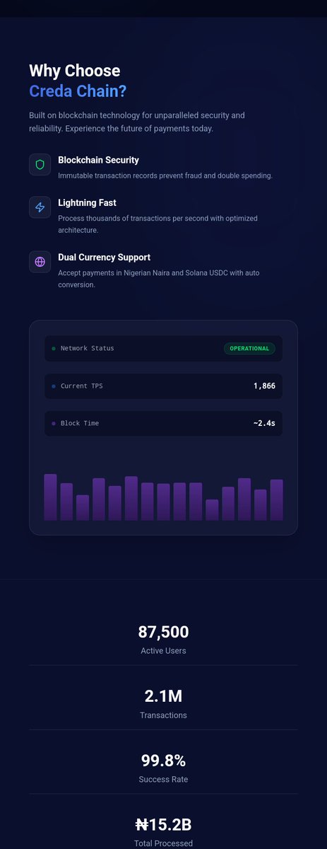
Question 2: The stats
A) Kill all fabricated numbers. Replace with "Join the waitlist — be among the first."
B) Keep the format but show Solana network stats honestly: "Powered by Solana: 1,866 TPS, ~2.4s finality"
Landing page, section 3: Features Grid.
6 cards. Vertical stack. Dark theme.
What works:
→ Icons are clean and color-coded (blue, yellow, green, purple, pink)
→ Card padding is consistent
→ Rounded corners feel modern
→ "All Your Payments in One Place"
Design question:
Should these cards be:
A) Horizontal layout (icon left, text right) — more compact, less scroll
B) 2-column grid on desktop, stack on mobile — better space usage
C) Keep vertical but bigger icons + centered text — current vibe, polished