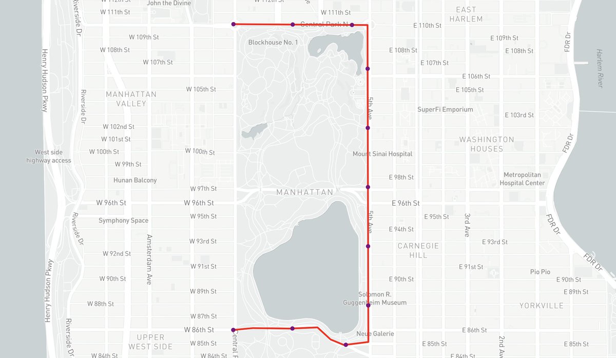
Boggles my mind how often people on this website reply to my tweets with a map ripped from the Highway 413 investigation, as if to bring it to my attention
Like... yes? I know? That's literally from a story my name is on?
We're hiring a data viz journalist to join the Americas graphics team at Reuters!!!
I'll be the manager for the role, but am going on maternity leave June 10. Until then, I would love speak to interested candidates, answer any questions, etc.
https://t.co/BEDJEUSEIv
How safe is it for schools to reopen?
@kellygrant1 and @hichenwang did a deep dive into neighbourhood-level COVID-19 data across 5 Canadian cities, and they found things are looking pretty good -- but there are a few hot spots and warning signs.
https://t.co/W7s9A3b5tv
Erin O'Toole pitched himself as the Conservative leader who can win in Ontario. The data says he has work to do https://t.co/DtLSSYLyHL via @torontostar#cdnpoli#cpcldr
I've hesitated promoting this given the state of things, but I'll be talking about map animations using @Mapbox + #turfjs today at noon for their webinar series. You can sign up here if interested: https://t.co/MmdecqMzZE Thanks to @domlet for organizing
This is tearing my family apart. My Ontario-raised wife says she’s making scalloped (rhymes with gallop) potatoes. I say she’s making scalloped (rhymes with call-up) potatoes. She doesn’t realize how wrong she is. #HappyEaster
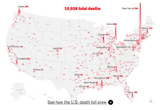
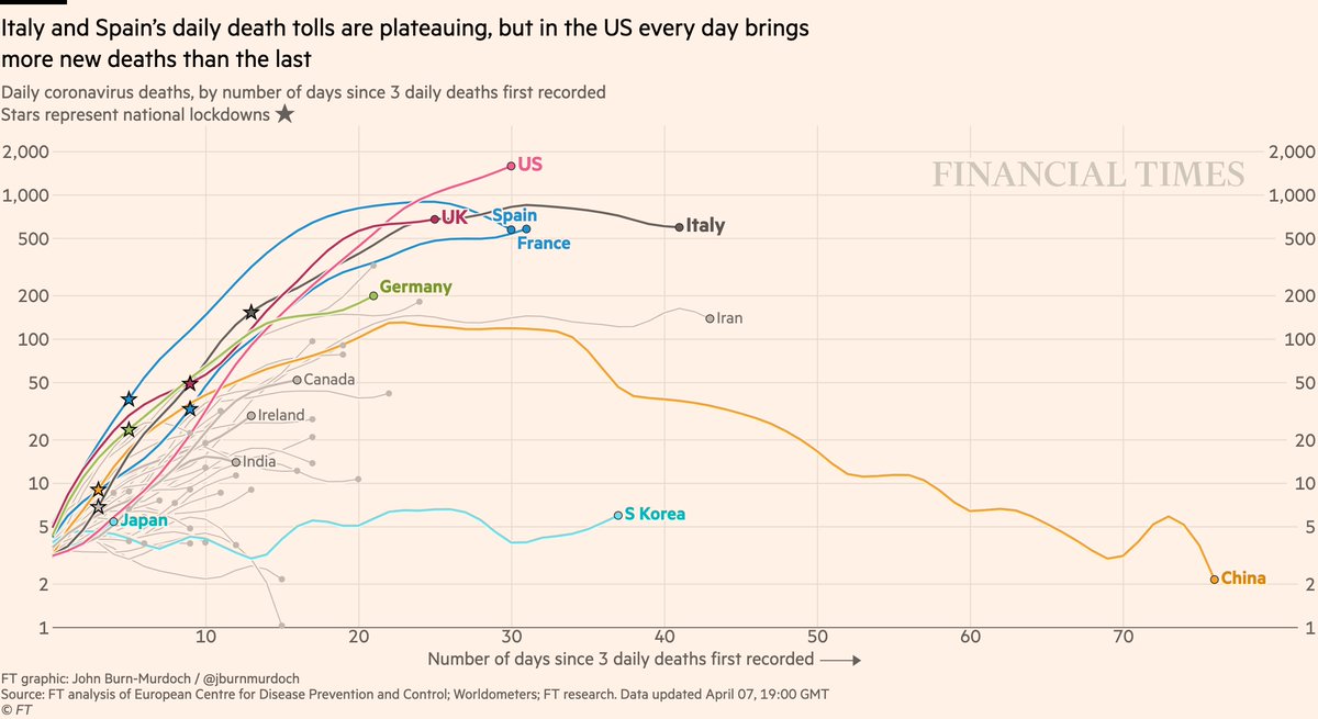
NEW: Tue 7 April update of coronavirus trajectories
Big changes here, so tonight’s thread will be fewer charts and more explanations.
Here’s the revamped daily deaths chart. I’ve switched from a 7-day rolling average to true daily numbers*
All charts: https://t.co/JxVd2cG7KI
Wrote a little stepper template a while back (sadly, scrollytelling isn’t currently possible on the https://t.co/84Jyf5uGkp) but I didn’t have a chance to actually use it for a story until now...