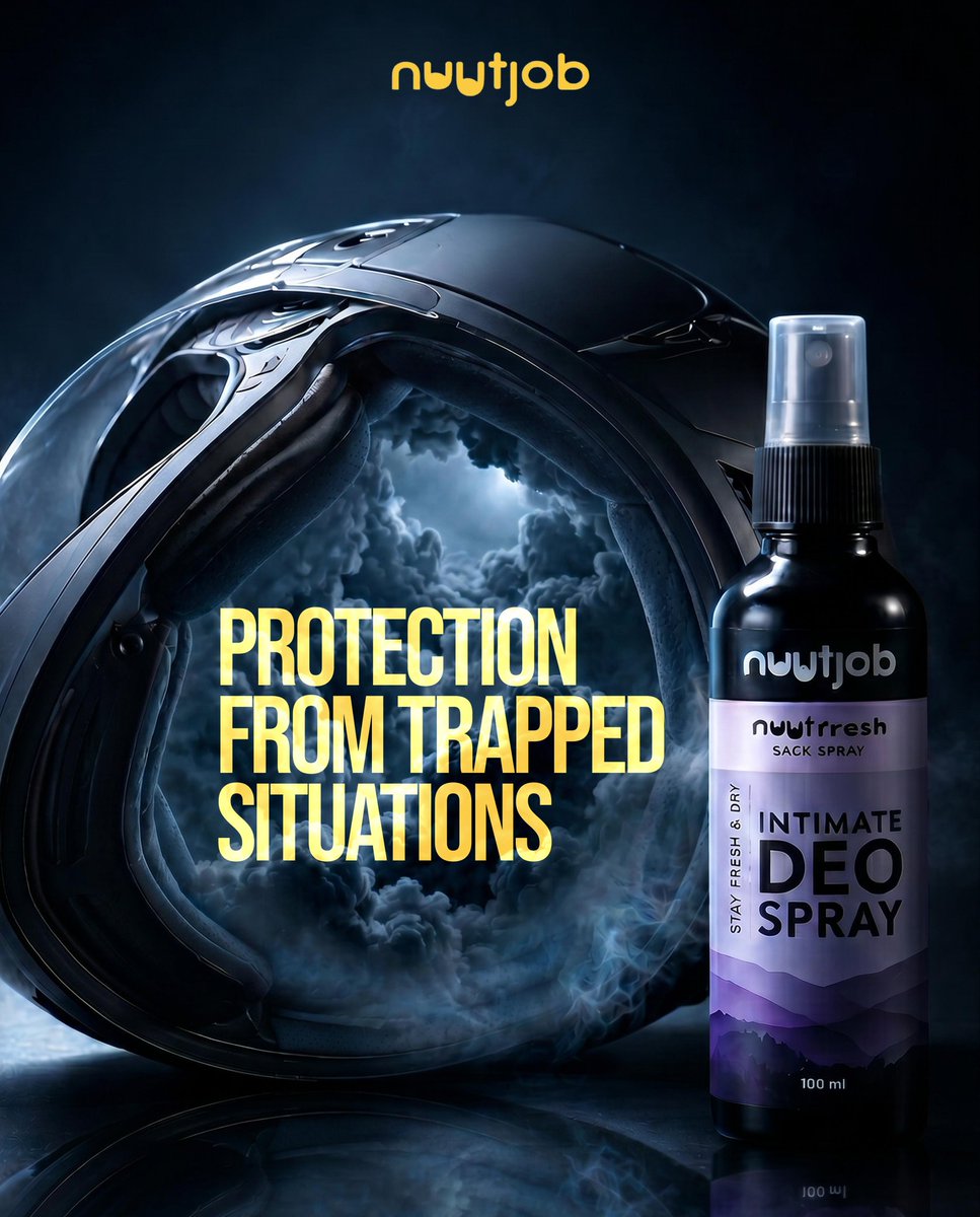
Experimented with AI-generated ad creatives for Nuutjob
Tried mixing cinematic visuals + storytelling instead of generic product ads.
Used helmets as a metaphor for “trapped situations” & freshness.
Not client work just exploring AI for campaign concepts.
#ai#advertising
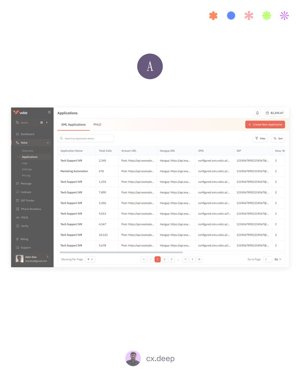
A/B Testing My XML Application Page — Need Your Feedback 👇
I’m testing two different layouts for the XML Applications page, and both solve the same problem in very different ways.
Here’s the breakdown:
Version A — Table-First Layout
- Shows all XML applications in a clean table view
- Users can compare multiple items at once
- Clicking any row opens detailed information on the right
- Great for users who prefer scanning, sorting, and quick evaluation
Version B — Card-First Layout
- Left sidebar shows each XML application as a card
- More visual and spaced out
- Designed for guided browsing and easier reading
- Clicking a card reveals the full details panel
The Goal
- Find which layout improves
- Discoverability of applications
- Speed of choosing the right one
- Readability of details
- Overall workflow efficiency
Your Vote?
Which version feels more intuitive for daily use?
A – Table View
B – Card View
Let me know why — your perspective will help shape the final experience.
The design industry is changing faster than we think.
Not because of new tools — but because of new expectations.
Today, users want:
- Instant clarity (no guessing what your product does)
- Context-aware interfaces (personalized, not generic)
- Effortless workflows (fewer clicks, fewer decisions)
- Human-like experiences (AI that feels natural, not robotic)
And companies want designers who can:
- Think in systems, not screens
- Understand business impact, not just aesthetics
- Use AI as a creative partner, not a shortcut
- Deliver designs that ship — not just sit in Figma
The days of “make it pretty” are gone.
Today design is strategy, communication, and product thinking — all rolled into one.
If you’re a designer in 2025, your real superpower isn’t Figma…
It’s how well you understand people, problems, and products.
#uiux #productdesign #itindustry #designindustry #uxcommunity #designcareers #uxtrends #productthinking
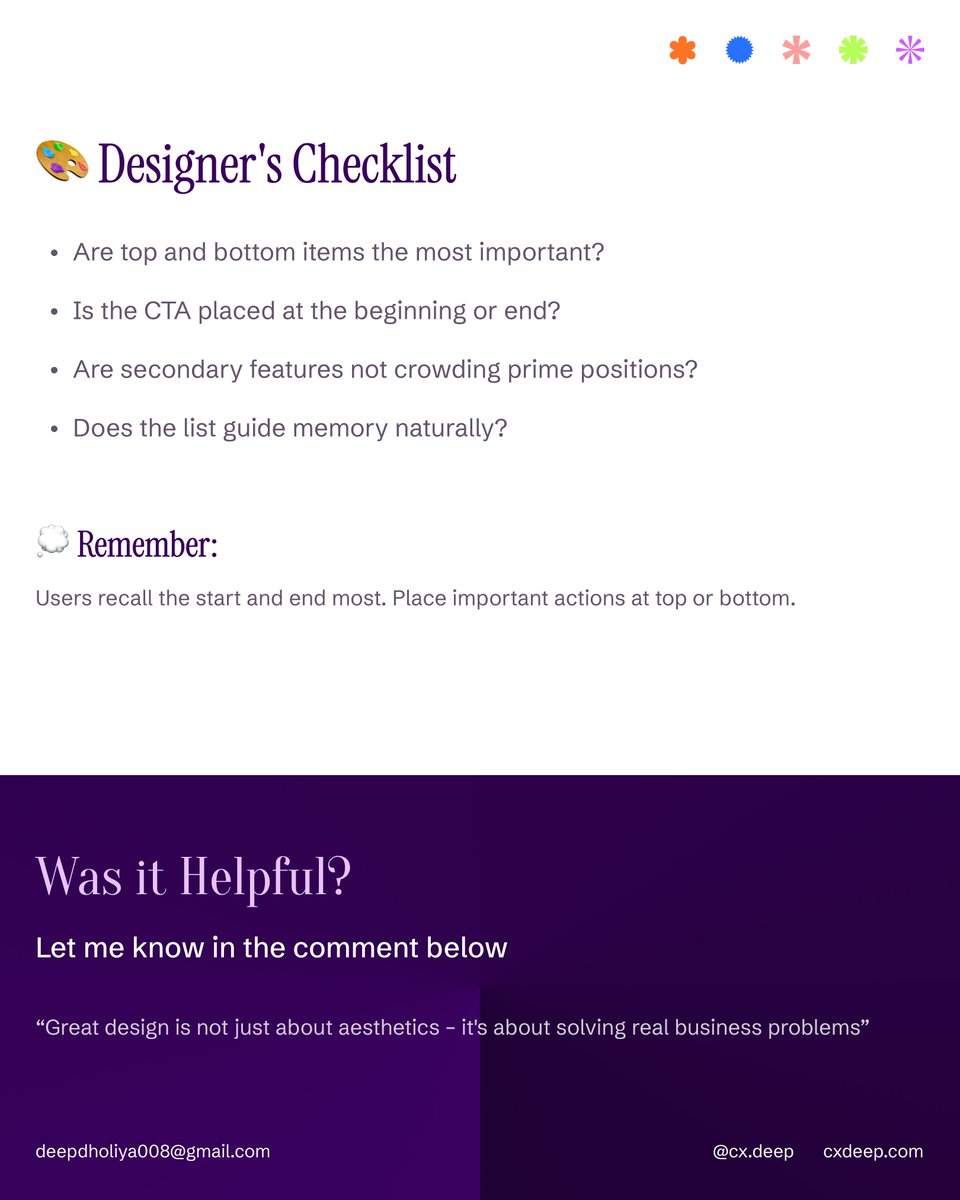
Ever wondered why users click the first or last button — but ignore the middle ones?
That’s the Serial Position Effect at work.
Users remember the start and end, not what’s in between.
Here’s how to apply it in UX 👇
- Top = Prime Spot: Place your most important actions first (Home, Dashboard, Profile).
- Bottom = Memory Anchor: Keep CTAs or final actions here (Checkout, Submit, Next).
- Middle = Forgettable Zone: Avoid putting critical options here — they get lost.
- Order Matters: Navigation, onboarding, and forms should always follow this memory flow.
🧠 Small placement changes can drastically improve user recall and conversions.
#uxdesign #uxlaw #uiux #userexperience #productdesign #uxpsychology #designthinking #uxprinciples #usability
I’ve noticed this in a lot of projects lately —
founders or teams say,
“Let’s just tweak the messaging. The design’s fine.”
But here’s the thing —
design and copy aren’t two different layers.
They’re two sides of the same story.
When you change what you say, you automatically change how it should look.
Because every visual, layout, and color choice exists to support the message.
- If the copy talks about “speed,” your visuals should feel fast.
- If it’s about “trust,” your layout should feel calm and balanced.
- If it’s about “AI power,” your visuals should feel sharp and modern.
But when you change the story and keep the old visuals… things break quietly.
Users feel the disconnect — even if they can’t explain why.
I’ve seen landing pages say “next-gen AI infrastructure” while showing a generic dashboard.
It’s not bad design — it’s just out of sync with the message.
So whenever your brand strategy or messaging evolves,
don’t just update words — rethink the whole experience.
Because in the end, design is not how it looks — it’s how clearly it speaks.
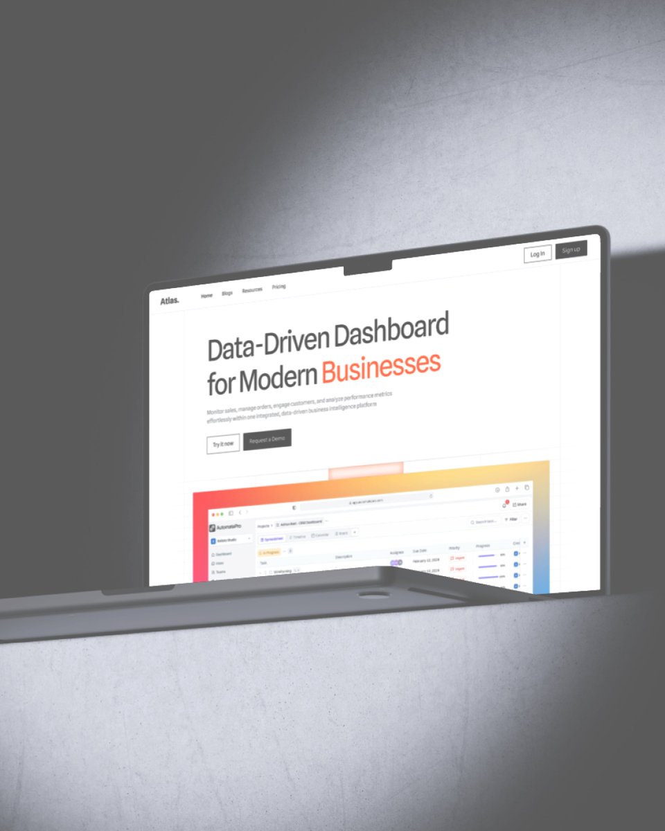
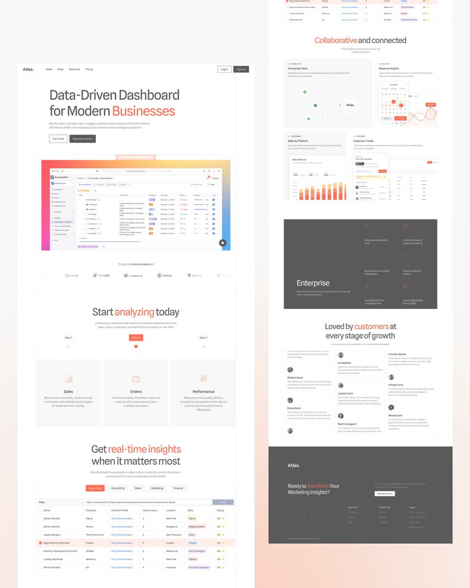
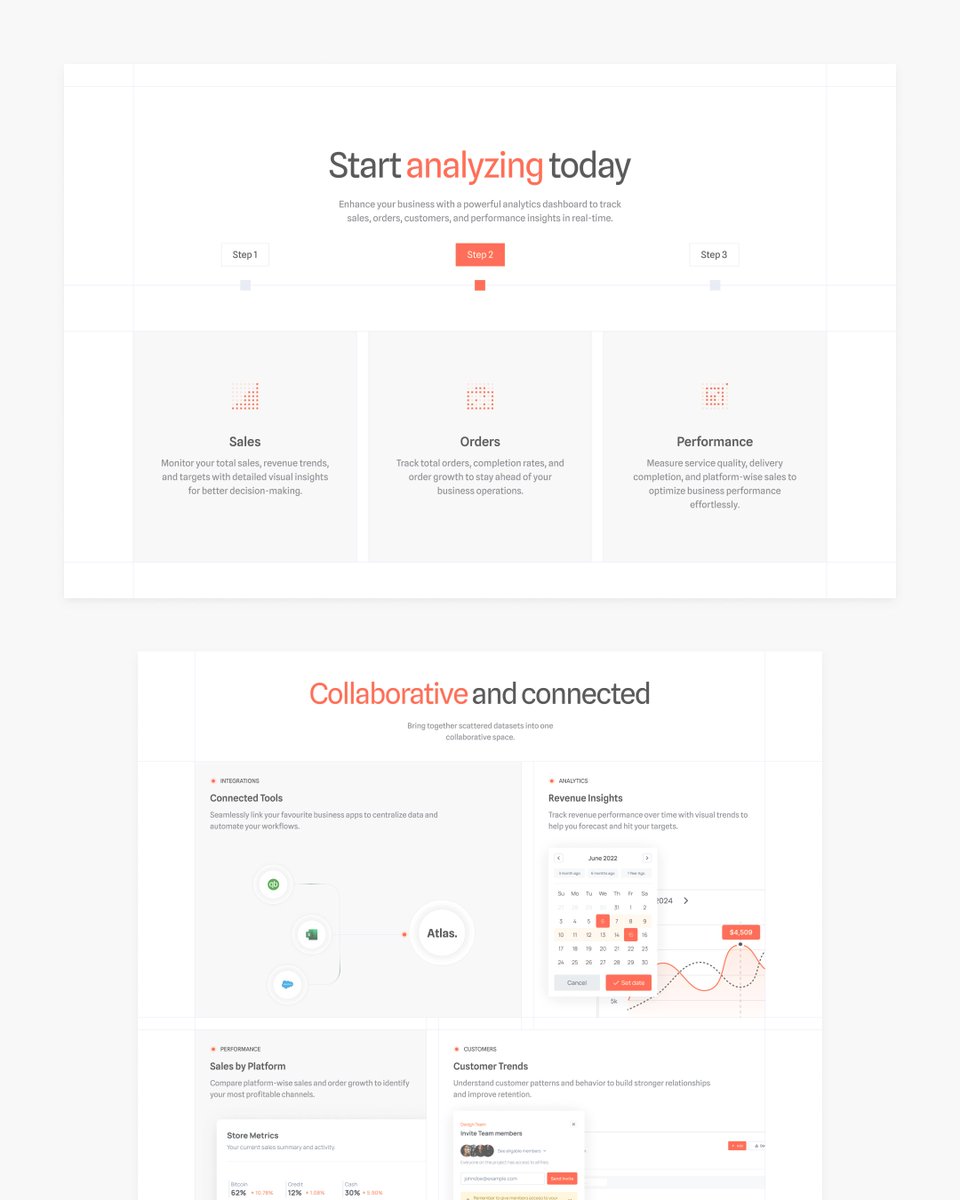
Modern Business Landing Page
Crafted a clean and data-driven landing page focused on clarity, contrast, and conversion. Every section is designed to guide the user seamlessly — from discovery to action.
- Strong visual hierarchy
- Clear call-to-actions
- Balanced typography & color flow
- Built for trust and performance
📩 Contact for projects: [email protected]
#landingpagedesign #uidesign #websitedesign #uxdesign #saasdesign #modernui #productdesign #creativedirection #visualdesign #dribbble #designinspiration #uxuidesign #minimaldesign #conversiondesign #businesswebsite
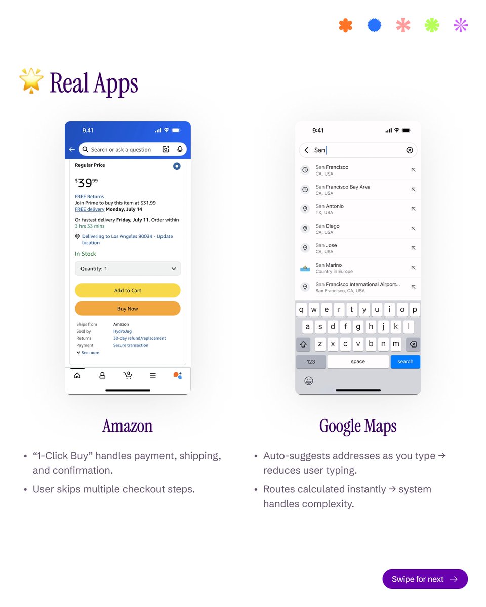
Sometimes, great UX isn’t about design — it’s about words. ✨
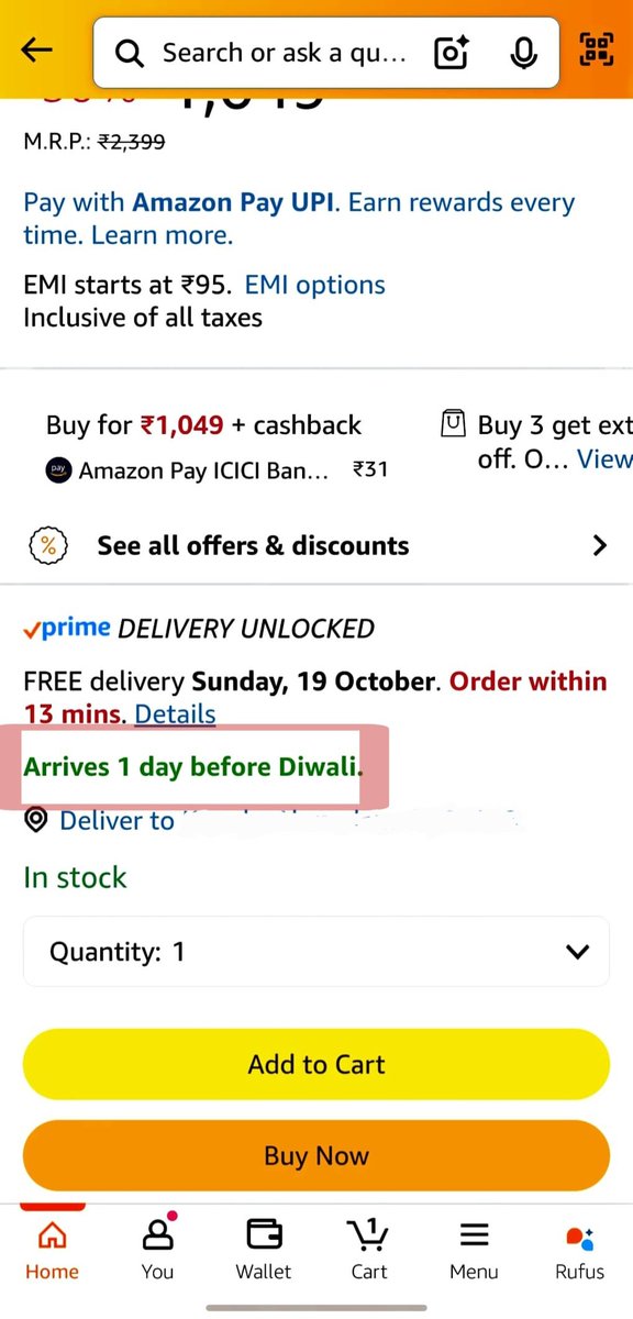
Today while purchasing a shirt on Amazon, I noticed something subtle but genius in their UX writing.
Right below the delivery info, it said:
“Arrives 1 day before Diwali.”
That’s it. One simple line — but incredibly powerful.
Here’s why this tiny piece of text is brilliant UX design:
💡 Why it works:
Emotionally relevant: Instead of a random delivery date, Amazon ties it to a festival — something that matters to the user.
Creates urgency naturally: “1 day before Diwali” subconsciously pushes you to order now to get it on time.
Personal touch: It feels like Amazon understands your context, not just logistics.
Cognitive ease: Users don’t have to calculate the date — it instantly communicates when it’ll arrive in a meaningful way.
Trust + delight: You feel reassured your order will be ready before the celebration starts.
This is a perfect example of microcopy done right — where small words create a huge impact on conversion and emotion.
#uxwriting #uxdesign #amazonux #microcopy #userexperience #productdesign #copywriting #designthinking #uxinsights #uxstrategy #uxdetails
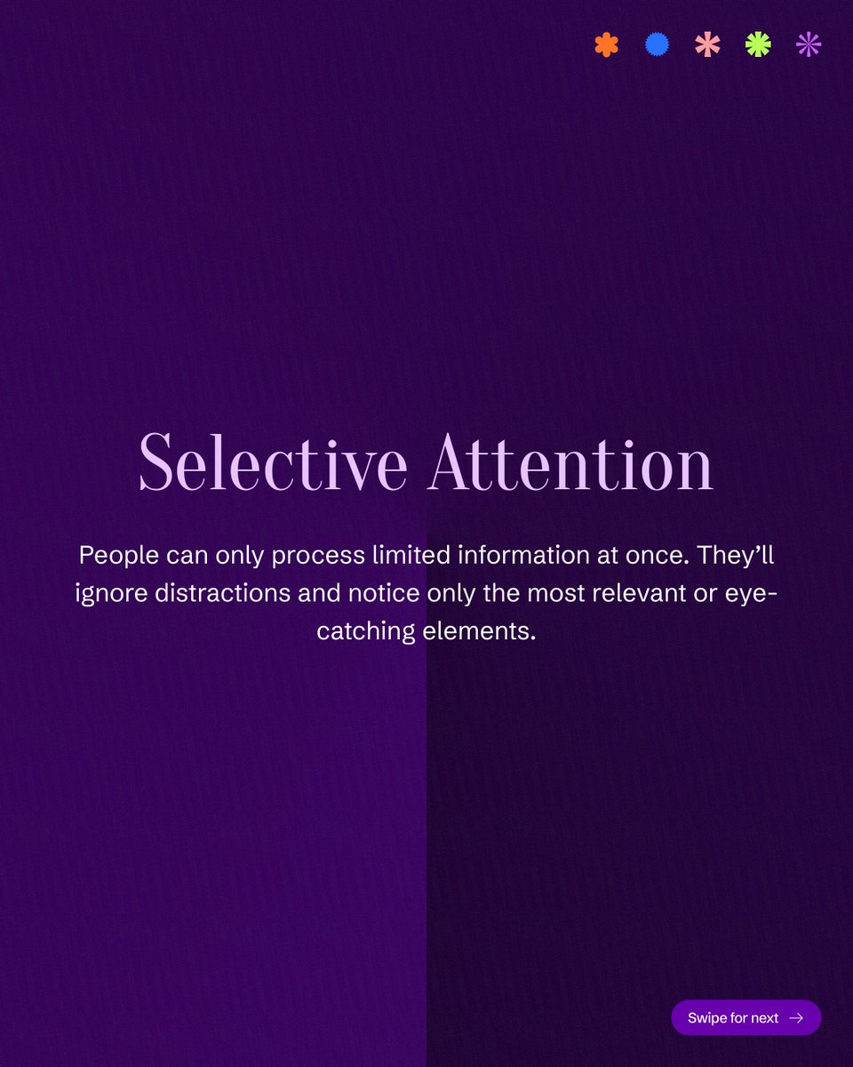
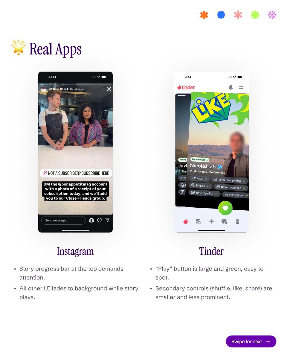
Your users don’t see everything — they see what stands out. 👀
Selective Attention in UX is all about focus. When everything screams for attention, users hear nothing. Guide their eyes with contrast, motion, and clarity — not clutter.
#uxdesign#uidesign#lawsofux #userexperience #uxlaws #designthinking #productdesign #uxprinciples #designpsychology #uxinsights
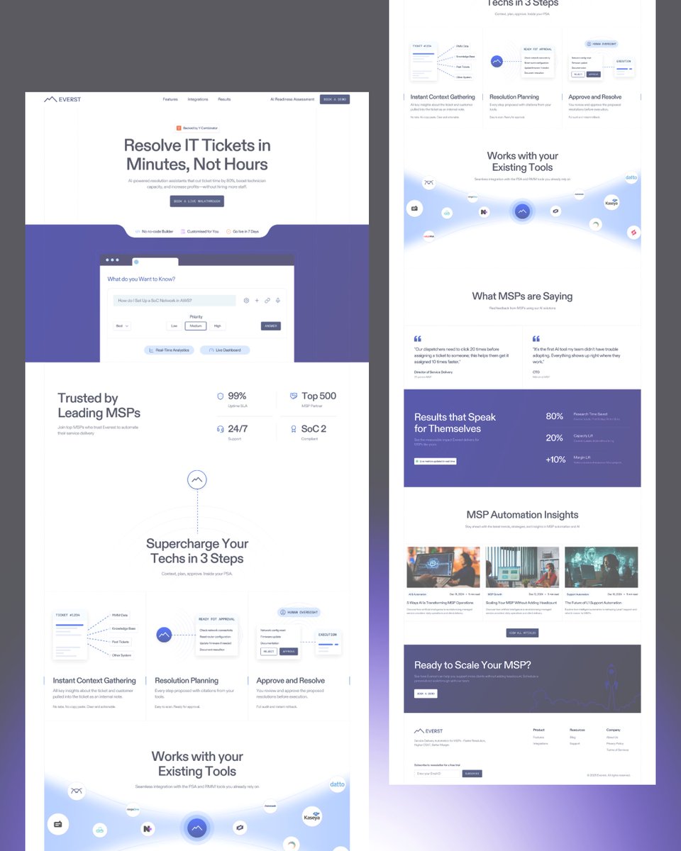
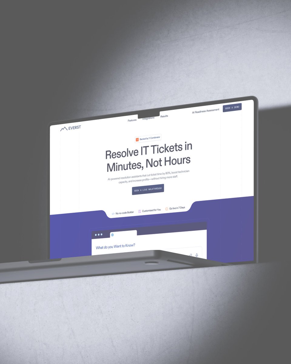
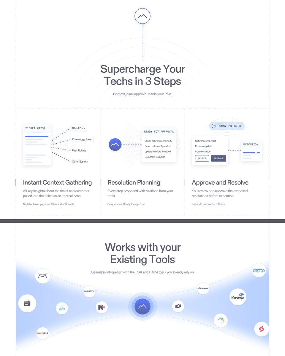
Redesigning Concept for Everest — The AI Assistant for IT Teams
A modern redesign for Everest, an AI-powered platform that helps IT teams resolve tickets faster and smarter. The goal was to simplify communication, highlight trust signals, and guide users toward conversion.
✨ Key Highlights:
- Hero section with stronger value proposition & CTA clarity
- Trust signals placed early to reduce friction
- 3-step process visualized with clean iconography
- Seamless integration showcase for tool compatibility
- Testimonial & metrics section for social proof
- Balanced hierarchy and white space for readability
💡 Focus: Conversion-driven layout with enterprise-level clarity.
📩 Contact for projects: [email protected]