When I started designing my submission for the @NYIslanders Third Jersey Contest, I didn’t want to create another throwback. I wanted to create a jersey that tells the story of the franchise.
Every detail has meaning.
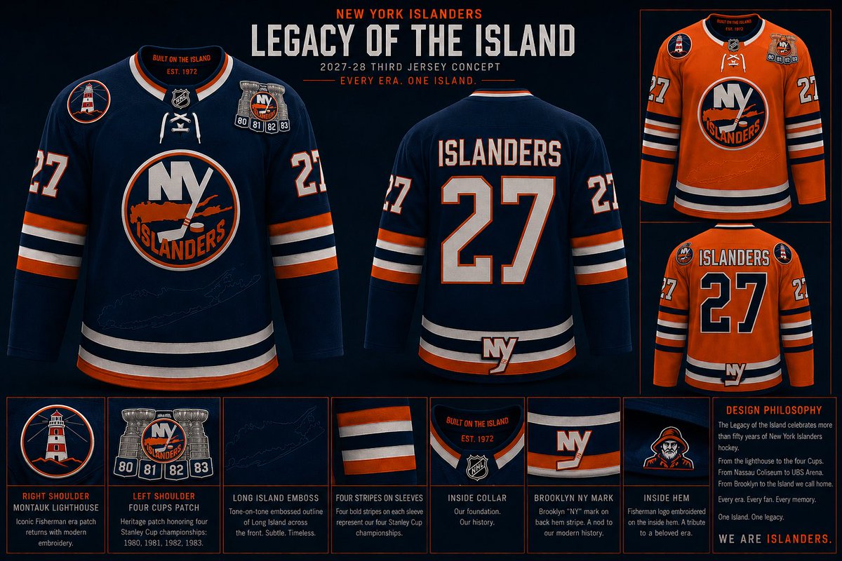
🏒 Current Islanders Crest – The logo is timeless. It belongs at the center of the jersey because it’s the identity of the franchise.
🗺️ Embossed Long Island Outline – The Islanders don’t exist without Long Island. Instead of making it loud, it’s woven into the fabric beneath the crest so fans discover it up close.
🗼 Montauk Lighthouse Shoulder Patch – A tribute to one of Long Island’s most recognizable landmarks and a respectful nod to the Fisherman era without recreating the jersey.
🏆 Four Cups Shoulder Patch (80 • 81 • 82 • 83) – A commemorative patch honoring the greatest dynasty in Islanders history.
🟠⚪🔵 Four Sleeve Stripes – Four classic stripes that subtly represent the franchise’s four consecutive Stanley Cup championships while staying true to the Islanders’ traditional uniform design.
🟠 Orange Alternate Version – The same design in orange pays homage to the Islanders’ early-2000s alternate jersey while keeping the heritage theme intact.
🔷 Brooklyn “NY” Logo – Placed subtly on the rear hem as an Easter egg honoring another chapter in franchise history. Not the focus, but part of the story.
🏴☠️ Hidden Fisherman Logo – Instead of putting the controversial logo on the outside, it’s hidden inside the jersey as a tribute to an era that has become part of Islanders culture.
📍 Inside Collar
“BUILT ON THE ISLAND”
“EST. 1972”
The idea wasn’t to pick one era over another.
It was to celebrate them all.
From Nassau Coliseum…
to the Dynasty…
to the Fisherman…
to Brooklyn…
to UBS Arena…
One jersey.
One history.
Every Era. One Island.
#Isles #Islanders #IslesThirdJersey #LongIsland #NHL
When I started designing my submission for the @NYIslanders Third Jersey Contest, I didn’t want to create another throwback. I wanted to create a jersey that tells the story of the franchise.
Every detail has meaning.
🏒 Current Islanders Crest – The logo is timeless. It belongs at the center of the jersey because it’s the identity of the franchise.
🗺️ Embossed Long Island Outline – The Islanders don’t exist without Long Island. Instead of making it loud, it’s woven into the fabric beneath the crest so fans discover it up close.
🗼 Montauk Lighthouse Shoulder Patch – A tribute to one of Long Island’s most recognizable landmarks and a respectful nod to the Fisherman era without recreating the jersey.
🏆 Four Cups Shoulder Patch (80 • 81 • 82 • 83) – A commemorative patch honoring the greatest dynasty in Islanders history.
🟠⚪🔵 Four Sleeve Stripes – Four classic stripes that subtly represent the franchise’s four consecutive Stanley Cup championships while staying true to the Islanders’ traditional uniform design.
🟠 Orange Alternate Version – The same design in orange pays homage to the Islanders’ early-2000s alternate jersey while keeping the heritage theme intact.
🔷 Brooklyn “NY” Logo – Placed subtly on the rear hem as an Easter egg honoring another chapter in franchise history. Not the focus, but part of the story.
🏴☠️ Hidden Fisherman Logo – Instead of putting the controversial logo on the outside, it’s hidden inside the jersey as a tribute to an era that has become part of Islanders culture.
📍 Inside Collar
“BUILT ON THE ISLAND”
“EST. 1972”
The idea wasn’t to pick one era over another.
It was to celebrate them all.
From Nassau Coliseum…
to the Dynasty…
to the Fisherman…
to Brooklyn…
to UBS Arena…
One jersey.
One history.
Every Era. One Island.
#Isles #Islanders #IslesThirdJersey #LongIsland #NHL
When I started designing my submission for the @NYIslanders Third Jersey Contest, I didn’t want to create another throwback. I wanted to create a jersey that tells the story of the franchise.
Every detail has meaning.
🏒 Current Islanders Crest – The logo is timeless. It belongs at the center of the jersey because it’s the identity of the franchise.
🗺️ Embossed Long Island Outline – The Islanders don’t exist without Long Island. Instead of making it loud, it’s woven into the fabric beneath the crest so fans discover it up close.
🗼 Montauk Lighthouse Shoulder Patch – A tribute to one of Long Island’s most recognizable landmarks and a respectful nod to the Fisherman era without recreating the jersey.
🏆 Four Cups Shoulder Patch (80 • 81 • 82 • 83) – A commemorative patch honoring the greatest dynasty in Islanders history.
🟠⚪🔵 Four Sleeve Stripes – Four classic stripes that subtly represent the franchise’s four consecutive Stanley Cup championships while staying true to the Islanders’ traditional uniform design.
🟠 Orange Alternate Version – The same design in orange pays homage to the Islanders’ early-2000s alternate jersey while keeping the heritage theme intact.
🔷 Brooklyn “NY” Logo – Placed subtly on the rear hem as an Easter egg honoring another chapter in franchise history. Not the focus, but part of the story.
🏴☠️ Hidden Fisherman Logo – Instead of putting the controversial logo on the outside, it’s hidden inside the jersey as a tribute to an era that has become part of Islanders culture.
📍 Inside Collar
“BUILT ON THE ISLAND”
“EST. 1972”
The idea wasn’t to pick one era over another.
It was to celebrate them all.
From Nassau Coliseum…
to the Dynasty…
to the Fisherman…
to Brooklyn…
to UBS Arena…
One jersey.
One history.
Every Era. One Island.
#Isles #Islanders #IslesThirdJersey #LongIsland #NHL
When I started designing my submission for the @NYIslanders Third Jersey Contest, I didn’t want to create another throwback. I wanted to create a jersey that tells the story of the franchise.
Every detail has meaning.
🏒 Current Islanders Crest – The logo is timeless. It belongs at the center of the jersey because it’s the identity of the franchise.
🗺️ Embossed Long Island Outline – The Islanders don’t exist without Long Island. Instead of making it loud, it’s woven into the fabric beneath the crest so fans discover it up close.
🗼 Montauk Lighthouse Shoulder Patch – A tribute to one of Long Island’s most recognizable landmarks and a respectful nod to the Fisherman era without recreating the jersey.
🏆 Four Cups Shoulder Patch (80 • 81 • 82 • 83) – A commemorative patch honoring the greatest dynasty in Islanders history.
🟠⚪🔵 Four Sleeve Stripes – Four classic stripes that subtly represent the franchise’s four consecutive Stanley Cup championships while staying true to the Islanders’ traditional uniform design.
🟠 Orange Alternate Version – The same design in orange pays homage to the Islanders’ early-2000s alternate jersey while keeping the heritage theme intact.
🔷 Brooklyn “NY” Logo – Placed subtly on the rear hem as an Easter egg honoring another chapter in franchise history. Not the focus, but part of the story.
🏴☠️ Hidden Fisherman Logo – Instead of putting the controversial logo on the outside, it’s hidden inside the jersey as a tribute to an era that has become part of Islanders culture.
📍 Inside Collar
“BUILT ON THE ISLAND”
“EST. 1972”
The idea wasn’t to pick one era over another.
It was to celebrate them all.
From Nassau Coliseum…
to the Dynasty…
to the Fisherman…
to Brooklyn…
to UBS Arena…
One jersey.
One history.
Every Era. One Island.
#Isles #Islanders #IslesThirdJersey #LongIsland #NHL
When I started designing my submission for the @NYIslanders Third Jersey Contest, I didn’t want to create another throwback. I wanted to create a jersey that tells the story of the franchise.
Every detail has meaning.
🏒 Current Islanders Crest – The logo is timeless. It belongs at the center of the jersey because it’s the identity of the franchise.
🗺️ Embossed Long Island Outline – The Islanders don’t exist without Long Island. Instead of making it loud, it’s woven into the fabric beneath the crest so fans discover it up close.
🗼 Montauk Lighthouse Shoulder Patch – A tribute to one of Long Island’s most recognizable landmarks and a respectful nod to the Fisherman era without recreating the jersey.
🏆 Four Cups Shoulder Patch (80 • 81 • 82 • 83) – A commemorative patch honoring the greatest dynasty in Islanders history.
🟠⚪🔵 Four Sleeve Stripes – Four classic stripes that subtly represent the franchise’s four consecutive Stanley Cup championships while staying true to the Islanders’ traditional uniform design.
🟠 Orange Alternate Version – The same design in orange pays homage to the Islanders’ early-2000s alternate jersey while keeping the heritage theme intact.
🔷 Brooklyn “NY” Logo – Placed subtly on the rear hem as an Easter egg honoring another chapter in franchise history. Not the focus, but part of the story.
🏴☠️ Hidden Fisherman Logo – Instead of putting the controversial logo on the outside, it’s hidden inside the jersey as a tribute to an era that has become part of Islanders culture.
📍 Inside Collar
“BUILT ON THE ISLAND”
“EST. 1972”
The idea wasn’t to pick one era over another.
It was to celebrate them all.
From Nassau Coliseum…
to the Dynasty…
to the Fisherman…
to Brooklyn…
to UBS Arena…
One jersey.
One history.
Every Era. One Island.
#Isles #Islanders #IslesThirdJersey #LongIsland #NHL
When I started designing my submission for the @NYIslanders Third Jersey Contest, I didn’t want to create another throwback. I wanted to create a jersey that tells the story of the franchise.
Every detail has meaning.
🏒 Current Islanders Crest – The logo is timeless. It belongs at the center of the jersey because it’s the identity of the franchise.
🗺️ Embossed Long Island Outline – The Islanders don’t exist without Long Island. Instead of making it loud, it’s woven into the fabric beneath the crest so fans discover it up close.
🗼 Montauk Lighthouse Shoulder Patch – A tribute to one of Long Island’s most recognizable landmarks and a respectful nod to the Fisherman era without recreating the jersey.
🏆 Four Cups Shoulder Patch (80 • 81 • 82 • 83) – A commemorative patch honoring the greatest dynasty in Islanders history.
🟠⚪🔵 Four Sleeve Stripes – Four classic stripes that subtly represent the franchise’s four consecutive Stanley Cup championships while staying true to the Islanders’ traditional uniform design.
🟠 Orange Alternate Version – The same design in orange pays homage to the Islanders’ early-2000s alternate jersey while keeping the heritage theme intact.
🔷 Brooklyn “NY” Logo – Placed subtly on the rear hem as an Easter egg honoring another chapter in franchise history. Not the focus, but part of the story.
🏴☠️ Hidden Fisherman Logo – Instead of putting the controversial logo on the outside, it’s hidden inside the jersey as a tribute to an era that has become part of Islanders culture.
📍 Inside Collar
“BUILT ON THE ISLAND”
“EST. 1972”
The idea wasn’t to pick one era over another.
It was to celebrate them all.
From Nassau Coliseum…
to the Dynasty…
to the Fisherman…
to Brooklyn…
to UBS Arena…
One jersey.
One history.
Every Era. One Island.
#Isles #Islanders #IslesThirdJersey #LongIsland #NHL
When I started designing my submission for the @NYIslanders Third Jersey Contest, I didn’t want to create another throwback. I wanted to create a jersey that tells the story of the franchise.
Every detail has meaning.
🏒 Current Islanders Crest – The logo is timeless. It belongs at the center of the jersey because it’s the identity of the franchise.
🗺️ Embossed Long Island Outline – The Islanders don’t exist without Long Island. Instead of making it loud, it’s woven into the fabric beneath the crest so fans discover it up close.
🗼 Montauk Lighthouse Shoulder Patch – A tribute to one of Long Island’s most recognizable landmarks and a respectful nod to the Fisherman era without recreating the jersey.
🏆 Four Cups Shoulder Patch (80 • 81 • 82 • 83) – A commemorative patch honoring the greatest dynasty in Islanders history.
🟠⚪🔵 Four Sleeve Stripes – Four classic stripes that subtly represent the franchise’s four consecutive Stanley Cup championships while staying true to the Islanders’ traditional uniform design.
🟠 Orange Alternate Version – The same design in orange pays homage to the Islanders’ early-2000s alternate jersey while keeping the heritage theme intact.
🔷 Brooklyn “NY” Logo – Placed subtly on the rear hem as an Easter egg honoring another chapter in franchise history. Not the focus, but part of the story.
🏴☠️ Hidden Fisherman Logo – Instead of putting the controversial logo on the outside, it’s hidden inside the jersey as a tribute to an era that has become part of Islanders culture.
📍 Inside Collar
“BUILT ON THE ISLAND”
“EST. 1972”
The idea wasn’t to pick one era over another.
It was to celebrate them all.
From Nassau Coliseum…
to the Dynasty…
to the Fisherman…
to Brooklyn…
to UBS Arena…
One jersey.
One history.
Every Era. One Island.
#Isles #Islanders #IslesThirdJersey #LongIsland #NHL
When I started designing my submission for the @NYIslanders Third Jersey Contest, I didn’t want to create another throwback. I wanted to create a jersey that tells the story of the franchise.
Every detail has meaning.
🏒 Current Islanders Crest – The logo is timeless. It belongs at the center of the jersey because it’s the identity of the franchise.
🗺️ Embossed Long Island Outline – The Islanders don’t exist without Long Island. Instead of making it loud, it’s woven into the fabric beneath the crest so fans discover it up close.
🗼 Montauk Lighthouse Shoulder Patch – A tribute to one of Long Island’s most recognizable landmarks and a respectful nod to the Fisherman era without recreating the jersey.
🏆 Four Cups Shoulder Patch (80 • 81 • 82 • 83) – A commemorative patch honoring the greatest dynasty in Islanders history.
🟠⚪🔵 Four Sleeve Stripes – Four classic stripes that subtly represent the franchise’s four consecutive Stanley Cup championships while staying true to the Islanders’ traditional uniform design.
🟠 Orange Alternate Version – The same design in orange pays homage to the Islanders’ early-2000s alternate jersey while keeping the heritage theme intact.
🔷 Brooklyn “NY” Logo – Placed subtly on the rear hem as an Easter egg honoring another chapter in franchise history. Not the focus, but part of the story.
🏴☠️ Hidden Fisherman Logo – Instead of putting the controversial logo on the outside, it’s hidden inside the jersey as a tribute to an era that has become part of Islanders culture.
📍 Inside Collar
“BUILT ON THE ISLAND”
“EST. 1972”
The idea wasn’t to pick one era over another.
It was to celebrate them all.
From Nassau Coliseum…
to the Dynasty…
to the Fisherman…
to Brooklyn…
to UBS Arena…
One jersey.
One history.
Every Era. One Island.
#Isles #Islanders #IslesThirdJersey #LongIsland #NHL
When I started designing my submission for the @NYIslanders Third Jersey Contest, I didn’t want to create another throwback. I wanted to create a jersey that tells the story of the franchise.
Every detail has meaning.
🏒 Current Islanders Crest – The logo is timeless. It belongs at the center of the jersey because it’s the identity of the franchise.
🗺️ Embossed Long Island Outline – The Islanders don’t exist without Long Island. Instead of making it loud, it’s woven into the fabric beneath the crest so fans discover it up close.
🗼 Montauk Lighthouse Shoulder Patch – A tribute to one of Long Island’s most recognizable landmarks and a respectful nod to the Fisherman era without recreating the jersey.
🏆 Four Cups Shoulder Patch (80 • 81 • 82 • 83) – A commemorative patch honoring the greatest dynasty in Islanders history.
🟠⚪🔵 Four Sleeve Stripes – Four classic stripes that subtly represent the franchise’s four consecutive Stanley Cup championships while staying true to the Islanders’ traditional uniform design.
🟠 Orange Alternate Version – The same design in orange pays homage to the Islanders’ early-2000s alternate jersey while keeping the heritage theme intact.
🔷 Brooklyn “NY” Logo – Placed subtly on the rear hem as an Easter egg honoring another chapter in franchise history. Not the focus, but part of the story.
🏴☠️ Hidden Fisherman Logo – Instead of putting the controversial logo on the outside, it’s hidden inside the jersey as a tribute to an era that has become part of Islanders culture.
📍 Inside Collar
“BUILT ON THE ISLAND”
“EST. 1972”
The idea wasn’t to pick one era over another.
It was to celebrate them all.
From Nassau Coliseum…
to the Dynasty…
to the Fisherman…
to Brooklyn…
to UBS Arena…
One jersey.
One history.
Every Era. One Island.
#Isles #Islanders #IslesThirdJersey #LongIsland #NHL
When I started designing my submission for the @NYIslanders Third Jersey Contest, I didn’t want to create another throwback. I wanted to create a jersey that tells the story of the franchise.
Every detail has meaning.
🏒 Current Islanders Crest – The logo is timeless. It belongs at the center of the jersey because it’s the identity of the franchise.
🗺️ Embossed Long Island Outline – The Islanders don’t exist without Long Island. Instead of making it loud, it’s woven into the fabric beneath the crest so fans discover it up close.
🗼 Montauk Lighthouse Shoulder Patch – A tribute to one of Long Island’s most recognizable landmarks and a respectful nod to the Fisherman era without recreating the jersey.
🏆 Four Cups Shoulder Patch (80 • 81 • 82 • 83) – A commemorative patch honoring the greatest dynasty in Islanders history.
🟠⚪🔵 Four Sleeve Stripes – Four classic stripes that subtly represent the franchise’s four consecutive Stanley Cup championships while staying true to the Islanders’ traditional uniform design.
🟠 Orange Alternate Version – The same design in orange pays homage to the Islanders’ early-2000s alternate jersey while keeping the heritage theme intact.
🔷 Brooklyn “NY” Logo – Placed subtly on the rear hem as an Easter egg honoring another chapter in franchise history. Not the focus, but part of the story.
🏴☠️ Hidden Fisherman Logo – Instead of putting the controversial logo on the outside, it’s hidden inside the jersey as a tribute to an era that has become part of Islanders culture.
📍 Inside Collar
“BUILT ON THE ISLAND”
“EST. 1972”
The idea wasn’t to pick one era over another.
It was to celebrate them all.
From Nassau Coliseum…
to the Dynasty…
to the Fisherman…
to Brooklyn…
to UBS Arena…
One jersey.
One history.
Every Era. One Island.
#Isles #Islanders #IslesThirdJersey #LongIsland #NHL
When I started designing my submission for the @NYIslanders Third Jersey Contest, I didn’t want to create another throwback. I wanted to create a jersey that tells the story of the franchise.
Every detail has meaning.
🏒 Current Islanders Crest – The logo is timeless. It belongs at the center of the jersey because it’s the identity of the franchise.
🗺️ Embossed Long Island Outline – The Islanders don’t exist without Long Island. Instead of making it loud, it’s woven into the fabric beneath the crest so fans discover it up close.
🗼 Montauk Lighthouse Shoulder Patch – A tribute to one of Long Island’s most recognizable landmarks and a respectful nod to the Fisherman era without recreating the jersey.
🏆 Four Cups Shoulder Patch (80 • 81 • 82 • 83) – A commemorative patch honoring the greatest dynasty in Islanders history.
🟠⚪🔵 Four Sleeve Stripes – Four classic stripes that subtly represent the franchise’s four consecutive Stanley Cup championships while staying true to the Islanders’ traditional uniform design.
🟠 Orange Alternate Version – The same design in orange pays homage to the Islanders’ early-2000s alternate jersey while keeping the heritage theme intact.
🔷 Brooklyn “NY” Logo – Placed subtly on the rear hem as an Easter egg honoring another chapter in franchise history. Not the focus, but part of the story.
🏴☠️ Hidden Fisherman Logo – Instead of putting the controversial logo on the outside, it’s hidden inside the jersey as a tribute to an era that has become part of Islanders culture.
📍 Inside Collar
“BUILT ON THE ISLAND”
“EST. 1972”
The idea wasn’t to pick one era over another.
It was to celebrate them all.
From Nassau Coliseum…
to the Dynasty…
to the Fisherman…
to Brooklyn…
to UBS Arena…
One jersey.
One history.
Every Era. One Island.
#Isles #Islanders #IslesThirdJersey #LongIsland #NHL
When I started designing my submission for the @NYIslanders Third Jersey Contest, I didn’t want to create another throwback. I wanted to create a jersey that tells the story of the franchise.
Every detail has meaning.
🏒 Current Islanders Crest – The logo is timeless. It belongs at the center of the jersey because it’s the identity of the franchise.
🗺️ Embossed Long Island Outline – The Islanders don’t exist without Long Island. Instead of making it loud, it’s woven into the fabric beneath the crest so fans discover it up close.
🗼 Montauk Lighthouse Shoulder Patch – A tribute to one of Long Island’s most recognizable landmarks and a respectful nod to the Fisherman era without recreating the jersey.
🏆 Four Cups Shoulder Patch (80 • 81 • 82 • 83) – A commemorative patch honoring the greatest dynasty in Islanders history.
🟠⚪🔵 Four Sleeve Stripes – Four classic stripes that subtly represent the franchise’s four consecutive Stanley Cup championships while staying true to the Islanders’ traditional uniform design.
🟠 Orange Alternate Version – The same design in orange pays homage to the Islanders’ early-2000s alternate jersey while keeping the heritage theme intact.
🔷 Brooklyn “NY” Logo – Placed subtly on the rear hem as an Easter egg honoring another chapter in franchise history. Not the focus, but part of the story.
🏴☠️ Hidden Fisherman Logo – Instead of putting the controversial logo on the outside, it’s hidden inside the jersey as a tribute to an era that has become part of Islanders culture.
📍 Inside Collar
“BUILT ON THE ISLAND”
“EST. 1972”
The idea wasn’t to pick one era over another.
It was to celebrate them all.
From Nassau Coliseum…
to the Dynasty…
to the Fisherman…
to Brooklyn…
to UBS Arena…
One jersey.
One history.
Every Era. One Island.
#Isles #Islanders #IslesThirdJersey #LongIsland #NHL
When I started designing my submission for the @NYIslanders Third Jersey Contest, I didn’t want to create another throwback. I wanted to create a jersey that tells the story of the franchise.
Every detail has meaning.
🏒 Current Islanders Crest – The logo is timeless. It belongs at the center of the jersey because it’s the identity of the franchise.
🗺️ Embossed Long Island Outline – The Islanders don’t exist without Long Island. Instead of making it loud, it’s woven into the fabric beneath the crest so fans discover it up close.
🗼 Montauk Lighthouse Shoulder Patch – A tribute to one of Long Island’s most recognizable landmarks and a respectful nod to the Fisherman era without recreating the jersey.
🏆 Four Cups Shoulder Patch (80 • 81 • 82 • 83) – A commemorative patch honoring the greatest dynasty in Islanders history.
🟠⚪🔵 Four Sleeve Stripes – Four classic stripes that subtly represent the franchise’s four consecutive Stanley Cup championships while staying true to the Islanders’ traditional uniform design.
🟠 Orange Alternate Version – The same design in orange pays homage to the Islanders’ early-2000s alternate jersey while keeping the heritage theme intact.
🔷 Brooklyn “NY” Logo – Placed subtly on the rear hem as an Easter egg honoring another chapter in franchise history. Not the focus, but part of the story.
🏴☠️ Hidden Fisherman Logo – Instead of putting the controversial logo on the outside, it’s hidden inside the jersey as a tribute to an era that has become part of Islanders culture.
📍 Inside Collar
“BUILT ON THE ISLAND”
“EST. 1972”
The idea wasn’t to pick one era over another.
It was to celebrate them all.
From Nassau Coliseum…
to the Dynasty…
to the Fisherman…
to Brooklyn…
to UBS Arena…
One jersey.
One history.
Every Era. One Island.
#Isles #Islanders #IslesThirdJersey #LongIsland #NHL
When I started designing my submission for the @NYIslanders Third Jersey Contest, I didn’t want to create another throwback. I wanted to create a jersey that tells the story of the franchise.
Every detail has meaning.
🏒 Current Islanders Crest – The logo is timeless. It belongs at the center of the jersey because it’s the identity of the franchise.
🗺️ Embossed Long Island Outline – The Islanders don’t exist without Long Island. Instead of making it loud, it’s woven into the fabric beneath the crest so fans discover it up close.
🗼 Montauk Lighthouse Shoulder Patch – A tribute to one of Long Island’s most recognizable landmarks and a respectful nod to the Fisherman era without recreating the jersey.
🏆 Four Cups Shoulder Patch (80 • 81 • 82 • 83) – A commemorative patch honoring the greatest dynasty in Islanders history.
🟠⚪🔵 Four Sleeve Stripes – Four classic stripes that subtly represent the franchise’s four consecutive Stanley Cup championships while staying true to the Islanders’ traditional uniform design.
🟠 Orange Alternate Version – The same design in orange pays homage to the Islanders’ early-2000s alternate jersey while keeping the heritage theme intact.
🔷 Brooklyn “NY” Logo – Placed subtly on the rear hem as an Easter egg honoring another chapter in franchise history. Not the focus, but part of the story.
🏴☠️ Hidden Fisherman Logo – Instead of putting the controversial logo on the outside, it’s hidden inside the jersey as a tribute to an era that has become part of Islanders culture.
📍 Inside Collar
“BUILT ON THE ISLAND”
“EST. 1972”
The idea wasn’t to pick one era over another.
It was to celebrate them all.
From Nassau Coliseum…
to the Dynasty…
to the Fisherman…
to Brooklyn…
to UBS Arena…
One jersey.
One history.
Every Era. One Island.
#Isles #Islanders #IslesThirdJersey #LongIsland #NHL
When I started designing my submission for the @NYIslanders Third Jersey Contest, I didn’t want to create another throwback. I wanted to create a jersey that tells the story of the franchise.
Every detail has meaning.
🏒 Current Islanders Crest – The logo is timeless. It belongs at the center of the jersey because it’s the identity of the franchise.
🗺️ Embossed Long Island Outline – The Islanders don’t exist without Long Island. Instead of making it loud, it’s woven into the fabric beneath the crest so fans discover it up close.
🗼 Montauk Lighthouse Shoulder Patch – A tribute to one of Long Island’s most recognizable landmarks and a respectful nod to the Fisherman era without recreating the jersey.
🏆 Four Cups Shoulder Patch (80 • 81 • 82 • 83) – A commemorative patch honoring the greatest dynasty in Islanders history.
🟠⚪🔵 Four Sleeve Stripes – Four classic stripes that subtly represent the franchise’s four consecutive Stanley Cup championships while staying true to the Islanders’ traditional uniform design.
🟠 Orange Alternate Version – The same design in orange pays homage to the Islanders’ early-2000s alternate jersey while keeping the heritage theme intact.
🔷 Brooklyn “NY” Logo – Placed subtly on the rear hem as an Easter egg honoring another chapter in franchise history. Not the focus, but part of the story.
🏴☠️ Hidden Fisherman Logo – Instead of putting the controversial logo on the outside, it’s hidden inside the jersey as a tribute to an era that has become part of Islanders culture.
📍 Inside Collar
“BUILT ON THE ISLAND”
“EST. 1972”
The idea wasn’t to pick one era over another.
It was to celebrate them all.
From Nassau Coliseum…
to the Dynasty…
to the Fisherman…
to Brooklyn…
to UBS Arena…
One jersey.
One history.
Every Era. One Island.
#Isles #Islanders #IslesThirdJersey #LongIsland #NHL