Solution: one context sentence per KYC step. "We need your BVN to protect your account."
Completion: +34% in month 1.
None of that comes from opening Figma first.
The problem statement is not the preamble. It is the work.
The one thing I do before opening Figma and why most designers skip it
Before opening Figma: I write a problem statement. One sentence.
"[User] struggles to [action] because [obstacle], which means they [consequence]."
Real example
Brief: "Users drop off at sign-up. Fix it."
Without a statement, I'd shorten forms and add progress bars.
With the statement "Crypto users stop mid-KYC because they fear the app is a scam. Not friction. TRUST."
A founder spent ₦650,000 on a designer, hated all 6 revisions, and is starting over.
Their brief: "Build something clean and modern for our fintech app."
That's not a brief. That's an invitation to guess.
Here's the 5-question format that fixes this 🧵
6 months in, a startup was spending 3 hours per new feature to recreate the same button. Not a design problem. A system problem.
New article: What Is a Design System and Does Your Startup Need One?
Covers what it is, what it costs, and exactly when you need one.
Link below
A founder redesigned their app 4 times in 12 months.
Beautiful product. Zero user conversations before designing.
Here's the 3-step MVP process I use to prevent exactly that 🧵
Step 3: High-Fidelity + Handoff
Build in Figma with a component system.
Design ALL states: success, error, empty, loading.
Deliver a handoff guide, not just a file.
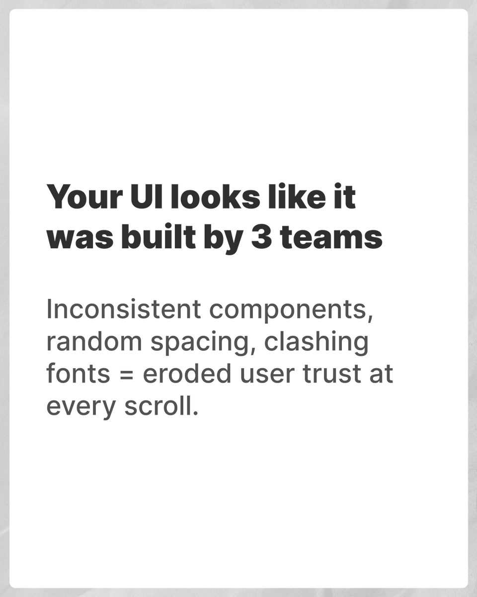
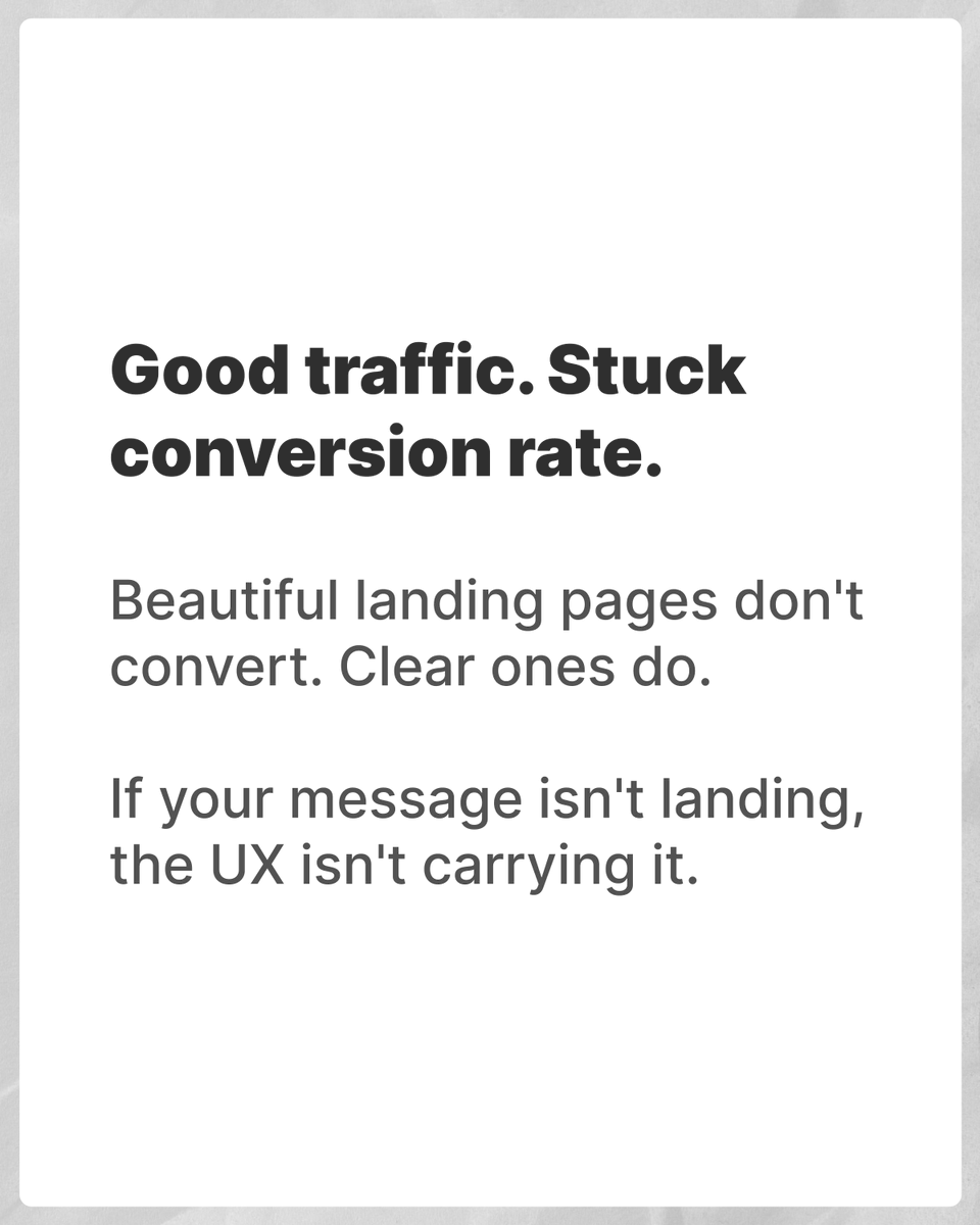
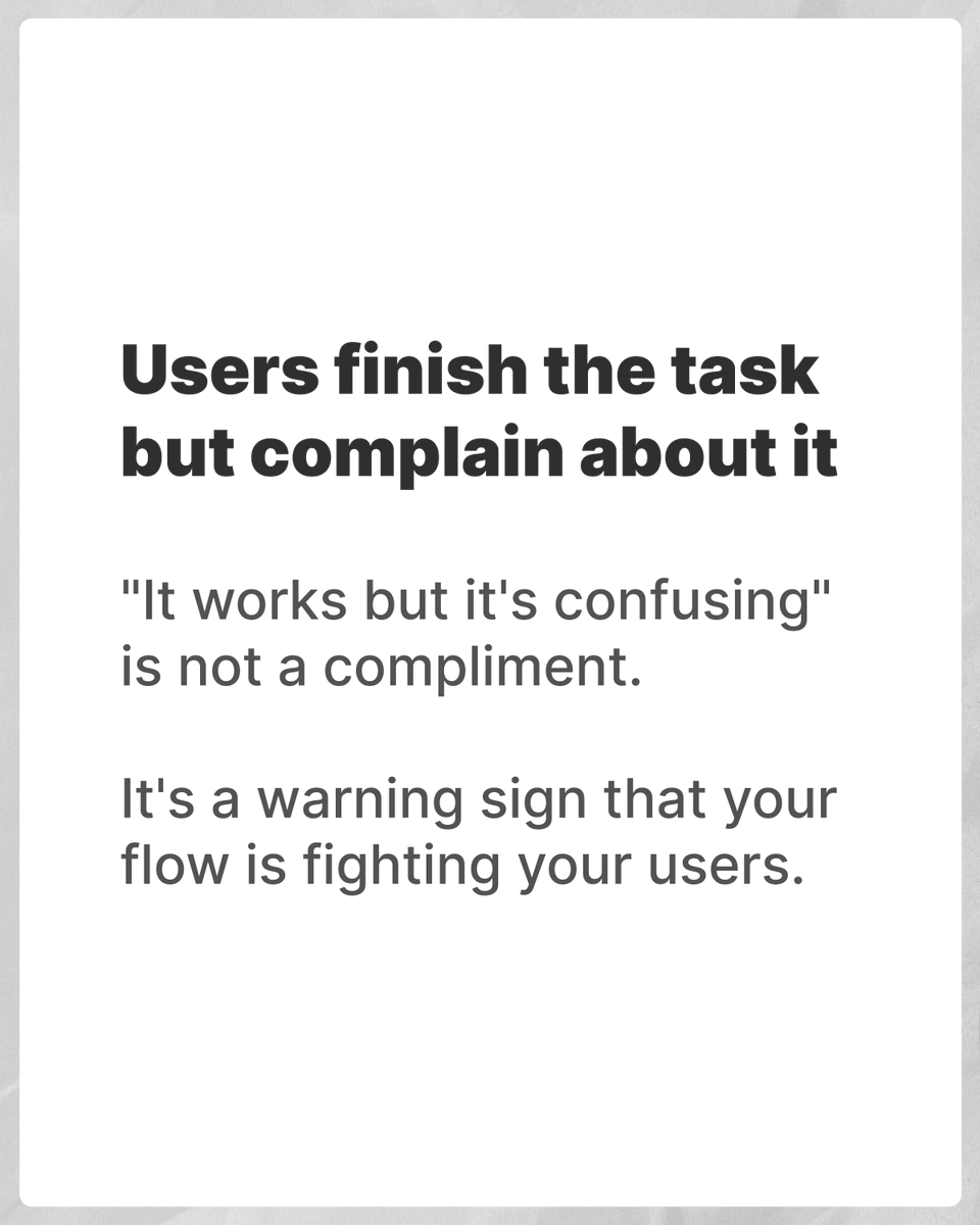
Here are the 5 signs I look for. Swipe to see if yours qualifies 👉
If any of these match your product, drop a comment, and I'll tell you which type of redesign you actually need.
#ProductDesign#UXDesign#StartupGrowth#NigeriaStartups
I reviewed 3 startup products last quarter, and all three founders said the same thing: "We just need it to look better." None of them needed a visual refresh.
All three needed a redesign for completely different reasons.