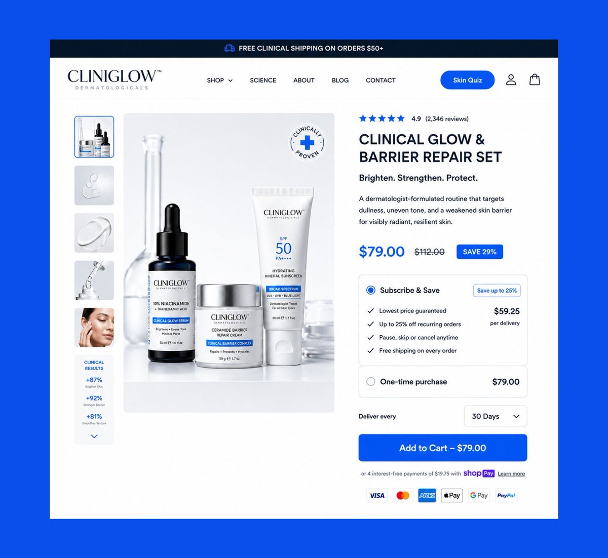
Most beauty brands lose money because their page looks nice but doesn’t sell.
This landing page was built to:
Build trust fast
Stack benefits visually
Push action without pressure
That’s CRO design.
Need this for your brand? My DMs are open.
Bundles aren't just for discounts. They're a conversion strategy.
A well designed bundle section increases average order value by making the better deal feel like the smarter choice not by forcing the upsell.
Every option should be easy to compare, clearly labeled, and simple to choose.#CRO #AOV #ConversionOptimization #ShopifyDesign #Figma #LandingPageDesign #EcommerceDesign #UXDesign #WebDesign
Designers focus too much on trends.
Brands care about:
• conversion
• trust
• retention
• revenue
That’s the real game.
Design should support business goals not just look “clean.”
A high converting buying box does two jobs at once.
It removes buying hesitation (CRO) and encourages larger purchases through bundles, subscriptions, and smart pricing (AOV).
When those two work together, you don't just get more customers you increase the value of every order.
Designed this buying box concept in @figma.
#CRO #AOV #Ecommerce #ConversionOptimization #ShopifyDesign #Figma #ProductPage #UIDesign #UXDesign #WebDesign
A buying box isn't there to decorate the page. It's there to remove doubt.
Every element should answer a customer's next question, reinforce trust, and make purchasing feel like the obvious next step.
Designed this desktop & mobile buying box concept in @figma with that principle in mind.
#CRO #ConversionRateOptimization #EcommerceDesign #Shopify #Figma #LandingPageDesign #UIDesign #UXDesign #DTC #WebDesign
Most DTC brands don’t have a traffic problem.
They have a conversion problem.
I design landing pages that fix that.
If you're running paid traffic, your page should be doing the heavy lifting.
Open for Shopify & DTC projects.
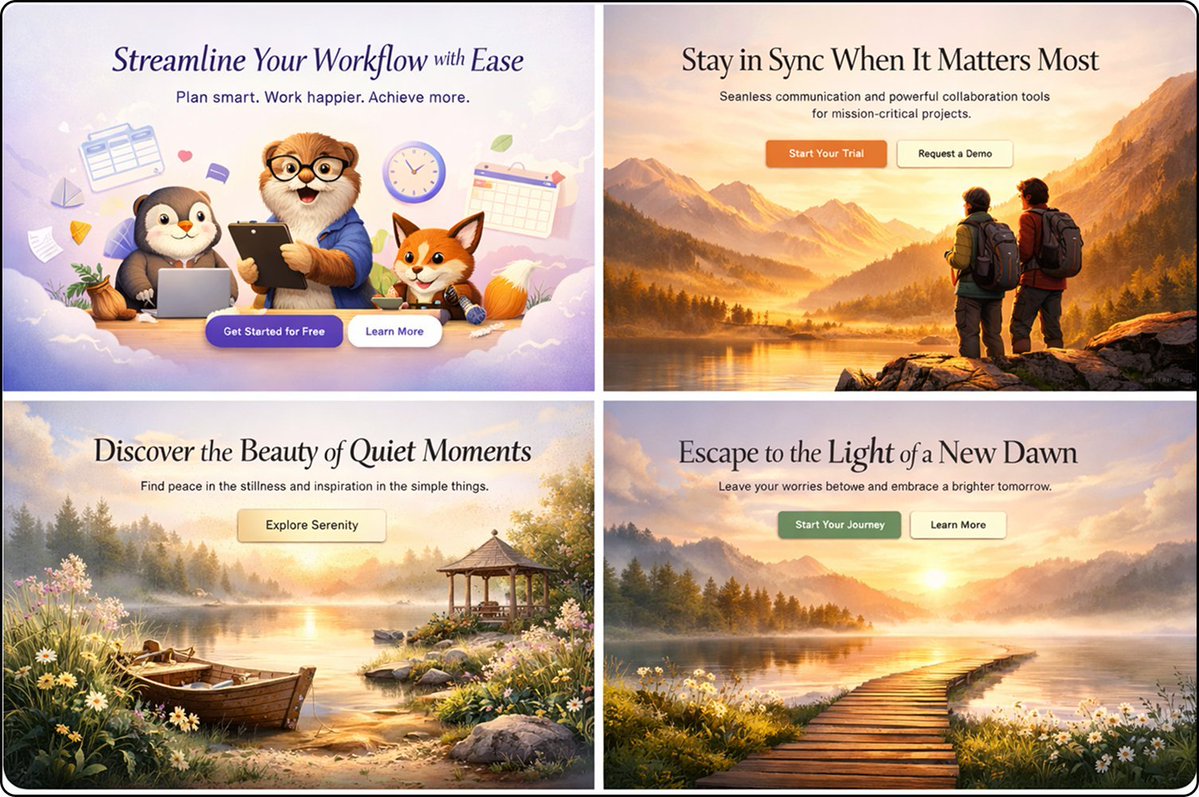
Designed 4 hero section concepts exploring different visual styles and user emotions.
Because first impressions happen in seconds, and the hero section often determines whether visitors stay or leave.
Which one do you like the most?
#WebDesign#UIDesign
Confused customers don't convert.
A great product page answers the right questions in the right order.
Instead of making people search for information, it guides them naturally toward a purchase.
These mobile concepts are built around that principle.
#ecommerce
When designing a product page, I always ask:
"What's stopping someone from clicking Add to Cart?"
Then I design to remove that friction.
Here's a skincare buying section concept I designed in @figma
A beautiful product page that doesn't convert is just decoration.
Redesigned this fashion PDP with a focus on product storytelling, trust signals, social proof, and a frictionless buying experience because every design decision should support revenue.
#EcommerceDesign#UIDesign
Most pet brands post cute dogs. Smart brands build pages that sell.
This listicle page was designed to educate without boring, Build trust fast.
Need one like this for your pet brand? My DMs are open.
#ecommerce
Designed a listicle page that does more than inform it sells.
Breaking features into clear, scannable sections helps visitors understand value faster and move closer to a purchase.
#WebDesign#LandingPageDesign#EcommerceDesign
Hundreds of happy customers. Brighter, smoother under eyes. Zero filters needed. This Aloe Vera Collagen Eye Mask sells itself Want your product page to convert better? My DMs are open.
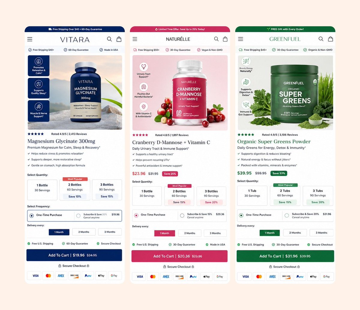
Redesigned this supplement buying box around a simple principle:
The easier it is to understand the offer, the easier it is to make a decision.
Focused on clarity, trust, and conversion first UX.
#UI#UX
A high converting buying section isn't about adding more elements.
It's about showing the right information in the right order.
Value → Trust → Decision → Action.
A few mobile eCommerce concepts I designed exploring that idea.
#ecommerce
Same product. Better buying box. Better conversion potential.
Before: • Low contrast • Weak pricing hierarchy • High text fatigue
After: • High contrast checkout that commands attention • Clear subscription offer to increase AOV • Trust badges and social proof positioned where they influence purchase decisions
Great ecommerce design isn't about making a store look prettier it's about making buying easier.
#Ecommerce #CRO #Shopify #WebDesign #UXDesign
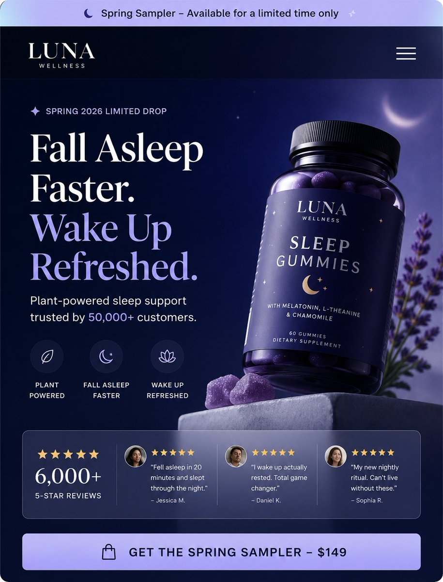
Great hero sections answer three questions instantly:
What is it?
What does it do?
Why should I care?
Here's my take for a sleep wellness brand.
#ecommerce
I didn't design this page to look premium.
I designed it so every scroll answers the next question in a customer's mind.
Does it work? → Benefits.
Can I trust it? → Reviews.
How do I use it? → Simple steps.
Why this over others? → Comparison.
Good product pages don't just sell. They remove reasons not to buy.
#ecommerce #WebsiteDesign
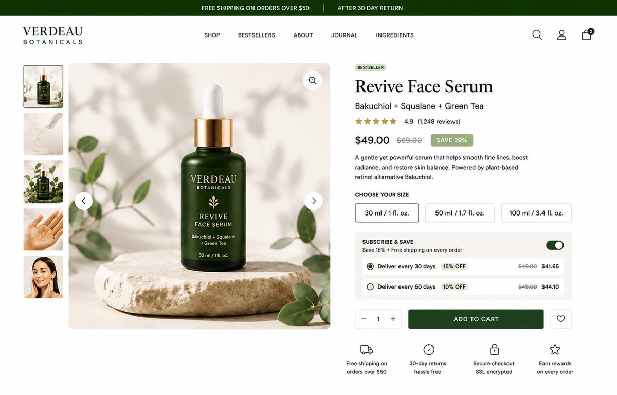
One thing I noticed while studying high converting brands:
Their buying box doesn't just sell a product it guides every buying decision.
From subscriptions to savings and trust badges, every element has a purpose.
I applied those principles to this skincare buying box I designed in @figma .
#WebsiteDevelopment #ecom #webdesign
Designed this landing page to guide visitors from “hmm” to “add to cart” Clean layout. Strong storytelling. Conversion focused UX. Your product deserves this treatment. DM me if you want a page that actually sells.